

Over the past few weeks I’ve visited two universities and conducted studio visits with undergraduates and graduates. Then I spent a couple hours at the University of Houston’s Masters of Fine Arts Thesis exhibition this past weekend. As much as the contemporary art scene tends to cause the black cloud over my head to pour rainy tears of depression, each of these experiences, culminating in UH’s thesis show, more or less reaffirmed my hope that, at the student level at least, artists are still interested in representing age-old stories of love and loss and politics with formal integrity in aesthetically complex objects.
The first works you’ll encounter at the UH show are Rajab Ali Sayed’s big figurative oil paintings and Erika Harper’s small acrylic canvases and assemblage sculptures. Sayed’s paintings are bold and confident. They evoke Eric Fischl’s style of quick, almost careless brushstrokes that cohere to produce decisively representational pictures that, when inspected closely, dissolve into abstract passages of creamy, flitting strokes and dabs.
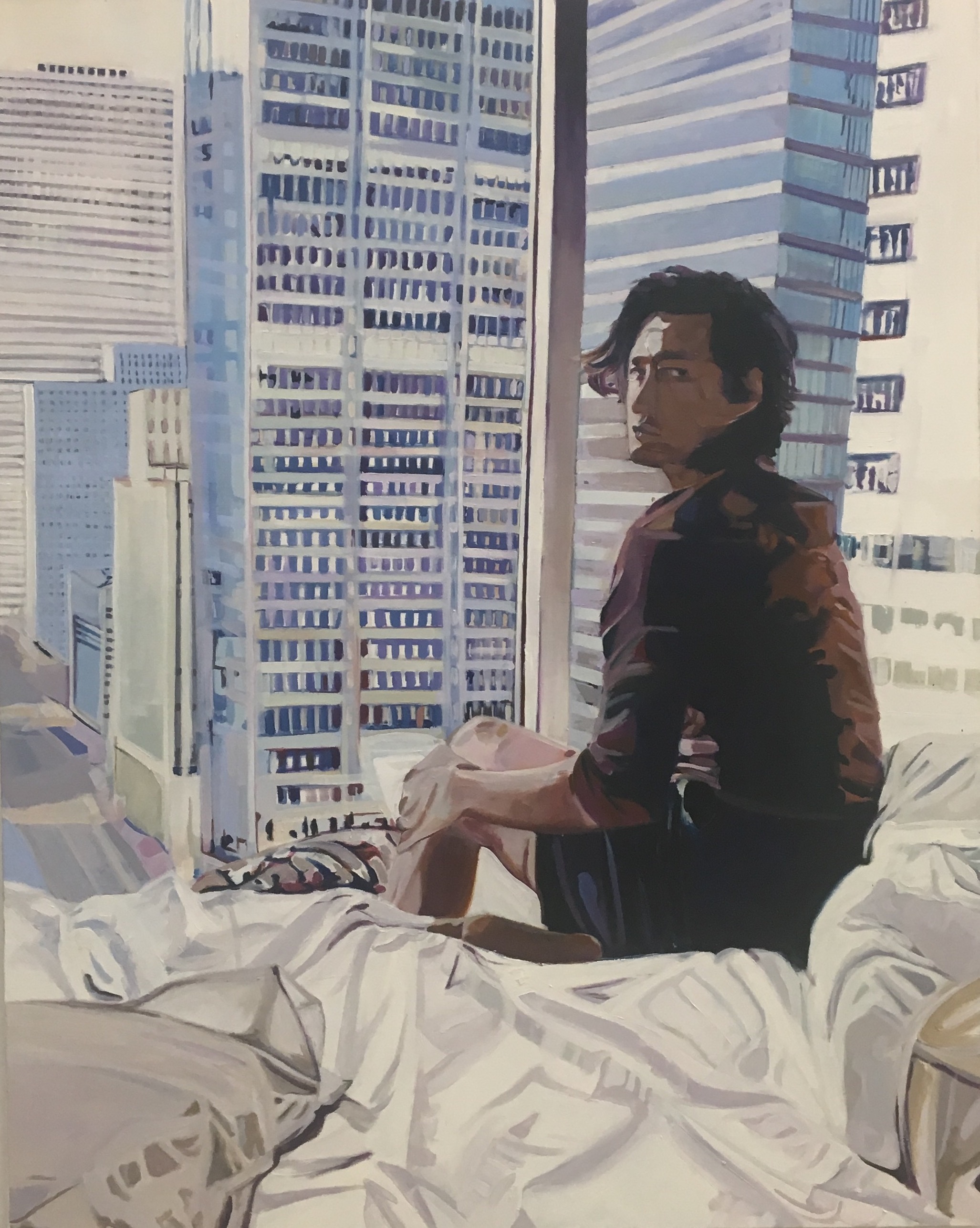
Rajab Ali Sayed, I’ve Been Waiting
Sayed relies heavily on tonal variation, mixing his colors with greys to produce canvases that are subdued and sophisticated. The narratives are mostly romantic. One canvas, I’ve Been Waiting, depicts a good-looking young guy (possibly the artist himself) sitting on a bed in a high-rise apartment or hotel room looking over his shoulder at the viewer. The expression on his face is decidedly bitchy, causing the viewer, who doubles as a late-arriving guest, to feel more than a little chastised.

Rajab Ali Sayed, The Convalescent
Next to Waiting, The Convalescent shows a burly bearded man with tousled hair thumbing a cell phone in a light-filled room that might well be the same room depicted in Waiting. He doesn’t look all that ill. From what is he convalescing? A long night? Sayed is a good painter but his painterly confidence sometimes edges close to laziness. Too often, what seems from a distance to be bravura paint handling dissolves, on close inspection, into clunky passages that don’t quite measure up to the paintings’ overall (impressive) impact. Nonetheless, Sayed is a strong painter for whom the question of painting’s death and the embarrassment of heart-on-sleeve narrative seems completely irrelevant.
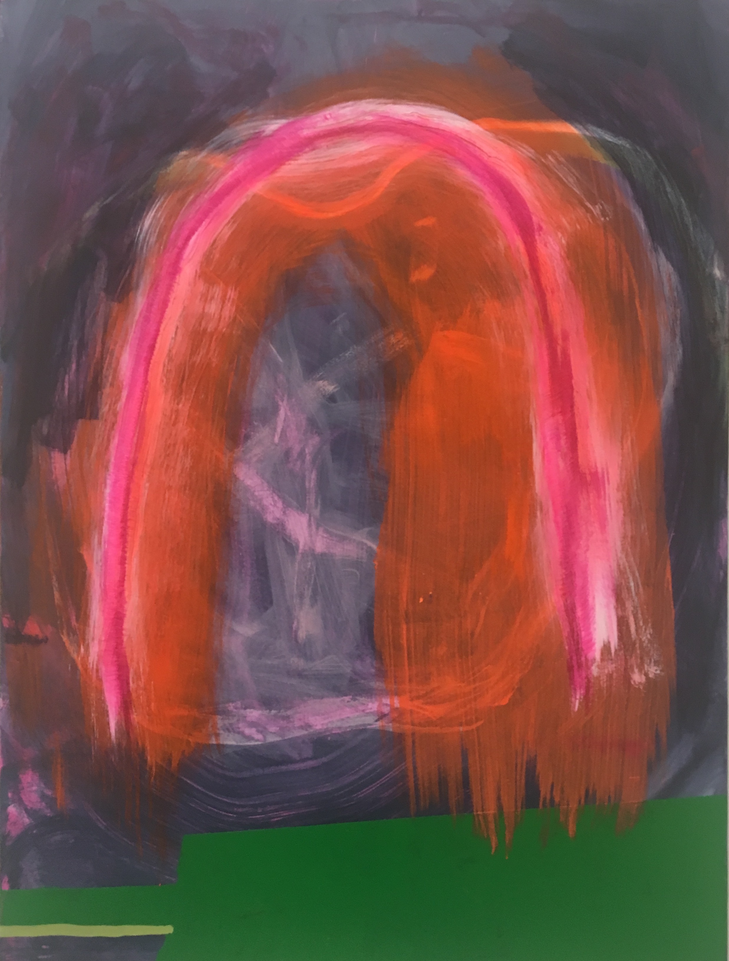
Erika Harper
Installed salon-style and interspersed with wall-mounted sculptures, Erika Harper’s casual abstractions exude a slacker charm to which I’m not immune, but they’re a little undercooked. Many of the canvases depict an arch or tombstone-like structure that emerges from broad, transparent, quickly brushed areas of bright, acidic acrylic paint. What they lack in resolution or finish they make up for in speed and confidence. Much of the visual action in Harper’s abstractions come from our ability to see through thinly applied veils of paint to the layers below. They give off an atmospheric glow that just rescues them from provisional painting purgatory.
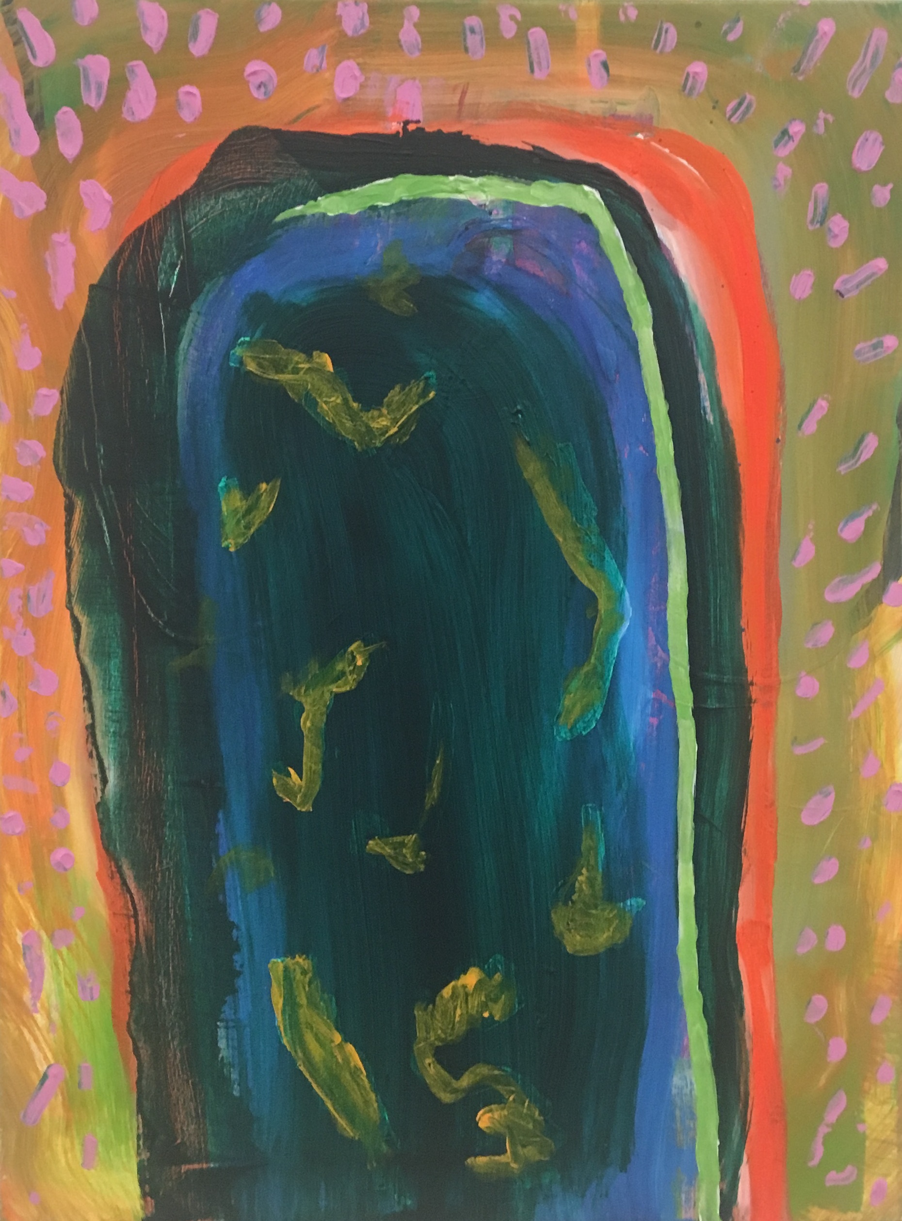
Erika Harper
I think a little more control will help snap Harper’s pictures into sharper focus. In the end, I want Harper to spend more time with these glowing totems—to be more strategic, more complex. Her paintings are as self-consciously lazy as they can be without falling apart and it’s that balancing act that lends them their charm, but her brushy style deployed on a much larger scale might lend her work a richer complexity that comes with greater time investment. There’s a lot of competition in the field of charming casualist abstraction these days, and Harper will have to find a way to lend her work enough gravitas to stand out in the crowd.
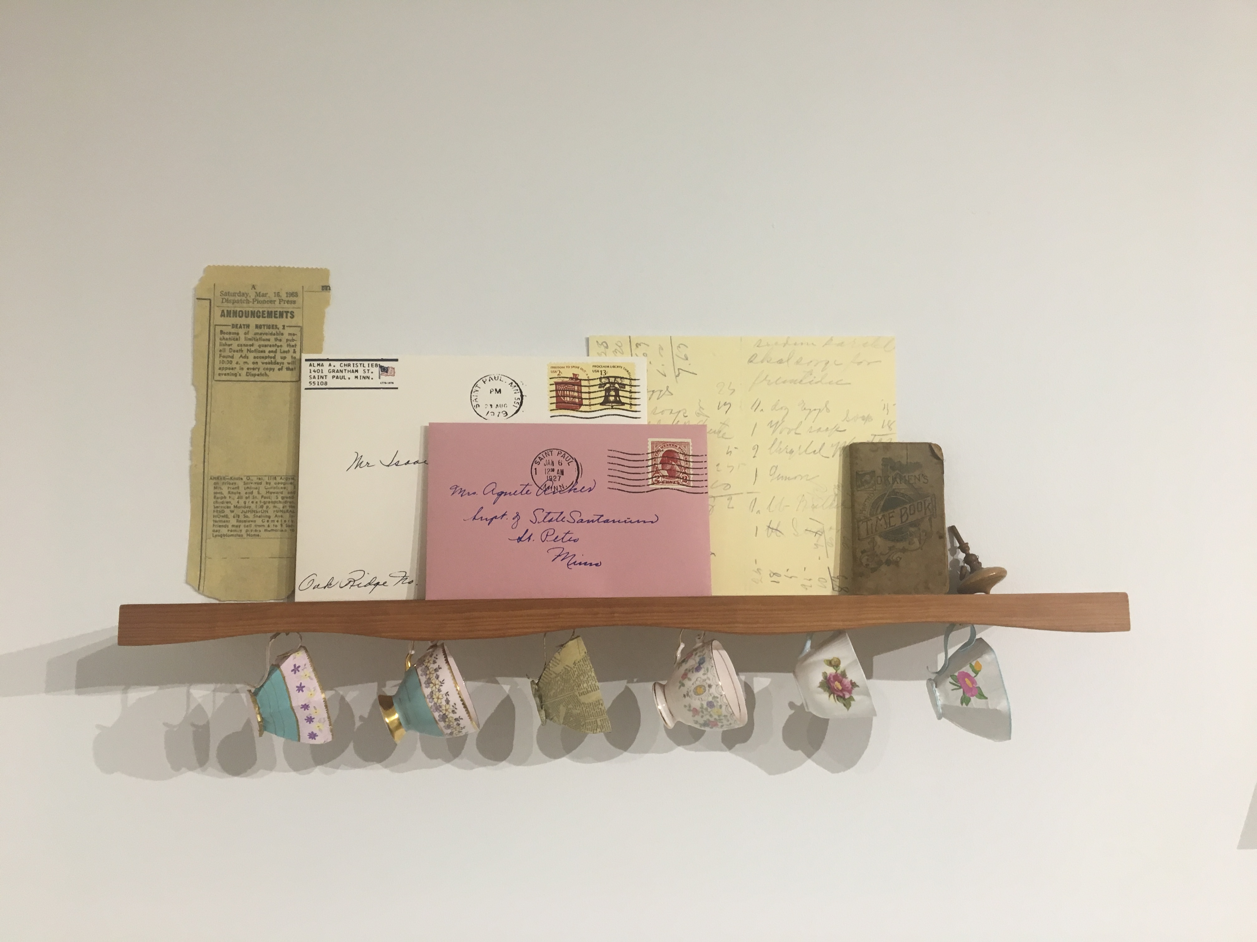
Lauren Christlieb
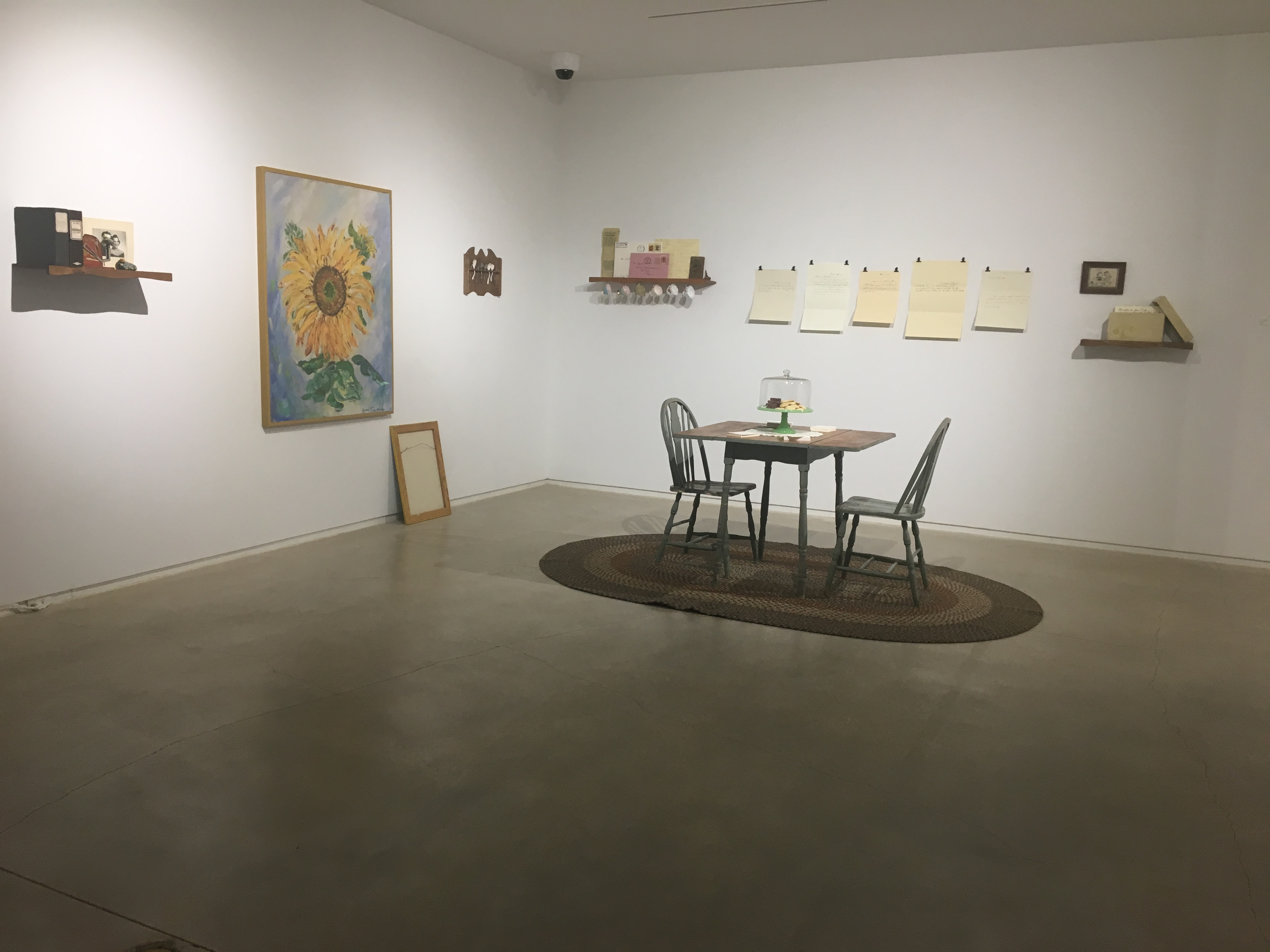
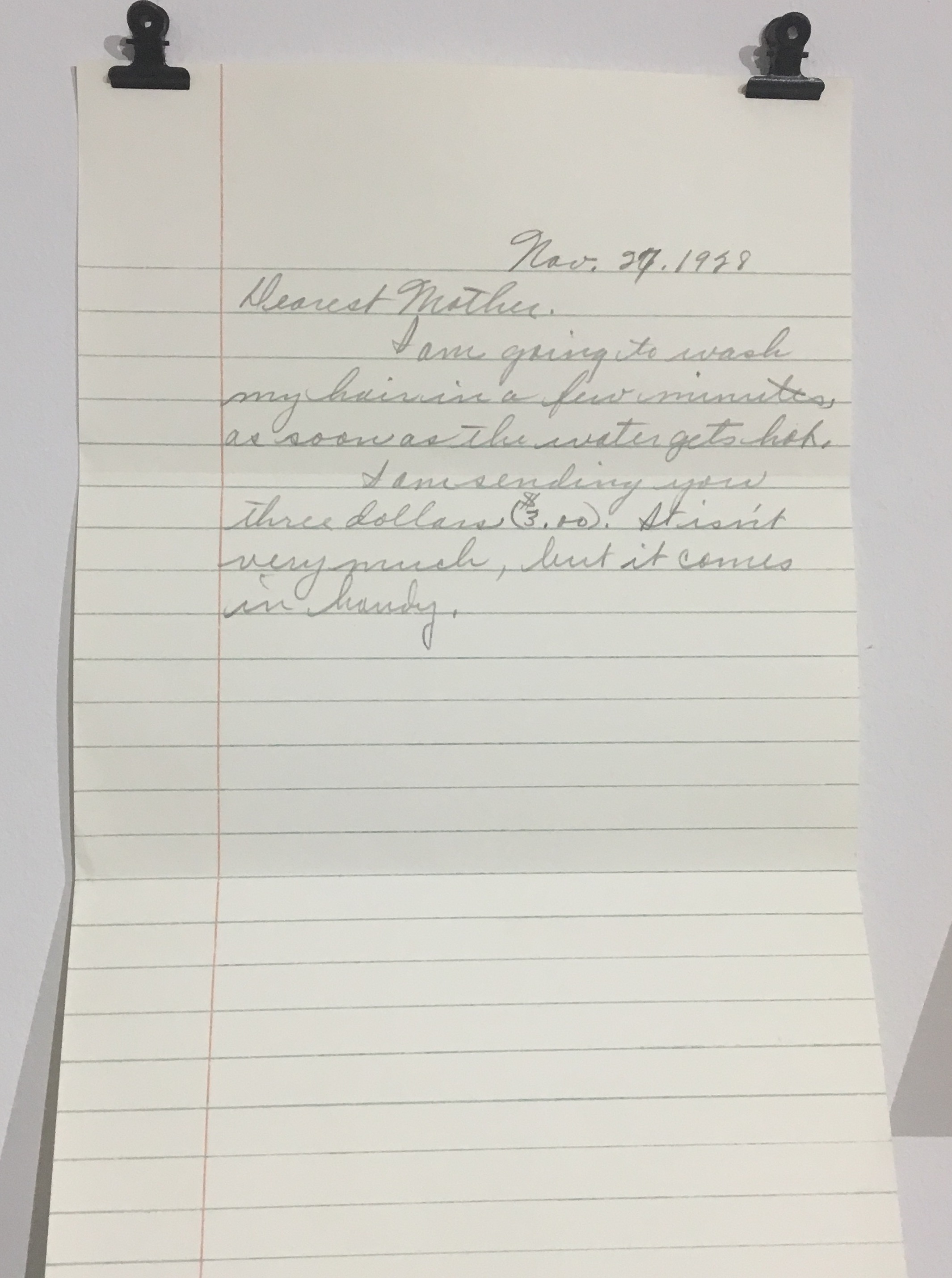
Lauren Christlieb’s installation, After He Passed, is particularly poignant. The installation takes the form of a kitchen with a small table and chairs surrounded by various mementos real and recreated. Clearly an elegy to a recently deceased loved one (I imagined a grandfather), Christlieb’s objects are less artworks than sacred objects used to come to terms with grief. Clipped to the wall are a series of handwritten letters, dated between 1928 and 1929, between what seem to be a mother and son.
Lauren Christlieb
The letters are recreations, copied in the original handwriting by the artist. The blue ruled lines on several of the sheets of paper are either drawn or printed. The sheets of paper and their carefully recreated envelopes, which sit on a nearby shelf, are all just a little bit larger than life-size. The cursive handwriting, also larger than normal, is smooth and even, never betraying whatever process (possibly projection) Christlieb has used to reproduce it.
Lauren Christlieb
There is something strange and compelling about recreating the writing of the dead. When my father died, when I was an undergraduate, I copied a large notebook of notes and diagrams he had made while taking electrical courses in trade school in his handwriting. It changed my own handwriting afterwards. On one wall in the installation Christlieb has installed a painting of a large sunflower signed Alma Christlieb. The artist’s grandmother?
On another wall, small china teacups are hung next to delicate recreations in fragile paper. Elsewhere recipes for sweets written on notecards in recreated handwriting lay stacked on a table. I thought they might be for the taking, but I didn’t dare. In all, Christlieb’s installation was mournful, deeply personal and about the cathartic business of real art. I recognized my own experience with grief in the careful objects populating Christlieb’s ghost kitchen. I was glad to be reminded that for many artists, art is still about something other than money or politics.
Moving up the stairs to the Blaffer’s second floor galleries I could hear, throughout both floors of the gallery, the audio for Whisper Campaign, Eric Thayer’s sound installation. “Hey, you,” a disembodied voice called out. Sound in galleries always seems oppressive to me. You can’t get away from it. And it colors all the other work in the exhibition. The title Whisper Campaign obviously has political implications referencing hushed back-door gossip channels meant to destabilize careers and cause governmental volatility. But the medium itself, present as it is in the air around every other artist’s work, asserts its dominance over the whole exhibition. (My own headphones and Phillip Glass solved this problem, eliminating the chatter of annoying visitors and intrusive sound installations. Thanks iPhone.)
James Radcliffe
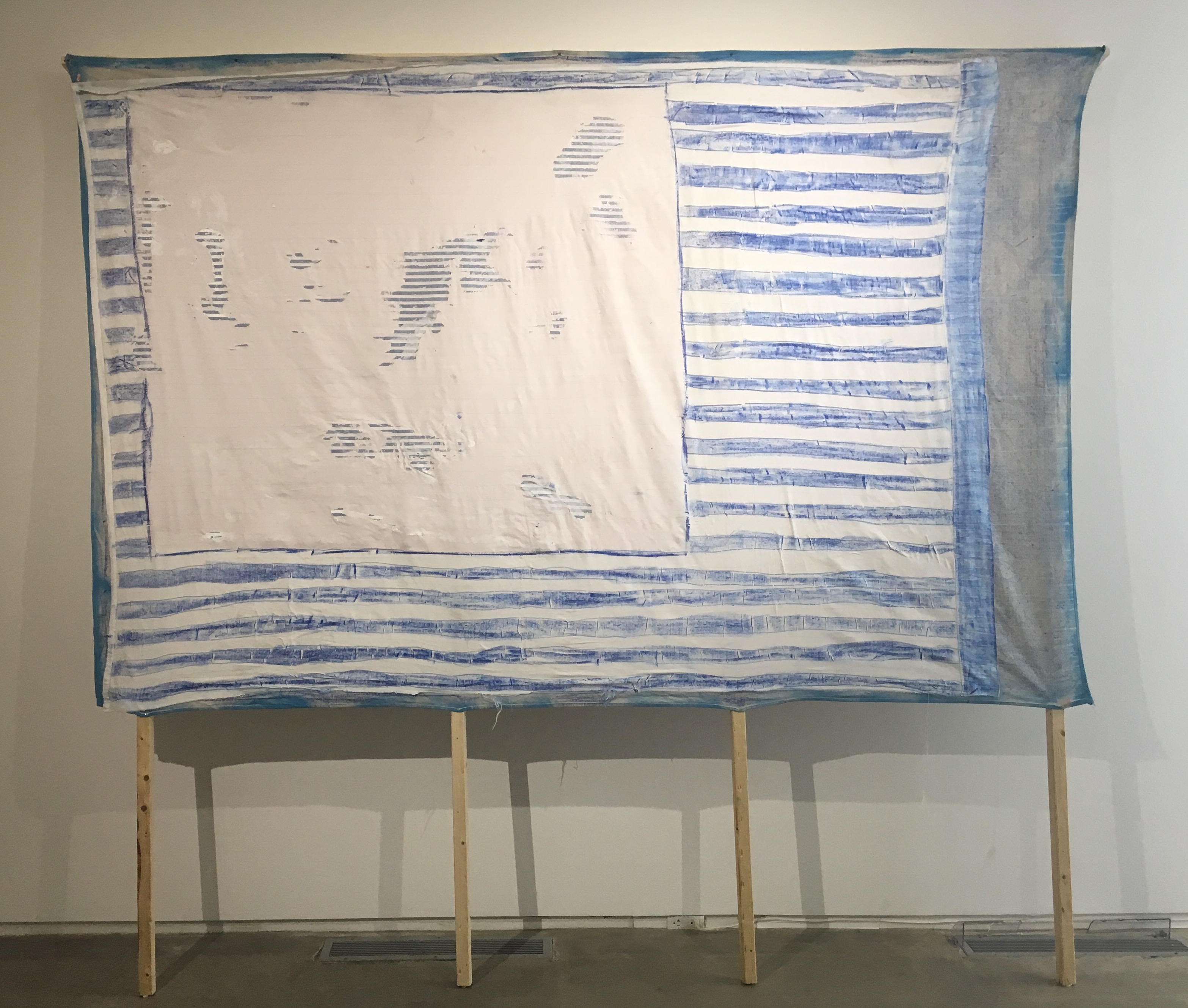
In the final upstairs gallery, James Radcliffe’s large, sign-like paintings on exposed supports lean against the wall, taking up much of the cavernous space. With titles like Unknown Unknowns, Blue Falcon and 40% Waste, Radcliffe’s provisional billboards seem to reference political and military jargon. Each painting bears more than a passing resemblance to flags or military insignia, but more than anything Radcliffe’s paintings seem to represent the deconstruction of the idea of painting itself.
Their clearest reference is to Daniel Buren’s flag paintings. Buren’s work, minimal in character, always emphasizes the making of a painting rather than its resolution in the form of a picture of image. Like Buren, Radcliffe seeks to pull the viewer into an investigative, rather than contemplative, process. Where his patterned surfaces at first glance seem comprised only of patterned fabric, closer examination reveals printed fabric patterns hiding behind or sitting on top of painted patterns. Close inspection of 40% Waste reveals small, blue fabric stripes hidden under a heavily painted surface on top of which sit larger roughly painted blue stripes.

James Radcliffe
Digging in visually, Radcliffe’s paintings are about the various processes: the gluing, cutting, and gessoing used to create paintings that lean against the wall, calling the viewer’s attention to their physical presence. Radcliffe denies illusion and mythological narrative. In the end his work is mostly just that: work. It emphasizes materiality at the expense of narrative. But his titles push that materialist emphasis into a slightly different register. As I walked out of the gallery it occurred to me that Radcliffe’s paintings remind me an awful lot of the Houston I recognized when I first moved here—a grittier place fast being covered over with townhomes and new restaurants.
The UH Thesis show is pretty strong overall. The most distressing and annoying political tendencies in contemporary art are largely absent. My recent university studio visits and this iteration of UH’s MFA exhibition suggest that while the most visible anti-art tendencies in big cities take up most of the social-media and economic space, many artists in Texas are still interested in making compelling objects that speak to human truths to which we all have access.
Through April 22 at UH’s Blaffer Art Museum, Houston.

1 comment
I must correct the record. Nowhere in Whisper Campaign were the words ‘hey, you’ uttered in succession, as was asserted by Mr. Bise. Perhaps he should have left his headphones at home, and paid closer attention to the work on display.
Best,
et