
Quiet, poetic, intimate — It occurs to me that paintings* like these fill the void left in people’s lives by the absence of books. James Buss‘ show at Hello Project is like visiting a library: rows of hand-sized rectangular objects, peering at which, you can experience reflective thoughts.
The thoughts are strictly your own. Buss only supplies the screen onto which they can be projected. Looking at them is akin to cloud-watching, or appreciating the veined marble while you’re waiting in a bank lobby. Like other nature-priest artists such as James Turrell or Richard Long, Buss’ skill consists of presenting a slice of the omnipresent, magnificent and transcendent World so that we’ll pay attention to it for a couple minutes.
Don’t get me wrong: critiquing Buss’ pieces for their lack of intention is like dismissing a Mondrian for its lack of realistic drawing. It’s a whole ‘nuther thing. The pieces are beautiful in that sublime, yet modest way only nature can be beautiful, if you’re in the mood for that sort of thing.
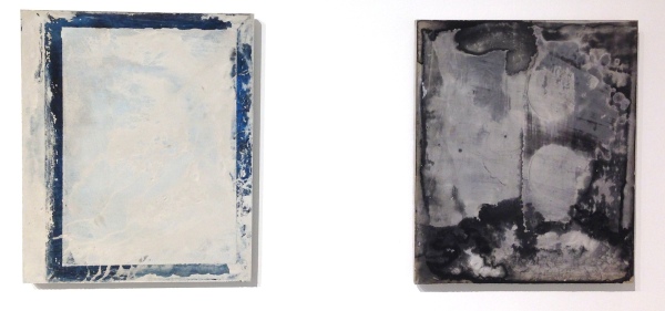
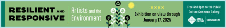
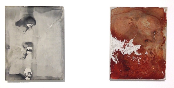
The few artistic decisions that have been made have been made well: the limited range of soft, neutral rusts, blacks and grays; the substantial but still wafer-thin plaster tablets; the crumbling ridges of plaster that leaked through cracks in Buss’ molds that he leaves as faint clues to his process. Even the mini angle irons that support two of the pieces on the wall are perfectly chosen. The works ooze sensitivity.
James Buss, Untitled, 2014. Do not attempt to adjust your screens.
There’s not much of the artist’s personality in them, except for its conspicuous absence. Where most artists use their work to shout their individuality at viewers, Buss is content to remain a facilitator: he enacts a scheme for capturing a suitably delectable natural texture then steps out of the way, preserving enough clues to his process so that viewers are aware of his diminished presence. Like the figure of a tiny pilgrim embedded in a Chinese landscape, Buss places himself alongside the viewer, as a spectator of his own pictures.

Guo Xi (ca. 1020-1090), Early Spring, dated 1072
Like some Chinese landscapes, Buss’ pieces are also vertical in format, making them more bookish and more active—the margins closing in from the sides force the random splatters and smooshes into a relationship with gravity. Confined in a vertical rectangle, some are on top, trickling down, others welling up from the bottom, with a sense of animation they wouldn’t have if they were allowed to spread horizontally across a wide, landscape-format picture. Blots and tatters read more like faces or text, rather than rocks and water.
There’s an important difference, though. In Guo Xi’s painting above, each mark and texture is the result of direct, positive action by the artist; its vitality is evidence of the artist’s conscious ability to imbue his marks with that quality, not a byproduct of semi-random process.
Brice Marden Cold Mountain 6 (Bridge), 1989-91. Oil on linen, 274.3 x 365.8cm.
Or, for a more contemporary, American example, take Brice Marden’s damnably authentic Cold Mountain series. Cold Mountain 6 (Bridge), above, makes the same, essential assertion of the identity between self and nature without Guo Xi’s layered symbolism, representational content, or fussy conventions. Marden and Guo Xi are forces of nature, Buss is nature’s midwife.
Even Marden used crutches: he relied on the vagaries of long shaky brushes (and the example of Asian painting traditions!) to help him let go; Buss is even more hands-off, letting the spread, flow and absorption of inks into his plaster panels create his images for him.
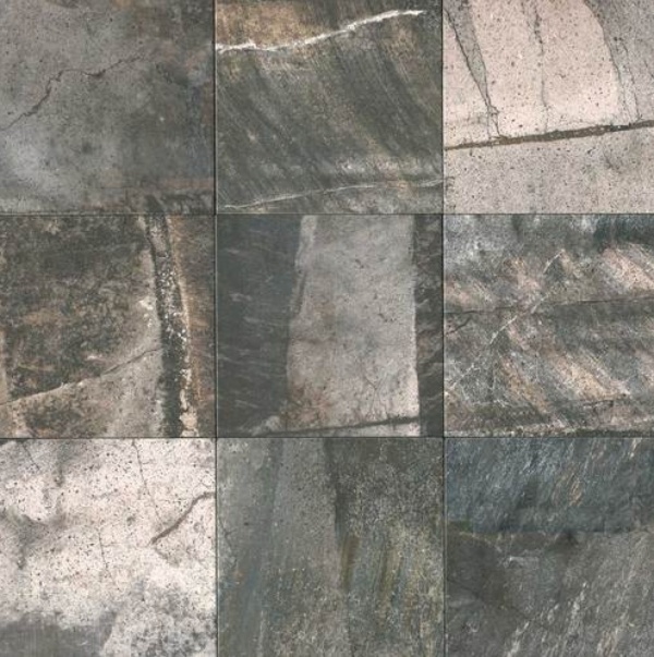
Tile samples, “Porada,” deep grey, PR 34 from Daltile.
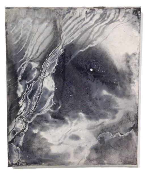
James Buss, Untitled , 2014. Relief ink and plaster
The refinement of Buss’ works is so easy to appreciate it might seem dumb. Over the weekend I spent an hour at Daltile, a high-end tile showroom, sorting through dozens of stone-like variations to find the perfect kitchen floor. Why did it take an hour? Because, even in floor tiles, nuances matter. The Daltile designers (who, after all, went to the same art schools as Buss) are going for the same understated naturalness, using some of the same techniques: textured, earthy materials, and semi-random process.
I’m not saying anyone could do it; on the contrary: it’s a mark of Buss’ skill that he makes it look easy. The impression of artlessness or lack of contrivance that Buss consistently achieves in his panels is one of their chief virtues. Despite their restful color and hands-off randomness, the panels never lapse into decorative blandness, like the tile sample.
His non-panel pieces don’t quite make it. The show includes a shelf full of standard black-bound sketchbooks, marked with printed or stamped blots on random pages. They’re not much of anything, and they’re not very interesting; the marks fill just enough of the books to push the remaining white space in the direction of lyricism: leafing through one, my first thought was that there was still plenty of perfectly good blank paper left; if I had one, I’d write haiku in it, or a dream diary.
James Buss: Outside the Phantastikon will be on view at Hello Project in Houston through November 8, 2014.
*They’re not, technically, paintings. I use the term to describe any flat, rectangular object hung where a painting ought to be.
