
(image: Adam Clay)
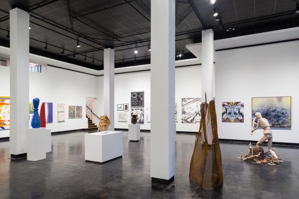
Year after year, Lawndale Art Center’s Big Show in Houston feels like a display of mass chaos—a kind of flea-market hunt for the odd diamond (in the rough), and admittedly, that’s part of the fun. But this year was a little different. Even with 105 works by eighty-seven artists covering two floors, it feels like a cohesive show. It’s the best Big Show I’ve seen. What happened?
A few things. This year Lawndale got rid of its submission fee, notably increasing the number of submissions (to 1,389, up from 972 from the previous year). This no-fee novelty compelled more than 150 extra Houston-area artists to submit more work. But this of course meant the show’s jurors had to sift through more to whittle the show down to a little over a hundred works on view.
A quick glance at the jurors’ statement will reveal how much thought they—Apsara DiQuinzio and Tina Kukielski— put into organizing this show, as most of their statement gives us a play-by-play through each of Lawndale’s three galleries. DiQuinzio and Kukielski didn’t fall into the trap that some Big Show jurors do—and almost all of them are from out of town—which is to gravitate toward a caricature of what they think Texas art is supposed to look like. Instead they brought a strong curatorial stance, as just about every piece communicates notions of familiarity and displacement. That may sound broad, but it’s thoughtful and appropriate for Houston, a city known for its friendliness, diversity, sprawl, and schizophrenic lack of zoning.
So were there pieces in the show that made me ask: “Why, just…why?” Sure. But far fewer of these than in previous years. This is the most difficulty I’ve had picking a top ten, and it was even harder to rank them. But I did it anyway! Without further ado:
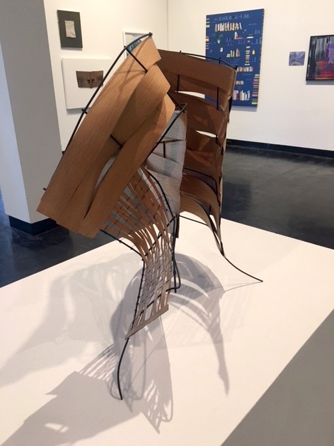
Maria T. Bodelon-Nelson
10. Maria T. Bodelon-Nelson, Folded Form-Gehry, 2015
Bodelon-Nelson’s sculpture clearly references post-modernist architecture, but being situated on the tips of spindly wire legs, Folded Form-Gehry reads more anthropomorphic and animalistic than architectural. Clawing diagonally as if it’s molting some kind of wicker-basket exoskeleton, this piece seems desperate to unfurl itself.
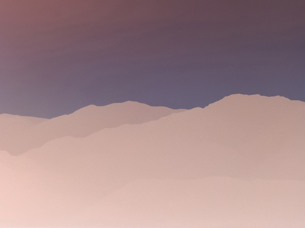
Pablo Gimenez-Zapiola
9. Pablo Gimenez-Zapiola, Death Valley, 2015
I’m not sure I have ever seen anything look so vapid and so luscious at the same time. Death Valley evokes the colors of Band-Aids, skin, and mocha. But it is also the opacity of the colors that make it feel so desolate, as if it were made out of plastic, sucking all possible romanticism out of this desert landscape. But it’s also weirdly corporeal, like the curves of two rippling bodies lying side by side.
Diane Fraser
8. Diane Fraser, Red Flag, 2016
Fraser’s painting resides somewhere between a cityscape and a dream. Yes, there are the symbolic gestures like the titular red flag and a bowing, Gumby-like telephone poll. But more pertinent here are the pairings of hard geometry with incoherent scribblings, cloudy erasures and apparitions. The sharp contrast between the two, and the fact that the latter is often contained within the former, gives us the impression of an artist attempting, with some urgency, to make concrete a slipping memory.
Dominic Clay
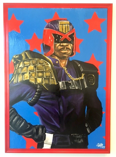
7. Dominic Clay, Judge Dred Scott, 2016
Before anyone goes all Kehinde Wiley on me, yes, there are obvious similarities, but there are marked differences too. Clay uses his portraiture to meld historical reality and sci-fi fantasy—that of futuristic authoritarian law enforcement officer Judge Dredd, and Dred Scott, the former slave who filed a law suit for his freedom. (Clay might also be referring to contemporary artist/activist Dread Scott, but his spelling of name and likeness of the lower half of the face suggests otherwise). The background may be more crude than a typical Wiley, but it works: the simplistic stars and the primary colors give it an eye-popping, fan-boy type of appeal, like a homemade superhero poster. It’s charming, and it’s poignant, and timely. Right now we could all use a little bit of Clay’s optimism.

Hogan Kimbrell
6. Hogan Kimbrell, Rumble, 2015
Are these volleyball players? Wrestlers? It isn’t entirely clear. But what is clear is that this collapsing dog pile of female athletes—rampant with taut muscles, the gripping of hair, the grimacing faces—reads as erotic as it does messy and combative. Even more interesting is the way Kimbrell’s style of hard contour lines and blocky, singular flesh tones gives the piece the cold removal of an instruction manual, which ratchets up the tension between the organic entanglement of bodies and the sense that the viewer is forever locked outside of the action.
Denise Liebl
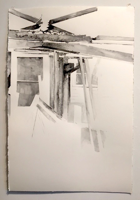
5. Denise Liebl,Untitled (501-2), 2016
Although the materials list says graphite on paper, Untitled (501-2) looks more like a watercolor. Watermarks and obvious brushstrokes give two-by-fours, windows, wooden beams, and screen doors the fluidity of a memory in decay.
Marky Dewhirst
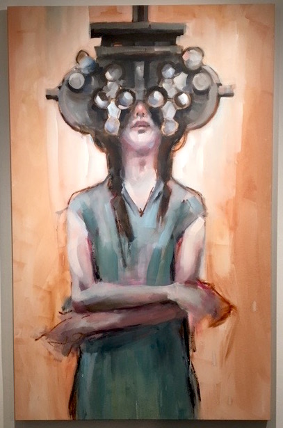
4. Marky Dewhirst, Glass Molecules, 2015
Thick, broad brushstrokes pull the entire painting downward with such force that it makes an otherwise banal image of a girl getting an eye exam feel heavy, lanky, awkward, and adolescent. An illuminating glow behind her head stands in stark contrast to the large metal contraption she is stuck behind, making the whole painting feel like both a womb and an entombment.
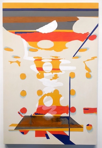
Robert Ruello
3. Robert Ruello, Reflect #4, 2015
Painting in pixels, or making a painting look computer-generated, is a strategy used by so many painters now it’s become passé. But what Ruello does so well (and better than most) is he refuses to commit to either design or painterly gesture. So we’re left with a painting that constantly volleys between the two in a way that’s gratifying and delightfully frustrating. Reflect #4 first tapers off in the middle—a vortex that moves our eye through the painting like a roller coaster or conveyor belt—before dissolving into a shiny plate of bleeding paint below.
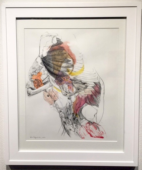
Isela Aguirre
2. Isela Aguirre, Serratus-anterior Obliques Internus Abdominis Implosion, 2016
This drawing is about as rich and complex as its title is long. Surging from the lower right hand corner and erupting at the top center, this drawing wrestles between abstraction and figuration. Misplaced organs tangle with an encasing rib cage, exploding with the type of energy that makes it look like it is repeatedly cannibalizing and regenerating itself.
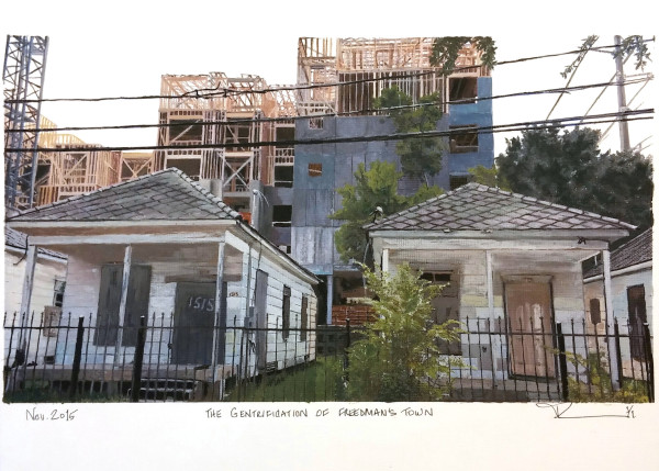
Patti Lennon
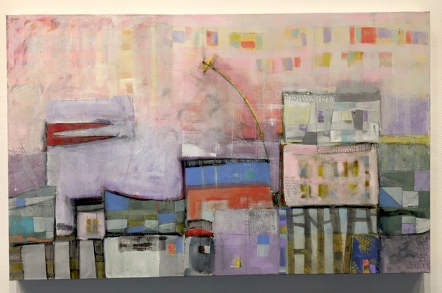
1. Patti Lennon, The Gentrification of Freedman’s Town, 2015
Painted with photographic acuity, this lovingly rendered neighborhood in transition reflects something that is not only happening in the Fourth Ward, but all over Houston. Given that it’s an issue that too often gets boiled down to simplistic, black-and-white terms, Lennon depicts it with the kind of sensitivity and ambivalence that a complicated issue like this merits.
Through Aug. 27 at Lawndale Art Center, Houston.

7 comments
Four of these are current MFAH Glassell School of Art Students: Maria T. Bodelon-Nelson, Diane Fraser , Denise Liebl, Marky Dewhirst and one instructor from the school, Robert Ruello.
And several more in the show are current MFA grad students from UH
Thanks for sharing this. I don’t have any deep reasoning or artistic explanations for why, but I liked numbers 5, 4, and 1 a lot. Something about number 1 is heartbreaking I was surprised to read that Untitled is graphite.
Go Glassell!!
Congratulations Patti Lennon!
Thank you. It was such an honor to have my watercolor named #1 by Betsy and Glasstire
Would have been nice to see more African American Artists included in the exhibition.