
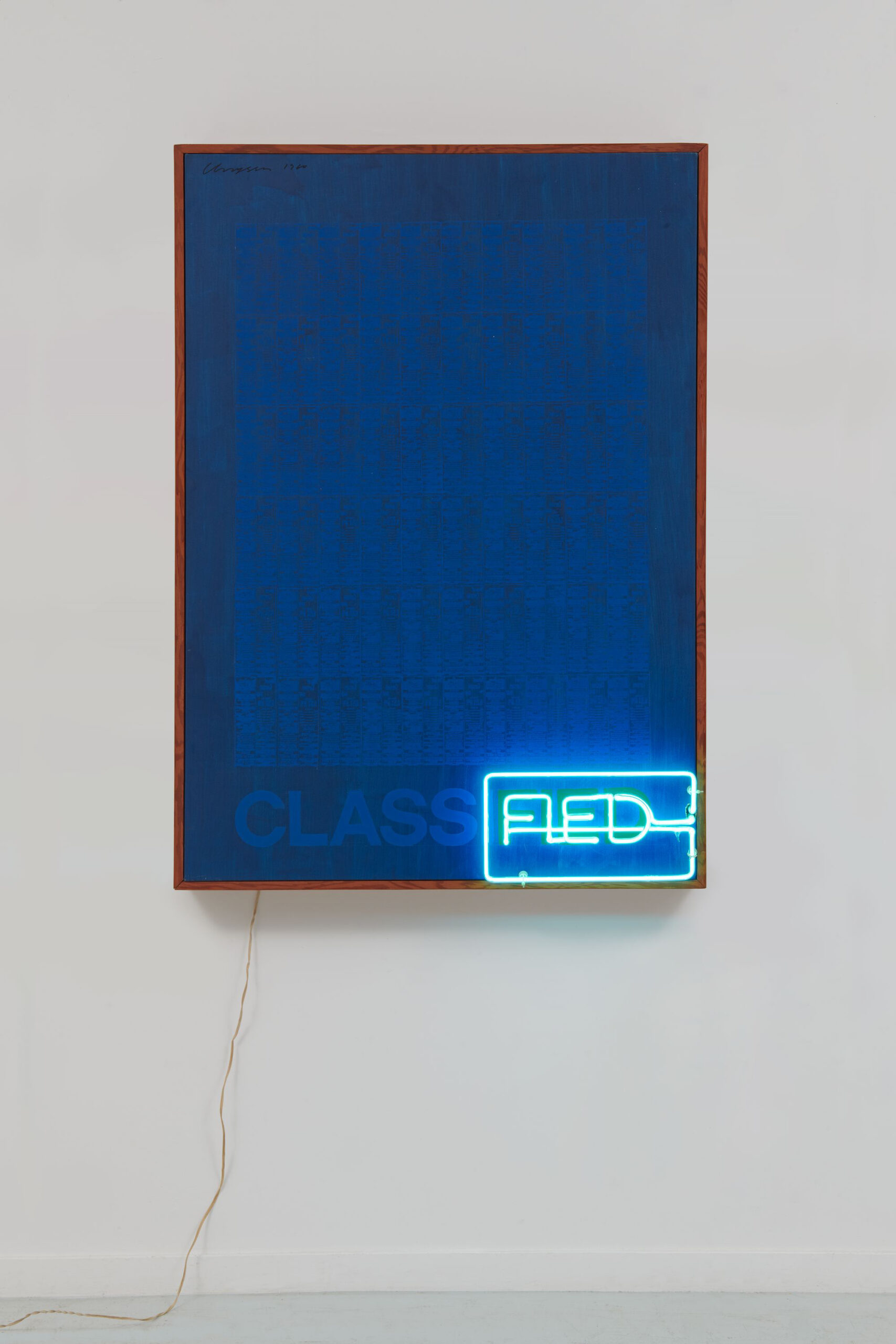
Chryssa, “Classified,” 1960, neon, oil on canvas, and wood. 52 1/8 × 37 × 7 1/2 inches (132.4 × 94 × 19.1 centimeters). Collection Irene Panagopoulos. © The Estate of Chryssa, National Museum of Contemporary Art Athens
Chryssa & New York at the Menil Collection focuses on the Greek-born artist’s career during the late 1950s to 1970s, when she worked in New York City’s Coenties Slip area, among artists such as Ellsworth Kelly and Agnes Martin. The exhibition and its catalog provide a timely intervention to assert the artist’s presence in avant-garde art making practices. There are likely many reasons Chryssa has been neglected by art history and exhibitions: she does not fit easily into an art movement (sometimes she is grouped with Pop, but usually not), and she has also fallen victim to the longtime gendered erasure in art history. A cursory database search brings forth few focused studies of Chryssa, with the Chryssa & New York exhibition catalog as the most recent text on her in over two decades.
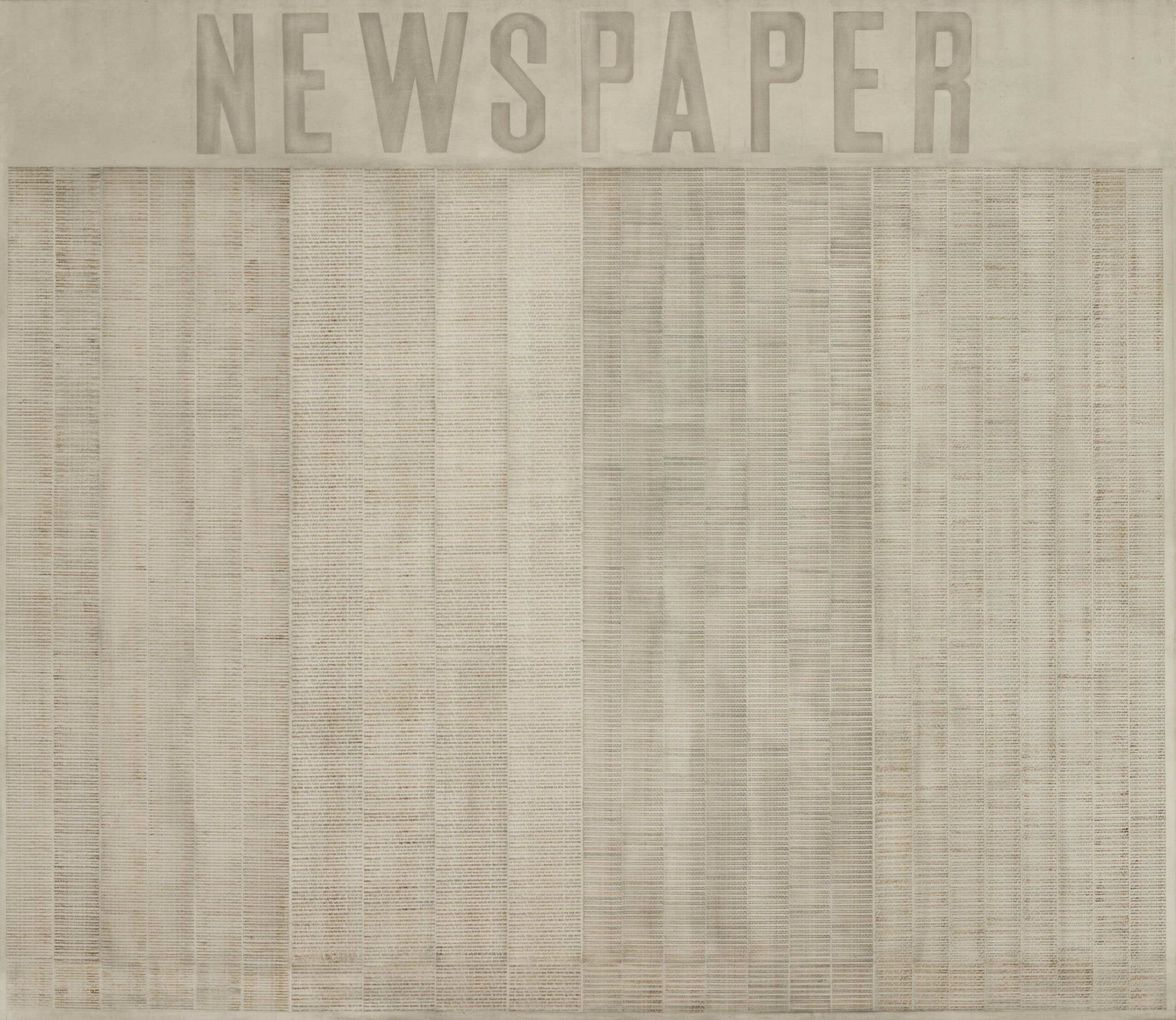
Chryssa, “Newspaper,” ca. 1962, transfer print and pencil on canvas, 104 1/2 × 120 1/2 × 1 inches (265.4 × 306.1 × 2.5 centimeters). The Menil Collection, Houston. © The Estate of Chryssa, National Museum of Contemporary Art Athens. Photo: Adam Neese
Chryssa & New York provides the proving grounds for the re-assertion of Chryssa’s work within the avant-garde practices of the postwar period. To enter the exhibition, you pass her Cycladic Books (which vary in date, with most dated in the 1950s) in the main hallway, connecting an ancient Greek past and the artist’s lineage to the Menil’s collection of Cycladic sculpture. Her work looks comfortable alongside the B.C.E. pieces — mysterious in their meaning, the Cycladic sculptures render her work even more ambiguous. Past and present coexist alongside one another; the materials of her books, terracotta and marble, appear as more freshly made ruins. Throughout the show, Chryssa continually exploits technology, language, and ruin.
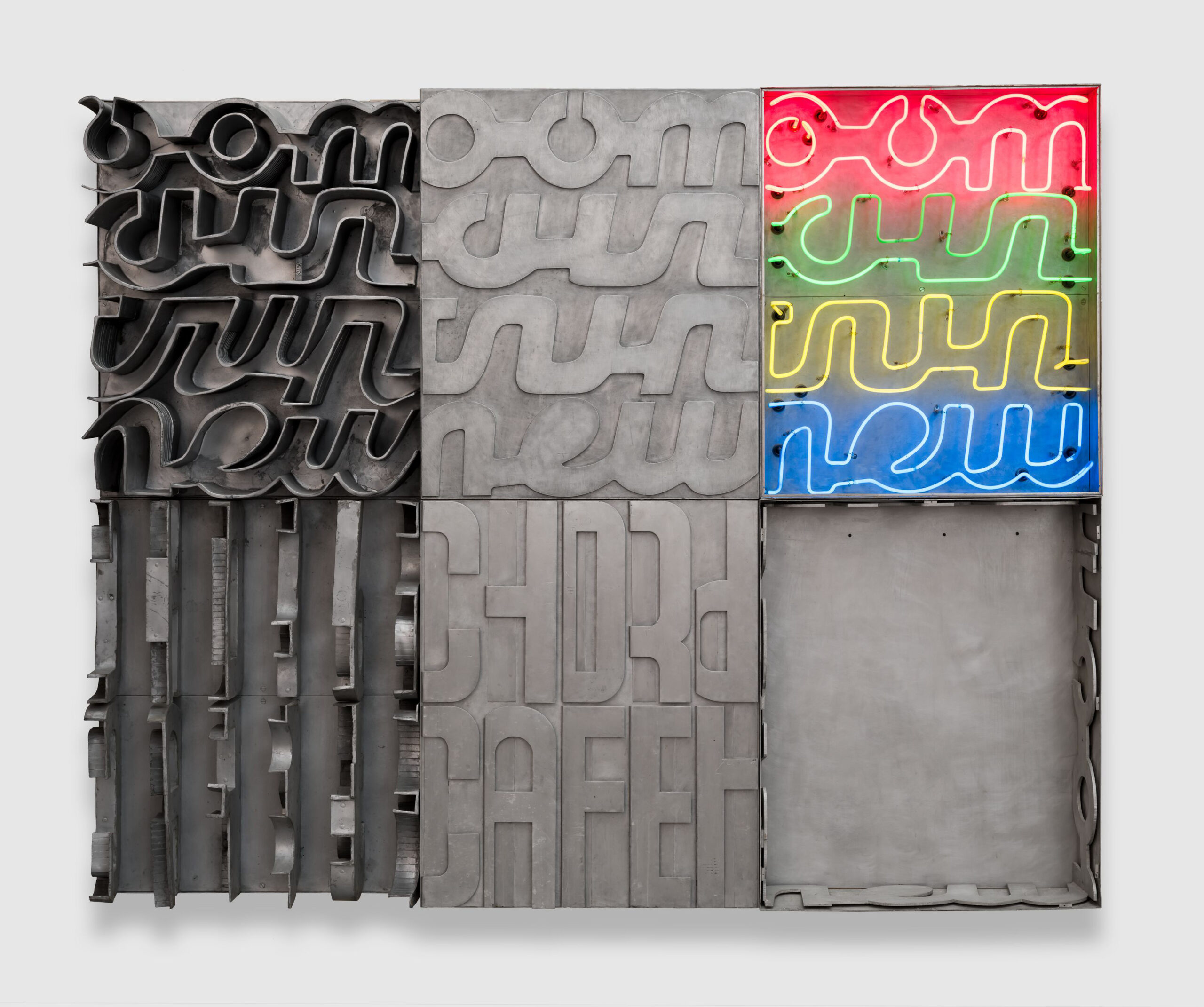
Chryssa, “Americanoom,” 1963, aluminum, steel, stainless steel, and neon, 90 × 108 inches (228.6 × 274.3 centimeters). Collection Lowe Art Museum; Gift of Mr. and Mrs. Aron B. Katz. © The Estate of Chryssa, National Museum of Contemporary Art Athens. Image courtesy Lowe Art Museum at the University of Miami. Photo: Oriol Tarridas
Inside the exhibition, Chryssa’s use of neon and language — and connecting both to the experience of New York City — is everywhere. Works such as Times Square Sky (1962) appear as an unreadable jumble of distressed letters, except the blue “air” that’s lit up. Another work in the first gallery, Americanoom (1963), uses similar salvaged letters alongside neon lights. In this piece, things are more difficult to decipher. Automat (1971), on the other hand, is legible, each letter of the title illuminating against a white plaster background and letters. The technology and brightness of the neon rises out of the background; Chryssa exploits plaster’s textural ability to appear bandaged, or like some kind of older excavation site. Works such as the Les Toyota Sales (n.d.) and Classified (1960) are where the artist’s possible Pop connections reside. These works, through her use of language and source material, create connections to Jasper Johns and Andy Warhol; yet she still asserts her own style — and signature — in both. She plays with language; sometimes you can read the letters, but not the word — other times, the letters get lost, too.
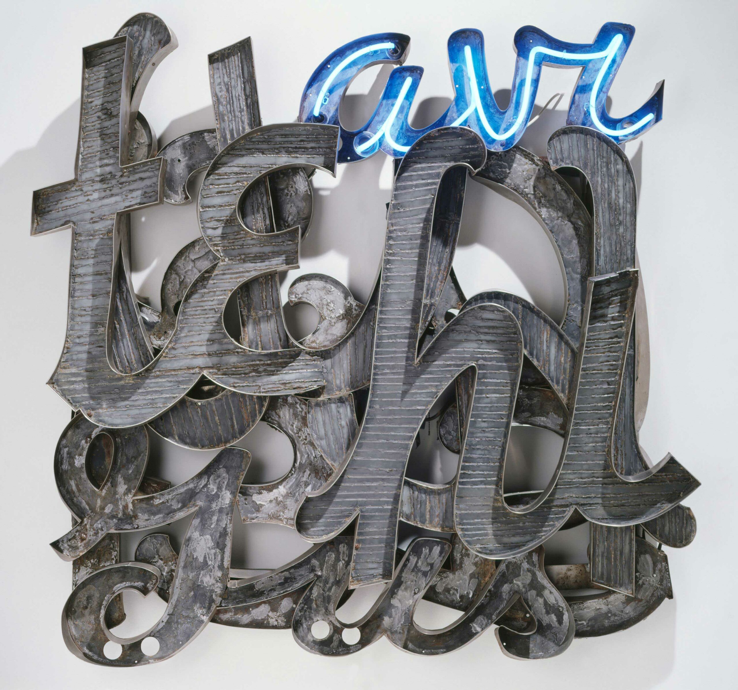
Chryssa, “Times Square Sky,” 1962, aluminum, steel, and neon, 60 × 60 × 9 ½ inches (152.4 × 152.4 × 24.1 centimeters). Collection Walker Art Center, Minneapolis; Gift of the T.B. Walker Foundation, 1964. © The Estate of Chryssa, National Museum of Contemporary Art Athens
The Gates to Times Square (1964-66) beckons in the next room. The monumental sculpture is exhibited alongside its preparatory works and other neon pieces. The bustling urbanscape of New York City is asserted in various exhibition spaces. After leaving, I realized the Menil was as quiet as ever; yet somehow, in the immediacy of those rooms, I remembered it being noisy. The Gates appears stately, waiting for your entry into its gallery. The work includes four arches on each side, forming the letter “A” spliced in half. The majority of the work appears industrial in its materials: stainless steel, plexiglass, and neon. Paper, yellowed with time, tops the “A.” The electric workings are evident from the back of the piece, and the stainless steel appears similar to scaffolding when seen from behind. Although no person can fit through (nor are they allowed to go) the center of the gates, they appear like some kind of industrial, technological entry to an abandoned city instead of an ancient portal to Athens.
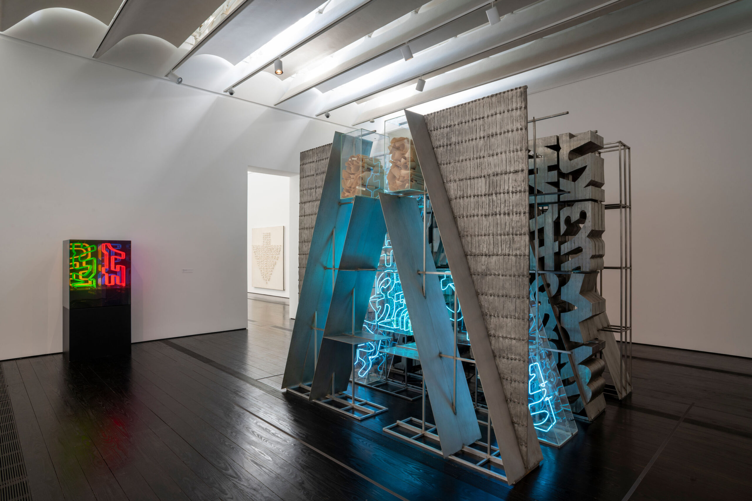
Installation View of “Chryssa & New York.” Photo: Paul Hester
Signs and language continue to toy with the viewer in other spaces. Language becomes an effigy, frozen and lost, in Bronze Tablet No. 2 (1956). The work seems to be a lost printing press in newspaper font, telling us the news the day before a city was destroyed. A similar effect, included in another gallery with Chryssa’s prints, occurs with Newspaper Print (One Page of Classified Ads) from 1963, its cast aluminum reading as coppery bronze — a lost artifact of indecipherable sales items.
Other works alongside Bronze Tablet No. 2 use white plaster to connote a loss of language: letters are legible from certain perspectives in Plaster Letter Plaque (1962) and kept under plexiglass. In N’s (1969), the letter is placed on its sides, readable from, again, only particular viewpoints, the viewer filling in their own “o” for the word “no,” a disavowal of coming together for meaning. A similar operation occurs in Composition Bach (late 1950s), where the composer’s name is separated by letter and positioned sideways. Each letter multiplies, elongating visually a kind of “B-A-A-A-A-A-C-C-C-C-H-H-H-H-H” proclamation, making audible what was once incomprehensible. In a neon work in the room, Five Variations on the Ampersand (1966), the illuminated symbol breaks apart and divides, only sometimes coming together to be “and.”
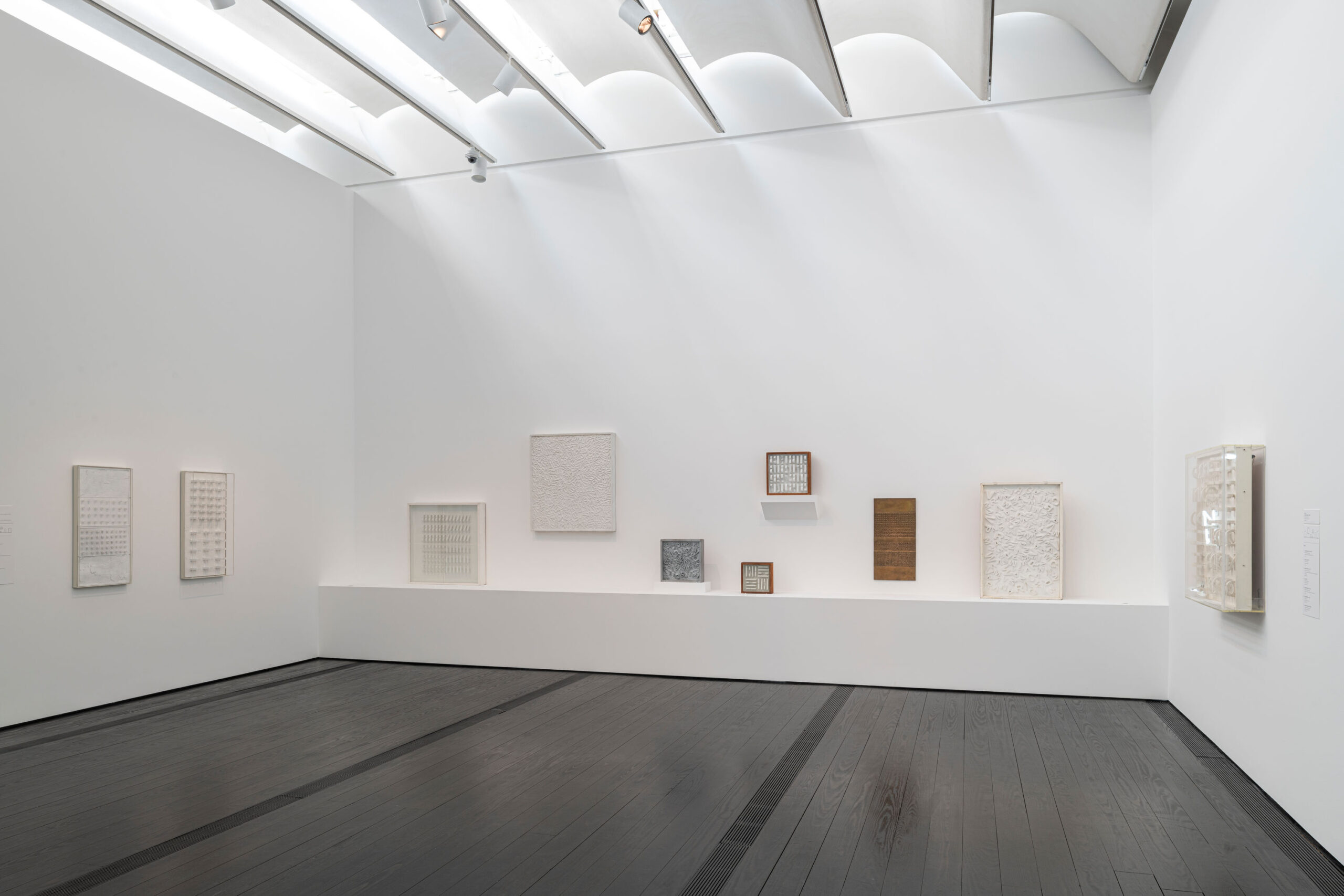
Installation View of “Chryssa & New York.” Photo: Paul Hester
The exhibition closes its circle with Chryssa’s large newspaper works, including the Menil’s Newspaper (c. 1962) and the smaller The Stock Market (1962). The last exhibition gallery is the most “Pop” of the bunch with its legible (yet still often unreadable) mass culture and media source materials — newspapers, advertisements, car tires, and stock markets. In the end, the newspaper and the economic machine of capital (the stock market) are generally inaccessible in how the text appears. The larger the newspaper painting, the more expectation we might have to be able to read it. Yet this generally is not the case. What do appear legible are advertisements for sales and movies, such as Gone with the Wind. In The Stock Market, numbers have no meaning; manipulated by Chryssa on the page, the numbers that dictate and determine lives appear as indecipherable as scribbles. The large white newspaper paintings and the ghost-like car tires of Car Tires (1959-62) become fossils of industry.
Installation View of “Chryssa & New York.” Photo: Paul Hester
A friend mentioned how Chryssa’s works such as Flight of Birds (1957-1960, from the Menil Collection) seemed made for the museum’s architecture. The austerity of the white walls, with minimal label information, informs and activates an impression of the quietude against which you view parts of ruins and archeological time on display in places like museums and archives. From photographs I’ve seen of the exhibition at the Dia Art Foundation, the space’s brick walls and loft-like windows appeared to connect the exhibition more presently to New York City (in addition to the space’s geographical closeness, compared to Houston), a more immediate one-to-one of the show’s ruin and landscape. The exhibition at the Menil Collection appears as a promise: one day our cities, gates, and language will be to future humans how ancient Greece in the Cycladic era is to us today.
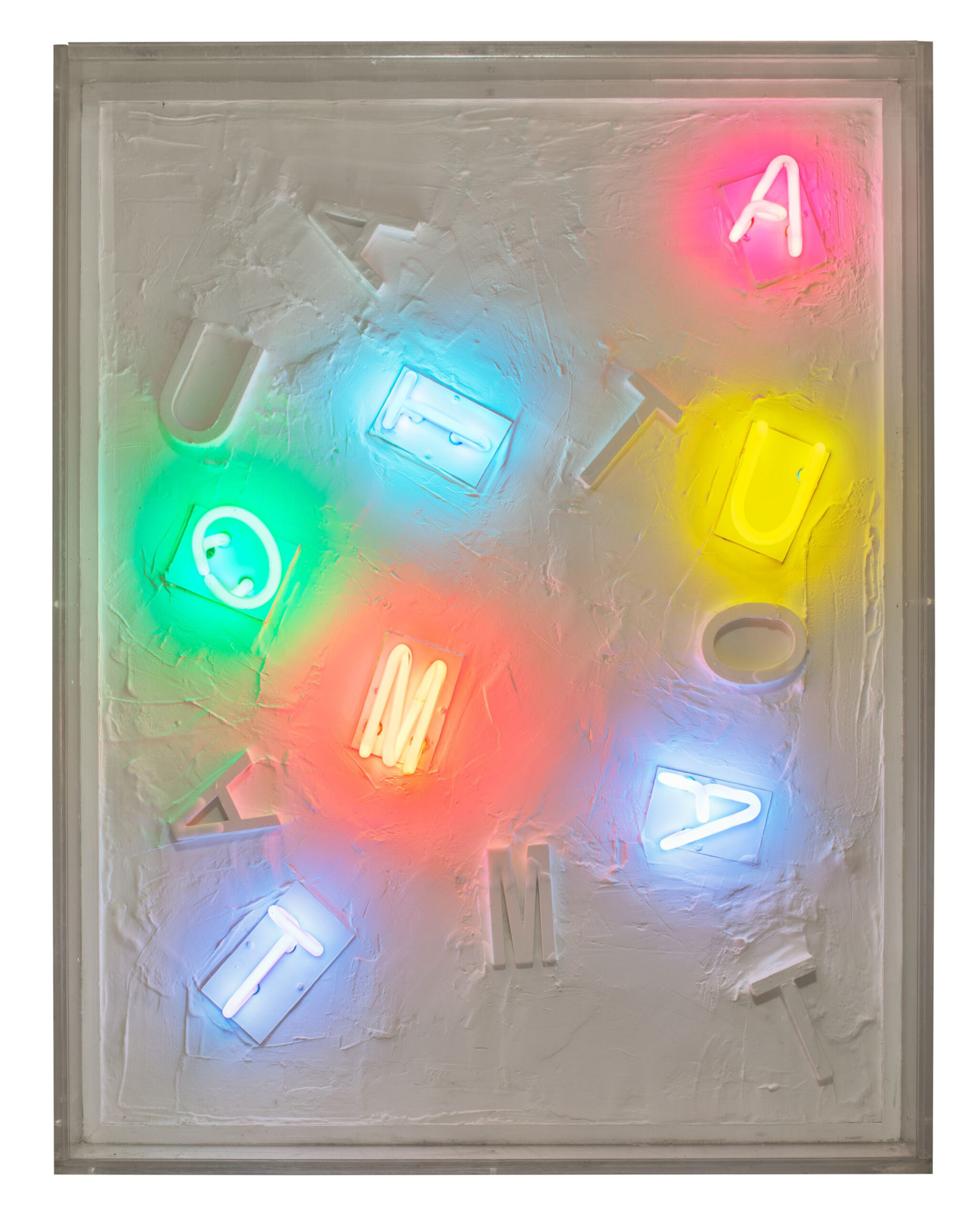
Chryssa, “The Automat,” 1971, neon and plaster, 37 × 29 × 6 3/4 in. (94 × 73.7 × 17.1 cm). Abrams Family Collection. © The Estate of Chryssa, National Museum of Contemporary Art Athens. Photo: Bill Jacobson Studio, New York, Courtesy Dia Art Foundation
Chryssa & New York is on view at the Menil Collection through March 10, 2024. It is co-curated by Michelle White, Senior Curator at the Menil, and Megan Holly Witko, External Curator at the Dia Art Foundation. The exhibition originated at the Dia Art Foundation and will travel to Wrightwood 659 in Chicago.
