Para leer este artículo en español, por favor vaya aquí. To read this article in Spanish, please go here.
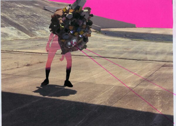
Juan Carlos Escobedo, “Isn’t Allowed”
I first met Juan Escobedo online after reading his comments on my Sarah Fox “Bad Bunny” article this past May, after the troll Benita Ocasio (fake name) attacked me, my writing and Sarah’s work. Unlike most commenters, Juan used his real name and spoke up for the arts and artists. His courage in speaking out against a powerful art institution made me want to find out more about him and his work. This, eventually, led me to his website and to a series of conversations about his work. Juan was raised along the U.S./Mexico border in Sunland Park, New Mexico, El Paso, Texas and the Ciudad Juárez region. His practice stems from his identity as a brown Mexican-American queer male. He received his MFA from Massachusetts College of Art and Design and lives in San Antonio.
Colette Copeland (CC): Your current exhibition at the Galveston Arts Center features your work x J.ESC: Assimilation Apparel, a pseudo-apparel line that examines issues surrounding class and race. I’ve been following this work over the last few months, as you’ve been posting on social media. I’m interested in how you are using subversive humor, specifically satire, as well as the visual and textual languages of fashion and advertising to speak about the “gentrification of the brown body,” and about navigating through privileged white spaces.
Juan Escobedo (J.ESC): I see the work as a representation of the constant adjustments I have made to the way I speak and dress in order to make people more comfortable with my skin color, my sexuality, and my socioeconomic background. I use humor and clothing as a way to relate to the audience and to ease the blow of what I am actually saying. I also dislike confrontation, so using the veil of humor and fashion lets me say things that would normally trigger people. It is easier to swallow that everyone is a little prejudiced and that we use this against people, if I top it off with whipped cream and a cherry.
CC: Your Instagram feed is really interesting in how you are using visual design elements not only to “market” your feed (and your work), but as a conceptual framework for dialogue surrounding larger issues. For example, recent posts include collaborative photo shoots with IVLeague feature models wearing your sculptural apparel. Posting empty grayscale images next to portraits disrupts the viewer’s scrolling tendencies. They stop and wonder — WTF, why is there an empty gray box screen on my phone? An older post series features the circle portrait, which reminded me of early 19th century silhouette portraits, which ultimately were used for racial profiling. How does your social media presence tie into your overall artistic practice?
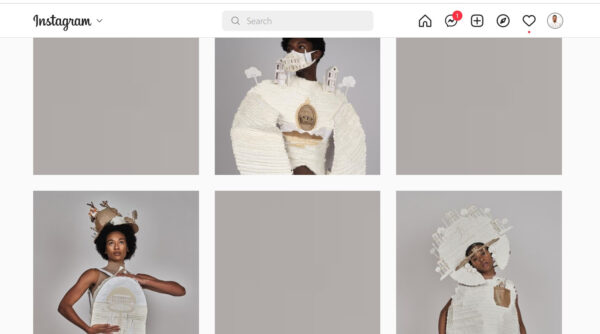
Juan Carlos Escobedo, screenshot of instagram feed with gray squares
J.ESC: If I can be completely honest, the gray squares and black circle frames are more of aesthetic choices without a lot of concept behind them. I noticed that when I was posting one image after another it looked a bit cluttered, so I figured if I added blank gray posts or circle motifs, it might make the page look more interesting. Also, the work from the very beginning has had an ancient/sci-fi quality to it and I think adding the simplified forms breaks up the feed. The main image(s) look like they have been placed in an altar-like position when you are seeing it in the grid format. I’ve started to make my website similar to this as well.
Now that you mention it, I wish I was more aware that the racial profiling silhouette aesthetic was present in how I lay out those photos. I know artists like Kara Walker use that technique and it informs their concept directly. I, unfortunately, was not thinking that deeply, BUT it is something I will take into consideration from now on.
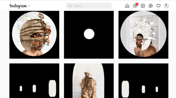
A screenshot of Juan Carlos Escobedo’s Instagram feed, showing white circles on black backgrounds
CC: Your use of language is really smart, powerful and darkly comic. The Reversible Helmet work states, “uses assimilation technology to ease cranial trauma from microaggressions. Not 100% guaranteed. Assimilate at your own risk. Available in ‘You’re not even that brown-beige and Predominantly white-pale.’” I saw on your CV that you teach and work as a writing tutor. What are your thoughts on using language as a tool to affect change?
J.ESC: I think I use humor as a way to put people at ease. I also use humor to make people somewhat complicit. Often people deny that they hold any prejudices. When you say something like “white privilege” or make the argument that black and brown people are disproportionately discriminated against, that makes people uncomfortable and they want to deny that these crappy things occur.
When you set up a phrase or situation that is humorous, there is an understanding of what is said as being common or typical. When I refer to things as “trashy”or make a statement like “you can take someone out of the trailer park, but you can’t take the trailer park out of the someone” I am using a common linguistic code that has been used repeatedly to reference how class can be perceived despite someone’s efforts to hide it.
I also feel it is easier to digest than a dry, academic, 10-page paper on systematic racism.
With regards to using language as a tool to affect change, I’m not sure I alone have the power to do so, nor have I ever intended to. Language can definitely create change but to do so, it first has to be collectively agreed on by the community using that language.
If I am creating change, it is by repurposing. I recycle and reuse EVERYTHING – the plastic food containers you’re supposed to throw out, clothes, cardboard, and I think this practice transfers to language as well. I use common phrases and linguistic formats and repurpose them so that the audience cannot claim I am saying something radical or new. I am just restating what has been said to me, but with the intent to make people in power accountable for what has been said in the past, and make the people that have been brutalized by this type of language feel seen and not like it is just in their head.
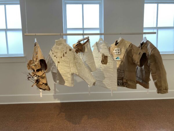
Juan Carlos Escobedo, installation view, “Assimilation Apparel,” on view at the Galveston Arts Center. Image courtesy the Galveston Arts Center and Jacqueline Zaragosa McGilvray.
CC: Speaking about reusing EVERYTHING, let’s discuss materiality. Cardboard is one of your materials of choice. It’s a powerful symbol to use to embody the themes in your work, especially the ideas of cheap labor and disposability. You’ve also played upon its brown color, referencing race and inequality in your work. In some of the more recent images, the materials include a mixture of white and brown.
J.ESC: The first time I used white was on the ERCOT Trainers x J.ESC. I was caught during the power outage in my lightly insulated apartment with no central heat and I was cold and bitter. I heard that some of the more affluent areas in San Antonio did not even feel the outage and were sitting comfortably, and this made me even more bitter. I remember trying to brainstorm a material that is the equivalent of cardboard but is perceived as better. The simple response was white paper— it was so easy too, and had been right in front of my face all this time. I recreated the Full House home because I loved that show as a kid. I then attached the home sculpture to the shoes and wrote a catalog description that read:
Got caught on the wrong side of the ERCOT grid outage? Put your best foot forward with these new trainers x J.ESC ESpor. At least one foot will stay warm!
Available in:
Not-warm-enough Beige
Keeping-it-lite White
Power-outage Pecan
The white home highlighted the brownness of the other areas, and emphasized the cardboard as found material. It also helped the audience pinpoint how we perceive the materials differently. Although I was excited for this leap, I was also nervous, because as a rule of thumb I try to stay away from portraying others’ identities in my own work to avoid projecting my own prejudices. This is why I avoid figures altogether and why I was the only one wearing the pieces initially.
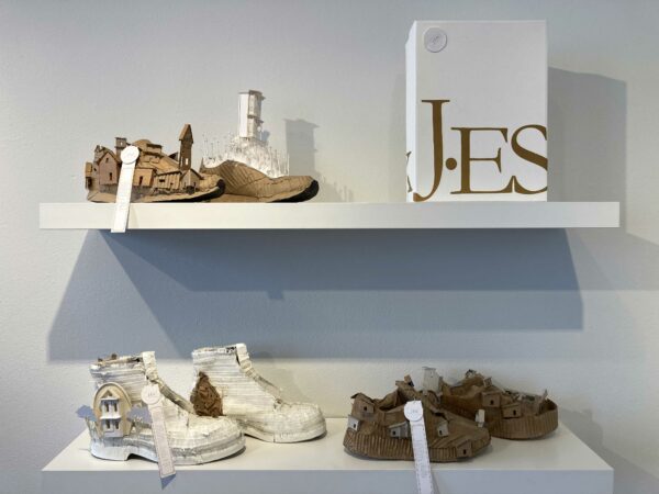
Juan Carlos Escobedo, installation view, “Assimilation Apparel,” on view at the Galveston Arts Center. Image courtesy the Galveston Arts Center and Jacqueline Zaragosa McGilvray.
I did not see the intersection between whiteness and myself, other than as being a symbol for something oppressive. Luckily, in the writing center we read a lot of literature trying to dismantle the idea that academic English was the standard for writing. The articles we read discussed academic English as just a privileged linguistic code that was rooted in classist and racist ideologies established by a white demographic.
One reading in particular, Vershawn Young’s “Should Writers Use They Own English,” really struck a chord because it was a scholarly article published in an academic journal which discussed these ideologies, but is fully written in African American Vernacular English (AAVE). It was jarring to read at first, but it helped me understand how academic English is a linguistic code made by and for white people, and that I learned, used, and was perpetuating the rules of this white code. This is where I saw the intersection between me and whiteness. I am not physically white, but I have used that way of speaking from a very young age to validate my presence as a poor brown person. It was something that I harnessed so that it could not be used against me.
To be fair, it has helped me a lot, because it allows me the opportunity to speak and write in a way that garners attention and respect — like interviewing for this article. But in the pursuit of feeling validated by a white English-speaking academic art world, I have lost or let aspects of my brown self fall by the wayside. It is a constant negotiation, because in a white space I am a brown queer with an El Paso accent that says “you know how?” and “ay ay” way too much, and in brown spaces I am an uppity queer that is trying to sound white by using words like “mitigate” and “amalgamation.”
Lol. It’s exhausting. I need a vacation.
CC: There’s a lot to unpack here. I agree with everything you said about how language can oppress, as well as liberate, while functioning within a white-privileged linguistic code. The negotiation you speak of is a liminal space, a space of limbo, where it’s difficult to find one’s true self. I try hard to avoid speaking and writing Academese, but clearly I failed, since I just used the word liminal.
J.ESC: And using those words is okay, Colette! We should be able to express ourselves in the linguistic code that we are comfortable speaking. What is not okay is when we see academic English, or just English in general, as THE “standard.” It has rules that one abides by, but so do other linguistic codes, including Spanish, Spanglish, AAVE, sign language etc — they are valid too.
CC: Agreed. Let’s get back to the sculptures. I love that the works are wearable sculptures, but not practical for functional use. Made from inexpensive materials, the sculptures are fragile and delicate. What role does the body play in activating the art? In the work, where the body is present, it’s a powerful reclamation statement about the brown body as a site of power.
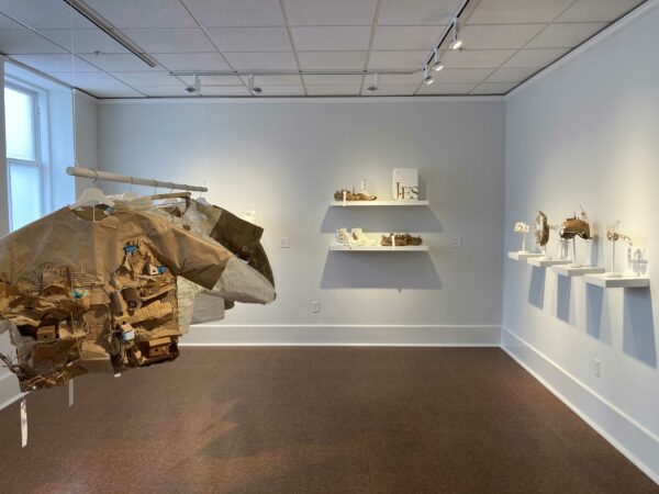
Juan Carlos Escobedo, installation view, “Assimilation Apparel,” on view at the Galveston Arts Center. Image courtesy the Galveston Arts Center and Jacqueline Zaragosa McGilvray
J.ESC: I have mixed feelings about how the art works on the body. On one hand, when I wear any of the pieces it makes me feel FUCKEN FABULOUS. I sometimes put some of the work on and will just look at myself and pose and take pictures.. the whole bit.
It also looked beautiful on the IVLeague models Marie, Alyse, and Willis, who are unnaturally gorgeous. You should see them in person, the photos do not do them justice AND they are actual professional models who are trained and honing this craft, so of course the clothes look great on them.
With this being said, I was very nervous about the models wearing the clothes because they all identify as black and I did not want to project or assign any stereotypes on them. One stereotype I am very aware of is that all brown or black people are poor. I happen to be brown and grew up poor, but I know this is not the case for everyone. In the past, I have been scrutinized by other Hispanic or Latino people for leaning too much into that aspect of the work and perpetuating the idea that all brown people are poor. I had a couple of conversations with the directors and with the models to explain my work. They all seemed interested and related to part of the work in one way or the other. That, or they just thought it was cool enough to wear and that makes me happy too.
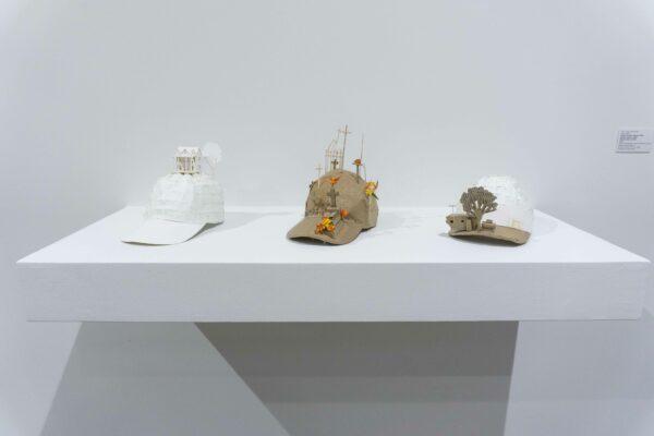
Juan Carlos Escobedo, “Cap” (left), “Colonia Cap” (middle), “Trailita Trucker Cap,” (right) 2022, brown cardboard, white matte board, white paper, brown paper, 5.5 x 6.75 x 10.25 inches each. Image courtesy the Galveston Arts Center and Jacqueline Zaragosa McGilvray.
In reality, the initial concept was that the clothes remain on racks or shelves, similar to a boutique or a store. I thought of this to try to push against normal installation methods and try to create an immersive experience. I envisioned the audience looking through the clothes. I was interested in making them think “which clothes would I choose?” and then have them think of why they made their choice. I also like to think that a person might choose the article of clothing that is most unlike them so they could experience what it would be like to inhabit that identity — sort of like walking a mile in someone else’s shoes.
I think the work is conceptually more successful off of the body because the vacancy of the stand-alone clothes helps the audience envision themselves in them. It also makes the work more accessible when we do not constantly attach a beautiful human to them.

Juan Carlos Escobedo, (left to right) “Panteonero Glasses,” 2021, cardboard
2.5 x 5 x 5.5 inches; “Round Sunland Park Glasses,” 2022, cardboard, 2.5 x 5 x 5.5 inches; “Face-It Face shield,” 2022, plastic, brown cardboard, white matte board, 6.5 x 9.5 x 2.5 inches; “White Facemask,” 2021, white matte board, white paper, 3.5 x 12 x 3 inches, Image courtesy the Galveston Arts Center and Jacqueline Saragoza McGilvray.
CC: That’s interesting. I can and have envisioned what my body might look like in your apparel. As a privileged white woman, I feel it would be exploitative of me to wear it, like I was appropriating a culture that’s not my own. I understand what you are saying about the models, but there is still a disproportionate shortage of models of color in the media. So, I stand by my statement that the bodies activate the works in a powerful way.
J.ESC: I think it would only be exploitative if you claimed to be brown while wearing them, only drew parallels between yourself and the disadvantaged aspect of the work, or if you denied the hierarchy of the materials and depictions of the homes. I invite a white person to put on the clothes, but by doing so they would have to take stock of their advantages and this is a hard thing to do.
It was hard for me to say “I have an advantage over other brown people because I can speak in a way that privileged white people can understand me and this helps me gain opportunities.” When I finally did, I became more aware of my identity and, conceptually, was able to add another layer to how I describe my identity. I think the audience also responded well to this because they can see I’m not just trying to play-up the impoverished, brown, gay kid card, but rather I am just stating the realities that many brown people have to face.

Juan Carlos Escobedo, “Isn’t Allowed”
CC: Please tell me more about the iconic symbol of the house as a recurring motif in your work.
J.ESC: I was always aware of the perception a home can have because I grew up in an unconventional home — a camper trailer that measured roughly 10 feet wide and maybe 30 feet long, so like 300 square feet. People reading this will be like “omg, that’s like the size of a tiny home. So on TREND,” but at one point seven people, me included, inhabited that space. I was hyper aware of the space and size because my mother obsessively cleaned it to try and counterbalance the perception that if you’re poor you’re also dirty.
I was also aware of homes because we would visit my mother’s aunt every weekend in Ciudad Juárez in the Colonia Felipe Ángeles area. It was on the east side of town in one of the poorest areas of the city. My Tia Berta (RIP) lived atop a rocky hill in a cardboard home. In the 60’s and 70’s, Juárez politicians gave away land and in order for people to claim it officially, they had to establish a home. Many people set up makeshift homes made out of pallets, insulated them with cardboard, and lived in them for decades. I think this is where I subconsciously digested the fact that cardboard could be used for something other than packaging or shipping. My mother emphasized that we were incredibly lucky to live in the home we did because there were people who were less fortunate than us.
My exposure to affluent homes was through TV. I was a latchkey kid and consumed disgusting amounts of TV shows and movies. I often developed crushes on TV and movie homes and thought of ways that the trailer home could be transformed into something similar to those affluent homes. Also, one of the two roads that took us from Sunland Park into El Paso was Country Club Road, so you can just imagine the beautifully manicured homes we drove by.
In my experience, homes are the best indicator of a person’s socio-economic standing. A person could present themselves with brand name clothing and a new car, but they could be going back to a house that does not reflect that standard. I know this because people often did it in Sunland Park. What they drove and wore was something they could change in order to present themselves in the best manner and earn some form of respect. I do this, even now by putting a lot of emphasis on the way I dress.
In the work, I use homes as a class indicator and basically use them as a stand-in for the people that inhabit that space. The audience, without a doubt, will know what type of person lives in the house depicted in the White Facemask versus the Trailita Trucker Cap.
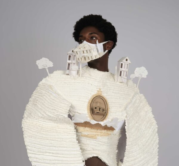
CC: This leads me to your alter ego HouseMan and the performance videos of this character, who seems very out of place in the world. I’ll confess to having a huge crush on HouseMan. They seem like an alien from outer space struggling to navigate the crazy world we live in. They wear their house on their person (just as a snail does), but seem lost and bewildered. The use of animation and funky colors adds to the disorientation. What is HouseMan’s origin story and we will see more of them?
J.ESC: HouseMan, to an extent, is one of the predecessors of the clothes. It was something that I created a few years after graduate school and was my attempt at downsizing the very large cardboard landscapes and homes I was creating in grad school. When I first created HouseMan — roughly around 2017, I was starting to take stock of my identity and the experiences I had in grad school. I was in San Antonio, in a shitty relationship, away from my family, and with no art community – I felt very alone. I did not fit in Boston, but also did not fit in Sunland Park. I was in-between.
I created the headdress out of cardboard to represent brownness and the socioeconomic culture I came from. I decided that the body should be an environment as well, to create visual instability. I often attach “psychological homelessness” to the HouseMan work. This term is used when an individual, mostly immigrants and children of immigrants, feels they are not part of the community they have immigrated to, nor the community they immigrated from. I did not immigrate, but definitely felt that, when I lived in Boston, there was a culture clash I was simply not ready for.
I put the headdress on, had my shitty ex take pictures of me wearing it (that was actually pretty kind of him), then I printed them out and collaged the images. For a while they existed as just collages, but after making one after the other the process became stagnant. Luckily, around that time I had a really great studio visit with Jacqueline Saragoza McGilvray who was kind enough to give me very valuable feedback in the sweaty hot garage I was working in. This was waaaay before I started meeting or being part of the art community in San Antonio, so I’m very thankful. During that visit Jack suggested that these could exist as animations or as videos, and then I changed the dynamic of the work. In the case of HouseMan, the work is better because there is a body to activate it.
I have made more HouseMan videos. There is actually a Season 2 of the HouseMan adventures that was created in collaboration with the students in the MOSAIC Program at Contemporary at Blue Star. The students developed and created two new characters and directed a new series of “episodes” where HouseMan interacts with them.
I was initially thinking of killing HouseMan off, but I think there is still a great opportunity there. I also want to take that digital collaging technique and use it on the clothes. I was accepted to the Houston Contemporary Craft Center Residency for the summer of 2023, so I’m really brainstorming what the next step is. I already have some ideas: one of them is that video, another is to create a cardboard landscape that hangs upside down, and the third is to make “night” and “sunset” outfits that incorporate lights.
So if anyone in Houston knows of an art teaching gig I can do for summer 2023 or needs someone to take cardboard off their hands, I’M THAT PERSON.
****
Assimilation Apparel is on view at the Galveston Arts Center through November 13, 2022


2 comments
Superb and engaging interview that had me glued to every word . The artwork of Escobedo is illuminating, subtlety provocative, delicate and visually beautiful … precious in all ways.
Thank you Alexander for taking the time to read and comment!