

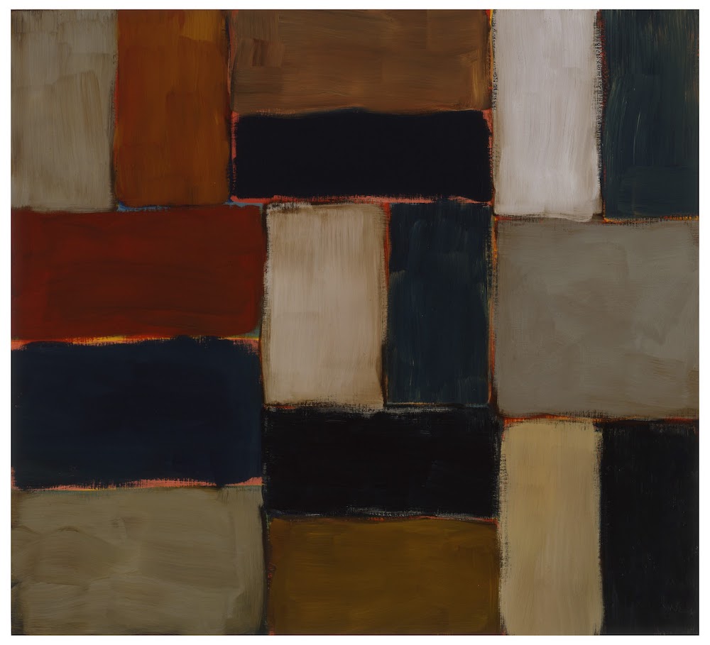
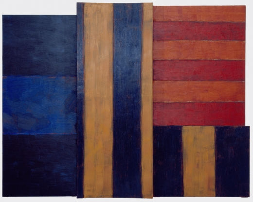
Sean Scully, Mooseurach, 2002
Sean Scully’s consistent and restless investigations into painting’s formal and expressive possibilities are evident in the current survey of his work Sean Scully: The Shape of Ideas at the Modern Art Museum of Fort Worth. The big, bulky, striped canvases we know of his from the Modern’s own collection are given some backstory here, starting with Scully’s early attempts to generate space by weaving grids of colored bands, and ticking through five decades of paintings, pastels, prints, drawings and paint sketches.
Scully, Irish born and London raised, arrived in New York in the early ’70s, a decade or two late to be listed in the pantheon of white-guy art gods to whom he is artistically kin: namely Rothko, Stella, and Newman. But his ambition and devotion to a single abstract form, the stripe, earned him a role as torchbearer for non-objective painting when many artists had given up the game. Scully took his time working through the logics of Minimalism, Op Art, Process Painting, and whatever was left of Abstract Expressionism — digesting them in ways compelling to some, but too impure for others. This doggedly independent trajectory gives him a kind of cred, though, with our contemporary moment in which the train tracks of “Post-War Art History” have lost their rigidity and all styles and media seem equally (ir)relevant. Some of his early works even feel prescient of current painters who’ve picked up airbrush and masking tape in a lo-fi rediscovery of simple illusions, as noted by Matt Bourbon in a short piece published here.
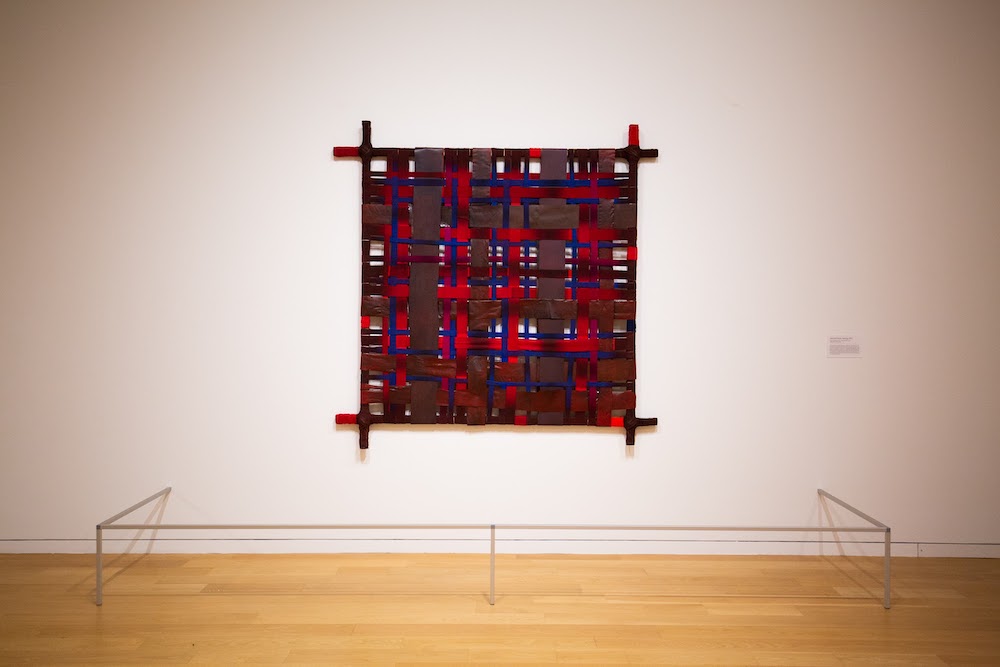
Sean Scully, Harvard Frame Painting, 1972
The shape of the exhibition is chronological; the evolution it charts is meandering. An early work from 1972, Harvard Frame Painting, clues us in with its physical construction to what the artist would later explore through the “weaving” of layered strips of pigment — overlapping, underlapping, covering, and revealing, mostly in relation to the verticals and horizontals of the picture plane itself. It’s set up like a primitive loom, and the colors are earthy and dull overall. From the same time period, Green Light takes a meticulous next step, flattening its taped-off strips of color into a sleekly painted surface. Its complex pattern of crisscrossing green and yellow bands push and pull the space into a buzzing plaid of energy, like a sterile high-rise apartment building, or a microchip glowing with artificial light. With these works he finds the “stripe” to be an irreducible and infinitely adaptable form. His early experiments will vary line widths, superimpose gnarly color combinations, even tip the grid on the diagonal or create separate sections of pattern on the same canvas.
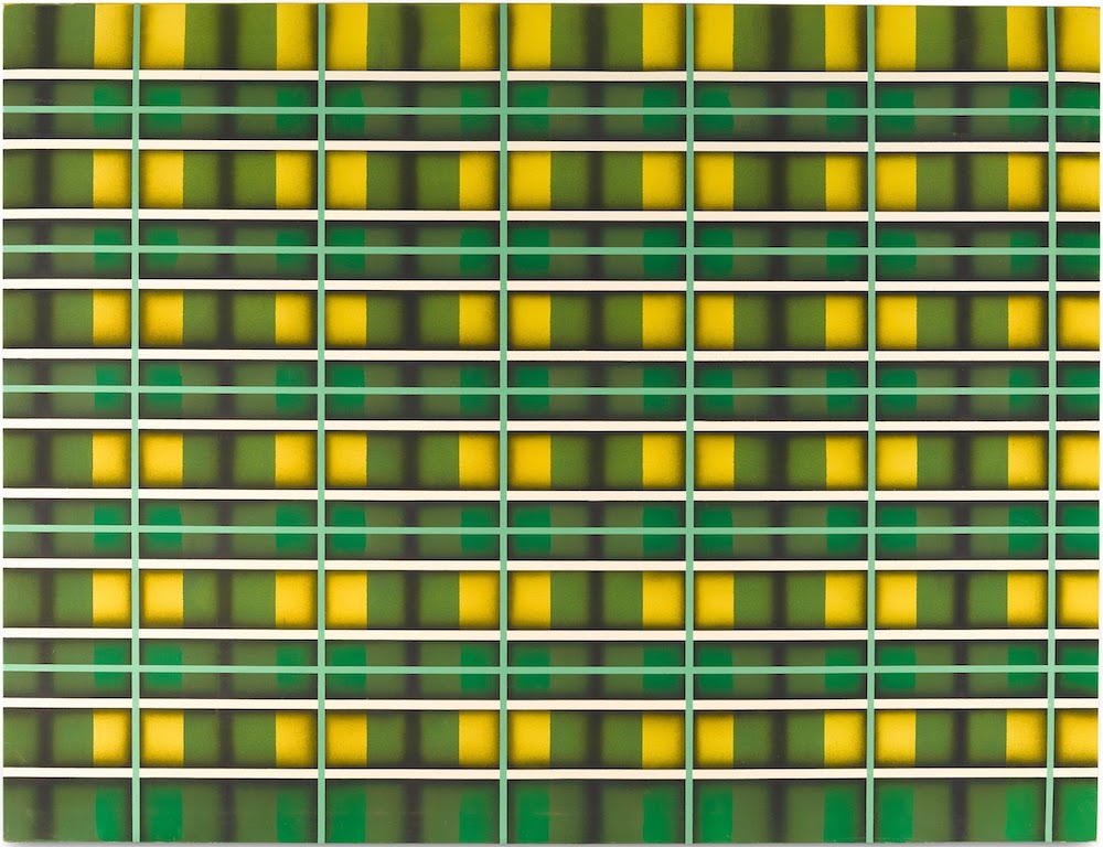
Sean Scully, Green Light, 1972-73
By the 1980s Scully is pulling the grids apart into their unidirectional components and arranging them side by side in off-kilter, sometimes jarring ways. The tension he had earlier generated by overlapping systems of grids he now achieves by placing systems side by side. The work of “seeing” them or understanding them together requires more active perceptual work from the viewer than his “all-over” canvases of the ’70s. He also narrows and tightens up the crisp lines to form sleek vinyl-like surfaces reminiscent of Naugahyde upholstery. Many of these are done in moody, low-contrast, two-color schemes, the color palette darkening to earthy mauves and maroons, or deep slate greens and blues — subtly strange pairings that feel nearly as ominous and dramatic as Caravaggio or Rembrandt.
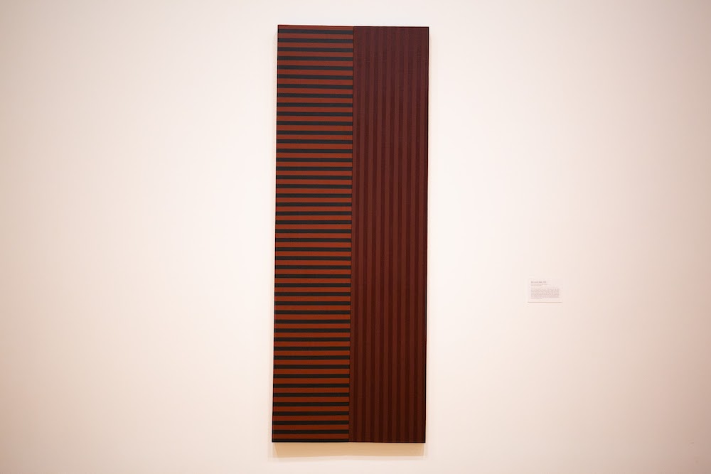
Sean Scully, Boris and Gleb, 1980
In Boris and Gleb these pin-stripe reductions get lengthened into a pair of tall vertical rectangles made from two even narrower plinths adjoined, their long seam the site of the work’s tension, drawn out to an extreme. The shape is so vertical it almost becomes a stripe itself on the wall, and the long seam centers and extends the clash. Color shifts play a major role. On the left, uniform horizontal strips of earthy red and tealish gray; on the right, the same strips vertical and in light and dark mauve. The left a richer mix of hues, the right a more visually overwhelming phenomena, the long vertical stripes occupying the eye longer. It’s a scale weighing apples and bananas.
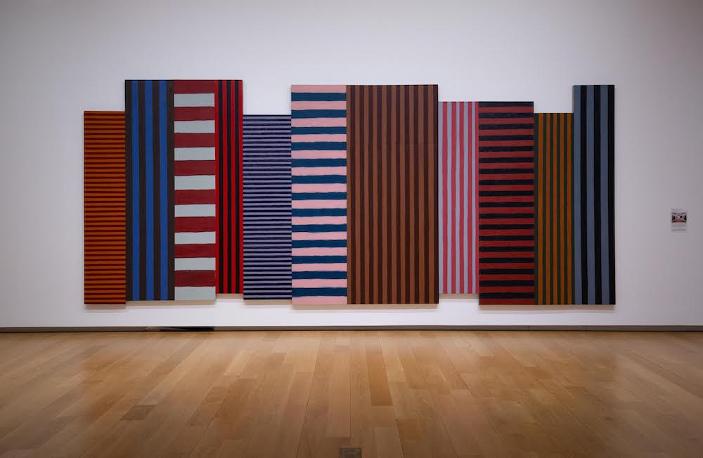
Sean Scully, Backs and Fronts, 1981
Then in 1981, just one year on from painting Boris and Gleb, the artist cranks out Backs and Fronts, a fantastically sprawling departure from the austere and measured technique he had been developing. Here we see Scully in maximalist mode, in what feels like a breakthrough of sorts. It’s easily 20 feet long — a cubistic explosion of loosely painted verticals, twelve attached canvases in all, with a circus-full of variety in color pairings, stripe width and orientation, as well as the dimensions and placement of vertical panels in relation to their neighbors — some aligning their lower edges, some their tops, and a couple syncing both or neither. It reads like a Rauschenberg combine of Stella paintings, but much heftier, with bulky stretchers jutting from the wall, the thick strips of color incised, almost carved into their surfaces. In some ways this is a watershed piece, and in some ways it’s just another dialectical shuffle, from which will follow a shuffle back toward containment and reduction.

Sean Scully, Blue, 1981
From the same year, ’81, we get a few more neatly packaged versions of this party. Blue, for example, crams four distinctly colored rectangles on three attached canvases into one shape, a near-square whose own dimensions work with or against its internal components to generate the same kind of synergistic balance the artist previously would work out through its depth.
Sean Scully, Falling Wrong, 1985
By the mid-’80s Scully is riffing in multiple directions. He begins pushing the separate panels of a work into the third dimension, with irregular perimeters and depths, bringing volume pointedly into his lexicon. The stripes here are more painterly and improvisational, the process more open, the resolve more touchy. Falling Wrong shows this with four hefty attached canvasses, one a good six inches proud of the others, just off-center to the left, its thick vertical stripes cropped, and in high-contrast values of bright orange and inky purple-black. An echo of this dangles off its lower right directly under a square of close pink and orange horizontals — slightly narrower, which read as a more distant ground. To the left of the foregrounded vertical panel hangs a squatter vertical section with dark and darker blue horizontal stripes, nearly as thick as they are long. This also pushes back into the distance like a sliver of landscape, a cropped patch of pond at dusk, a cool respite. The stripes here are stretched wide enough to open up as brushily painted surface areas themselves. Some chalky and opaque with bits of underpainting peeking through at their edge; others with transparent color spread over and mingling with the brushstrokes and tints underneath. It goes about as far as a painting can go before becoming something else.
Sean Scully, Magdalena, 1993
Toward the late ’80s Scully fixates on what he calls “insets”, which are just that. A separate painting, not painted within, but fully built/framed into, and flush with, a larger canvas. A painting pregnant with another, swallowed by another, infected by another? Anyway, the spatial fracture or rupture we’re asked to deal with here is center out rather than front to back or left to right. Some are blatantly jarring, even when perfectly centered and symmetrical, as in the work Magdalena. The composition harkens to Rothko with its inset panels floating one above the other and centered in the field. Interestingly, with the inset there are stripes which no longer touch the outside perimeter on at least one edge. The inset relates to the surrounding field, but not also directly to the wall. There’s a hierarchy of grounding, and thus of material vs. semiotic weight — something pure abstractionists usually avoid.
In the 2000s his compositional strategies become more quilt-like and all-over, yet retain the boundaries between different chunks of pattern, though these internal divisions are mostly painted and not separately framed. Their edges are loose and corners imperfectly aligned… mostly. This is the structure of his large Wall of Light series, which also marks a shift in the retinal significance of the patches of paint, suggesting windows onto scapes of light and shadow, variations in hue and value now reading as differing qualities of light bouncing off various surfaces, or through particular atmospheres at different times of day or night. The monumental three-part work Iona, from 2004-6, is a dramatic example with each of its roughly 9–by-11-foot sections containing similar but not identical compositions and playing games with color temperature and intensity. The center panel is checkered with bright and deep reds richening up the blacks and warm grays and setting off a cool grayish swath in the top right corner that feels explicitly like a bit of cloudy sky over a dry, grassy field. The panels flanking this are drained of their color (mostly), the one on the left a patchwork of lower contrast and cooler grays mostly mid-value range, while the right panel has a warm red glow under its grayscale pattern that reads as embers of the center panel. It all feels like a circular time-lapse of predawn to morning.

Sean Scully, Wall of Light Desert Night, 1999
The wonderful Wall of Light Desert Night, from 1999, is built of the unmistakable qualities of moonlight: chalky washed-out blue-green grays mixed with cool muddy off-whites — a Diebenkorn kind of light with a lighter shade of opaque color stretched over a darker one.
Scully thinks of his work as continuing the project of abstract painting that reaches back to Mondrian and Malevich, hinting at cosmic truths underneath vision, language, and all other illusions. I relate his stripe to the “zips” of Barnet Newman who similarly saw the visual and conceptual power available in the stripe, with its suggested infinitude tied to its perceptual immediacy. Newman saw this as a compositional analogue of a blissed-out universal reality which he called “oneness”.
It’s easy nowadays to chuckle at those dated Modernist ecclesiastics, but if you can get past the whiff of high mindedness trailing them, these are deep waters worth peering into. Scully’s body of work provides a nice, wide on-ramp. It shrugs off some of the pretense, openly valuing notions like craft, narrative, and emotional specificity. If nothing else, Scully has brought the purities of previous abstraction a little closer to the dirty realities we primates inhabit. All the while insisting that the shape of our ideas need not be bound by the shapes of the known world.
Through Oct. 10 at the Modern Art Museum of Fort Worth
