

At the moment, walking into Devin Borden Gallery feels like conceptual whiplash—in one gallery Chris Cascio’s wristband paintings, whip-it installations, and porn-ad enlargements reek of a drug-and-party culture hangover of massive proportions. In the adjacent gallery, quiet, modestly-scaled drawings by Sharon Engelstein differ so greatly from Cascio’s pieces that, at first glance, they seem withdrawn and clinical.
Part of the perceived sterility of these drawings lies in their precision: the lines are so straight, so angular that they seem to derive directly from computer software and, indeed, Engelstein maps out the fuzzy, halo-centric colors in her drawings with CAD software. But it isn’t until the viewer sticks her nose to the glass that she can tell that the harder lines and dots are hand-drawn. Engelstein’s hand wavers ever so slightly, and the jig is up—up close, the drawings become parodies or caricatures of their previously cold, dull selves, offering something less serious, and more self-deprecating. The lines are calculated and deliberate, yes, but they are also thoughtful, sweet, and considered, and that is ultimately a saving grace.
The drawings also read as sharp, sleek, and even sexy. The soft clouds of color lend a strange translucency, creating a sense of layering, as if they were on Mylar rather than opaque paper. Trying to figure out how she did it—whether there’s Mylar or not, what’s printed and what’s drawn, if it’s translucent or opaque—is fun, but it’s also a quickly tiring series of gimmicks. Despite all the oohs and aahs these may elicit, Engelstein’s smartest decisions are her simplest. The work is at its best when it isn’t showy; when she’s just making small, yet certain, formal decisions.

Green Slime
The best example of this is how Engelstein chooses to juxtapose her hand-drawn lines with the printed color underneath. Occasionally we see soft blobs or vague cumulus clouds of color, but most of the time the color is more structured, like a stratus cloud or the trail a fighter jet leaves as it flies through the sky. While most of her lines run through the centers of the trails of fuzz, in Green Slime they run along the outside, as if it is a shaded map suggesting lakes surrounded by land, or islands within a lake: we can’t discern what is land and what is water.
In Green Slime, Engelstein activates the fuzz instead of treating it like a background or some tepid optical accessory as in other drawings. The cloudy trails feel sculpturally combative, continuously pushing up against harder, incisive lines. They go beyond something aesthetically pleasing: they constantly demarcate and deterritorialize themselves, which is conceptually exciting.
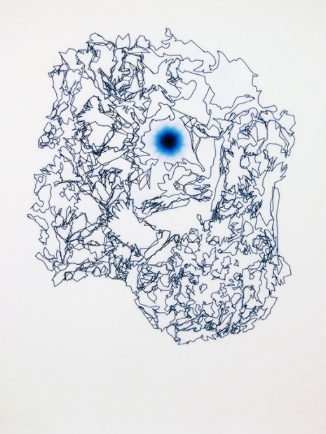
Mystic
Mystic is not as formally compelling as Green Slime, but it tells a more interesting story. In Mystic, the lines break into small, shattered shards, as if pieces of Antarctica broke off and started floating around the Pacific Ocean, bumping into each other as they circle a central blue hole, or perhaps surrounding a saturated moon reflecting off the water.
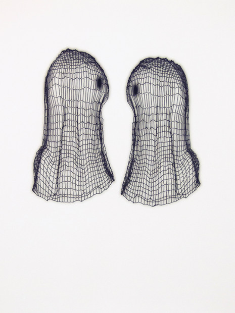
Ghost Twins
Many of the drawings lend themselves to narrative, but some are characters in themselves. Facing each other, Ghost Twins look like competing, BFF sock puppets; P3UV looks like a floating court jester or a slain bank robber, the pantyhose still stretched tautly over his face. Pink Taste starts at the bottom as a small satellite, echoing and reverberating some indecipherable message circularly across galaxies.
Harkness
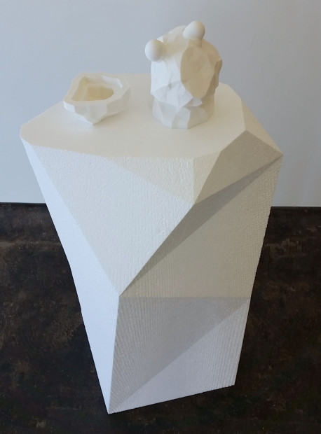
What is most interesting about this show, and possibly most problematic, is that these tightly knitted renderings all read as prototypes for future projects. Why not just make the final draft? Engelstein answers this question with Harkness, the weakest piece in the exhibition. A sculpture, the piece offers us physicality, but with the vapid, predictable scale of the 3-D print, which sucks all the dynamism out of the work. As prototype drawings, we can still imagine the three-dimensional iterations as infinitesimally small or cosmically large—either electrons or entire continents.
Paired with the bombast of Chris Cascio’s work, Sharon Engelstein’s drawings can come off as stubborn and rigid, but give them time: soon they will warm up and start telling some pretty odd and particular stories.
Sharon Engelstein: Whatever You Think of Is True was on view at Devin Borden Gallery from March 6- April 18, 2015.

3 comments
Nicely written and very thoughtful critique Betsy. Good choice for a piece in my opinion as well. Sharon has taken minimalism to some very innovative places for the past 30 years…(Nearly Sharon? Scary huh!)
I want to make a small point, zealot that i am about this, only as a suggestion to critics everywhere…again. I may be reading wrongly into this? but i am yet again feeling this sort of need in contemporary criticism to find fault in calculated intention, giving it names like gimmicky or overworked, trying too hard. (My own work will show the bias here, but take me out of the equation if you can or know it). I think artists and writers on art have been beaten in the head for so long now about the evils of craftiness and visual aesthetic that to show any praise in that area has become taboo. No artist should need to apologize or make conceptual excuses for work that will affect an audience in whatever way it does. Effect is not limited to intellectual concept. Lets go further please. Be braver. Or am i wrong? maybe. :
“Trying to figure out how she did it—whether there’s Mylar or not, what’s printed and what’s drawn, if it’s translucent or opaque—is fun, but it’s also a quickly tiring series of gimmicks. Despite all the oohs and aahs these may elicit, Engelstein’s smartest decisions are her simplest. The work is at its best when it isn’t showy; when she’s just making small, yet certain, formal decisions.”
“They go beyond something aesthetically pleasing: they constantly demarcate and deterritorialize themselves, which is conceptually exciting.”
Conceptual description; always stepping on itself too. its like all too many artist statements.
OK thanks for indulging. Don’t hate me I’m an aries an artist and an actor so i need to be loved and spout opinions. My excuses in advance – Steve
Hi Steve,
First off, thanks for reading, and thanks for the lengthy and thoughtful comment. I think to a pretty great extent, your gripe is valid, and really, I don’t disagree with what you’re saying. I think there’s room in our large art world, especially in our expansive Houston art scene, for work that’s purely craft-based, and I think it holds its own value and matters very much. Not trying to take us too far down some conceptual rabbit hole, but I think art made solely for the sake of being beautiful and well made holds its own critical stance, and really it’s meta-critical in the sense that it’s kind of giving a middle finger to conceptually based work. I’m sure you’ll agree with me on this…after all, that’s essentially the point you’re making in your comment. If I thought that’s what Engelstein’s drawings were actually doing, that’s how I would write about them. But come on Steve, you and I both know that’s not what’s going on here.
With her drawings, Englestein is quietly, and quite cleverly, telling stories. My point is that she has relied so much on the layering of the clouds that her stories tell the same plot line over and over again. It’s a crutch–a beautifully decorated crutch, yes–but a crutch nonetheless. Green Slime was the only drawing, or maybe one of two where she juxtaposed the line differently, and it’s great. This is where she creates real tension…there’s a climax there that’s missing in the other drawings.
hi betsy, not sure quite how you originated that i might be comparing or separating purely conceptual (based) work and pure craft/ work made for the sake of being beautiful. the term conceptual has become somehow owned by language based art in recent decades. the line is truly too blurry to disregard great concept in visual and well crafted beauty. concepts are not limited to language. there are no words for many of them. its originally why artists are the worlds visual messengers.(i.e., examine the effect of the beauty in the decor on the “crutch”) people forget. no one is shooting the bird at conceptual based work. only at the trend in too many circles to banish beauty to a land of conceptual emptiness. where the nude emperor can’t go. nice line huh?
in any case, to be fair, i have not seen the cloud works up close, but i might speculate, if i may, that sharon, as many artist do, could be telling very similar stories in separate works destined for walls miles apart one day. it is the nature of an art series to contain close similarities. the gallery is a compact place and a show of multiple portraits, for instance, may seem repetitive there. but there can be subtle experiments in between each that only the artist can recognize. in the end each will have its own wall in a different room. I’m picking at a very few of your words. i wouldn’t have cared had your piece been less eloquent. rarely, i do like to play art critic metacritic. thanks for playing along.