

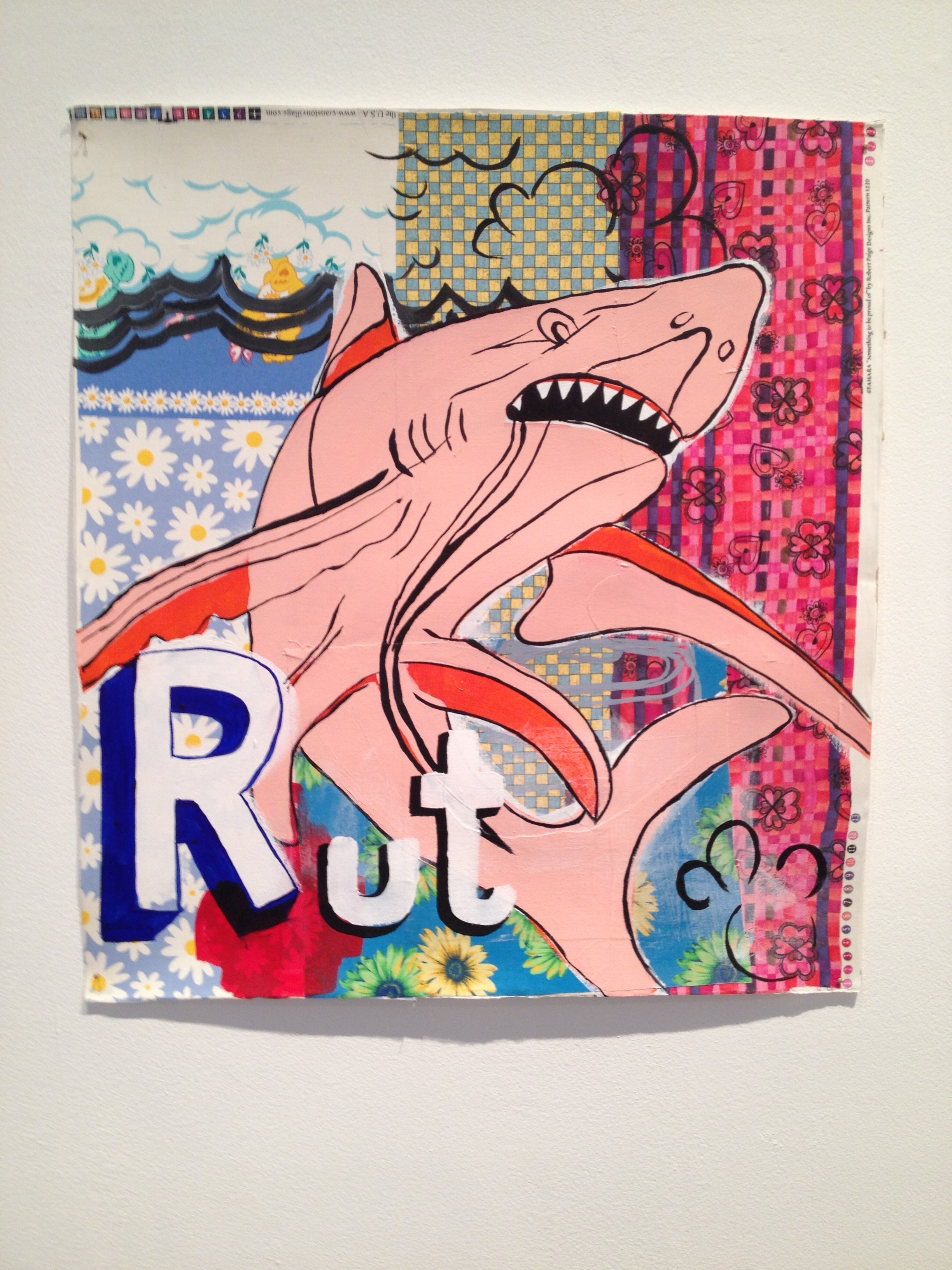
Michael Miller, “Rut,” 2006
When I had a commercial space next to Barry Whistler’s gallery in the mid-aughts, I’d drop in for visits, and that first summer he and I were talking one day about the coming season. Whistler said something about how, even though most galleries open in early September, it was better to wait until late September or even early October to open the first big show of the fall, because the heat really is exhausting for many people and they just don’t want to be out in it.
The impact of that plain wisdom struck me, mainly because Barry Whistler is one of the longest-running and respected contemporary galleries in the state. He had years of experience behind this conversation and he has clearly been doing a lot of things right for a long time.
His current summer show is a pleasantly distracting group outing titled “SUM MER FALL 2014” (extra spacing intentional) and lasts until September 27. In some ways the end date elongates the casualness of summer, which I appreciate. Summer in Texas should officially last until around September 27. It could be our consolation for enduring the pitiless heat.
Anyway, most of the work in this show has never been shown before in a Texas gallery, though much of it is not new. There’s a lightness of touch in the installation, which is a mix of secondary market stuff that feels summery and citrus-y, with a few dark punctuation marks sprinkled throughout, and a couple of big Joe Andoe horse paintings that felt entirely out of place. But I warmed to one of the horses quite a bit before I was done looking and then didn’t mind its intrusive weight anymore.
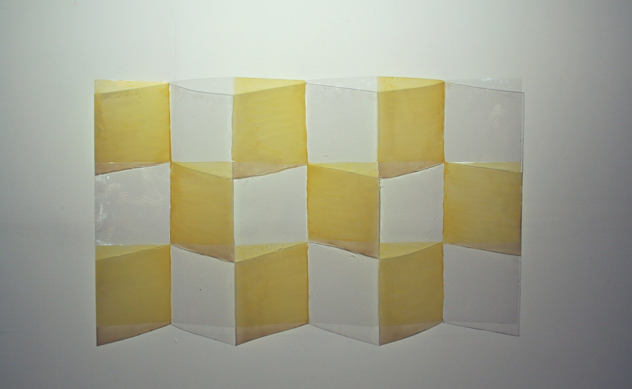
Tom Orr, “Yello Casement,” 2014
The newest thing I settled on was a 2014 Tom Orr piece that practically embodies the notion of summer: a semi-folded Lexan and yellow-tinted urethane number called, appropriately, “Yello Casement”. It does the standard Orr transparent op-art and shadow play, though in this case felt very fresh and crisp while still being shimmery and weightless. Pics don’t do it justice; the loss of depth perception here is key (and fun). But I heard that Orr doesn’t want to read any more positive reviews of his stuff, and I totally understand because he means that this area has lacked almost all critical dialogue for too long, and that’s like a city with no seasons at all, i.e. depressingly dull. So I’ll shut up and move on but it was my favorite piece in the show.

Joel Shapiro, “Boat, Bird, Mother, and Child (f),” 2009
That crisp, weightless theme extends to the piece right next to Orr’s: a small and charming abstract Joel Shapiro from 2009. It’s a five-color screen print that is 100% about its formal qualities of composition and color but is nonetheless titled “Boat, Bird, Mother, and Child (f)” So I suppose if you squint hard you can make yourself see something that’s not there. I’m a sucker for a good composition that reads like a layered geometric collage of construction paper, and this is a fine one.

Scott Reeder, “Post Cats,” 2013
A current group-show/summer-show/show-not-to-be-taken-too seriously might feel incomplete without a jokey, meme-y, semi-abject painting-of-the-moment. Detroit-based Scott Reeder delivers this with “Post Cats,” a 2013 acrylic-on-canvas text piece in Pepto pink. It’s dumb and cute. I’m probably supposed to “get” something else about it, but maybe not. That would be refreshing.
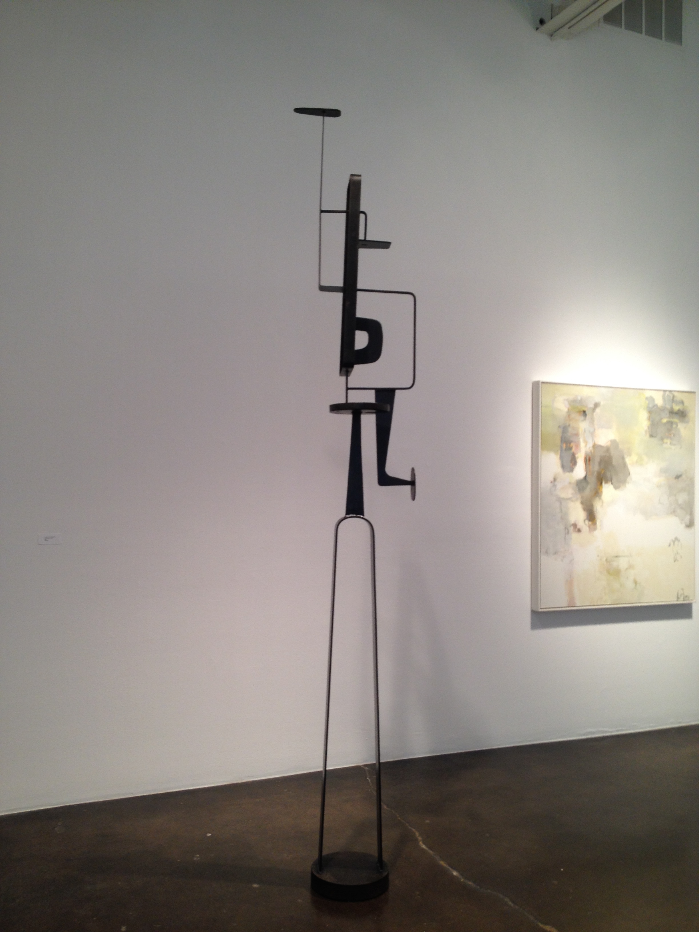
Jean-Paul Philippe, “Tall Perch 2,” 2013
One of the punctuation marks of the otherwise pastel-y array was a tall, skinny, black steel sculpture from 2013 by Jean-Paul Philippe, a New York artist and designer who specializes in current work that reads like straight-on Modernism. Its curves and blocky shapes shoot up from the floor and it juts out here and there seductively, and there’s a very Calder-esque nod to the idea of a bird’s head on top. It would make a splendid diversion for the garden, and I mean that in the best way. I like it, but when I have to do a double take at a wall label telling me the work was made last year when it looks like 1958, I get a little itchy.
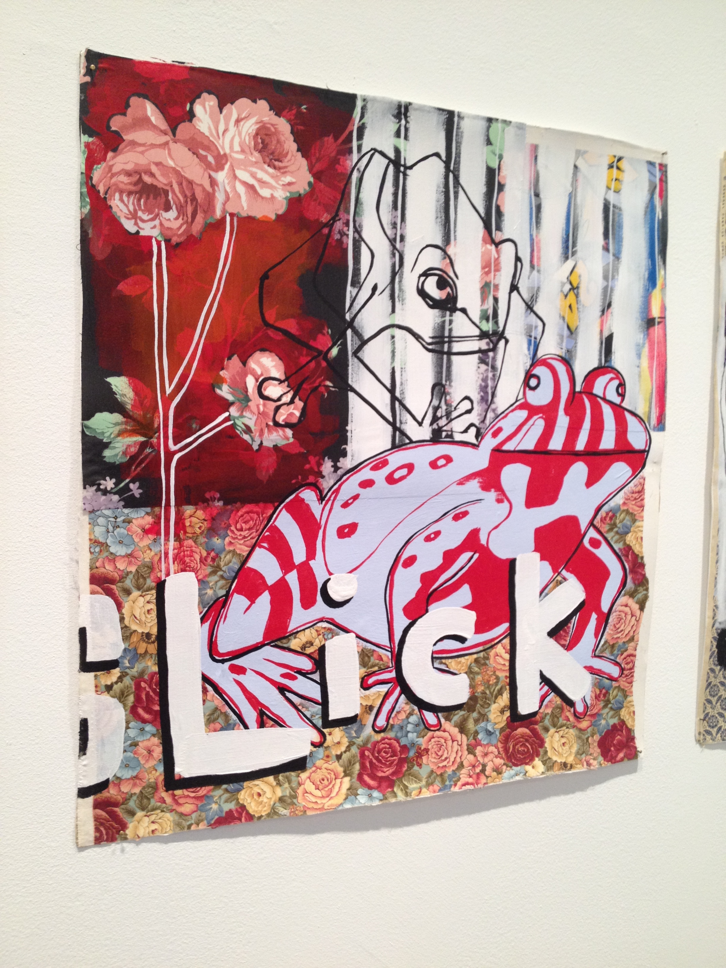
Michael Miller, “Slick,” 2006
I also like Michael Miller’s amped-up, technicolor-patchy collages; these five are from 2006. They always look right in sets, and Whistler picked out some good ones for the summer: among them are a big pink shark sporting the caption “Rut” and a psychedelic frog with the word “SLick” scrawled across it. Also on hand is the requisite large-format Ann Stautberg beach photograph from a series circa 2003. I actually never get tired of these. I’ve been looking at these images at Whistler’s for years, and I’m happy to look again—they epitomize the soupy, atmospheric, slightly menacing but also nostalgic bent of a Texas coastal summer.

Roy Lichtenstein, “Head With Two Braids,” 1980
There’s a very weird little Roy Lichtenstein color etching-engraving from 1980 called “Head with Braids.” This came from a period where he explored themes and ideas around Native American art, and he mixed it with surrealism and his signature pop-art style. The combo is odd and a little comic and aggressive but ultimately, I think, sad. I think it’s meant to be.
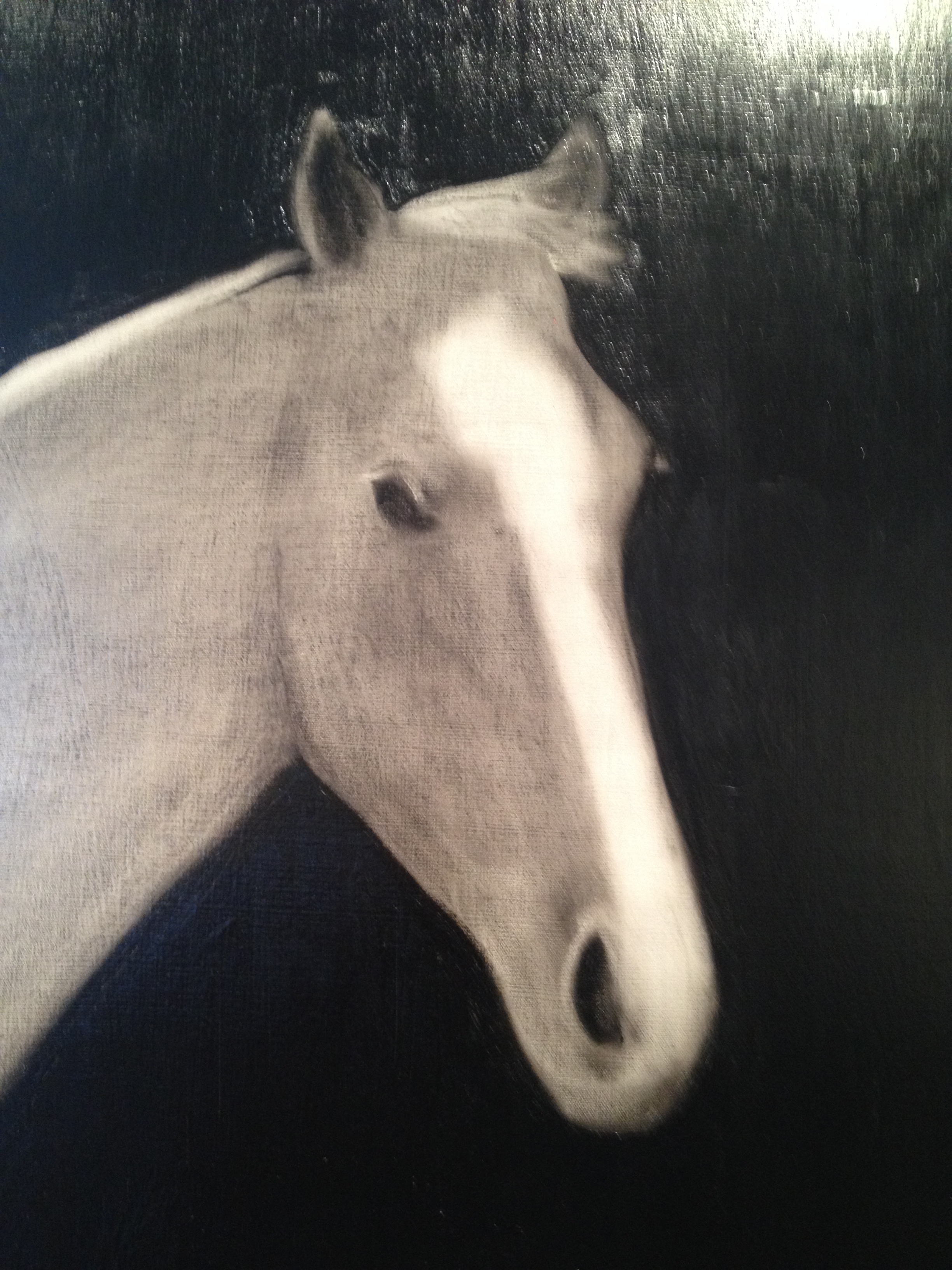
Detail from Joe Andoe’s “Young Horse,” 2013
Which brings me back to that horse. The one I like, called “Young Horse” is one of two paintings in the show by New York’s Joe Andoe. It’s big and mostly black and it threatens to practically capsize the room it’s in, but then I got in closer to look at its surface, and the horse’s face. The horse is painted in an almost flattened, abstracted wash and has a lovely, blurred-out ghostliness, and its face has a marvelous placid calm reflected through very little information. The title and the face make this a melancholy piece, but a cool one, temperature-wise, and it’s dignified. Once familiar, it reads much lighter than its first impression. So why not throw it into a summer show? And why not extend summer all the way through September? I’m game.

3 comments
Post cats?
POST CATS
^ ^
; x ; < miAUu
Is Scott Reeder no longer based in Chicago?
I’ve known him as a Chicago artist, too, but his current CV reads Detroit.