
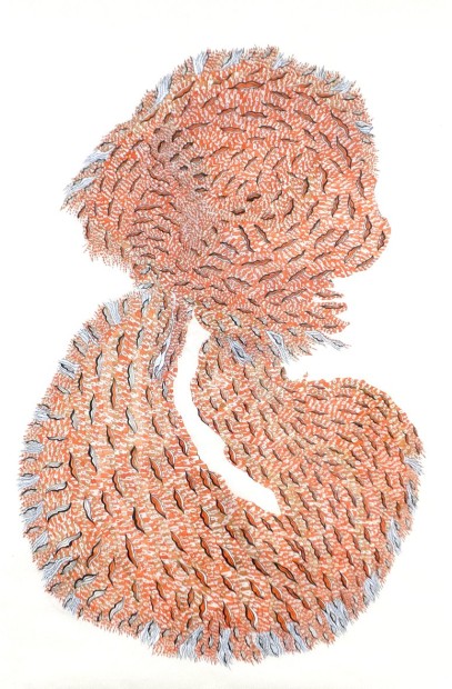
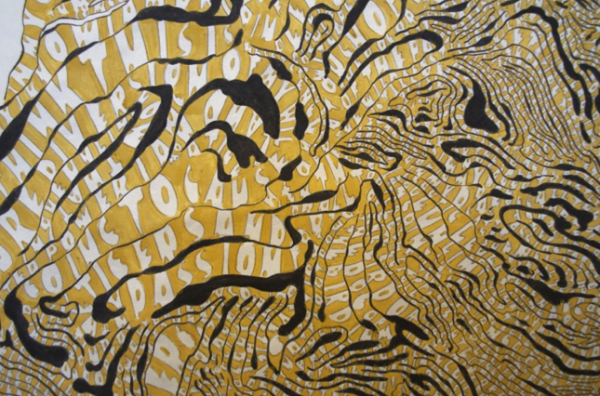
Untitled (Book of Nature 2), 2013, 37 x 57″
When it comes to contemporary art, the sparkier questions are left in abeyance. It’s deemed un-hip to ask questions or note the obfuscation of meaning regarding artwork. This awkward situation is pointedly evoked by Natasha Bowdoin’s exhibition In the Garden, on view at Talley Dunn Gallery through September 7. The show delivers a load of allusions, imagery, medieval references and heady constructs with minimal clues as to how they should be deciphered.
Untitled (Book of Nature 2) (detail)
In the Garden is composed of two suites of works. One is dubbed “The Book of Nature” while the other, “Flowers for Henry,” operates as a nod to one of the lodestars of outsider art, Henry Darger. All the work evokes fragments of natural landscapes, including forest thickets, vaguely dendrite-ish shapes and one clearly discernible serpentine coil. Each piece is constructed from methodically cutout letters derived from vast texts. The name of the show, of course, is a medieval term that denotes the notion that knowledge of the Creator is conferred by an understanding of creation. This, coupled with a mysterious confection of serpents, tangled flora and twining language, leads one to assume that what’s being insinuated is Biblical—specifically Edenic—imagery.
Thus, it’s off-putting to learn via gallery press material that the transcendentalist writer, Ralph Waldo Emerson, is the source for much of Ms. Bowdoin’s work. She transcribes his essay, Nature, via stacked cutout letters to create large, amorphous images that are vaguely reminiscent of the natural world.
Ms. Bowdoin is clearly well-schooled. Says she: “… the text outlines a belief system that suggests that divinity suffuses all nature, and outlines the notion that we as human beings can only really understand our reality and purpose by studying the nature around us.” Well, then, if we take Emerson’s advice, why read at all? Why not decamp in Big Bend and shoot bears? And, certainly, why go to an art gallery? This is odd, indeed. Also, Ms. Bowdoin’s scissoring technique makes it impossible to read Emerson’s text, rendering us incapable of heeding his manifesto even if we should avidly yearn to do so. It’s possible to look at Ms. Bowdoin’s art for extended periods and only discern a few scant words. This, it should be noted, is a process approximately as thrilling as picking lint.
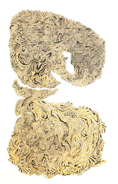
Untitled (Book of Nature 1), 2013, 37 x 57″
Untitled (Book of Nature 1) (detail)
One example is Untitled (Book of Nature 1). It’s a curving and layered work that calls to mind thinly cut wood; it’s large and unwieldy and does, in fact, invoke the natural world. And the fact that it’s made from meticulously cut letters taken from Emerson, of course, inflects it with additional meaning. But, ultimately, it remains a question that’s far more frustrating than enlivening. Its primary allure is a brand of intrigue conferred by sheer bafflement.
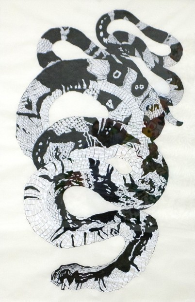
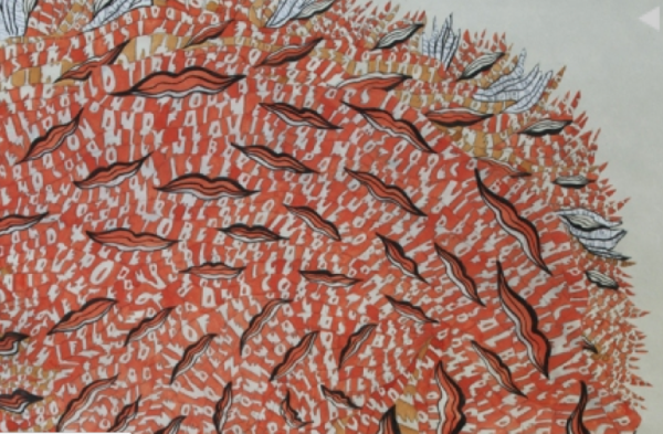
Untitled (Book of Nature 3)
The aforementioned work is parried by Untitled (Book of Nature 3), a depiction of a serpentine shape, rendered in grayish tones and, again, constructed from transcribed and carefully cut letters taken from Emerson. Thus, widely understood symbols that overtly refer to Western myths are retracted in favor of more obscure references in Emerson. The latter states… “in the woods too, a man casts off his years, as a snake his slough… (and) is always a child…” Ironically, we’re pitched from the realm of Classics into a celebration of natural life—one that relishes books, art—and certainly galleries—far less than bees, bark and sunlight.
(By the way “Flowers for Henry” is similarly frustrating. However, in this case, the text was taken from Mr. Darger’s autobiography which issued no celebratory passages about stars, fields, woods and vegetables.)
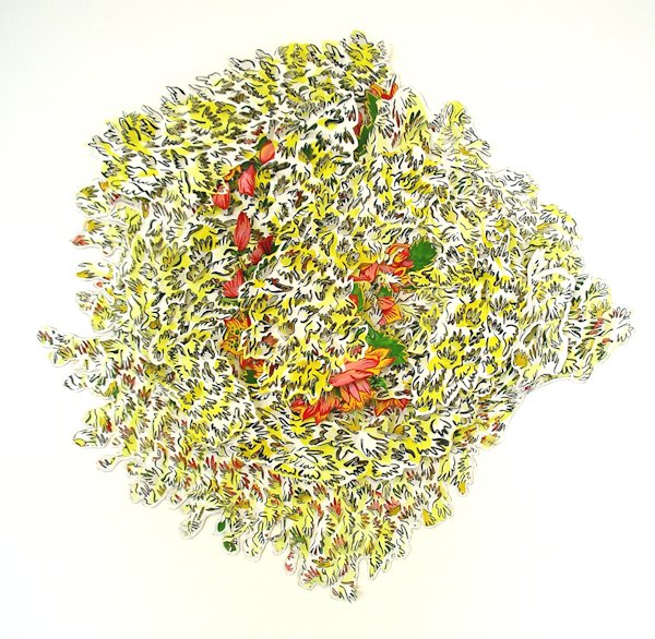
Blengin Bloom (Flowers for Henry), 2013, 28 x 28 x 2″
Ms. Bowdoin adds that her “images are meant to conjure associations to the natural world but associations that remain in flux and are thus difficult to pin down.” This is yet another iteration of “my art is new every time someone looks at it.” This is an age-old epistemological trick that is over-used; it’s become a crutch for work that is less rigorous than it ought to be. It’s also been spun more times than Motown vinyl.
The art world has been gliding on excuses that amount to an infinitely long and pinched bit of turf for decades. The willingness to laud cute or winsome names is rife and galleries love to keep us bobbing on the surface. What we’re actually confronted with is a disquieting and sepulchral landscape—and the real news is that, sadly, there is rarely a there there. Thus, it would be refreshing, positively shocking even, to encounter work so deeply lovely that we would willingly let inhabit the infinitely rich territory south of our overrated noggins.
For instance, if we’re going to have art about books, why not start with the splendidly gorgeous and interlaced knots and links found in “The Book of Kells,” circa 800? It’s lovely beyond speech and celebrates text in ways that are ravishing. It’s also utterly straightforward. It doesn’t lead us down obscure trails to landscapes that are less rich than what’s promised.
What we’re witnessing again and then again in galleries is a hospice for dying culture. We’ve become so inured to inauthenticity and a flip insouciance that we fail to speak out about it. It’s time to write truthfully about such things. Otherwise, how will our culture evolve? And how will we escape the current monotony in which everyone is becoming hardwired to live with glib references? If we begin to demand more perhaps we’ll actually get it.
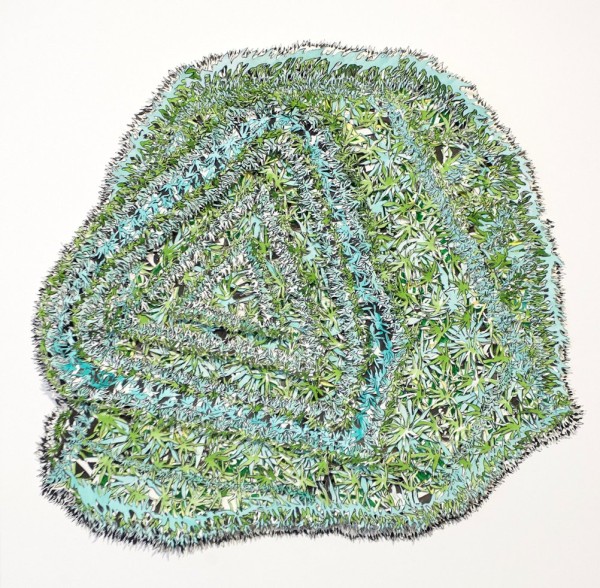
The Lizard and the Text (Flowers For Henry), 2013, 28 x 28 x 2″

10 comments
I can feel your frequent thesaurus use and it’s painful.
Patricia Mora is to be congratulated on her review of “Down the Garden Path,” by Natasha Bowdoin.
I have not seen the exhibit. However, after having read Mora’s thoughtful and well-written appraisal of it, I am more inclined to see the show to determine if I agree or disagree with her.
I am a painter, former art teacher, successful gallerist and have collected art for an eternity. I behooves us—particularly those who hope to one day have their work
taken seriously—to appreciate such criticism. It should be taken as a challenge.
Chapman Kelley, Dallas, Texas
Bryan, I hope to begin a conversation. If you would like to counter what I had to say, I am certainly open to a discussion. In fact, think that would be great. The “thesaurus” reference, however, is unfounded. I had no use for them even in high school. But I welcome YOUR point of view about the work. Join in and tell me how I’m wrong and in what ways your opinion differs. I would like to hear your point of view. Best wishes, Patricia Mora
It’s funny how one negative sentence elicits a reaction as opposed to the optimistic paragraph which earns nothing. Its just plain funny to me.
“Aforementioned”, lol.
Patricia, Even though I haven’t seen the show, that doesn’t discount the appraisal inferred on other recent shows (90%) in Dallas. Your commanding assertions of what’s contracted at openings is spot on. Keep it coming.
I did go and see the show because of this review and must assert that Patricia’s implied survey of this particular instance falls short in analysis because, I think, the work does speak for itself-at least the 3-dimensional pieces.
I think we just need to discount the gallery’s referencing of impetus for the work and analyize it for its tactile,depth of field lushness created by the feathery “pinking” effect created by multiple stacked cuttings glued together.
That said, I feel the 2-d pieces were unremarkable. I still enjoyed the show.
Swamplot,
I have never been so disappointed with you. I know you can’t control who reads your blog, but surely you control what writing you publish. This “review” is willfully ignorant in its refusal to think critically and unbelievably entitled in its demands for explanations. Perhaps worse, it ends up trashing an excellent show based solely on the author’s inability to understand it and belief that someone should be there to spoon feed it to her. I’ve been in the art world for 20 years and just now, upon reading this, understand why so many art world denizens belief that maybe art just really isn’t for the masses. This is ignorant and poorly written.
Patricia,
The thesaurus reference was due to your use of words that are obviously there to try to make your writing sound better than it actually is. It didn’t work. When you do not understand what you are writing about, you will sound ignorant no matter what words you choose. Why don’t you stick to something you’re familiar with? I don’t know you, but you sound like you may be more familiar with subjects like… why we should help republicans shut down all the abortion clinics in Texas? Or why we should cut arts funding because those damn artists just won’t explain what they’re making in a way that we can easily understand. To be clear, I’m saying that you sound like the worst kind of ignorant entitled critical republican who has no business determining what should and shouldn’t constitute “culture” in our society. If you can’t seem to “get it”, Patricia, just stay out of the art world. We don’t want you.
How odd that a less than positive review would put me in line with Republicans. That’s REALLY funny. If you deem me to be an “ignorant entitled republican,” you are wrong on several counts. Apparently you definitely do not “get it.” At all. I’m hardly alone in this kind of thinking but, as I said, articulating the obvious can be treacherous.
Perhaps a comment box is not a place for a thoughtful discussion.
The problem, Patricia, is everyone in town whose a “Galleryfile” is expected to group think in locstep to the polite, politically correct pablum dished out by the writers for each and every opening we see.
When it requires a novella to explain your art, something’s wrong.