


Newly renovated Blaffer exterior
About three years ago I installed my Master’s Thesis Show at the Blaffer Art Museum. Every piece in my exhibit was ready-made sculpture and vinyl wall text, however, until my last semester I only made two-dimensional work. Basically, my thesis was a stupid idea–one I completely believed in.
Nearing the end of something I get cranky and existential so when my three years were nearly over at the University of Houston I thought to myself: “Maybe this is all I get, maybe I’ll end up working in ‘communications’ or hawking toy helicopters at the mall. If this is it, then I should make it what I want it to be.” For almost three years I believed that a master’s program could help me in the “real” art world; it wasn’t until my final semester that I realized that world had nothing to do with what I wanted my work to become.
Dave Hickey stopped eating Twinkies after Hostess started adding vitamin D to the list of ingredients. If Twinkies had to cater to the food cautious then they weren’t honest – they weren’t Twinkies anymore. Similarly Hickey believes that art schools pump their students with their own version of vitamin D keeping them from brutal actualization in their art making: “Thirty-five thousand MFAs a semester, 90 percent of whom never make another work of art…[MFA programs are] training sissies for teaching jobs.”

As far as I can gather Twinkie’s never claimed to add vitamins to their cakes, daily value of vitamin D = 0.00%.
It is now six years after Hickey’s claims and three years after I left academia and I’m still giddy to see a new batch of MFAers take over the newly renovated Blaffer Art Museum. With fresh walls and a sparkling array of bright and witty new staff members, the Blaffer Art Museum turned their once bland exhibition halls into a gleaming museum space that makes this exhibition the most polished I’ve seen.
Jasleen Sarai
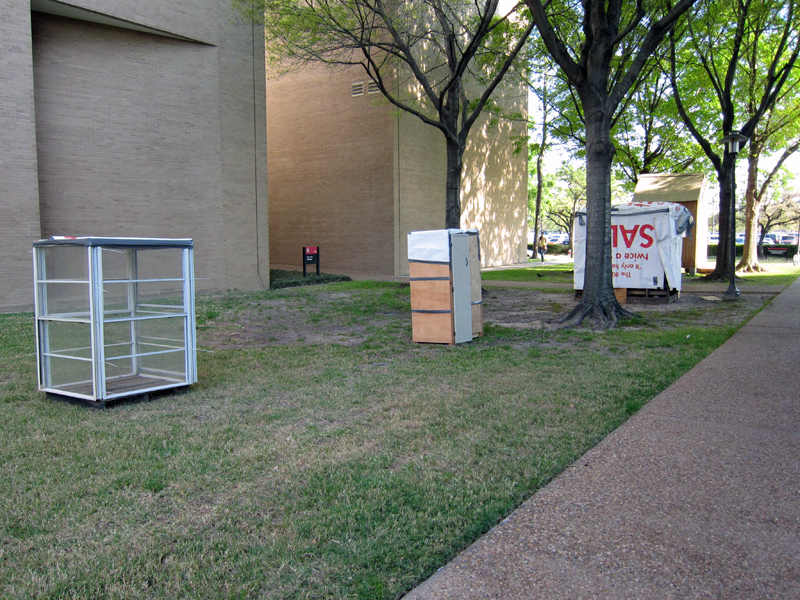
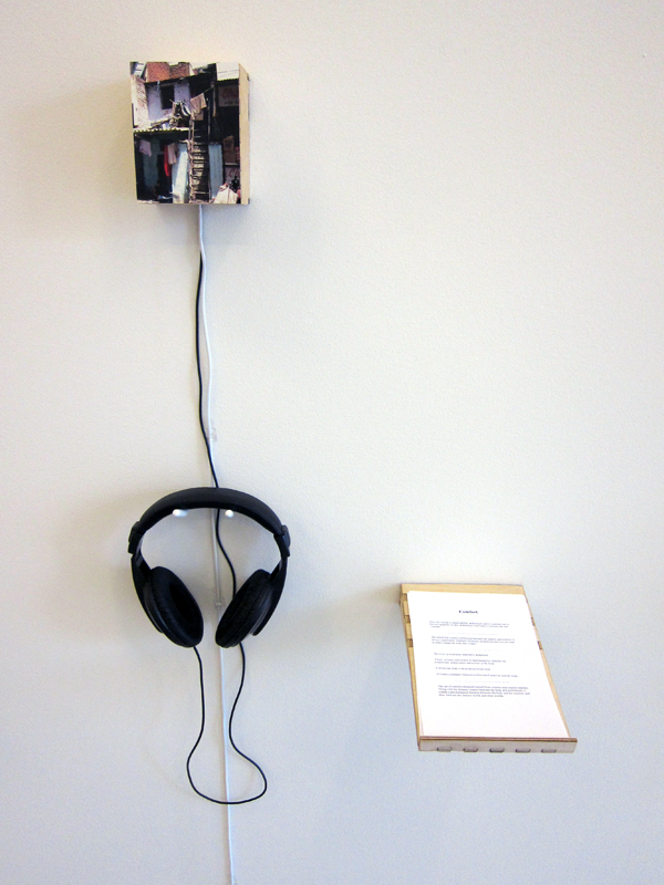
Curatorial fellow Amy Powell graciously led me through the exhibition as we started our tour outdoors. Flanking the east side of the museum were five forms of housing structures built by Jasleen Sarai progressing from a cardboard shack to a small sturdy house each representing the following stages: territory, security, privacy, comfort, and luxury. Through this thoughtful progression Sarai carefully lays out architectural ideology for questioning and interpretation in This Is What We Call Home (Study). Once inside the Blaffer museum Sarai couples a small image of each structure with headphones playing a recording of her explanations. Unlike the discovery of the standing structures these didactic audio pieces were not as necessary. However, with supreme craftsmanship and hefty ambition I think Sarai’s work is sociologically poignant.
Erica Ciesielski Chaikin
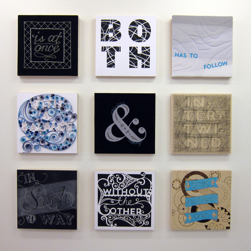
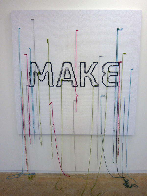
Across Blaffer’s entry hall are graphic designer Erica Ciesielski Chaikin’s paper and fabric works. Bridging the gap between design and craft Chaikin’s cleancut aesthetic too easily reflects her artist statement: “I am a graphic designer who creates typography to blur the boundaries between contemporary design and traditional craft.” Complete with a sew-your-own adventure piece titled Hand Stitches Chaikin creates a light and fun atmosphere for viewers to interact in. Inviting and generous, what Chaikin lacks in content and depth she makes up for in presentation.
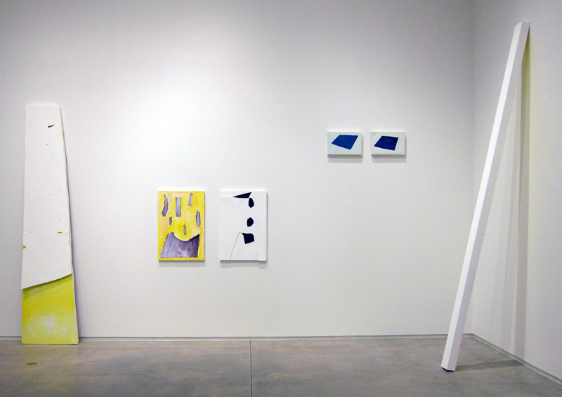
Carrie Cook (BEAM is at the far right)
Entering the high ceilinged gallery through large glass doors reveals the most cohesively successful space in the entire exhibition. The giant gallery allows enough breathing room for everyone’s work to stand alone and interplay seamlessly together.
The first piece that caught my attention was Carrie Cook’s BEAM. The back of the structure is painted neon yellow which casts a gradation of color along the wall behind the piece like a motel sign on in midday. Rough around the edges and purposefully not precise, the piece feels like a DIY Dan Flavin sans electricity. Simple and alluring, BEAM reveals itself paradoxically in both an ostentatious and subtle way—ostentatious in size but subtle in sculptural composition. Cook’s other paintings in the gallery also lead viewers willingly to them, but none as seductively as BEAM.

Megan Badger
Along the right wall of the large gallery are a series of photographs by Megan Badger that were seamless in their presentation as a series. The group of photos felt cohesive, professional, and did not fall apart under close inspection. Staying true to her statement the works are “metaphysical and poetic”. I thought the series was successful in getting across a predetermined set of goals and hopes but it did not incite strong emotions or questions in me as the viewer. Badger creates her images through a calculated manipulation but in some ways that takes away from the overall effect. Yet, I do think she has an eye for the magic she seeks and I look forward to seeing her work as she hones in not her craft, but her vision.
Jessica Ninci
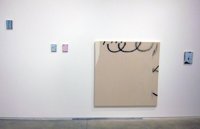
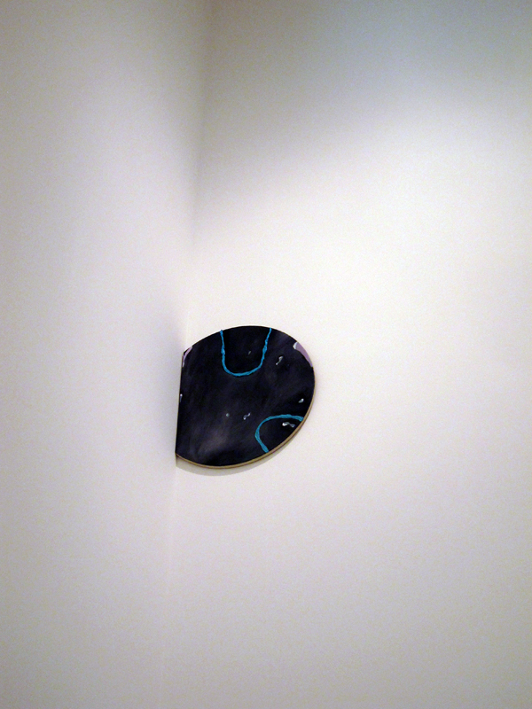
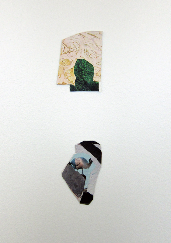
Further down from Badger’s photographs is a stark contrast of minimally handled paintings by Jessica Ninci. Her collection is familiar in style but distinct in placement and overall tone. Ninci’s circular painting Moon Rocks Don’t Matter was placed high in the corner like a partially cut aspirin lodged in a cabinet door. In Under the Wall Ninci delicately places the 2″ x 74″ painting underneath the crevice between the floor and gallery wall; wonderfully unnoticeable Ninci remarked that at one point, “one of the security guards tried to sweep it up and throw it away.” Although her painting style seems a little too similar to other contemporary painters I thought there was just enough of her own voice in each work. Overall, I loved her utilization of the space and detachment from the overbearing history of painting with a casualness and flippancy that felt fun and succinctly honest.

Katelin Washmon
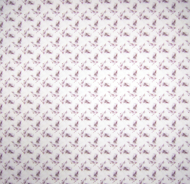
Following Ninci’s pieces along the wall is a series of high-resolution photographs of human hair and detritus by Katelin Washmon. The photos are extreme close ups of dust bunny tumbleweeds left to roam in someone’s apartment. Turning the corner into the adjacent gallery space an entire wall is covered by a wallpaper pattern made up of these hairball images she dubs “floaters”: “The wallpaper series ‘floaters’ demands an examination of the unwanted and ignored, allowing for rediscovery of what was once lost.”
Washmon’s wallpaper feels like hitting the repeat option on my desktop wallpaper toolbar and instantly regretting the decision. Yet, from far away the pattern was almost seductive. Although Washmon’s works weren’t conceptually very interesting due to their straightforward approach the pieces made me wonder what she could accomplish in performance, video, or sculpture.

Fiona Cochran
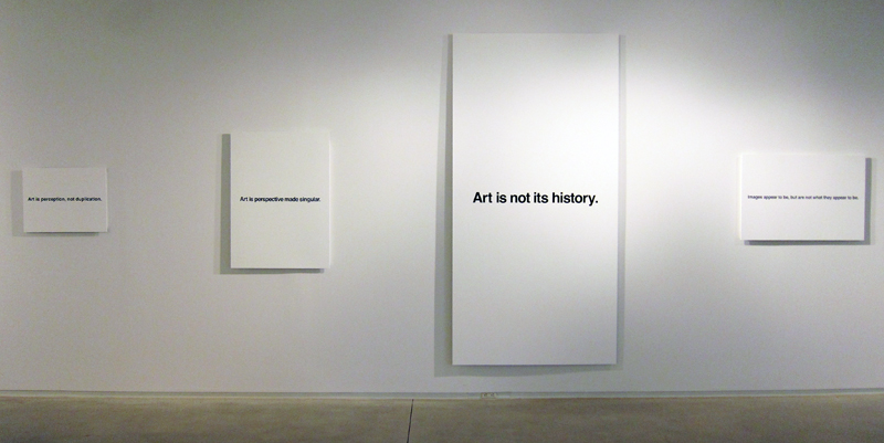
Filling the largest portion of the second half of the downstairs gallery were a staggering amount of white shapes and black vinyl text by Fiona Cochran. Each white cube or rectangle is a dimensionally accurate replica of a canonized artwork including Duchamp’s Fountain, Warhol’s Brillo Boxes, Pollock’s No. 5 1948 and aptly Sherrie Levine’s After Walker Evans: 4. On the center of each piece Cochran adheres vinyl text–pithy statements in Helvetica font. Cochran claims her texts are the “translation of the arguments put forth by the works”. On Duchamp’s Fountain reads the phrase: “Art is context, not craft” and on Pollock reads “Art is not its history”.
More than any other work in the exhibition, Cochran’s works were the least successful in their attempt to be courageous. Unlike artist Sherrie Levine whose very process calls into question the validity of artistic authorship Cochran over simplifies her perceived meanings of the art historical cannon in her appropriations. In the end the result feels overly serious in its lack of self-reflexive humor. Instead of prompting “a new discourse, a new art” Cochran’s pieces come across as unconsciously arrogant and unyielding.

Elecia Garcia
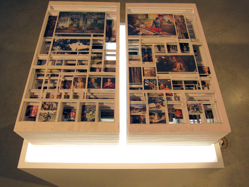
Across from Cochran’s fake fountain is a giant light box illuminating the work of Elecia Garcia titled 60 Units. On top of the light box Garcia constructs sixty reconfigurations of New York Times layouts that are devoid of any text but still contain imagery. Although I couldn’t shuffle through the piece like I wanted to Garcia does create an interactive experience. My favorite moment was recognizing that a square of pure light denotes an area of the newspaper always devoted to text.

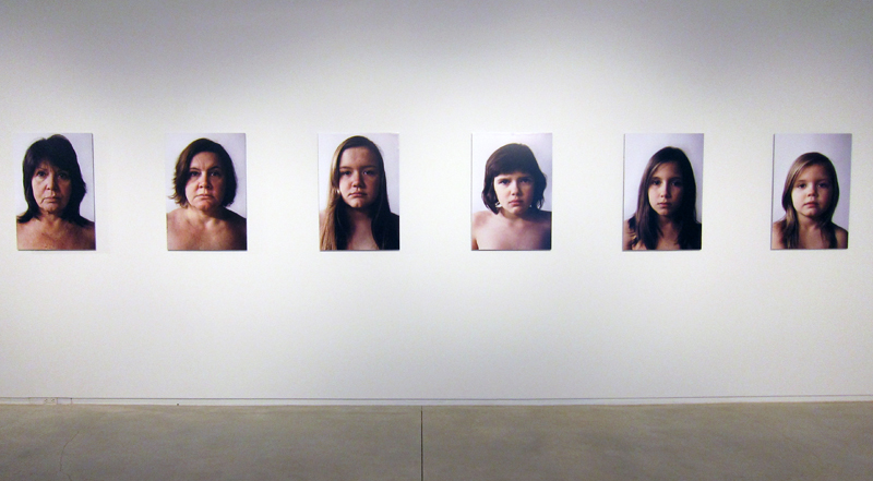
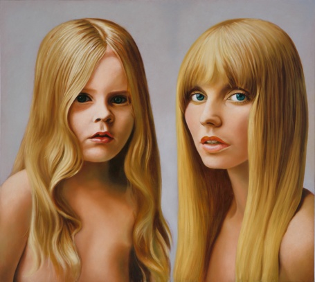
Stacey Farrell
Distinctly different than Garcia are Stacey Farrell’s large-scale photographs of herself and her daughters, a series caled Generatives. The subject matter reminded me of photographic giants Rineke Dijkstra, Nicholas Nixon, and Sally Mann. Even though Farrell may not have the clout, eye, or brut talent that these photographers posses I did think the work was strong and let me in to her life benevolently and without predictability. In her series Generatives we see her and her daughters in similar scale akin to Richard Phillips’ painting Girl Child without the sexual gloss. Farrell’s photographs collectively made me question how children’s and mother’s roles have changed over time which proves their subtle power.
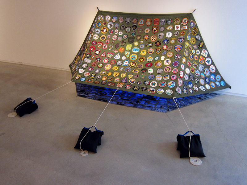
Chris Cascio
Before leaving the downstairs gallery I came upon one of my favorite pieces in the exhibition Chris Cascio’s Spoils of War. Known for his obsessive collections of drug culture inspired paraphernalia I expected a wall full of black light posters, bongs, and Ziploc baggies. Surprisingly concise and wonderfully autobiographical Spoils of War sums up Cascio’s day-to-day existence as an adult coming to terms with his past and himself. Through this piece I understood what it felt to be in Cascio’s head which proves that the more personal art becomes the easier it can be understood.
Carrie Cook (upstairs gallery)
Once upstairs I was met with a few more pieces by Carrie Cook including some small collages that held their own despite their business card dimensions. I wasn’t as intrigued by Cook’s video or large scale beach photographs on the ledge of the upstairs window, yet, looking down on the high ceiling gallery from above only reinforces the strength of her piece BEAM.

Stephen Paré
Before heading into the larger gallery I stumbled upon Stephen Paré’s inkjet prints. Out of everyone’s work I spent the least time with Paré. After reading his artist statement I felt even more at odds with the pieces: “My work is an attempt to resume a dialogue with an outmoded past…the truth in that past that may still live for us, inquiring anew; and, from the reverse point of view, to apply the unspent artistic capital of that artistically prosperous era to pay the debts of our own poverty-stricken one.” Sounds confusingly majestic like time travelling to get a good parking spot or win an argument.
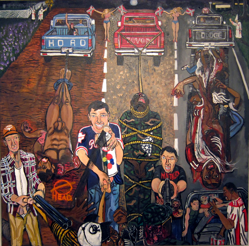
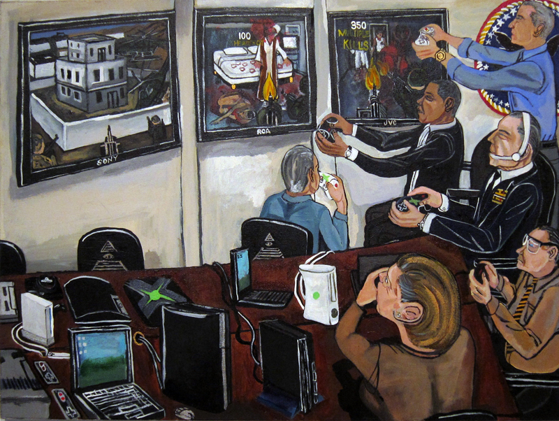
El Franco Lee II
The upstairs gallery housed what was basically an El Franco Lee II retrospective. The gallery was full of his narrative paintings that anyone who has seen Lee’s work before will recognize not only because of his signature style but because some were completed in 2011.
Depicting local rappers, marginalized victims, sports stars and various urban pop narrative elements Lee has dubbed his style as “Urban Mannerist Pop Art”. Yet, looking at a room full of his work I don’t think they “[preserve] the elements of society that have a vague presence in the art world” through Lee’s personal vision but rather through the grandiosity of painting in a conceived style. In Obama vs Osama Lee re-interprets an Internet Photoshop joke as similarly as he paints the horrifying hate crime depicted in Down South Drag Racing.
What evades in Lee’s work is his presence. Does he truly live in the extreme world he depicts, is he making fun of it, or does Lee appropriate these experiences disingenuously and thus perpetuates a forced aesthetic that borders on brash stereotype? The paintings are neither absolutely confessional nor completely detached to say for sure. Often employing visceral imagery Lee’s claim of shedding “light on urban subculture not represented in fine arts” is a bold statement in a contemporary art world where artists like Glenn Ligon, Kalup Linzy, and Kara Walker exist. Despite my initial let down in seeing the work mostly unchanged since Lee’s Lawndale residency I still hope to see what he can dream up because he can definitely make an image stick in your head.
After surveying everyone’s work I admit that despite any criticism I admire all twelve of these artists. Part of me agrees with Hickey and his fictional vitamin D Twinkies but I’m not so sure that all MFA programs only churn out timid artists. So far I’ve yet to hawk toy helicopters at the mall and I owe so much to my past professors and to the University of Houston, even if the experience was just about realizing my misconceptions. No matter where these twelve MFA candidates end up I respect them and any other artist stupid enough to believe in their own ideas.
I’d like to caption this “Hickey’s watching you”…but he isn’t.
Hurry! 35th UH School of Art Master of Fine Arts Thesis Exhibition is only on view until Saturday, April 13!

6 comments
Firstly, I want to thank you for writing this review. You made some great points and I hope this review encourages people to visit the Blaffer.
I just wanted to say that I found Fiona Cochran’s work to be one of the most successful and courageous works in the exhibition. I feel that her simplicity in tackling what appears to be complicated is very refreshing and I would encourage everyone to go see it! I don’t think art requires to be humorous.
Thanks!
I agree Jasleen. That, and Cochran’s work has absolutely nothing to do with courage, or a lack thereof. To misread her pieces simply as art historical paraphrasing I think reflects more on the failings of the reviewer than the work.
Making art about art is a common strategy. It often comes off as just a short-lived art world inside joke. I would encourage artists to mine their experience and/or perception of a larger reality, if their goal is to make truly great art.
Real criticism. I like it.
Helvetica, not Arial.
Thanks Type Police! Now changed.