

 In my younger days, between my divorce in 1985 and my return from Baltimore in 2004, I moved many, many a time. Each time I moved, I would cull through the shelves, and drawers and cabinets of my house and get rid of the old band aid papers, and tags and spare thread and extra buttons attached to new clothes, and the disposable cutlery that I got when I ordered out, and all the other crap that accumulated over time. Upon arriving at each new abode, I would take great pleasure in carefully and thoughtfully arranging all my remaining treasures, dishware, clothes, and books, and everything else – towels and washcloths not only folded carefully but placed on equal but separate shelves, the painting my father made of the English huntsmen centered over the front door, the statues of the Virgin Marys, Saints, puppy dogs, birds and Santas arranged in such a way as though engaged in conversation. (Of course anyone that knows me, realizes this initial period of meticulous arrangement is shot to hell after about a week of living in the new house – Santas shun the Virgins, the huntsmen slide off their horses, and the towels engage in intercourse with the washcloths, with the end result an overabundance of useless hand towels.)
After seeing Use Your Illusion, an exhibition curated by Paul Horn at Colton Farb Gallery (July 9 – August 20, 2011) I started thinking about how the process of moving to a new home is very much like the process of curating a show. In both instances it makes sense to cull out that which is trash and extraneous both before and after arriving at the new space; to plan on how many and what kind of objects will reasonably fit into the new environment; and to consider object placement within the allotted space, in terms of practicality and aesthetic.
Of course there are additional decisions that might ensure the success of a curated exhibition but that would not fly in the context of a move. For example, a curator of a show might think it only fair to give each artist an equal amount of wall space, or baring that, display a more or less equal amount of work. It would not fly to apply the same judicious form of partition to each room of a house. You would never say “Since Living Room must have ten pieces of furniture, then Kitchen must have ten pieces as well” for then you might find yourself in the ridiculous predicament of balancing on the top of a chiffarobe while trying to fry eggs.
Which is all a very circuitous way of comparing Use Your Illusion to a not so successful move. (The exhibit features the work of John Bruce Berry, Scott Burns, Dandee Danao, Nicky Davis, “Dual”, Paul Horn, Daniel Johnston, Solomon Kane, Sharon Kopriva, Matt Messinger, Angelbert Metoyer, Kevin Peterson, Kevin Sechelski, Trey Speegle and the unlisted John Paul Hartman.) The show is a jumble of works, a few good, some truly bad, and most in the middling range. Using the analogy of a successful move, I will make suggestions on how this exhibition might have faired better.
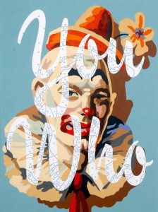
When packing for a move, you should first decide which of your objects are indispensable. As for this exhibit, the works that immediately come to mind are Trey Speegle’s You Who, most of Matt Messinger’s pieces, Daniel Johnston’s wonderful drawings and I’ll even concede to admiring Kevin Petersen’s technique, even though his uber realistic style is not my cup of tea. If you were moving, this caliber of work would be analogous to your personal treasures –the wicker couch and rocking chair that belonged to your grandmother, the cabinet your father made, the distressed dresser a friend gave to you, and the refrigerator you actually paid for.
In an ideal situation, you would only have treasures. But since our hypothetical move is a more common and realistic situation, then you need to decide which of your objects are still functional or essential to the comfort of your new home, pack those away and put them in the van. These would be like your bed, you have to have that, your clothes, you can’t run around naked all the time, at least one cup, etc. Shifting to the realm of Use You Illusion, those kind of items would translate to the artworks that, although not perfect, could still make for a somewhat decent show – for example Nicky Davis’ and Dandee Daneo’s paintings, John Paul Hartman’s Mickey Mouse inspired pieces and Scott Burns’s drawings to name a few.

Continuing the analogy of a move, you have now reached the point where its time to start cleaning out drawers and throwing things away. No, you cannot keep those stained, torn and stretched out under panties, the single crust infested socks, that pair of gray sweat pants that make you look like a Beluga Whale, no matter how sad it makes you to throw them away. In the parallel universe of curating, it is now that the Curator must make some very hard decisions – what work does not fit, what work brings the show down?
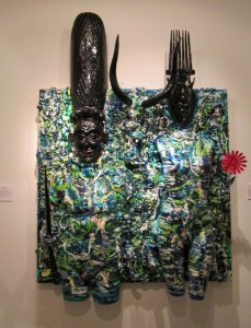
There are at least two artists I would, without hesitation, either eliminate or severely reduce their holdings from the show – Solomon Kane and “Dual”. Solomon aka Jeff Reese at least tries damnably hard – he’s puts a lot of effort (certainly a lot of paint) into his work, he thinks about social issues in his own sort of misguided way – but, I believe the art world would be better served if Kane’s work were hung in a venue where it more rightfully belongs, such as the kind of furniture store you would go to if you were in the market to reduce your bottom line.
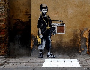
As for “Dual”, I’d not only get rid of his work, I would have never considered it in the first place – first and foremost because it is mind numbingly boring and unoriginal. And I am not railing against “Dual’s” work because I am too old to understand or appreciate the whole wheat paste street art concept thing (which if I were, would make me about 10,001) or because I don’t understand and appreciate appropriation, which I absolutely do and am guilty of myself. What I don’t understand or appreciate is when someone who claims to be an artist is so unmotivated that he doesn’t even attempt to take the ideas he lifted from another and turn them into something that makes them his own, other than marking his territory by putting his name on the piece. “Dual” is no Banksy, he’s not clever or mysterious, he’s just some kid who has silk screened a bunch of Dadaist Madonnas and Victorian optical illusion skulls and pictures of Bert Lahr and the overly, overly, overly used Eye of Conception and then shittily wheat pasted them onto warped boards. My ire is up, because this lack of intellectual curiosity or creative drive reminds me way too much of students who, when asked to write a research paper, are too lazy and entitled to even bother to footnote or even paraphrase the not necessarily accurate information they found at the first site that appeared in their Google Search, and then who take you to the Dean when you give them the grade they deserve, which is a big fat F.
O.k., back to the analogy. Before we start loading the boxes and furniture into the van, let’s measure the new space, so as to gauge how much stuff we can realistically bring along. Then, once we start unpacking, lets not just put the objects in the first room or drawer that presents itself, but rather take the time to rearrange things until we figure out the most practical and visual pleasing way to store and display them. For example, say you have three couches in your old house, but your new house, which is not even a house, but is an apartment, only has room for one. So what do you do? Either sell the extra couches, lend them to friends or put them into storage. Get rid of them – don’t lean them against the wall, or cram them under the bed and certainly don’t ask your friends to step over them when they come to visit. And when you place that solitary couch in the new apartment, make sure it is in a room large enough to accommodate it, so that when you finally do sit down to watch television, you don’t have to hold the t.v. on your lap.
All of which is a round about way of saying, there is too much work in this show, even for a space as large as Colton Farb. With the exception of the main gallery, art is placed everywhere – in narrow cramped hallways (two of Kevin Peterson’s painting); in nooks and crannies (John Bruce Berry); on the floor leaning against the walls (A Matt Messinger painting, a “Dual” wheat paste thing, and a couple of Daniel Johnston collages – which in all fairness, I was told were so placed so to replicate his work environment), This leaning things against the wall business is all very well and good if it looks like it was done that way on purpose and/or if the artwork plays off and interacts with its environment and other objects surrounding it (as in Robert Gober) but when it doesn’t work, it just looks like you ran out of nails.
 However, I will say there has been, at least, some effort put toward systematically grouping the artworks in Use Your Illusion according to some kind of ordered aesthetic- i.e. black and white pieces go here, cartoon based imagery goes here, etc. , but there is little evidence of the rearranging and arranging that curators and gallery staff must deal with before achieving a visually harmonious balance – the kind of harmonious balance achieved through the application of – believe it or not- the Principles of Design. I guess somebody was sleeping in class that day.
 One final gripe. You want to know what really bothers me? Maybe I am annoyed because I suffer from the overly heightened sense of equity that is forced into a parent’s psyche the minute his or her child develops into a cognizant being –i.e. under no circumstance would you, when presented with two kids and ten cookies, give one kid nine cookies, and the other poor sap one. Don’t let some of your artists show ten million things, and the others only one or two! It just doesn’t make sense. Either give everyone the same amount of wall space or let them show the same number of works. Not only is it the fair thing to do, but it also makes for a more even and better show.
So enough criticism. I an of the eternally hopeful opinion that a curator can take almost any level of artwork (children’s, seniors, monkeys, elephants, emerging and established artists or a mix there of), and through the application of my rules of moving, turn that mix into a relatively decent, cohesive, visually appealing show. So Mr. Horn, the next time you take on the task of curating, which I feel confident that you will again, just pretend you are relocating your belongings to a new house in a new neighborhood on the other side of town.

10 comments
Great piece of art writing and criticism. Enjoyed reading it immensely.
“I an of the eternally hopeful opinion”= am? Teach needs to reread before posting and boasting on the internet. 🙂
I really enjoyed this write up. Regardless of the friends I had in the show, I wholeheartedly couldn’t agree with you more on the lack of awareness on the part of the curatorial staff. The show was the most awkward possible fit for the space… which has an equally inconvenient layout (WHO PUTS THE BAR IN THE NARROWEST HALLWAY WHERE NOBODY CAN GET PAST IT TO THE OTHER %50% OF THE GALLERY?!).
I also thought it was really cheesy that Dandee had his works front and center in the first room… considering hes a Houston gallery owner (who is having his first solo show… at his own Houston gallery(uhm,FAIL.)), as well as his blatant use of copyrighted and entirely lackluster images that are void of any kind of his own imagination. If your going to go big with that genre of painting… no one wants to see/invest in knock offs of knockoffs you can find at the print store for several hundred dollars less…unless it’s in Colton Farb(haha). Originality isn’t hard… it just takes not being lazy and a little honesty, and don’t make it so your easily shown up by someone who just does it better and keeps it arguably more interesting: such as >>> http://www.kevintkelly.com. Its the popularization of Houston based work like Dandees that contributes to how the rest of the US perceives Houston as a joke… and I find this depressing. I expect more from people trying to make it off their contributions to the local art scene.
thanks Keith!!!
Love it, rock on Beth!
‘“Dual” is no Banksy.’ Heck, is anybody really sure Bansky is Bansky? However, I like Dual in the art’s original context (the street) in the same way as I enjoy–as expected–your brilliant, even-minded, and fair evaluation. Hooray.
it would be helpful if the images in this review were labeled
you are right.
1. Kevin Peterson “Inked”
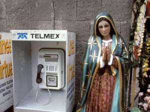
2. A picture of the Virgin Mary I found on the internet
3. A drawing by Daniel Johnston
4. “You Who” by Trey Speegle
5. A beluga whale I found on the internet
6. “African Gothic: Correcting Historic Misconceptions” by Solomon Kane
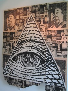
7. “Eye of Providence” by “Dual”
8. Piece by Banksy
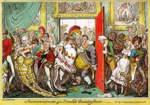
9. “The Crowded Room” by George Cruikshank
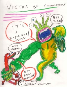
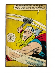
10. I think this is a Marvel Comic about Thor
11. “The Sleeping Gypsy” by Henri Rousseau
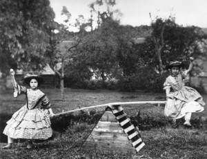
12. Artist unknown, Girls on a SeeSaw
It drives me crazy to not list the following in any publication or the web:
Artist, Title, Year, media, dimensions. Have not seen the exhibition but always enjoy your word-smithing thunder. maybe a bit too much on the moving analogy and curating and not enough on the works.
Over the past 25 years or so I have learned to trust the writer’s observational skills, ability to communicate, and just general point of view on everything, I am sure that she wrote about the most interesting part of the who she could fine to write about. If this review prompted the writer’s mind to wander off into issues surrounding moving and how they relate to the task of curating, I suspect it is because there was not enough interesting work in the show to engage the writer’s interest. The curator’s choices, both good and bad, became the most interesting thing about the show and that is not a good thing.
“Great analogy Beth” Such as in life. The apartment, the starter home, the Mansion, all box containers holding the human coil, holding the human spirit. its like Russian nesting dolls. Life is one big Container Store.
So it is the same with the white cube gallery. A perfect white box designed by and for the enjoyment of none other then the most obsessive of organized movers.
But as for Mr.Horn, what kind of mover is he? We can all make generous assumptions. Given the long history of curatorial attempts involving the nik-naks of Texas Gallery, Inman gallery,Moody gallery and Barbara Davis to name a few. Some might come to the conclusion” that he would pack up his fine silver inside a hollowed out watermelon, or pack up his wives jewelry in a freshly made 7 egg omelete.
It seems Paul Horns past curatorial events have always used the wrong box. Boxes such as convenient stores, Hotels, bathrooms and elevators to name a few.
In his shows, art and environment are locked in an arm wrestling match. One is fighting to control the other. This is what was lacking in “Use Your Illusion”. It Is to his credit though, How he makes a rough diamond shine shine. By placing it in the wrong place. For Example, a Bill Davenport Painting in a brown Holiday Inn Lounge. A Mark FLood In a Friendly Mart.
As for “Use your Illusion” I enjoyed the seemless blend of contrasting cartoons,photo real paintings and Pawn Star Junk. I especially loved the touching “un-plugged concert” with Dan Johnston. But Honestly I would of Rather seen it held in a barn with live animals. So I Hope Mr. Horn keeps moving his valuables around. Next Time find a different box.