
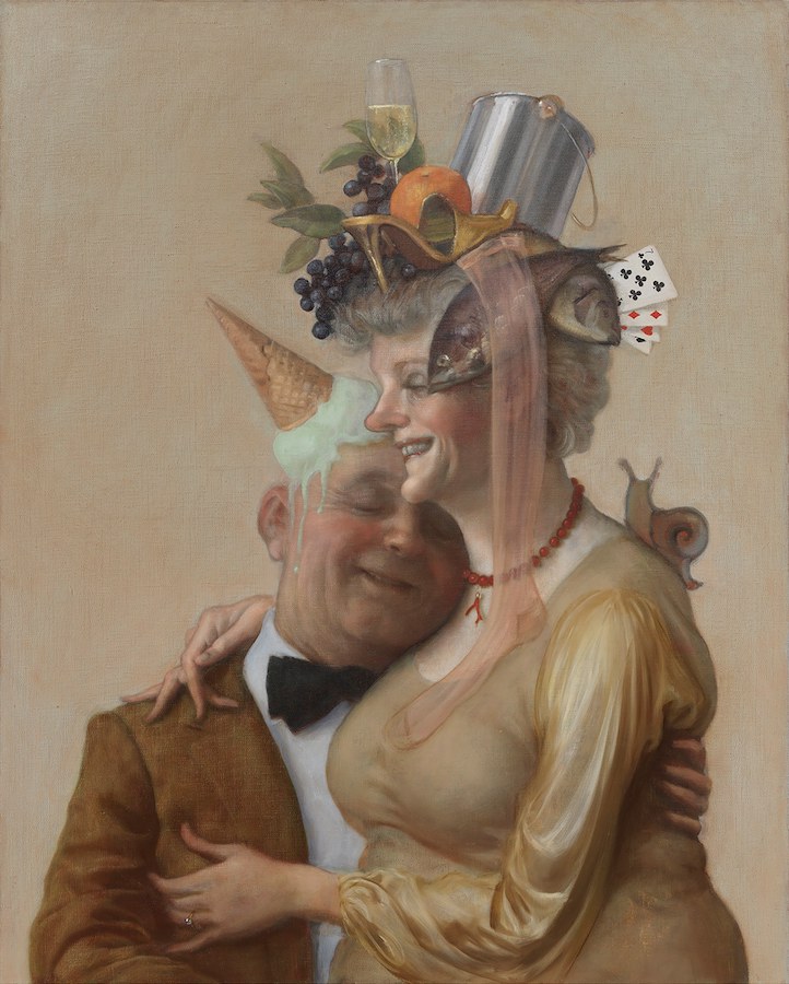
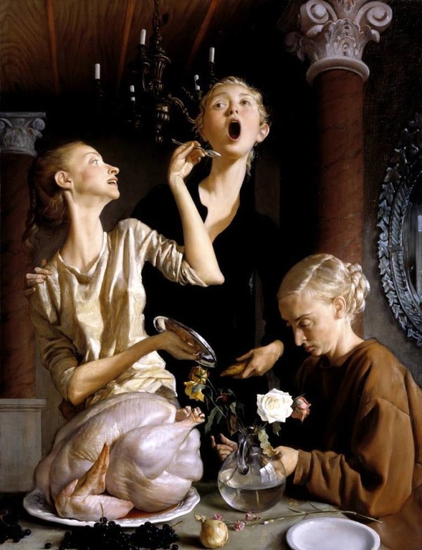
John Currin, Pistachio, 2016
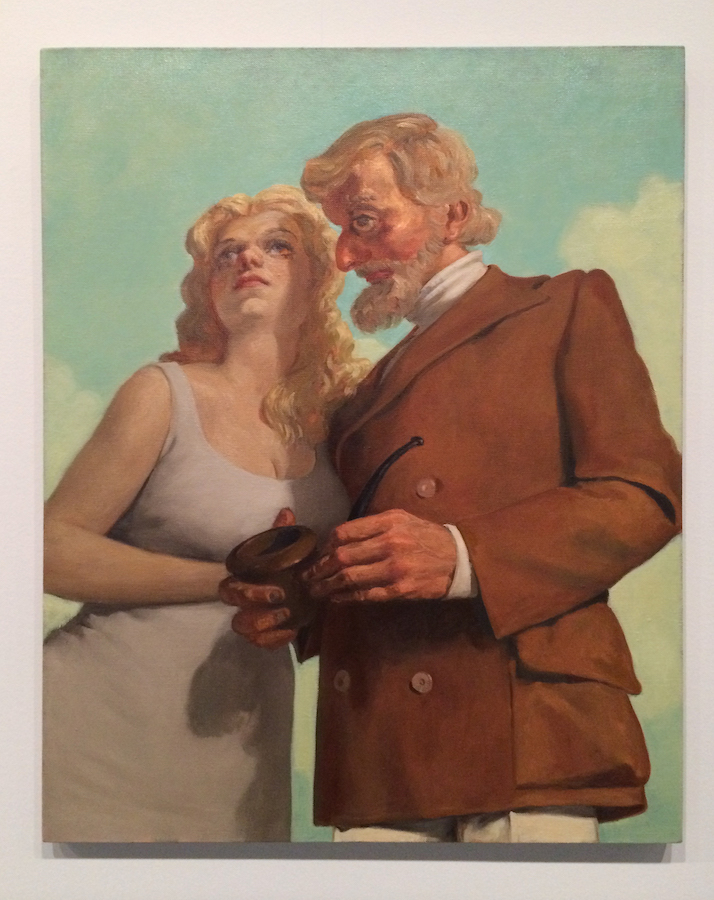
My Life as a Man, a show of paintings and drawings by John Currin, one of America’s finest painters in a generation, is exhibiting in Dallas’ Design District at the Dallas Contemporary.
Renowned and occasionally condemned for his highly sexualized paintings of women, John Currin also happens to have painted men. And his children. Most of Currin’s men in this wonderful show are, of course, versions of himself — sometimes more noble and upstanding, sometimes a little abject, often comical or satirical, and sometimes lost in time and space.
Many of his women subjects are probably also, vicariously, himself — or at very least projections of himself. Ordinarily, his wife, the artist Rachel Feinstein, comes into his pictures quite profoundly, although she is specifically absent from this exhibition while strongly represented by several exquisite paintings of Feinstein and Currin’s children.
Currin’s paintings of people, genre paintings mostly, are not so much specific portraits as they are a composite of his world view. The reductive and bombastic criticism that Currin objectifies or reduces women to sexual objects as his raison d’etre, I think, misses a fundamental point: Currin doesn’t consume people or things to fuel his art. He uses art and its bottomless potential to see the world more clearly. It is a two-way street of course, but those who critique his art from a sociological point of view only may have it completely arse-over-tit.
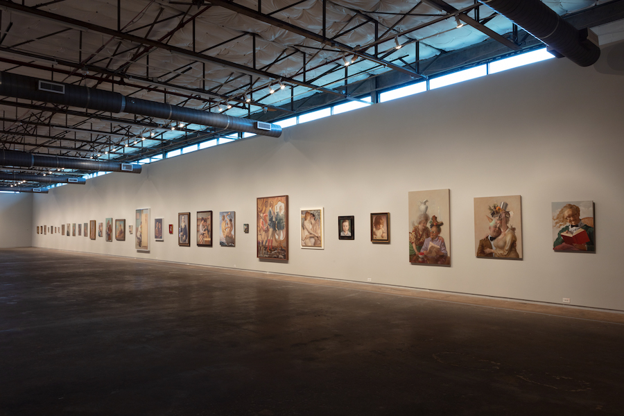
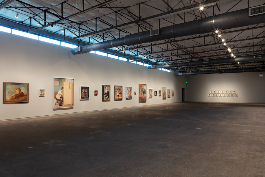
Installation view. Photo by Kevin Todora
It is entirely appropriate that Currin should borrow a title from Philip Roth’s novel for his show, because the arc of Currin’s career to date reads as much like that of a novelist as that of a painter. Currin’s more accomplished work, even at its most reduced, is usually multi-faceted and rarely didactic. The didacticism sometimes applied in the reception or interpretation of Currin’s work fails to accommodate its fundamentally absurdist position. The problem perhaps, is that there are times when Currin’s work returns to a more singular and rational position. This shifting position — from absurdist to less-absurdist — has confused critics over the decades. In a fragmented world with as many artists as viewers, there’s an understandable but ridiculous expectation that a given artist maintains the same position for their entire life. This is simply not possible. Friends and family die before you; things change. This superb exhibition sets out to reflect Currin’s journey during a period of modern history that feels as if it’s changing faster than we can keep up with.
Fleet-footed as he is, Currin seems trapped in his Americanness. This might be his principle anxiety, and from here all of his considerable painterly and non-painterly wit and intelligence springs forth. His possible dissatisfaction with American life has turned his eye for decades toward Europe, although the characters and the scenes in his paintings — however much they may be influenced by Fragonard, Cranach, or Picabia — strike me as unmistakably U.S.A.
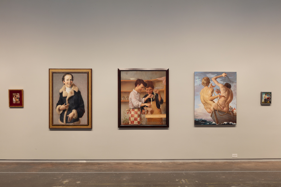
Installation view. Photo by Kevin Todora
Nonetheless, Currin’s paintings leave an imprint that suggests he’s skated back and forth across the last 500 years or so of painting as if on his own personal Grand Tour, stopping off pretty much everywhere: the Baroque, the Rococo, Botticelli, Cranach, Weimar Germany, Otto Dix, Max Beckmann, visiting with Picabia, Magritte, Whistler and Sickert, Hopper, Rockwell — and coming out the other end as an entirely unique item. There is no modern painter I can think of who touches Currin. He is a painter of real stature not because of the infernally lauded technique, but almost despite it. The work is complex, obtuse, dumb, clever, difficult, and rarely comfortable, and he’s shown courage both in this show and in his entire oeuvre. My Life as a Man holds its course through the life cycle of anxieties, and makes a roadmap of Currin’s self-steering, rakish progress.
Installation view. Photo by Kevin Todora
For Currin’s show, the Contemporary’s exhibition space is dimly lit like a Roman chapel, so that our eyes can more gently find the work. The paintings are arranged in the street-shaped gallery along the long outer wall, and are flanked opposite by a large selection of drawings (ranging from quick-jotted sketches to fully worked-up proper drawings). On the short end wall are the least interesting and most monosyllabic works in the show: the Jackass series (1997), which provide a moment of respite where you can switch your brain off for a moment, much like an uncalled-for intermission. These are a series of printed 1970s Playboy ads onto which Currin has altered in gouache the females’ faces to a consistent and sour disdain. These are, by now, tedious and simplistic; they tell us that the men depicted in 1970s Playboy-ad-world are a bit dumb. I think we all knew this, even in the ’70s, and certainly when he presented them in the 1990s. I suspect the Jackass works were more about indulging in the zeitgeist of 1990s nostalgia for the 1970s, which was very much a thing at the time. By 2002, the writer Michael Bracewell, among others, had called a timeout on “the age of irony.” Barring Anchorman’s late-in-the-day cameo, we were done with recycling comedic views of sideburns and golf pants and caveman sexual politics for the purpose of a retrospective and ironic orientation in order to try to understand where we might be landing in the present tense. As Bracewell put it, the idea of authenticity (whatever that might mean in art) was about to replace the idea of irony. This was a mostly London-based position, but it carried over to New York, too. Currin, at this time, in the fin-de-siècle moments leading up to the millennium, seemed impressed by London’s scene.
For the sake of brevity, I’ll skip the drawings, although they offer fascinating insight into Currin’s process, and some are exquisite in their own right.
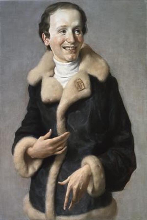
To begin at the beginning with the paintings, there are certain leitmotifs in Currin’s work that might be useful to list. Some are explicit, and some more implicit and not immediately obvious as motifs at all. With good reason, Old Guy (1994) is separated from the rest and put at the front of the show as a type of prologue, and serves as a useful cipher for the rest.
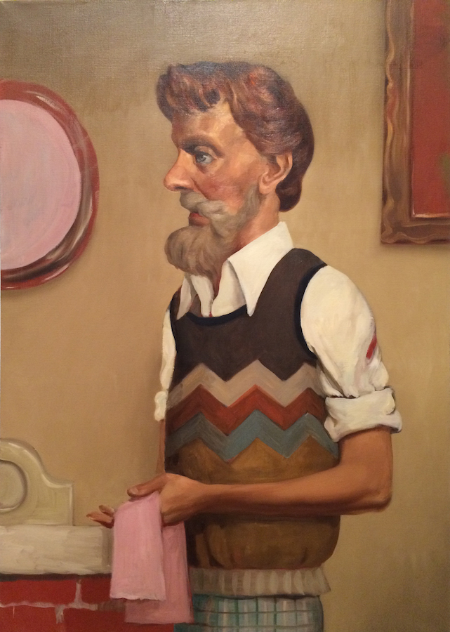
John Currin, Old Guy, 1994 (photo taken at show by the author)
Leitmotifs in Old Guy:
1. 1970s clothing that seems to emanate from charity shops. Currin’s characters are never in their own time. They borrow from other periods and other places, out of time and out of sync — like America itself. The sense of self is defined as being elsewhere and not there; otherness; the escape from, the stuck in; the claustrophobic fear that the great American landscape maps all too much onto the great American vacuity. As Currin got more successful, his characters’ clothes got more upmarket. But they remain out of their time. 1970s Man can flip to 1940s Man or 1670s Man while exuding the following traits: nostalgia, lostness, conservatism, searching, vulgarity, dressed by their mothers, effeteness, consumed by.
2. Fictive Space. Currin creates fictive space — it’s not the real world, it’s not cartoons, but it pertains to a sense of reality as defined by Currin’s trademark painting space. It’s not realism, it’s not surrealism, it’s not idealism (although it almost is at times). It’s psychologically astute and attentive, and its closest -ism may be existentialism.
3. Beards. In a 1990s panel discussion at London’s ICA, Currin was quizzed by a curator as to why he tended to paint mostly women. He answered that he found men very difficult to paint. His solution was to paint women, and then turn some of them into men. Hence the men’s giant dolls’ eyes and ridiculous Barbie lashes. What better way to signal ‘man’ than to slap a beard on at the end, even though this was out of sync with the fashions of the time. For younger folks reading now, you may not know that the 1990s was all about Jarvis Cocker, and Pavement, and Blur — none of whom had beards. Now everyone has a beard — even Currin — but those born in this century may not know this. Back in 1994, only 50-something men in Dallas who worked at ACE Hardware had beards. It’s possible that Currin’s 1970s Man, in his 1940s fictive Picabia-esque painting space, was sporting the 1940s beards of late-’40s Beatnik Man. But unlikely.
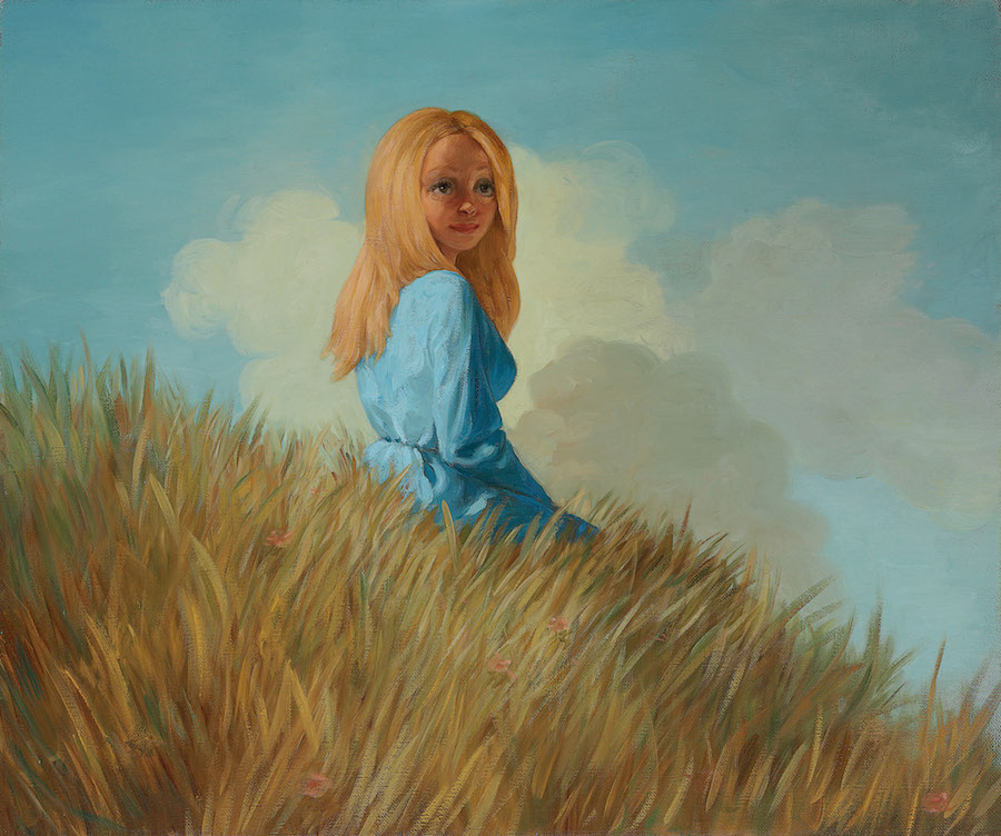
John Currin, Girl on a Hill, 1995
4. The intimate but uncomfortable relationship of materials to image: fabrics, oils, resins, solvents, space, color and depth. Currin is very particular about all these things. He’s the consummate painter-geek and quite the dandy artist. He had a giant book of Renaissance painting techniques in his lavatory at his studio that he’d pore over, as Feinstein once showed me. He’s a snappy dresser with an acute eye for objects, clothes, fashion, fabrics, underwear. The tooth of his heavy linens sometimes seems outsized for the scale of the canvas. Into this the paint fills the tooth like filler at times, over which new layers of paint are applied — dry brush in places, washed on here, impasto there, but always in layers. Think Titian. More often, the color in his interiors or hilly skyscapes has a sort of toxic feel, as if the paint and color replace any available oxygen; as if his characters’ nostrils are forever filled with linseed and turpentine that melts their lungs and the reflections from their eyeballs and finds their natural resting place in the liver. His painting Girl on a Hill (1995, not in the show) is remarkably similar to Fragonard’s In the Hay — the sky color and the golden grass is similar in both, and constitutes the real subject in both paintings. There is no air in either — only chemicals and unnatural color. Both are more about culture than nature.
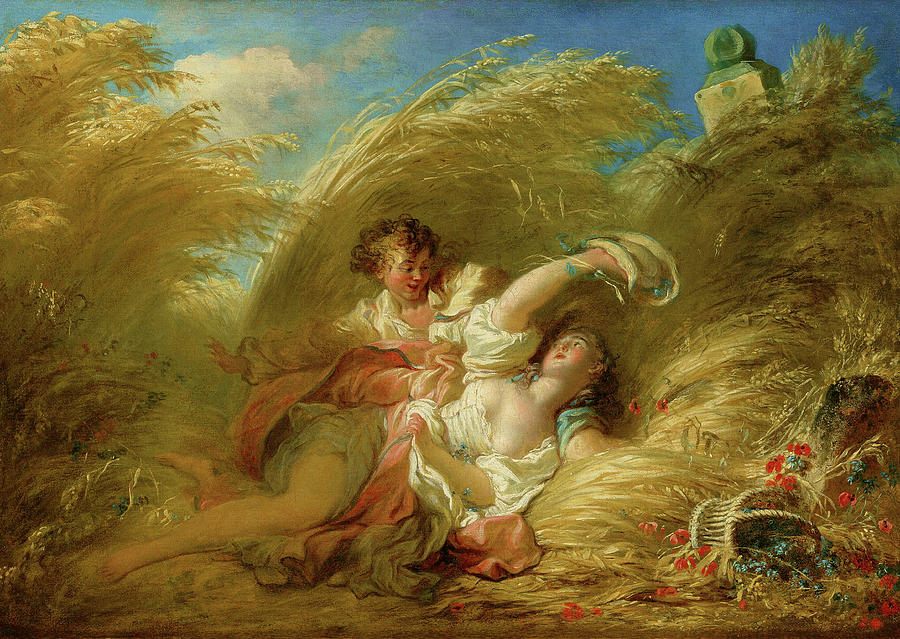
Fragonard’s In the Hay
5. Underpainting. Currin’s underpainting is not just for the sake of his ‘old master technique,’ but because it eventually (or soon) became an end unto itself and something that he constantly plays with. The underpainting in Currin allows you to sense the layering and veiling in his works, and vitally, allows them to appear unfinished. Unfinished-looking = Modern. The underpainting is what tantalizingly peeks out from the layer above. Currin’s later paintings (particularly at Gagosian LA recently) showed females mostly nude but exposing their naked bodies through sheer silks and chiffons. Paint layers might be seen as the canvas’ own clothing, as well as depicting clothes themselves. It’s also more erotic to see things partially, as anyone shopping for underwear knows. “Slipping glimpsers,” de Kooning called it.
In Old Guy, there’s a strong red that doesn’t belong on the upper sleeve of his shirt. It’s underpainting showing through, if I’m not mistaken — like a bra strap showing when it shouldn’t, the waist band of underpants or something. It’s there for you to glimpse in order to imply underneath-ness, and for you to only guess at. It’s a tease.
(There’s only one letter’s difference between “underpaints” and “underpants.” And then there’s the mysterious red streak — is it blood? Or paint? Old Guy is actually a murderer? Or he’s actually a painter? We’re not sure, but we know he’s concealing something. His beard betrays this.)
John Currin, Thanksgiving, 2003. Not in the show. This is almost certainly a triple portrait of Currin’s wife, the artist Rachel Feinstein
Underpainting: of course its purpose is to provide textural depth, a sense of time, and most important, a vibrance and luminescence of color. Have a look at the turkey in Currin’s painting Thanksgiving (2003, not in the show)— as with Ron Mueck, both artists have reserved their most chilling bravura moment of bringing art to life by depicting something dead: a 22-pound plucked fowl in Currin’s case, and a dead dad in Mueck’s.
However, in this case, underpainting also stands in for the bedrock layer of modern abstract American painting, which is probably the true unseen jumping-off point of Currin’s career. Underneath the shirts, the blouses and panties, under the flesh, the screens and the interior walls — is Brice Marden color; underneath is the history of recent 20th-century American art. You can’t properly understand Currin’s work if you don’t see it backward through this history of abstraction, because despite his reactionary bent, he knows he is indebted to all who preceded him. He’s not just fast-forwarding backward to Fragonard and Cranach and skipping the stuff in between.
6. Materiality vs light. In Old Guy, the glass and reflection in the mirror are rendered in the same pink paint off his palette as is the towel the man is clutching. How can both be the same pink paint? One is object, one is light? The towel, combined with the sideways anxious expression of the protagonist, suggests hand-wringing and washing, cleaning up, guilt, neurosis. Is the reflected light of the mirror telling us the man is trapped in a world of pink tea towels and domesticity? Or is the man clutching, metaphysically, a piece of acrid light that’s been woven into a mysterious magic fabric? Both, maybe? Does it need to make sense?
In Currin’s work, much is paradoxical, much is contradictory, and that which is unequivocally signaled at times seems equivocal. Some stuff is obscure and irrational. He presents multi-faceted and metaphysical painting gags, acute observations as well as enigmatic moments of divergence in passages of paintings that appear as vignettes within a bigger picture. There are plots and subplots, texts, intended subtexts, and inevitable unintended subtexts. The extent to which he doesn’t control the meaning is courageous, honest and real. For those who want it neatly sewn up, pasteurized and vacuum-packed, I’m afraid you need to turn away. There’s plenty of other art to look at, after all.
John Currin, Lovers in the Country, 1993
Moving on in some sort of order: the lined-up paintings feel as much a parade as a darkly comedic Best in Show. All are mutts, but some aspire to pedigree.
Lovers in the Country (1993) is a daring upshot of a composition featuring what are clearly Founding Father types — a middle-age bearded man with an eagle’s nose, looking quizzically and territorially to stage right, ever aware of potential intruders. His lover looks insipidly skyward — demure, coy and apparently in search of God and deliverance.
(Wherever you see the word ‘country’ in Shakespeare, there’s a very good chance it’s a pun on that oldest of Anglo-Saxon words. Whether this is intended here, I don’t know. My money is on yes. So Lovers in the Cuntry as well, possibly. Lovers of all things Cuntry. In a nice way.)
These are the pillars of society, parent figures, conservatives, frontier people, early settlers — distant puritans, even. The patriarch’s job was to provide, to lead and to defend; the matriarch to educate and provide religious instruction, morality, ethics, guidance, and to oversee family matters. These folks are, metaphorically and culturally at least, the loins from whence young Currin or his forbears must have sprung. We can imagine they have 19th-century American names that Will Forte once listed on a seemingly lost SNL skit: Jebediah, Horace, Ezekiel, Wilbur… . Is Currin happy with this starting point or not? Happy to paint it, that’s for sure.
The punchline in the painting — and it still makes me smile, if not laugh — is the massive toilet bowl of a pipe that the man’s massively strong hands clutch. The big hands, nose and cavernous pipe may suggest (according to folklore) some almighty wedding tackle beneath the cinnamon-colored, double-breasted coat. The man wears a Val Doonican 1970s crooner light-entertainment TV-host turtleneck, to remind us he’s out of his time and not real. Most daring, in a sense, is the boldness of the composition. There’s an acre of coat and a lot of pipe; the large patch pocket is as graphically important as a passage in a Diebenkorn. A great painting. I love it. The pipe seems empty. He doesn’t actually smoke, maybe? He’s a puritan. The pipe is just a prop, therefore. Maybe a weapon? In the words of Magritte, this is not a pipe.
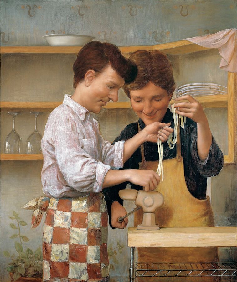
John Currin, Homemade Pasta, 1999
Next up: Homemade Pasta (1999). What a painting this is. It’s far from benign, and veers toward the sad more than it does the happy. At first look, we’re somewhere like Sagaponack, or upstate New York, or Connecticut, and Martha Stewart has personally gifted the vintage pasta machine. I first saw this painting in Currin’s Whitney retrospective, when it was still quite new. I thought it somewhat sardonic at the time. I’ve owned a couple of pasta machines in my life. I used each one one time only. It’s a lot of hassle.
Seeing the painting again in Dallas, I feel its purpose is not to poke fun (no more than any of his paintings, at least), but describes things that might be missing. The two figures have large heads, like boys who became adults too early and their bodies never got up to scale. This is the opposite of Bellini’s infant Jesus, where the body-to-head proportions of the baby are that of an adult.
The figure at left is Kennedy-like in appearance (most of Currin’s men seem to descend from the Irish or from the German-Czech border). However, the man in question here may be Irish-American; he seems to dye his hair to give it a dark henna hue. The two men are jointly absorbed in the new gadget. The machine. Homemade Pasta, in this instance, is a rare occasion where Currin depicts a machine as a central image. He doesn’t usually directly paint the modern machine-made world, because hand-made objects lend themselves better to hand-made paintings; look at the ellipses on the water jugs in Velázquez’s The Waterseller of Seville. Talk about a painting opportunity! Same with Currin’s aforementioned mega-pipe.
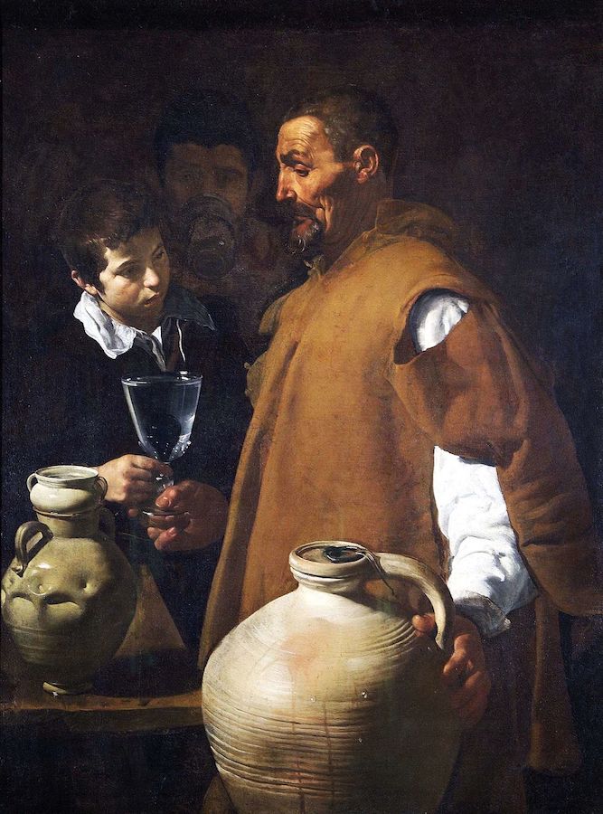
Velázquez’s The Waterseller of Seville
It’s hard not to recall the celebrated scene in the Odd Couple between Jack Lemmon (the enthusiastic cook and house-keeper of the partnership) and Walter Matthau (the grumpier opposite), when Lemmon sits down to eat his linguine after a spat. Pasta-philistine Matthau thinks it’s spaghetti, which induces a wry laugh from Lemmon, leading to Matthau launching the plate of pasta at the kitchen wall.
Seeing the painting again, it seems to be an allegory for the semi-futile current obsession with authenticity. Authentic pasta is like authentic art. Ironic pasta doesn’t exist. Look closer though, and the painting gets weirder. Pasta machines tend to be stainless steel or chromium these days, but this one isn’t. While the Metro shelving system of the kitchen island is entirely recognizable, the pasta machine’s brand seems obscure or made-up (older pasta machines may well have been stove-enameled in 1940s colors). Currin’s machine, through no accident I sense, is dildo pink. The machine becomes some sort of proxy or surrogate, and while one man cranks its handle, the machine extrudes the strands of tagliatelle in an ejaculatory trajectory (and both the late Jack Lemmon and I could assure you that this is tagliatelle, and not fettucine — there is a difference). The loving couple hold the pasta high above the work-station in awe of their creation, much like the shepherds surrounding the nativity. They hold the pasta aloft, as if it’s something umbilical that attaches to nothing. It is a kind of immaculate conception. The pathos in the painting might be the suggestion that there is something missing here. For me, there is a sadness in it, despite the men’s apparent mutual delight.
To make the painting weirder still, the painting has a gratuitous subplot separate from the main event: the white and red checkered apron — more explicit Underpainting. And a lot of it. The apron’s pattern is atop a mid-blue-green-gray undercoat, to support the strong reds. The checks are by far the most impasto part of the canvas which is otherwise smooth. The man’s apron suddenly becomes a cutaway visit to a Chelsea gallery (maybe Anton Kern’s?). These are Baselitz checks — heavy paint, a European import — and along with the odd dildo-colored pasta maker (which in turn might be a reduced metaphor for an incubator of sorts), the whole scenario suddenly seems more about art production.
All of this is Currin non-sequitur par excellence. I believe this is how Currin’s brain works, how his humor plays out. Here they are in domestic bliss, Chablis chilling, but the guy with the henna-ed hair has a Baselitz wrapped around his waist. It’s absurd, it’s out of nowhere, but it makes perfect sense. Currin showed some mercy to the viewer here, though — he could have selected a Sean Scully to wrap around the cook’s waist.
One other thing. The figures might also stand in for Currin and his friend and old studio and gallery mate, the artist Sean Landers. They’re gleefully cranking out dough: money.

John Currin, Fishermen, 2002
The same theme may be present in Fishermen – a painting, along with The Producer (see below), that I was lucky enough to see in progress in Currin’s Chelsea studio in 2002. Feinstein, Currin’s artist wife, was showing me around it, since I’d recently moved to New York and I was trying to find a studio. She insisted I see Currin’s studio even though he wasn’t there. “Are you absolutely sure?” I kept asking, acutely nervous that I was gatecrashing his inner sanctum. Once I was inside, I knew right away that he’d made a quantum leap forward with the work. I actually think The Producer is the greater of the two paintings, but Fishermen seemingly marked a milestone in Currin and Landers’ young careers, where the two studio mates had to find their own separate spaces. Currin warned me (I’d been in a parallel situation in London with my ex, the painter Fiona Rae, and studio mate, painter Gary Hume) that the loneliness of being on your own in the studio takes a lot of adjustment.
Fishermen, then, is more clearly Currin and Landers — both strapping and handsome young men, sitting on the wrong end of the boat, looking back, Caspar David Friedrich-like into the seascape, their muscular physiques a touch homoerotic, somewhere in between Caravaggio and Michelangelo. The position of their backsides extends far enough over the boat’s gunwale to expose a builder’s-butt amount of arse-crack, in a Rockwell-esque moment of populist humor. The sea is painted terribly, like a blind man did it. The men seem like they must be the first disciples, Peter and Andrew. They have a magnificent catch of big and varied fish, all with mouths greedily gaping. Their catch for the day.
The fish might be their collectors — sucking up, reeled in, desperate to acquire a painting. Meanwhile, Landers is casting his net again, but he’s about to net himself. They’re the fishers and the fished. At this point in his life, Currin was about to shell out for his first big mortgage. He told me he was nervous about it and that his paintings might not keep selling. In the top left of the painting, blithely filling the space between Currin’s head and the frame of the canvas, is an intruder in the form of a seagull, heading downward. The gull is oddly uninterested in their catch. Because it might not be a gull at all. It might be Icarus crashing earthward.
This is one of Currin’s catchier but more obviously allegorical paintings, and its crowning glory is the timeless one-liner of the bearing of their butt cracks to the art world as an act of defiance. Hard not to like that one, even though along with The Dream of the Doctor, it flies dangerously close to Norman Rockwell’s sun.
John Currin, The Producer, 2002
Moving on: the Velázquez-grade The Producer. I thought this the finer of the two paintings at the time in his studio, and I haven’t changed my mind. It’s not just the beautifully painted fur lining of the coat that brings Velázquez to mind — it’s because Currin was finding a way of making a fictitious latter-day nobleman to mildly deride. Again, a possible/probable patron figure — a figure of evident power and position. His crisp white turtleneck might stand in for a 17th-century ruff, while his fine-but-thinning hair suggest the air of aristocracy, as do the tapered, long fine fingers and mannered hand positions.
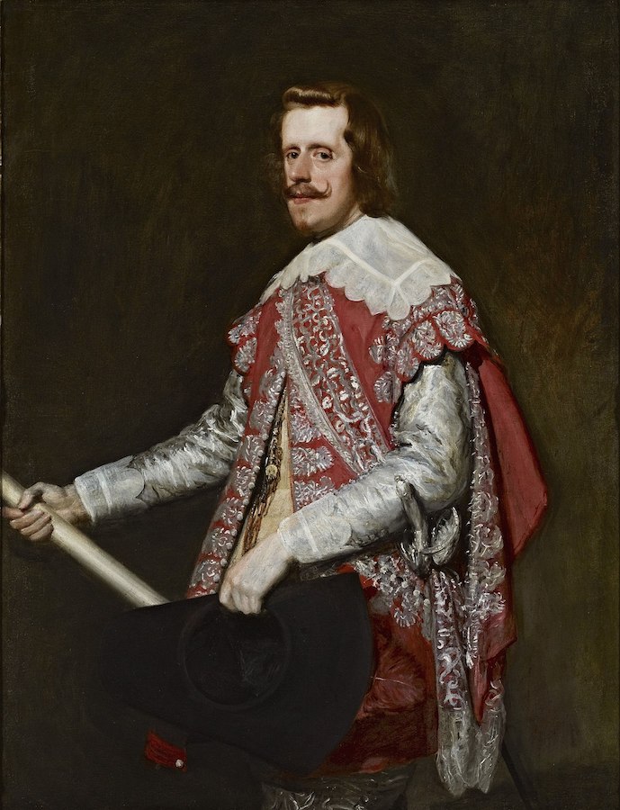
Velázquez, King Philip IV of Spain, 1664
As with Velázquez’s flattering yet quietly critical portraits of King Philip of Spain, there is unequivocal grandeur here, but a sense that the artist has retained a position of power and self-regard in the hierarchy of patronage and has not entirely fawned his way to the bank. The Producer has shiny, scrubbed, fine skin and rouged cheeks — someone vaguely royal and from a protected life. His high forehead and small back teeth nervously exposed in an effete smile remind me of an un-Martin Amis, worried about crumbling teeth and thinning hair, but one lacking, perhaps, the artist’s incisive wit, criticality and actual talent. It’s one of the simpler paintings on display, but I challenge anyone to show me a 21st-century painter who’s managed to nudge up so close to some of the great European painters of the past. What a terrific painting this is.
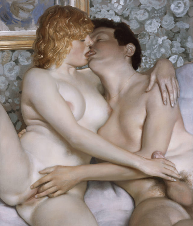
John Currin, Deauville, 2007
Next along is a painting of two lovers in a mutual naked embrace. It’s difficult to say anything about this painting and in a sense, nothing needs to be said. I had to fight down the beginnings of an erection on my first visit — that’s how good the painting is. Thank god not that many people come to the Contemporary on a weekday afternoon. The painting defies expectation. With its iridescent skin tones, this is ironically, perhaps, the most tender and straightforward (along with the paintings of his children) of the paintings in the show. Currin’s pining over the seemingly more adjusted European approach to sex and pornography seems to have finally found resolution in his psyche in this painting. It’s a fantastically erotic painting, off-set beautifully by the slightly more violet bed linen. Wow.
In the final three paintings of the lineup, the show moves toward old age, retirement, and perhaps the threat of senility, in what one presumes are depictions of Currin’s parents, or himself projected into old age. I know Currin recently lost his parents, so it feels inappropriate to dwell, except to say that these are very serious and touching paintings. The objects (that aren’t in actuality) on their heads speak of a life gone by. The man and woman become the plinths and armatures for the still lives that we all eventually become.
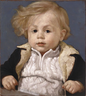
John Currin, Francis, 2005
Finally, there’s a wonderful painting of Currin’s son Francis, which he’s bookended the show with, but out of chronological sequence and placed at the beginning of the parade. The boy is adorned in a princely but miniaturized Producer coat, replete with fur lapels, and a cable-knit sweater beneath — another opportunity for Currin to get his painting chops going — the young boy with his golden hair holds his elbows back in expectation, his hands reach tentatively forward over a table top by means of practicing a subtle but conventional repoussoir. His large irises offer no reflection, and the closer-than-expected set of his eyes suggest a certain wisdom — reminiscent perhaps of Rembrandt’s, whose eyes still feel like they know more about us than we about him. The boy’s large, dark pools for eyes are not sentimentally puppyish in this instance. They don’t reflect back the world in the manner of a John Donne conceit. The boy sees out only. He’s still an innocent. He sees out but his dad reserves the right not to reflect the world on the surface of his son’s eyes.
My Life as a Man is a platinum-level, diamond-studded, once-only-in-Dallas experience, and kudos to the Contemporary for bringing it here. It’s a magnificent exhibition.
On view through Dec. 22 at the Dallas Contemporary

1 comment
A brilliant painter. I have been admiring him for the last 20 years as I stumble along getting my own inventory of paintings built up at a very late stage in my life. He is a great inspiration for me. A true Master Currin is