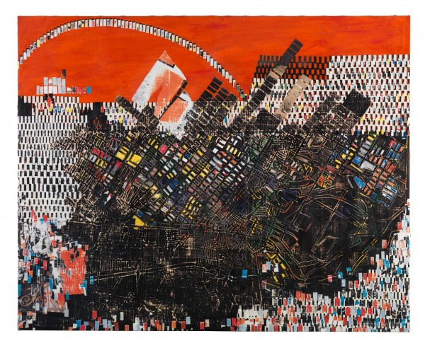
Mark Bradford, "Scorched Earth," 2006. Billboard paper, photomechanical reproductions, acrylic gel medium, carbon paper, acrylic paint, bleach, and additional mixed media on canvas, 94-1/2 x 118 inches. Collection of Dennis and Debra Scholl. © Mark Bradford
Every writer has her biases and I’m no exception. If someone were to ask me if Abstract Expressionism were my favorite art genre, I would vehemently shake my head “no.” So it surprises me that I’m having such a lovefest with the expressive work of L.A. artist Mark Bradford at the DMA. In fact, this infatuation is rather embarrassing, as well as frowned upon in some uppity critic circles. So I won’t pretend that this is an objective review. However I will attempt to explain why his work is so amazing. It boils down to Ambition, Process, Technique, Content and Humor, a.k.a. APTCH.
Ambition—This one is obvious when you look at the voluminous amount of large-scale work that Bradford has churned out over the past decade. There’s a good reason he won the 2009 MacArthur Foundation Genius Award.
Process and Technique–This man is O.C.D. in the best possible way. Bradford’s multi-layered collaged works are very labor intensive. His process is simultaneously additive and subtractive. He methodically paints, adding layers of billboard paper, newsprint, carbon paper, string, photocopies, acrylic gel medium and sometimes bleach. Then he strips away layers to reveal what is hidden beneath the surface. For example Scorched Earth (2006) resembles a topographic aerial view of a city. It refers to the infamous 1921 Tulsa race riot in which more than a thousand homes were destroyed and dozens if not hundreds of people were killed, but it could reference any urban wasteland.

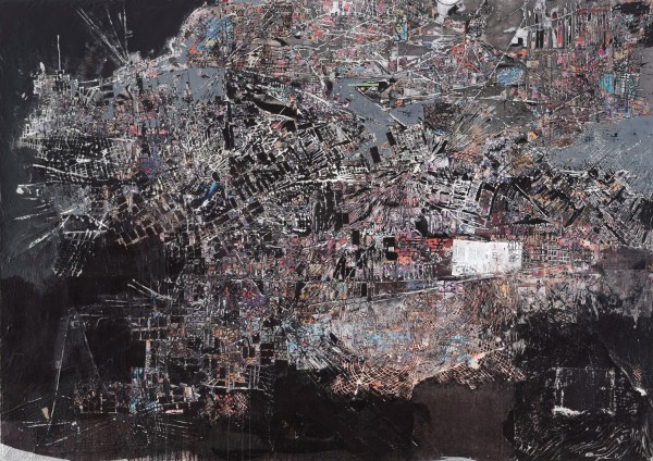
Mark Bradford, "A Truly Rich Man Is One Whose Children Run Into His Arms Even When His Hands are Empty," 2008. Photomechanical reproductions, acrylic gel medium, comic-book paper, carbon paper, acrylic paper, caulking, and additional mixed media on canvas, 102 x 144 inches. Collection of Marguerite Steed Hoffman. © Mark Bradford
Content—While Bradford seduced me with his process and technique, the big L occurred when I discovered his masterful way of weaving in content. He uses titles to introduce his conceptual framework. Works such as Your No Body (‘til Somebody Kills You) (2009), Thriller (2009), Potable Water (2005) and Is This Child Yours—DNA Testing (2006) address issues of urban poverty, racial discrimination and social injustice. The content is subtle and allows the viewer to reexamine the works with a fresh perspective.
Humor—You have to love a guy who uses hair salon permanent wave wrappers in his work. Unfortunately one of my favorite Bradford works was not on display. It’s a performance video of the artist, dressed in a Lakers jersey and antebellum hooped skirt, playing basketball. He falls and almost can’t get up. But in his words, “I always make the shot.” You can see this work on Bradford’s Art21 episode.
I’m asked all the time about the secret to “making it” in the art world. Young artists take heed—APTCH is all you need, and Mark Bradford has it in abundance.

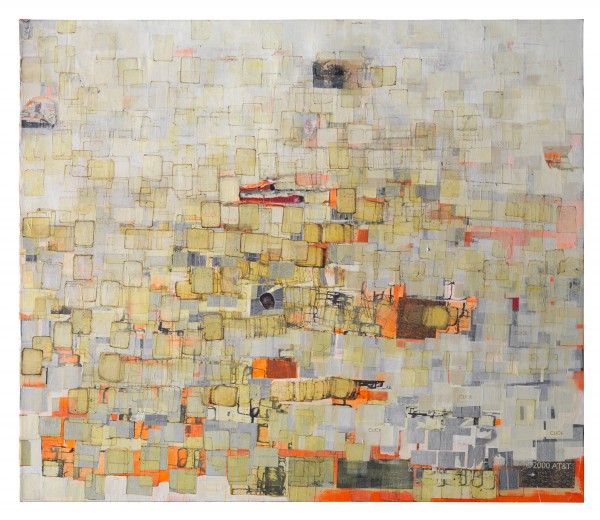
Mark Bradford, "Strawberry," 2002., Photomechanical reproductions, acrylic gel medium, permanent-wave end papers, and additional mixed media on canvas, 72 x 84 inches. Collection of Barbara and Bruce Berger. © Mark Bradford
Mark Bradford
Dallas Art Museum
October 16, 2011–January 15, 2012
____________________
Multi-media artist Colette Copeland recently relocated to Dallas from Philadelphia. She writes for Afterimage—Journal of Media Arts and Cultural Criticism and Ceramics: Art and Perception Magazine. Her work can be found at www.colettecopeland.com.


5 comments
I have not been so taken by art in years. Loved the show!
hes the real deal but im not sure everyone needs to know about him being a hairdresser.
Ricardo,
His mother owned a beauty salon and he speaks about how he learned calligraphy and was in charge of making her pricing signs. He cites that as a major inspiration/formative experience in using signage/ads/text in his work. He’s putting it out there, so I’m not revealing anything that’s not already part of his public persona. Check out his art 21 video online. http://www.art21.org.
ok thanks cc
Great response to a great show. The exhibition also has a terrific website:
http://www.pinocchioisonfire.org/