
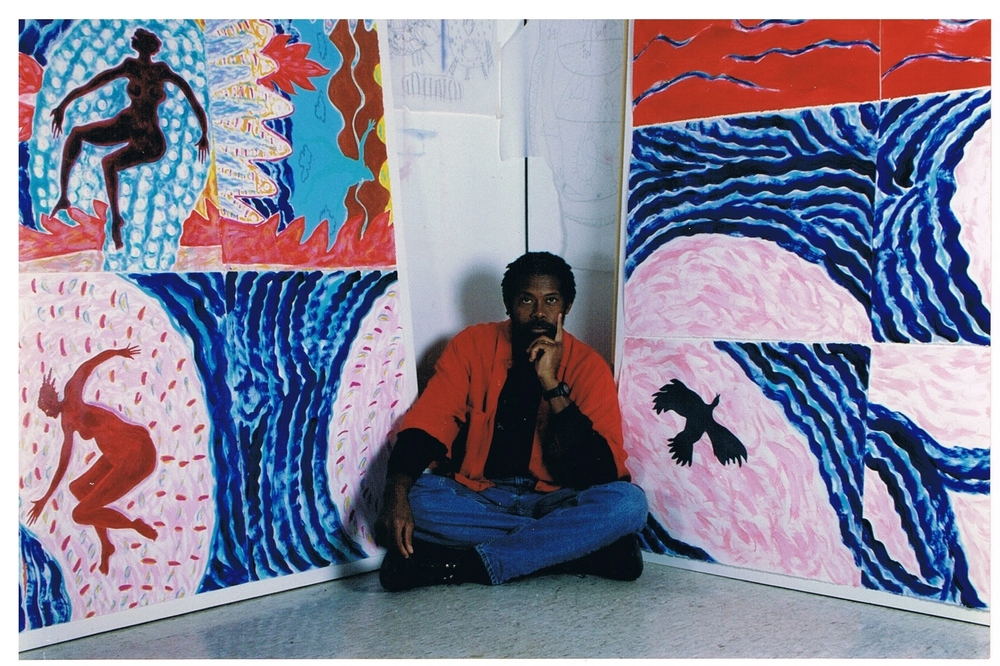
Newsum in his studio. Image from www.floydnewsum.com.
The Floyd Newsum survey at University of Houston Downtown’s O’Kane Gallery is an unusually complete and generous overview of an artist’s life’s work. I say “unusually” because the O’Kane Gallery is not a large space. A complete retrospective of Newsum’s work would have required a larger space, and I hope we see it someday. But until then, this show is a good primer of Newsum’s range. It includes some of his earliest work, including highly rendered, realistic paintings from the early ‘70s when Newsum was still a student. Newsum got his MFA in 1975 from Temple.
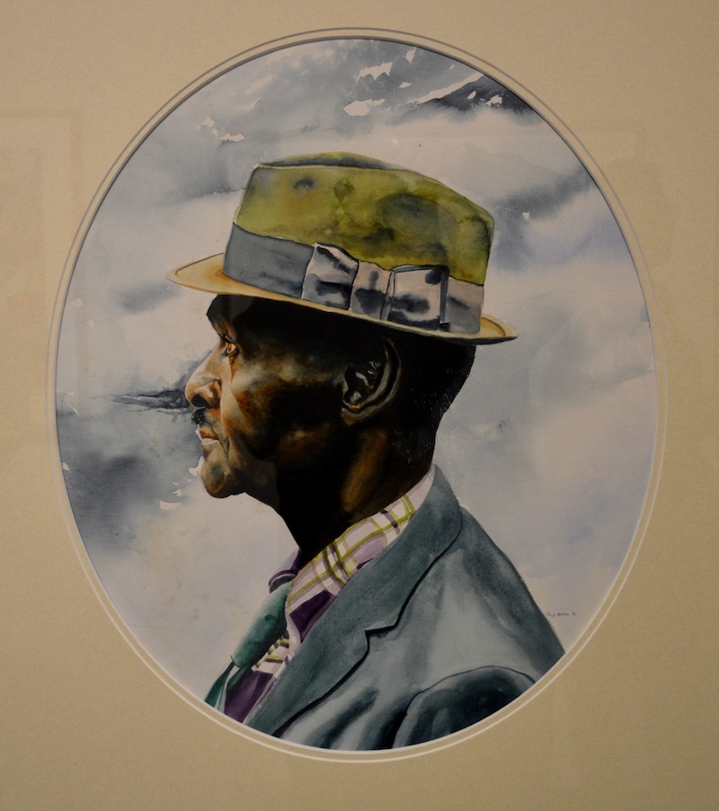
Reverend, 1972, watercolor
Some art lovers believe that artists, once they find their audience, shouldn’t change their style. Newsum has ignored that advice all his life. (He didn’t have a critical or a collector community that he had to please — he’s been been teaching art for 41 years and has had a steady job at UH Downtown since 1976.) His early realistic portraits soon gave way to a more surreal approach, which in turn has grown more expressionistic over the years, and more abstract. One of the pleasures of this exhibit is seeing Newsum’s evolution over decades.
At one point, Newsum left realism behind and started producing paintings that were set in complex, indeterminate spaces, that were rich in color and featured a set of personal symbols. If your paintings are effectively surreal, as Newsum’s became, you also invent your own symbiology, and while symbols in surrealist paintings don’t always have clear meanings, they aren’t necessarily puzzles or rebuses to be solved, either — not even by the artist. The symbols in surrealist paintings are, by design, more private, personal, and sub-conscious. Magritte may have had something specific in mind when he painted a bowler hat, or de Chirico when he painted a tailor’s dummy, but what those meanings are — if they even exist — is not something I intrinsically know.
Like de Chirico, Newsum has used a tailor’s dummy in his work, and in Newsum’s case, the dummy is of a woman’s shoulders and head. He started out using these as substitutes for the live models he had been employing; the mannequin started appearing in the late ‘70s in paintings and drawings.

Mannequin and Two Women, 1979, gouache on paper
But the mannequin didn’t merely take the place of individual female models. It became for Newsum a symbol for all women. He wants it to represent the strength of women, individually and collectively — a repeated theme in many of his works. One could infer other meanings, of course: A dummy is a mute thing, without agency. An object. Which is the correct interpretation? The artist has stated that the former interpretation was his intent, we should likely defer to him, but as Jorge Luis Borges wrote in the forward to Dr. Brodie’s Report: “All words, all pages, predicate the universe, whose most notorious attribute is its complexity.”
Some of Newsum’s symbols come from his own life. Many of his paintings include depictions of ladders, sometimes drawn and sometimes added as collage elements. Newsum’s father was the first black firefighter in Memphis, so the ladder has an autobiographical element, but it’s also about hope and survival. In Newsum’s work, fishes and birds symbolize freedom and a way out. A fish appears in Entrance and Exit (1987-88). When Newsum began working on the idea that became the painting, he was working at the Studio Museum in Harlem, and his original concept was to show African Americans addicted to heroin. But the final painting is more a depiction of life in the city — buildings, people walking, the river. The inclusion of the hopeful symbol of the fish perhaps recalls his original, darker subject matter.
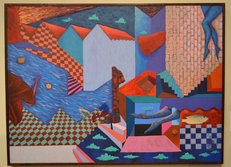
Entrance and Exit, 1987-1988, acrylic on canvas
Newsum uses this private, personal iconography, but he’s still very much an artist of the world. As with Entrance and Exit, the painting Night Screams: Red Clouds Roll Over South Africa is topical. The current Houston show displays both a preliminary drawing and the final painting, and the drawing is extremely tight. It appears to have been completed — the last step — just before the painting was painted. I would have liked to see even more preliminary sketches, where Newsum was working out his visual ideas, but to include them would have required a larger exhibit.
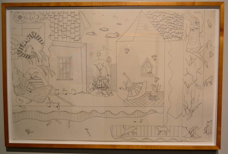
Study for Night Screams: Red Clouds Over South Africa, 1989, graphite on paper
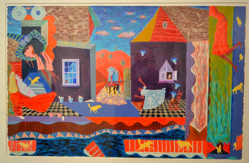
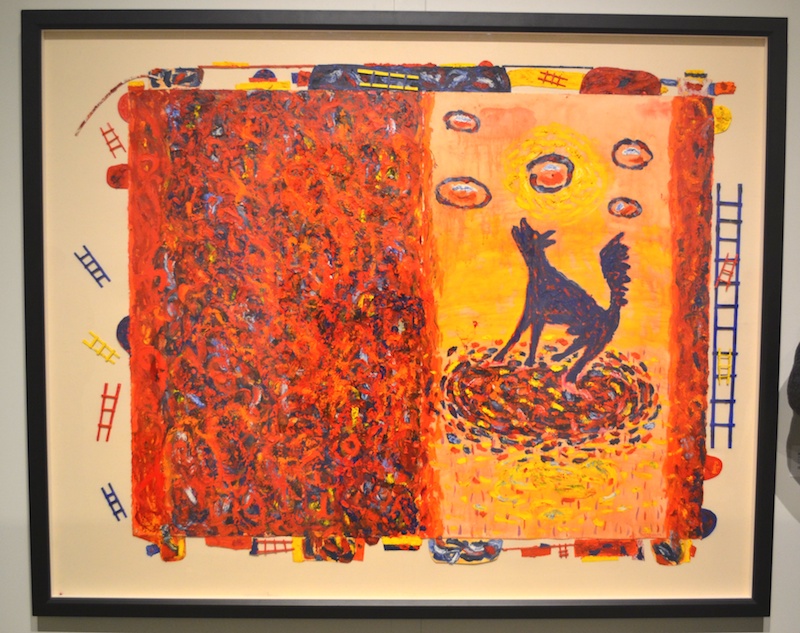
Night Screams: Red Clouds Roll Over South Africa, 1989, acrylic on canvas
One key element in Night Screams are the dogs that appear in yellow silhouettes throughout the painting; Newsum describes these as symbols of the cowardice of the government of South Africa, but from the point of view of someone who’s watched his career unfold, they’re also the beginning of a remarkable series of dogs. They started yellow, then turned blue. Newsum’s blue feels intense and personal, and appears in so many of his works that it’s almost a trademark, the same way that yellow was for Beauford Delany, an artist who influenced Newsum. In some paintings, Newsum covers up the blue with orange, its color-wheel opposite. These paintings veer towards pure colorfield abstractions, although they’re never completely abstract. He always reserves some part of the canvas for representations of things, often added as collage elements.
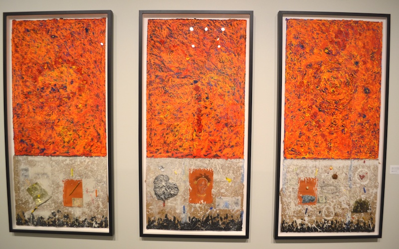
What’s Your Primary, 2010, acrylic and oil with collage elements on paper
What’s Your Primary is made up of three orange rectangles, though this triptych originally had four parts. (Newsum sold one.) A close examination of this three-quarters-of-the-whole shows that beyond the large slabs of color, there are collage elements, including a highly rendered portrait of a girl and a dollar bill. An an even closer examination reveals that the orange and yellow marks lay on top of a thick blue impasto.
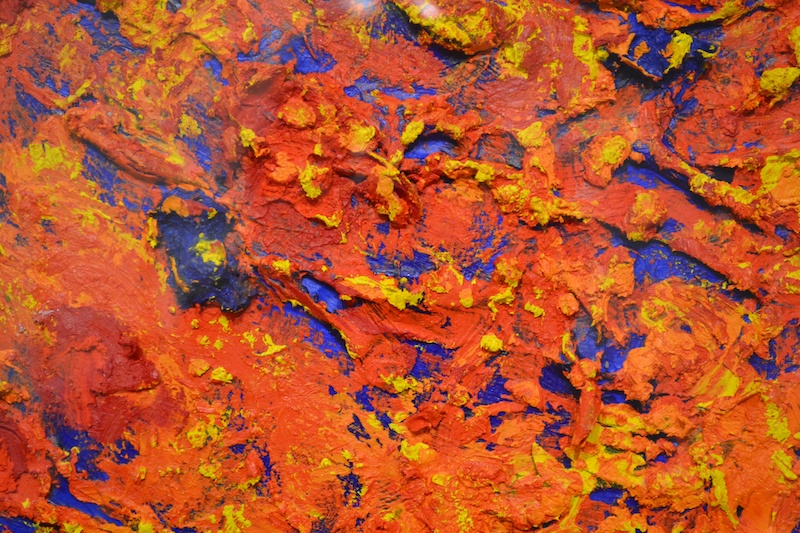
detail of What’s Your Primary
The primary is blue; it’s peeking out from beneath the orange and yellow on top, and the thick, frosting-like impasto on paper is bold—the paint must be quite heavy. I’m surprised that the paper didn’t rip under its weight. It reminds me of some work by Michael Tracy I had seen in 2016, where he too swirled yellow and orange pigment into a thick impasto relief on paper. But Newsum, by including the partially visible blue underpainting and including the collage elements, has created something fundamentally different. The Tracy paintings were objects; What’s Your Primary, despite an insistence on its own physical presence, carries meaning beyond its objecthood.
That effect of orange-over-blue underpainting is used again in Blue Dog at Sunset (2012). The symbols are there (ladders, the dog), but through this painting, one can deduce that the orange-over-blue structure of What’s Your Primary may represent sunset — the crepuscular moment where the sky goes from orange to deep blue. And the dog, not yellow but blue, is a benign symbol here.
Blue Dog at Sunset, 2012, oil and acrylic with collage elements on paper mounted on canvas
Newsum’s voyage toward abstraction didn’t end there. The show includes two paintings from his Sirigu series. Sirigu is a town in Ghana famous for its painted houses. There, women are traditionally in charge of painting buildings, and do so with vigorous, mostly abstract designs. Newsum refers to a book called African Canvas: The Art of West African Women as inspiration. But unlike the bold geometric designs found on Sirigu’s walls, these paintings offer a gestural, all-over abstraction. There are Newsum’s usual collage elements, which focus the eye, but when viewing these paintings in person, you feel the little ladders and houses fade away. The viewer—this viewer, at least—is subsumed in Newsum’s oceanic swirl of colors.
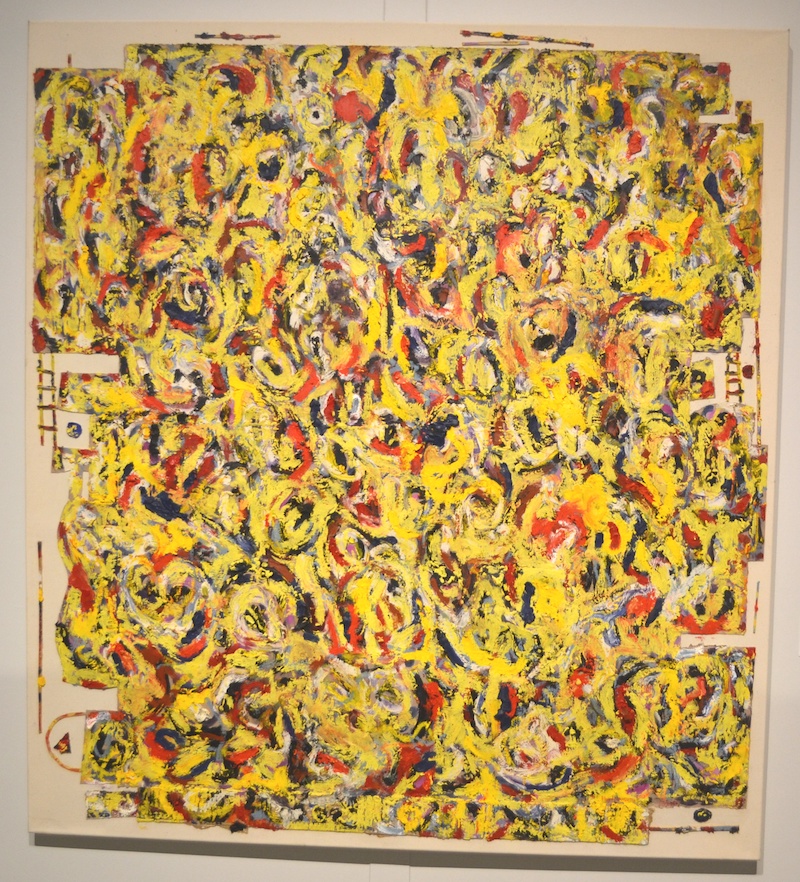
Sirigu: Yellow Passion, 2015, oil and acrylic with collage elements on paper mounted on canvas
Sirigu: Yellow Passion has a specific inspiration: a painting by Delaney. As mentioned above, Delaney is famous for his use of yellow in his paintings, but perhaps more importantly, his ouevre seems in some ways to prefigure Newsum’s, in that Delaney moved so easily between abstraction, realism and stylized figuration.

Maquette for Planter and Stems, 2002-2003, painted stainless steel
The UH exhibit also includes maquettes for some of Newsum’s public art pieces. One of these works is Planter and Stems (2003), the finished work which can be seen from the Red Line train in downtown Houston. At first glance it appears totally abstract. When I first saw it, it reminded me of the New Wave furniture designs of the Memphis Group in the 1980s or, say, Fiorucci advertisements of the same era. A fun, slightly wacky sculpture. But knowing what we know about Newsum, it’s not surprising that every element of the sculpture is, in fact, symbolic.
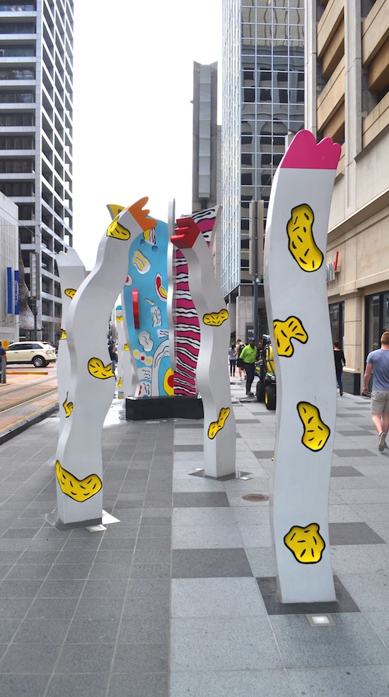
Planter and Stems downtown
The center section—the planter—is meant to represent the entrepreneurial class of businessmen who built Houston (think Jesse H. Jones) while the surrounding stems are the small- business men who helped. Knowing this, for me, adds nothing to the consistent and considerable pleasure of seeing Planter and Stems.
Some of Newsum’s work, especially his drawings, may remind some viewers of the work of Jean-Michel Basquiat. The similarities are there, but are superficial. Basquiat’s drawing seems much more emotional than the controlled, self-possessed drawing of Newsum. And Newsum’s life as an artist is utterly different as well — compared to the incandescent Basquiat, Newsom has been a slow-burning flame. Newsum has taught generations of students, steadily produced a huge body of work, and tithes a portion of all his art sales back to his church. As an artist, he is about as solidly bourgeois as one can be. And that’s part of his mystery. We often expect artists to be bohemian and restless and subversive, and we think that can help us make sense of what sometimes seems uncanny about their work. When confronted by an artist like Newsum, whose work is filled with deep, personal magic, it seems miraculous that this nice, mild-mannered professor has produced it all.
On view through March 29, 2018 at University of Houston Downtown’s O’Kane Gallery

3 comments
Who organized the exhibition?
It was organized by Newsum and O’Kane curator, Mike Cervenka.
Great review.