

When Richard Serra’s drawing retrospective opened at the Menil Collection, it was SERRAPALOOZA. Throngs of people congregated at the Menil, many of us on the outside lawn in festival fashion, to hear Serra in conversation with the Menil’s Michelle White, one of the exhibition’s curators. Having just spent the last few months working with the artist Joel Shapiro on his new installation at Rice University Art Gallery, it was interesting to hear Serra speak a similar language as Shapiro, but with very different ideas about color and process. Also, soon after seeing Serra’s exhibition, I went to The Museum of Fine Arts, Houston and saw an exhibition of paintings from the 1960s to the late 2000s by Jules Olitski. These exhibitions provide a rare opportunity in Houston right now to see a sculptor (Shapiro), a draftsmen (in this instance, Serra), and a painter (Olitski) navigating the terrain of space, scale, form and color in radically different ways. It is also a chance to see work from each artist that you may not be as familiar with: Shapiro’s recent move toward installation, a broader survey of Olitski’s paintings, and Serra’s lesser known work in drawing. (You can also see Shapiro’s drawings and sculpture in a beautiful show at Texas Gallery.)
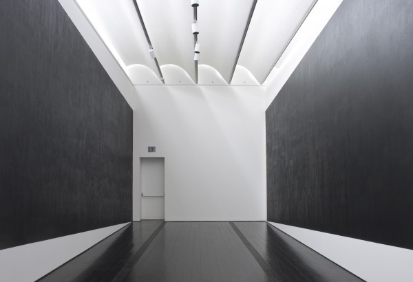
Richard Serra, "Two Corner Cut: High Low (2012)," The Menil Collection. Photo © Hester + Hardaway Photographers. Fayetteville, Texas
Serra’s drawing retrospective covers forty-some-odd years and shows how he found a form of drawing independent of his sculpture, yet one that still explores his basic interest in scale, weight, balance and spatial perception. For part of the exhibition, Serra and the curators have transformed one of the galleries of the Menil into a high-walled labyrinth of small spaces. These white cubes were largely designed to become containers for what I found to be the most interesting work in the show, Serra’s “installation drawings” — dense fields of pure black paintstick on cut linen, stapled directly to the wall. Serra’s placement of these drawings keeps everything in tension through their distance from the floor or their relationship to the edge of the gallery walls. In a drawing done specially for the Menil exhibition, Two Corner Cut: High Low (2012), two large, tipped rectangles nearly cover two parallel walls. The title describes the exact action taken to create the piece where Serra cut a corner of each rectangle, one “high” in the top left corner of the gallery space and one “low” in the bottom right corner. The floor appears to incline as you look into the room. As you walk to the end of the narrow room and look back, the floor appears to slant down. It is as overpowering and disorienting as Serra’s best sculpture.
Whereas Serra’s weighty black voids delineate space by anchoring themselves to the floor or ceiling, Joel Shapiro’s installation at Rice Gallery uses colorful lines, shapes and forms to seemingly defy gravity, despite being physically anchored by taut cord that stretches from each wooden element to points on the ceiling and floor. The painted beams, planks and boards appear to be momentarily halted as they float and twist. Walking through the installation, I always get the feeling that if they were snapped free, each piece would continue its individual trajectory, unfrozen from its state of arrested motion.
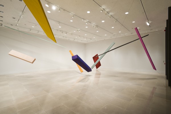
Joel Shapiro, New Installation, 2012, Rice University Art Gallery, Photo: Nash Baker © nashbaker.com
While Serra’s heavy voids have the tendency to contract space and suck you in, Shapiro’s installation shows how space can be opened and activated with color, line, and form. Serra made it clear in his talk that he did not trust the “emotional weight” of color, implying that it obscures the essential qualities of form and structure. In his installation, Shapiro balances this emotional weight with form and structure to create something that seems at once joyful and rigorous. Shapiro puts it best in a film by Mark and Angela Walley when he says simply that he hopes to make “lively” work. Compositionally and spatially, it seems as if Shapiro’s installation could potentially work without color, but color adds rhythm as the individual parts of the installation change and reconfigure as you walk through the installation and view it from various angles.
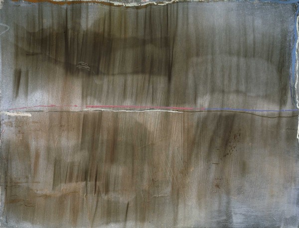
Jules Olitski, Greek Princess - 8, 1976, Hirshhorn Museum and Sculpture Garden, Smithsonian Institution, Washington, D.C., Museum Purchase, 1976 Image © Estate of Jules Olitski/Licensed by VAGA, New York, NY; photo Lee Stalsworth
If Shapiro synthesizes color with form and structure, Jules Olitski seems to wish he could revel in the atmospheric, “emotional weight,” or better put in Olitski’s case, weightlessness of color. In the exhibition at the MFAH, the artist’s famous “spray paintings” are flanked by his early stain paintings and his later work, in which he built up the surface of the painting from somber washes to shiny, opalescent hues and finally dense pools of opaque color. Akin to Serra, Olitski lets process shape his pictorial forms, or in Serra’s words, “the how” leads to “the what.” Standing in front of a spray painting, there are tiny dots and speckles as gradients of atmospheric color slowly shift. In many of the spray paintings, thin bands of heavier paint are set along the edges of the canvas, which seem to reassert the frame and keep them from being boundless fields. Compare the experience of standing in front of an Olitski canvas to one of Serra’s more obstinate rectangles. Like Serra’s voids, the color fields can draw you into their depths, as in Olitski’s Goozler (1969), a 15 x 8-foot rectangle of deep purple and black that feels a bit like staring into an image of the cosmos or a galaxy.
Olitski’s paintings, Serra’s drawings and Shapiro’s installation show three artists using abstraction toward very different ends. Serra seems only interested in the raw matter and concrete impact of scale and material. Any feelings of emotion or transcendence a viewer might feel when subsumed is not part of his intention. Contrasting himself with someone like Rothko, Serra put it bluntly: “I am secular.” Olitski is a Rothko descendant and explicitly interested in the transcendental, going so far as to talk about inspiration as “forces working through him.” Shapiro is harder to place, but seems between the two, hoping his work is an “upbeat” experience and willing not just to see it as inert matter to be physically felt. As he says:
“I try to find form that is some reflection of what I am thinking about, and the thoughts are complicated. They are about art. They are about my life, and they are about experience. One’s life has some meaning and significance to others if you can communicate what you experience. I think that’s what artists do.”
What exactly abstract art “communicates” or “does” to a viewer has always been a tricky issue. Abstraction has often been championed (and criticized) for the belief that it can provide a more universal, direct experience for the viewer. Whether you’re transported or left inert, I recommend visiting all three back-to-back and seeing what happens.
___________
Joshua Fischer works as the assistant curator at Rice University Art Gallery. He graduated from Trinity University, where he double majored in Studio Art and Sociology. He then received an M.A. in American Studies from the University of Texas at Austin.

8 comments
Sorry to be pedantic, but aren’t the drawings in Two Corner Cut: High Low rhomboids and not rectangles? Their interior angles are not 90 degrees?
That’s right, Robert. As I understand it, they started out as rectangles and then were each cut in opposite corners to be a rhomboid or parallelogram.
Aside from the geometric difference, Josh, this is a very telling and quantifying review. Thank you for what the Chronicle should be doing.
Yeah. We know why the Chron is short an art critic, but there’s no reason they couldn’t have found freelancers to take that role by now. (And I agree, nice work Josh. Useful to connect these three artists whose careers overlap.)
Great read. Not for the last time, I wish I were in Houston to see the exhibitions. Thank you for a review that’s about the art and not about the critic.
Thank you, Janet, HJ, and Robert. I appreciate you taking the time to read the article.
Your passion would be great for the Chronicle.
It’s refreshing to see a critic jump on the opportunity to cover three such disparate artists and practices and link (and contrast) them. It’s an enviable opportunity for Texans to see what appear to be three first class acts.
Charles Nodrum