

With last weekend scrapped by the Labor Day holiday, the weekend of September 5-6-7, 2014 had to do double-duty for gallery openings; and with the fall art season cranking up, tasty new shows and events beckoned from every side like the nozzles at a frozen yogurt bar — the gummy worms on top were the 56 booths at this years’ early edition of the Texas Contemporary Art Fair.
I spent a lot of time cycling people around the fair in the Glasstire Pedicab, and probably saw more art more often than any art fair I’ve ever attended. After the 7th circuit, some things begin to stick in your mind, after the 17th, many of them fade out again, replaced by generalizations which cover 90% of any art fair’s offerings.
Hop in the back, it’s free!
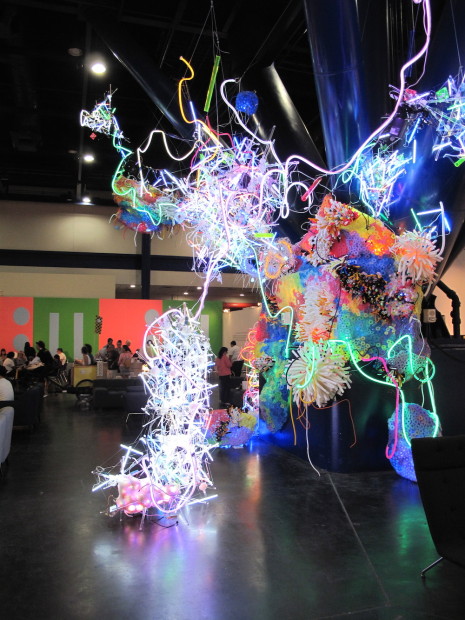
Anya Tish brought Adela Andea‘s crowd-pleasing light-up sculptures to the fair. Their gimmicky complexity is merely faddish as art, but her large column-climbing piece in the fairs’ lounge area was a superlative piece of decor.
Aside from Andea’s illuminated coral reef, the fair’s special projects, which can make events like this worthwhile from an art-lovers’ standpoint, were pathetic. Mac Whitney’s two welded pieces at the entrance were dwarfed by the enormous hall; Rodrigo Valenzuela’s kiosk-like installation to the left, was desperately arty, and far less interesting than his photographic representations of similar set-ups in Upfor Gallery’s booth. Iva Kinnaird’s hand painted fair map was sweet, but amateurish. Anne Deleporte’s Sonotube collage, Paul Fleming’s grid of resin lozenges, and Catherine Lee’s ceramics were merely obstacles to be avoided while cruising the main concourse. Sometimes it doesn’t pay to be a careful driver: if I’d bumped my cab into any of these pieces, they would have been more interesting.
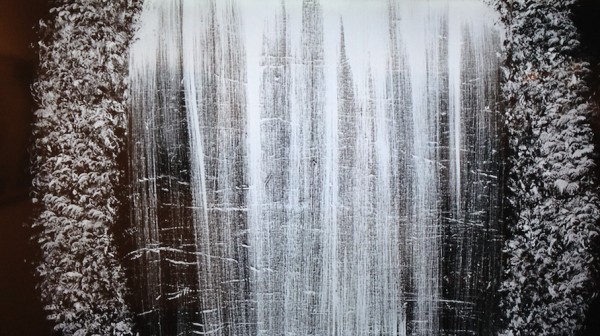
Barry Stone, HUM, (video still)
You can’t tell from the picture above, but HUM, Barry Stone’s 21-minute video, in his solo show at Art Palace’s booth, had the hypnotic power of one of those illuminated mechanical waterfall pictures. Its combination of slow motion graphics and heavy-metal soundtrack really works: like pieces by Sam Taylor Wood, Bill Viola, and Jeremy Blake, Stone’s video effectually bridges the viewing experience between film and still photography, in a way earlier video art, presented via ugly TVs on pedestals, or in eerie darkened projection rooms, never did.
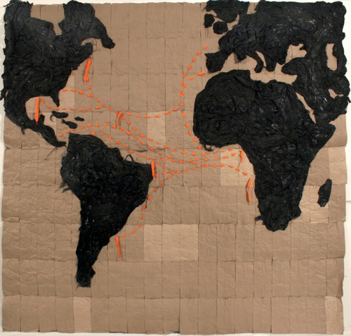
Nathaniel Donnett, How To Get Rich On A Shoe String Budget (orange shoestrings), 2014. Shoestrings, paper bags, plastic 95 x 95″
Nathaniel Donnett’s one-man show at Darke Gallery‘s booth was weak, a mish-mash of familiar black artist imagery and materials: kraft paper, shoe laces, trash bags, quilt-like collages of old clothing, expressing well-trodden racial identity issues without adding much. The hollow-point bullets in a candy vending machine and the “I’m the Only Black Person Here” t-shirts were just as obvious, but, as simple provocations, work better.
Marjorie Schwarz, Stack 22014, 2014
Dutton had a slow-art booth, worth getting off the bike to look at. Gloamy marshmallow-realism paintings by Dallas artist Marjorie Schwarz make you rub your eyes and take off your glasses hoping for a clearer view. Labor-intensive grooved wood panels by Josh Dihle, with embedded stones and teeth, had a Gauguin-in-Tahiti kookiness.
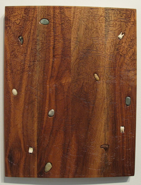
Josh Dihle.
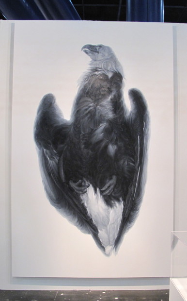
I thought Vincent Valdez’s big dead bird at David Shelton Gallery was a vulture, until heard it was a bald eagle—they’re not really so different. Alongside his fake folded funeral flag, it both respected and criticized American patriotism, and was a highlight of the fair.
Keegan McHargue painting at Fredericks and Freiser
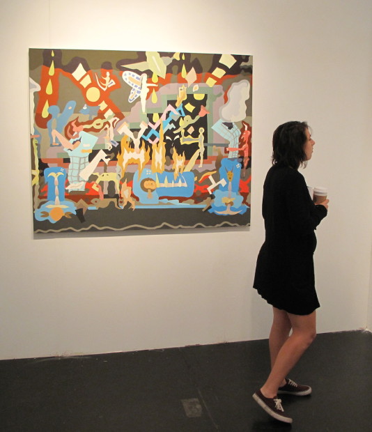
Fredericks & Freiser returned from New York with a booth full of diverting Keegan McHargue paintings. McHargue’s work won the $10,000 Art Fair prize last year. They had a bad spot, though, way at the fair’s lower left corner, behind RH Gallery’s spread.
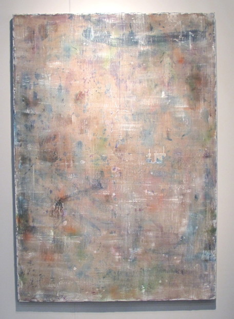
Dutch grayness at RH- what’s to fear?
I was rooting for the embattled RH Gallery — but I’m a contrarian. RH is a subsidiary of Restoration Hardware, a large corporation whose core business is high-end furnishings. They recently branched out into fine art, opened a four-story gallery in Chelsea, and are scaring the pants off traditional art dealers whose bread and butter is just the kind of bland abstract art RH gallery was offering. The hatred is intense: there are rumors that some other galleries threatened to pull out of the fair if RH was allowed to exhibit. Despite the infighting, their art was unremarkable— at one with 80% of the works on display at the fair, neither terrible schlock, nor very interesting, just overpriced home decor. I’m all for it— the sooner RH kills off other galleries touting this kind of dull filler, the sooner interesting galleries and artists will be the only ones left.
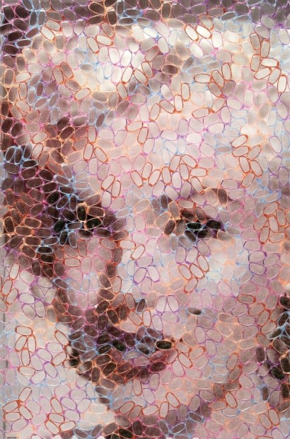
Marilyn Monroe by David Datuna. 2014
The hatred directed at RH really ought to go towards Birnam Wood Galleries, which easily won the “most contemptible schlock” award for his fair. The interior of their booth, filled with aimless imitations of contemporary art, was bad enough, but the outside was studded with these eye-grabbing portraits of celebrities under screens of plastic eyeglass lenses. It made me feel sorry for the exhibitors next door, who had to look at them all day.
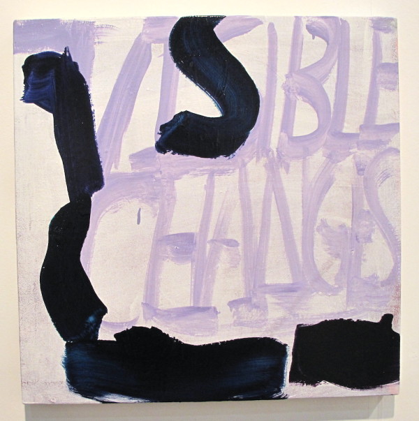
Dana Frankfort, Visible Changes, 2013. 24 x 24″ at Inman Gallery
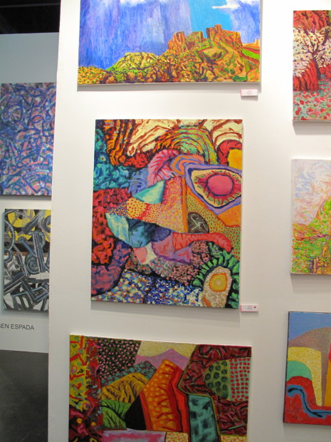
Wall of Earl Staley’s latest
Zoya Tommy Gallery from Houston had this wall of new Earl Staley paintings. A lot of Staley’s prolific output is terrible. OK, ALL of it is terrible, and always has been, but Staley is famous for just that—for more than fifty years he’s been putting down his varied interests on canvas with the boneheaded enthusiasm of a boy constructing model race-cars in his bedroom. With this new crop, Staley has hit a particularly good patch: the Philip Guston-in-Santa Fe surrealism borders on (and may borrow from) Aboriginal art’s naive intensity. Truly, they look as if your kid could have done them, but I wish I had kids like this.
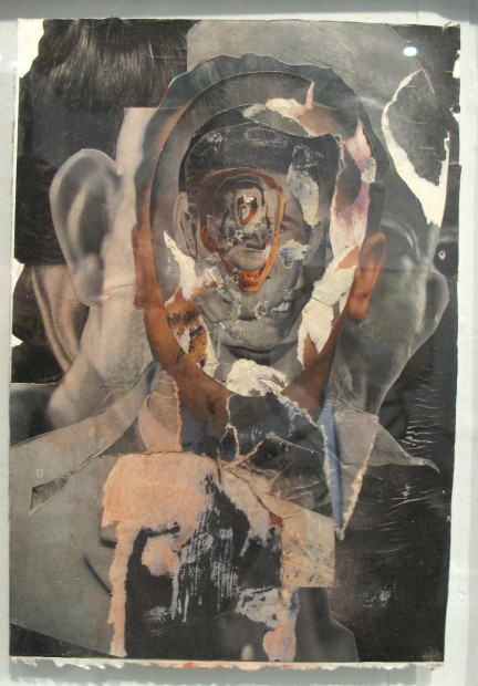
Luke Harnden, Untitled [Collage Series], 2014. 14 x 10″
Kirk Hopper Fine Art had one of the better booths at the fair, with a flowery bearskin by Ann Wood, and these creepy collages by Luke Harnden, and some nice Roger Winter paintings.
Ana Serrano at rice Gallery
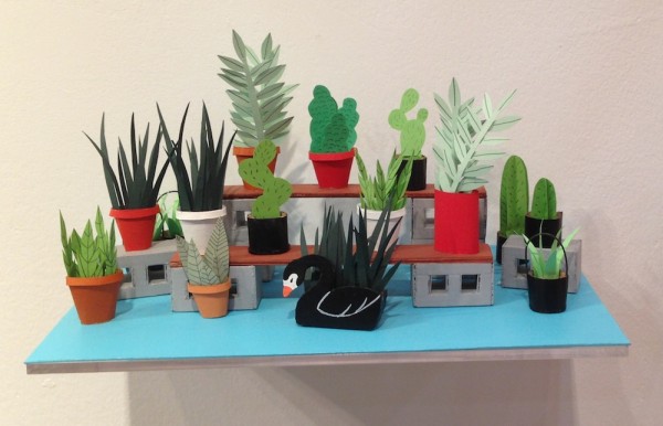
In keeping with the fair’s overall vibe of diminished expectations, Rice University Art Gallery, like Glasstire, scaled back on their booth this year. They were the powerhouse of the first Texas Contemporary Fair with Steve Keene‘s mass-market paintings. This time around they again reprised an old exhibition, bringing back Ana Serrano, who presented a cute, colorful paper and cardboard interior, with a selection of paper buildings and cakes for sale for $100 each.
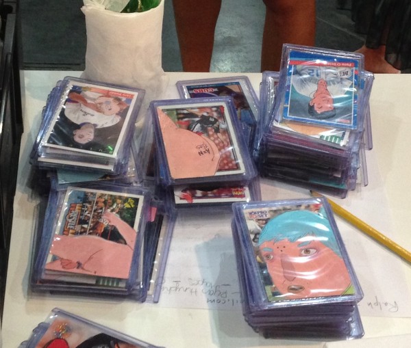
Taro-Kun cards at The Public Trust
Mustachioed Brian Gibb of The Public Trust was, along with Cris Worley and Kirk Hopper, one of three Dallas galleries to bravely venture south this year. He brought a slate of artists with a definite youth-culture slant, not like anything else in the fair: skateboards, a Duchamp BMX bicycle by Ryan Humphrey, hand painted underground comix-syle trading cards by Taro-Kun, and big silver spray paintings by William Binnie, founder of Dallas’ Beefhaus gallery.
The inevitable Carole Feuerman. Kendall Island, edition of six, $148,000 at Timothy Yarger Fine Art.
Although I’d say public interest has been as high as ever in attending the fair, with a whopping crowd on the opening night, the fair seems to be dying out- the initial excitement among exhibitors that greeted its advent four years ago has receded into a realization that there’s simply not enough money to be made. The fair’s quality hasn’t diminished — the percentage of absolute schlock is still quite small— but the fair has failed to attract many important galleries from out of town, making this a de-facto local affair. In one way that’s good, because the Houston and Texas galleries are very definitely showing the most interesting work, but they don’t need a fair for that.
Would-be fair promoters, this is your chance. I foresee an opening in the next decade for a locally-produced art fair, like Dallas has. Cheaper for exhibitors, edgier, more pro-actively local. A fair with the intense support of all sectors of the Houston art scene. One that would provide an occasion for people from elsewhere to visit (HOT Tax money, here we come!) and see all the great art that’s happening here, not just the art that commercial galleries can afford to promote. Keep it free from factional bickering, wide open to all comers, make it a great party, and we’re in business.

24 comments
Mr. Davenport, can you please expound on your understanding of familiar black artist imagery and materials? I am a young black artist working in Houston and your insight would be very helpful!
“kraft paper, shoe laces, trash bags, quilt-like collages of old clothing.” I’ve seen these materials used in the same way in other artists’ works. The woven quilting from Trenton Doyle Hancock, scrap clothing collage from Gee’s Bend, the charcoal drawing on brown kraft paper from Robert Pruitt, and others. It seems like Donnett is piecing together other people’s ideas and techniques. Not in the sense that he’s ripping them off, but he seems to still be trying to find his own voice, borrowing different ways of getting at what he wants to say from artists he respects while he figures out his own vision. That’s why his works are so varied- at the CAMH’s booth he had another set of entirely different pieces using hair. Unlike most of the more humdrum artists in the fair, he’s trying, and that’s good, but he’s not there yet.
All art about race is not necessarily about identity. And the term well-trodden is annoying – as if we’ve all heard or seen it so many times there couldn’t possibly be anything left to say on the subject, so why bother. Criticize the effectiveness of the message, the technique, or talent – but don’t flippantly dismiss the subject matter. Recent events should tell us that perhaps we NEED to hear and see the same thing over and over again or else nothing will ever change.
I apologize for not expressing myself more clearly. It’s not at all my intent to trivialize the importance of the issues Donnett is trying to raise, they need to be addressed over and over again. “Well-trodden” refers to the way these issues are handled in this work, not the issues themselves.
I am always pleased to be on a list and with a photo too. I have always been a ‘bad painter’ and am an alumni of the “Bad Painting” show at the New Museum in NY back in the day, curated by the late great Marcia Tucker. Thanks for your heart felt, perceptive comments. See more bone headed work at the Jung Center this month and at Zoya Tommy in October.
I found what I thought was a bald eagle feather on the beach a while back. They’re illegal to posses, but pfft. While I was looking up feather characteristics to verify the authenticity of my accquisition I learned it was in fact a vulture feather by the square ribbing of the quill. Needless to say I washed my hands. On further research however, I read vultures are sometimes known as “eagles of peace” as they only take their pray once it’s soul has left the body. Poetic huh? So I tied it to the grip of my shotgun, for you know, the souless.
How come we never hear about well-trodden white identity issues? What the fuck are black materials? Did Desmond Tutu bless the kraft paper? Are those Kola Boof’s laces? What the fuck Bill? Do you know how offensively white you’re sounding right now? Is Glasstire gonna start running reviews of minority spaces more regularly, cause based on the stream of articles coming out of this site I have no proof that you’d recognize “black art”. Clean your house, son! Start ponting out the particulars of your ethnicity before you start teaching us how to be efficiently Black.
Sebastien it has been too long!! Email me!! [email protected]
Bill, I think I’ll answer Sebastian’s question about Glasstire’s current refusal to run reviews concerning minority spaces (although Im not really comfortable with the idea of “Minority Spaces” brother).
NO, KNOW, NOPE, Nada and any other way you can spell or imply that useless white writers issue these critiques, they are not going grace the pages of Glasstire. Bill, will accept reviews by black writers of any any show but then if he does not like the ‘tone’, the language, the writer’s critique of the show, then he will simply delete it. ‘No thank you but it doesnt quite cut the mustard, or I dont have time to look over your piece but I will get back with you’,nothing. He simply renders you and the shows you cover as invisible and inconsequential. Did me like that with my review of the Kinsey Collection over at HMACC; never again. Heard Bill say not so long ago, over at DiverseWorks, that if he does not have the expertise, interest or wherewithal to cover a show, he defers to writers that he trust. Does not trust me and that’s cool. He has the power to do that. Just remember, nobody holds power forever.
Quite right Garry, I got a little too comfortable with the shorthand. “minority spaces” was a bad choice.
I completely disagreed with Bill’s assessment of Donnett’s work. However, if he rejected a piece you wrote, remember we live in the age of “free.” It costs nothing to start your own blog with Word Press or Blogger. Nothing except your time and effort.
Thanks for the advice Robert. Posted it on Not That This soon after I figured Bill wouldnt run it. Not quite sure I follow the line of your disagreement with Bill’s assessment of ND’s work though. Read your blog and it seemed to me that you bought ND’s work because it was a good bargain, that you could afford it. Would love to hear some of the aesthetic reasons that you found his work so compelling.
Well, I usually limit my art-purchasing to things I can afford–it’s a good practice! And I thought the work was a bargain because it felt like it should be worth a lot more –it is intriguing and witty and caustic. I realize this isn’t a critical response, but after all we’re talking about an art fair, a bazaar full of goods for sale. In fact, I thought that Donnett, by offering inexpensive goods, was poking fun at the whole art fair idea. The pretentiousness of the art fair (compared to the unpretentious Big Texas Train Show that was happening simultaneously) deserved to be taken down a peg.
But the problem is that if I buy something, I feel like I can’t really talk about it critically because it seems like self-dealing in a way. (It risks being what in the stock world is called “pump and dump”–not that I have ever “dumped” an artwork.) Suffice it to say that I liked Donnett’s performance at the Art League in 2012, I like his show up at the CAMH right now, and liked what he did for the art fair. “Liking” is not criticism, but it’s all I got right now!
Keep up the good work Mr. Davenport.
I usually don’t comment on comments on comments. And no “Bill” bashing, please.
But there was no kraft paper in the DARKE gallery booth. Nathaniel Donnett uses paper bags, part of an ongoing series commenting in part on colorism, a discriminatory act within the same race or ethnic group based on dark and light skin tones, lighter or darker than a paper bag. Artists of all colors use kraft paper, it is cheap and comes in nice big rolls.
I wanted the tees and shorts be a mini “Gap”, “exit through the gift shop please” thing. Art fairs are fun, and very commercial, big box stores of art.
Another ongoing project of Nathaniel’s, the clothing store, a community participation piece, the tees with be worn and inspire more conversation. We sold out, I’m afraid you will see them everywhere. (Plug: more on nathanieldonnett.com)
I am a blue eyed girl and very fortunate to show some of Houston’s best artists, intelligent, thoughtful, beautiful work. And some are black, some gay, some both. I was lucky to get my first job in the education department of the Newark Museum, which has one of the finest collections of African American art begun in 1929. (No, I wasn’t working there then but I learn new stuff every day.)
No ad hominem of course, but If Billy D is down is white supremacist speech then maybe we should be down some Billy D bashing.
Sebastien, after your first comment, I was angry at myself for publishing an overly abrupt, ill-tempered piece, just because I was tired of the art fair, and rushed by a deadline. A lot of it is dismissive and superficial, (not just about Donnett, either!) but I knew better than to critique Donnett’s work without greater care and precision, because negative reviews have generally got to be longer and more detailed, lest they seem dismissive, because Donnett is an artist who might benefit from real feedback, and because there is a Berlin Wall of potential misunderstanding when a white critic approaches black art, which, in my haste, I ran right into.
Your second, “white supremacist” comment made me feel better; rather than calling me on the real shortcomings of my piece, for which I apologize, or disagreeing with my take on Donnett’s work, you resorted to racial put-downs. For those readers who haven’t seen any of Glasstire’s recent videos, I am white. I’ve got a viewpoint shaped by my experiences, among them my race. But I’ve never done that kind of name-calling.
I’ll get over it. More importantly, let’s talk about the black viewpoint on Glasstire. I’ve been desperate for African American writers with a willingness to critique living local artists since I became Glasstire’s editor almost two years ago. Sebastien, your last piece for Glasstire was “Wrangle: John T. Biggers at TSU” which I published on April 13, 2013. You may remember the emails I’ve sent since then:
8/21/13
from: Bill Davenport
to: Jean-Sebastien
Sebastien:
A lot of news shows and happenings are coming up, if there’s anything you’d like to write about, I’m all ears!
9/3/13
from: Bill Davenport
to: Jean-Sebastien
Lots of fall shows coming up! I’d love to hear from you!
Darryl Ratcliff in Dallas has done several local reviews, and some scorching institutional critique, providing some of Glasstire’s most-read pieces. But I’ve been told flat out by a Houston artist that criticism between black artists here is “divisive,” which is true enough — no one wants to face the abuse I’m facing now over a single critical sentence. It’s tough for anyone, regardless of their race, to write honestly about people you might meet on the street tomorrow, and whose friendship you may lose, but until potential black Houston writers, like yourself, write, black artists will be only be written about by white critics, from a white viewpoint.
I don’t want fawning artist profiles, softball interviews, or reviews that describe but don’t analyze. I want honest insights and opinions on the art that’s happening now. Putting your real ideas out there isn’t safe, but if you want your voice in the mix, talking about the art of your time, you need to step up.
Somehow it is my fault that Glasstire doesn’t have a black presence? I was busy, if you must know. There are more than a half dozen unfinished pieces for Glasstire on my hard drive, including a couple of interviews that I truly regret not finishing because I feel that I’ve wasted the artists time. Kelly found me, and it should not be that hard to find another black voice or five in a city like Houston, in a state like Texas.
That was not a racial put down, btw. That was what I thought was a fair assessment of the tone and content of your paragraph. It was my issue from the beginning. It was clear that some missed the point the first time around so I made it crystal. No one is calling you Mister Charlie or White Devil, no one is saying you brake for Stormfront. No one here is calling you an extremist, because that is simply not who you are. But you brought in a racial dimension to your commentary that was paper thin, only to use it as a blunt instrument to dismiss the work. It’s white supremacy because you’re speaking from a position of power, and you are using a common rethorical device used to discredit black endeavors. It is low on research and empathy and heavy on wink wink nudge nudge. I’ve been reading you long enough to have a good idea how conversant you are with art history so why act here like you’re a neophyte? White supremacy is not an extreme position, it is the default setting of most American institutions and businesses.
You want dialogue? You want Black perspective? Latino perspective? Asian perspective? LGBT perspective? Let’s do it. Truth is my schedule has cleared up of late, but I’ve not been to excited about writing for a Glasstire that I felt has wholeheartedly embraced the European Hegemonic Paradigm. You want to reverse engines then let’s do it. Invite some new voices over, I’ll make the time to participate. Push your white writers to go outside of their comfort zones, ain’t nobody got nothing against allies. If this ain’t just lip service go ahead and bring it. Organize something in meatspace and I’ll be there. Set up and email exchange to be published, I’ll weigh in. There are people on your writing staff I I definitely count as allies, find them then find us, we aren’t going nowhere. Let’s just do it before February.
Artists of any ethnicity making art about issues of their ethnicity does not mean they are making strong art. Artists of all ethnicities can make weak art, same as anyone else. Judging artists of any ethnicity making art about issues of their ethnicity does not mean they nor their ethnicity is being judged outside the subject of the work.
Art criticism is subjective. An art critic who does their job and is critical of work, is not always critical because of race. Weak art is weak – no matter who made it – if deemed so by an art critic.
But reasonable people can disagree, and one critic’s evaluation is rarely the last word.
I guess 2014 is the year calling someone a “white supremacist” because they disagree with art critic’s criticism became the signifier of a reasonable person.
Not really dude, has more to do with the continued pedestrian handling of black artists by Bill. And the continued silence of those artists, black, white, brown, blue, green and orange, who voice their disapproval of his reviews, in the quietude of their private conversations but will never have enough chutzpah to voice them in the public arena. Dr. King called it “the silence of our friends”.
Ms. Darke, I dont know you from Adam or Eve, although I have heard some wonderful thing about you from ND and Regina Agu, BUT, I have to agree with Brother Boncy. Not so much that Bill’s parlance has the tone of a white supremacist(which unfortunately but truthfully it does) so much as it has to do with his and Glasstire’s notion that their voices are the only ones that count. Very obvious that they are only interested in certain types of art. And more importantly in a certain ‘voice’ that chronicles that art.
At the beginning of the Hickey lecture, founder Rainey Knudson talked about Glasstire as being this conduit for the “commerce of ideas”. Since Kelly Klassmayer has stepped down as editor, that superhighway of ideas has narrowed down to a two lane FM road. Things done changed, yessur!!
I know the white supremicist label stings… but think to yourself does it sting as much as your work being completely stereotyped and dismissed in a few cheap sentences? I would gues that the sting is equal.
As for the deadline excuse….don’t waste our time with bad writing about art you don’t like. There is too little being written about as it is.