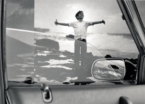
Eduardo Muñoz OrdoquI Sin título (Untitled)…from the series Marea baja (Low Tide), 2002…Silver gelatin print, 20 x 24…Courtesy of the artist and Gallery 106, Austin
Often the group show is a curator’s showcase. This is not to say that the artists featured are unappreciated — on the contrary, the artists are the inspiration by which the curator works. But sometimes, in deference to the subject matter of the show, or by dint of being one of (n) number of artists, individuals remain hazily anonymous to the efforts of the organizational body. To some degree, this is the case for 22 to Watch.
The 22 that co-curators Dana Friis-Hansen, Gail Sanders and Erica Shamaly petition us to watch represent a group of young and/or transplant Austin artists who signify an emerging visual art scene with aspirations for national recognition. It is refreshing to see the more regional tastes of the established Austin art-set put aside to make way for local art that addresses broader contemporary issues. To the curators” credit they have tried to keep these issues, as well as the artists, at the forefront of discussions. Nonetheless, a significant amount of buzz circles instead around the show itself, which stands as the first effort in memorable history that any of Austin’s major art institutions has offered significant recognition to a group of young local artists. The show is also an attempt to bridge the gap between Austin’s unorganized body of artists, its scattered, feckless array of small galleries and the indifferent collectors who export their art-buying money (and confidence in art of contemporary relevance) to the likes of Houston, Dallas, L.A. and NYC.
Reflecting the “best foot forward” harmonic tone of the show, 22 to Watch comprises a balance of objects, assemblage/mixed media, paintings, photographs, prints, and installations. Many of the works are displayed such that adjacent works complement them in style or thematic approach, while other themes pop up atavistically from room to room throughout the museum. One such theme is the incorporation of graphic design. Matthew Gutierrez’s series of paintings After-During I-V (2001) depicts a lottery ticket falling to the ground (along with the purchaser’s hope for winning). The oversized, realistic rendering of the lottery ticket is placed against an empty, video-blue screen background. Nathan Heiges presents us with photographs of fruits and vegetables dipped in lacquer so as to push seduction to the level of nausea. The fruits and vegetables rest in a blemish-free white ground. Roy Stanfield’s pictograph on vinyl, Horse Banner (2001), depicts a heart attack victim posited atop a two-legged horse. The logo-like icon mirrors itself from opposite ends of a red banner. The isolation of object in ground in these works, as well as the fetishizing of beauty to the point of perversion, is in the tradition of artists criticizing commercialization. But the utilization of these commercial signifiers recognizes the need to bridge the gap alienating art to and from a broader public.
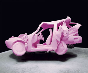
Supporting the commercial theme in three dimensions is Mark Shatz’s sculpture Pastel Crash (2002). Mark reclaimed a smashed Geo Prism from the salvage yard. He then covered it from bumper to bumper with Pepto-Bismol pink polystyrene foam. Pastel Crash demands a showroom environment — which is imaginable from the corner of the small room that AMOA has provided it — to create its illusory effect. Its many commercial signifiers — toy-like stature, color, surface, the car hovers above the floor — make it easy to forget about what a devastating, if not fatal, vehicle the Prism must have been for its previous owner.

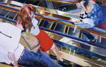
Katy O”Connor Jennifer Running Down Escalator, 2000…Oil on canvas, 53 x 80…Collection of Carly Staehlin…
Mark Shatz with his car, Andy Coolquitt with his paint cans and Lois Weinthal with her drywall illustrations address the issue of product longevity. A car may last five to ten years, a paint can is only good as long as it has paint in it, drywall may last thirty years. By renewing or using materials in a non-standard way, these artists have assigned a second order viability to the materials. But they also make the viewer aware that art has a finite existence.
Cinematic influence also features prominently in the show. Teresa Hubbard and Alexander Birchler have meticulously set up their photograph entitled Filmstill [Odeon] (2000) with consideration to light, composition and structure. They then layered multiple exposures to create a heightened ambiance — a warm refuge in a cool environment — for the cinema they tribute. Katy O”Connor has utilized similar photographic techniques to derive the source material for her painting Jennifer Running Down Escalator (2000). But while Hubbard and Birchler’s shot tributes setting with its majestic view, O”Connor’s provides the more intimate voyeuristic scope used to establish character.
Many of these works rely on nostalgia to activate the viewer. Fortunately, through deft eye and subtlety, these artists have avoided sticky schmaltz and have instead affected warm sincerity. Such is the case with Eduardo Muñoz Oroqui, whose layering of images onto silver gelatin prints avoids the didacticism of neo-expressionism and offers a sincere, personal look into the artist’s memories of his childhood in Cuba. Utilizing the nostalgia inherent to the Super 8 medium, Gabel Karsten’s Front Door (1998-present) documents the persons entering and leaving her front door. Super 8’s place in history is solidified by the growing obsolescence of the camera. So despite the fact that Front Door is a current and ongoing project, with it’s overexposed background and shadowy foreground, it has the feel of a 1960’s home movie. Super 8 is used ad nauseum in the filmic medium to generate knee-jerk emotional responses from viewers. Only through shrewd editing has Karsten avoided producing the same tired effect.
Paul Beck’s installation Livin” That Life (2002) lacks the subtlety of the more successful pieces in the show. It features a stuffed animal whose mouth has been fitted with upper and lower plates of human teeth. The animal is nightmarishly eerie, but the rest of the installation, which has the subtlety of a baseball bat across the forehead, undermines this presence. The stuffed animal sits in a high chair with its birthday cake, faces a television playing animated images made using a rotoscoping animation process. Perhaps this juxtaposition was meant to create the conflict of high-tech verses no-tech, but instead the installation feels like a big found-object-assemblage arrow pointing awkwardly towards the artist’s animation.
There are too many good pieces in the show to list for individual merit. So I will close by mentioning the one that stands out for its uniqueness. Andy Coolquitt’s Openings (continuing series) resembles a museum display. The illuminated glass case features previously smashed cans whose shapes have been restored close to their original state by the artist. This dramatic presentation lures in viewers to examine the jagged edges remnant of the cans” smashing and decay. Power and beauty also lay in the bold colors and commercial graphics put on the cans during manufacturing. Presumably, Andy did not manufacture or smash these cans. Acting as editor, he reclaimed them in shape and in context. In result, Openings stands unique among the other works in the show by resembling museum artifacts and reflecting a different type of artistic process.
Images courtesy the artists and the Austin Museum of Art.
Remaining hazily anonymous, Michael Stewart is a practicing artist in Austin who writes reviews and is finishing renovations on a house he would like to sell to you.


