

When I prepare to write a review, like I am doing right now, I try to read up a little bit on the artist, while at the same time avoiding the reviews of others, so as to not color my own commentary. In this particular case, whereas I am covering the artist Perry House’s show Enigmatic on view at d.m. allison gallery in Houston through May 25, I haven’t had to do much reading up on the person in question, because I’ve known House and his work maybe since the late ’80s or so.
I’m not really sure what to call Enigmatic. It’s not really a survey or a retrospective, as it barely touches the surface of Perry House’s long career both here and in California, nor does it make a dent in his prodigious output. When it comes to making things and the flow of ideas, House’s mind is like a water tap that nobody wants to turn off, and I imagine that trying to create a true retrospective of his work would be like attempting to shovel out the Aegean stables (an impossible task) and so we will forgive Dan (of d.m. allison) for only giving us a thoughtful selection of House’s work, as Mr. Allison is merely mortal, and his gallery space oh-so-finite.
In terms of selection, Enigmatic has a heavy emphasis on House’s work from the late ’80s to the mid-‘90s, and the late 2000s up until last year, with a scattering of other works in between. At first glance it’s hard to classify the paintings into any neat chronological categories such as “the de Chirico/Guston period of the ’80s and ’90s” or “the visceral abstractions of 2000,” “House’s Houses of the later years,” etc., because as an artist, House is self-referential, constantly reworking and revisiting his ideas.
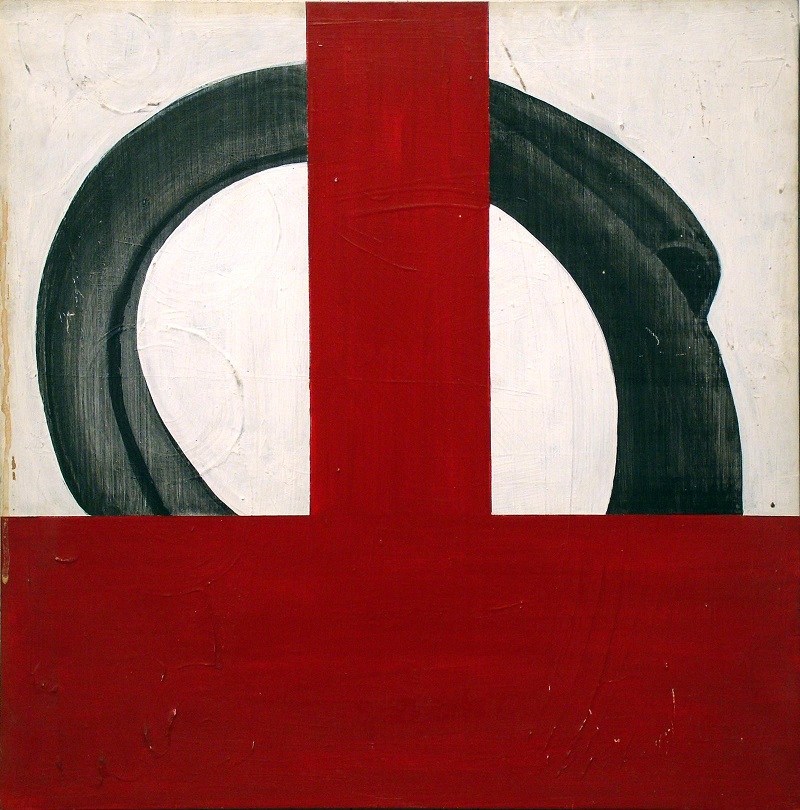
Take for example a group of older paintings that are in the back room of the gallery, and two newer pieces that are in the front. In both sets of paintings there are objects such as ship sails and metal coils, houses, stairs, and boats , and the objects and structures are always floating, and sometimes covered in the kind of ornate scrollwork you’ll see in Mexico and the Southeast, and sometimes partially obscured with thick lines or solid geometric bands of color.
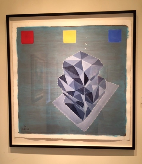
For the most part, both the old and newer sets of these works are evocative and beautiful, although the newer versions seem to possess an added layer of gravitas that I’m pretty sure comes along as a result of the artist’s experience and age. One of these more recent works, PH 9-27-13, directly references an “Untitled” ancestor of 1987 that wasn’t included in the show, but can be found in the exhibition catalogue. Like its ancestor, it boasts three of the four color bars, such as printers use (i.e. red, yellow and blue), only in the newer rendition, the three are not cheek-to-jowl with one another, but are instead evenly spaced, projecting a sort of formidableness that one might expect from a Queen’s Guard or a post 9-11 concrete barricade. Also, this painting is true to most of House’s work, old or new, in that it’s got texture. In this case the texture is more noticeable in the background, with its look of papyrus, and its soft yet evident brushstrokes of grayish-toned turquoise and cadmium red. The floating object here is an off-centered abstract geodesic structure painted in gray scale, on a light gray base, and outlined with white stitches of paint.
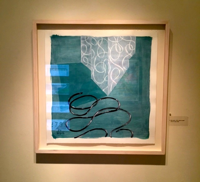
Both PH 9-27–13 and another work, PH 11-3-13 (below), are mesmerizing and moving. I found it hard to walk away from either one of them, and it is a toss up to which is the strongest of the show. While looking at them, one can’t help but think of the final walk that we all must take, and of that shuffling off of these mortal coils, and the age-old epitaph: “As I am now, you soon shall be.”
From these we move to what I call House’s Houses. For many years I had the pleasure of teaching at the same school as Perry House, at Houston Community College Central. A few times during our biannual faculty meetings, I’d be lucky enough to sit next to him, despite the risk it entailed: House conducted himself as though he were at a party rather than a faculty orientation. He’d talk and talk and talk while simultaneously producing sketch after sketch after sketch. On one such occasion it was buildings that House drew, and in retrospect I realize the time frame coincided neatly with the period he was working on the “Happyville” and “Helter Skelter” series, sometime around 2008 to 2010. The “Helter Skelter” series consists of colored paintings and black and white drawings, and one such drawing is in the current show. 3-2-9-10 is a strong piece, a near elephant-folio sized page of what could and should be in a graphic novel, with its perfectly composed crisscross of city blocks and buildings, whose bits and pieces are cracking off and flying about in the wind.

I wish there were more of these ink drawings in Enigmatic, and I hope that the reason there are not more is because they’ve all sold. I’ve seen several of them before now and they kick ass, and what kicks ass for me about them is their sheer inventiveness and their deceptive sense of spontaneity. The cities and neighborhoods within these drawings seem to have sprung full grown from House’s larger-than-life cranium, like Athena from the head of Zeus.
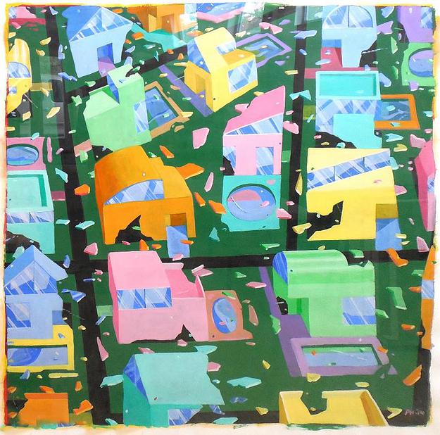
Another work from around the same time period is PH 7-1-10, also known as Culdesac. Originally two paintings, brought together as a diptych the pair look like they’ve been forced into wedlock, and if it were up to me, I’d put a little space between this unhappy couple. Maybe then they would start to relate to one another. Two versions of the same neighborhood, they (like their cousin the ink drawing) have bits and pieces flying off into the wind, and again are depicted from an aerial point of view. These differ from the ink drawings in that they’re rendered in close up and in color. The close-up view is a welcome change; I want to focus on what’s going on in those city streets. The color on the other hand—well, I’ll admit it—the colors are jarring, and detract from House’s skill as an artist and from any emotional experience I might have otherwise felt.
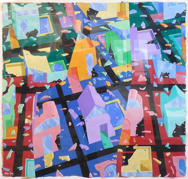
There are several newer paintings that riff on the themes of “Happyville” and “Helter Skelter,” alternating between close ups as in Culdesac, and the more-or-less zoomed-out airplane perspectives of his drawings in ink. Some of these are more successful, such as PH 10-18-14 in terms of aesthetics, energy, and sheer joy, with others running into the issue of color again, making me wonder if House ran out of acrylic paint and has resorted to cracking open packages of mint nonpareils.
Overall, it’s a strong show, but I’d lie if I didn’t say it’s a little spotty in places; there is a little bit too much of the work for the space at hand, and not all of the work is good. There are a handful of pieces that, a la the rapture, should have been left behind, i.e. House’s two self-portraits which are – sorry! – terrible and relate to nothing else in the exhibit. Having admitted that, most of the work is great, and some of it even masterful. The two stinkers shouldn’t stop you from going to see the show, and I would especially recommend it to you youngsters in the group who aren’t familiar with his work, and don’t know what a true jewel of an artist we have in Perry House, mint nonpareils and all.

2 comments
BETH:
This resurfaced review is one of the finest you have written about one of the finest of our Houston pantheon of great artists. Thank for this remarkable overview.
Thanks Harvey. I was so honored to write it.