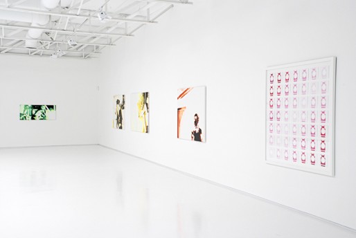
"Witnessing a music performance, performing music and listening to recorded music enter the realm of ritual. They are all sacrificial acts, for the performer and the audience. In an era where the physical presence of the recorded object is vanishing, I find it all the more important to focus on its trace. These objects occupy aural space with their contents but also occupy physical space. While the recorded object is the document, the relic ; the live event is the ultimate channelization(sic) of noise, as well as the place of immediate surrender to it. In the live event, with its group catharsis, the mesh of noise, bodies and heat ; I choose to focus on the documentation of these performances."
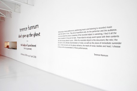
Someone needed to type-read this thing before it headed for the laser cutter. Where was the editor to tone down the rhetoric, to undress his essentially quite simple ideas, finding actual words for them rather than made-up ones, and schooling him in the proper use ; of the semi-colon? And that’s before deciding to assert it as a work of art in itself: it looms over all, occupying more space than any other single thing in the show.
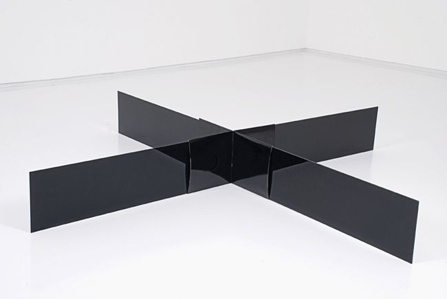
And I haven’t even gotten to the bulk of the work, nearly two dozen pieces of it struggling to cope with the warehouse-size front room, gloomily lit by one lone skylight. Did the artist and the gallery think that tossing some artsy, vaguely theoretical terms about ("trace" is classic MFA-blather) would fill the void, here only thrown into more stark relief by two abject, flimsy, derivative record sleeve constructions? One black, one white (with “Minor Threat” painted in light blue gouache – wow, so heavy), they huddle the floor, looking lost and forlorn.
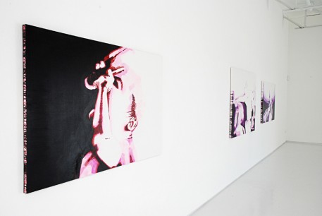
Did they think that if saddled with some somber verbiage and left unlit, the poverty of the slew of painting’s surfaces would accrue some heft; that the thin day-glo Crayola marker colors would manifest some of the feeling presumably experienced by the fans and bands at the concerts they clumsily depict? You can’t bludgeon this space into submission – it’s the King Kong of galleries. Three well-placed, well-made objects could maybe tip the monster. Instead, you’re given this onslaught of mediocrity, as if the quantity will overcome your doubts. With titles like “Kill the Light (Evanesce)”, “Conquest for Death (Necro)”, “Erase my Presence (Evacuate)”, and more simply “Doom”, these feather weight doodles have all the turbulent tortured epic death metal spirit of an iPod commercial.
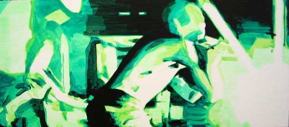
"Fanning the Fires (Annihilate)" 2007



6 comments
Judging from the images in your post (and the gallery’s website) I honestly don’t see much that differentiates this artist’s exhibition from the vast majority of shows I’ve seen installed in Texas or anywhere else. Although I haven’t had the opportunity to view these works in person, the images provided by Light and Sie, on their web site, appear to fit quite nicely into several genres that might appear in lauded publications such Vitamin P and so forth. I agree that the overabundance of didactic wall texts in exhibitions these days is sad commentary on the diminishing importance of the work vs the pretentious need for PoMo-based bullshit in order to “explain” (read: turn the work into illustrations of some moronic French theorist’ work or other) the import of the artifacts in question.
On another note, I couldn’t help but chuckle upon discovering this little gem of overreaching functionality on the gallery’s web site,
“One of the primary goals of the gallery is to retain specific territories for each artist we show. What will define the artists as a group is that each, independently, will be singly responsible to the medium(s) of their choice and is mindfully questioning of the role that art plays in the universe.”
So this gallery is in the business of putting together rock bands. Over here you have the drummer and here the lead guitar player. Am I reading this right? As for universal aspirations, I’d like to know how artists in the Alpha Centari system feel about that last statement. I think it more prudent to start with Texas first.
the pictures do it too much justice. As you say, it looks hip and aware, but the work itself has no bones, no rigor. In person, the paintings are thin, ill-conceived, and brimming with trends (for instance, compositions dominated by large central areas of negative space) that are, happily, already passe’. Much of it is just badly handled, from figurative elements to the really unfortunate use of color.
This is just more art trying to evoke some pastiche of amped guitars, but over and over (here and elsewhere) we see how it doesn’t work. Painting is fundamentally about other things – Hannum doesn’t appear to understand painting as painting, or sculpture as sculpture, or the different critical/metaphysical space created by art, vs. music. He’s hardly alone there.
When you see these things in person, you see the lack of care about surface, about the material itself. The sculptures too. Really – more art out of record sleeves? Even in the video install, he’s slapped a couple pieces of black plex on the walls,which he explains as creating a simulation of the crowd at the show; but they just baffled me and others, seeming like nothing more than another half-baked gesture. These are all just gestures, and what do they indicate? Since they don’t work on their own, the gallery tries to prop them up with texts that are in themselves weak, and the work tries to simply generate some idea of something “cool”, or even moving, but it’s occurring somewhere else, sometime else. The feeling isn’t in the work itself. Art is communication – I think this work is broadcasting its real subject matter loud and clear, as much by what’s missing as what’s present. And what is that subject really?
Thanks for the reply. I’ll take your word as to the rigor of the work as I can not make it up to Dallas to view the show. Like you I find the the ubiquity of record sleeve art a bit tiresome (along with painted skateboard decks and deer antler/sparrows on branches fixations commonly found in some of the more graphic work being produced today). If you could indulge me in one last query, how do you define “painting as painting” in practical terms? My hermeneutics will rest upon their haunches while awaiting a proper elucidation.
BTW, the I enjoyed the series regarding Dallas Artsist Siros (?). One of the more interesting diatribes I’ve read on this site in some time. Kudos.
means, for instance, in this case dealing with the flat white of the gessod canvas as something other that blankness devoid of any further need of attention. It means that the sides of the canvas aren’t overwhelmed with self-conscious drips, like every second painter under thirty. It means that there is some palpable feeling that the artist is engaged in a meaningful, affectionate, likely agonized conversation with the 1000 year old monkey that climbed on his back when he decided to take a stick with some hair glued to the end, and dab some colored goo onto a hunk of cloth wrapped tautly across a wooden frame.
As Dirk Skreber said, “It’s terrible to be a painter.” Hannum seems to approach more as an exercise in style, to round out the show. He’s served up as a virtual renaissance man – musician, filmmaker, sculptor, painter, star. It all adds up to nought.
I like that description of painting, Titus!
Drips on a painting better come from the sweat that rolls off your face from making the god forsaken object. The drips in a painting are another story. Dam that stubborn monkey.