

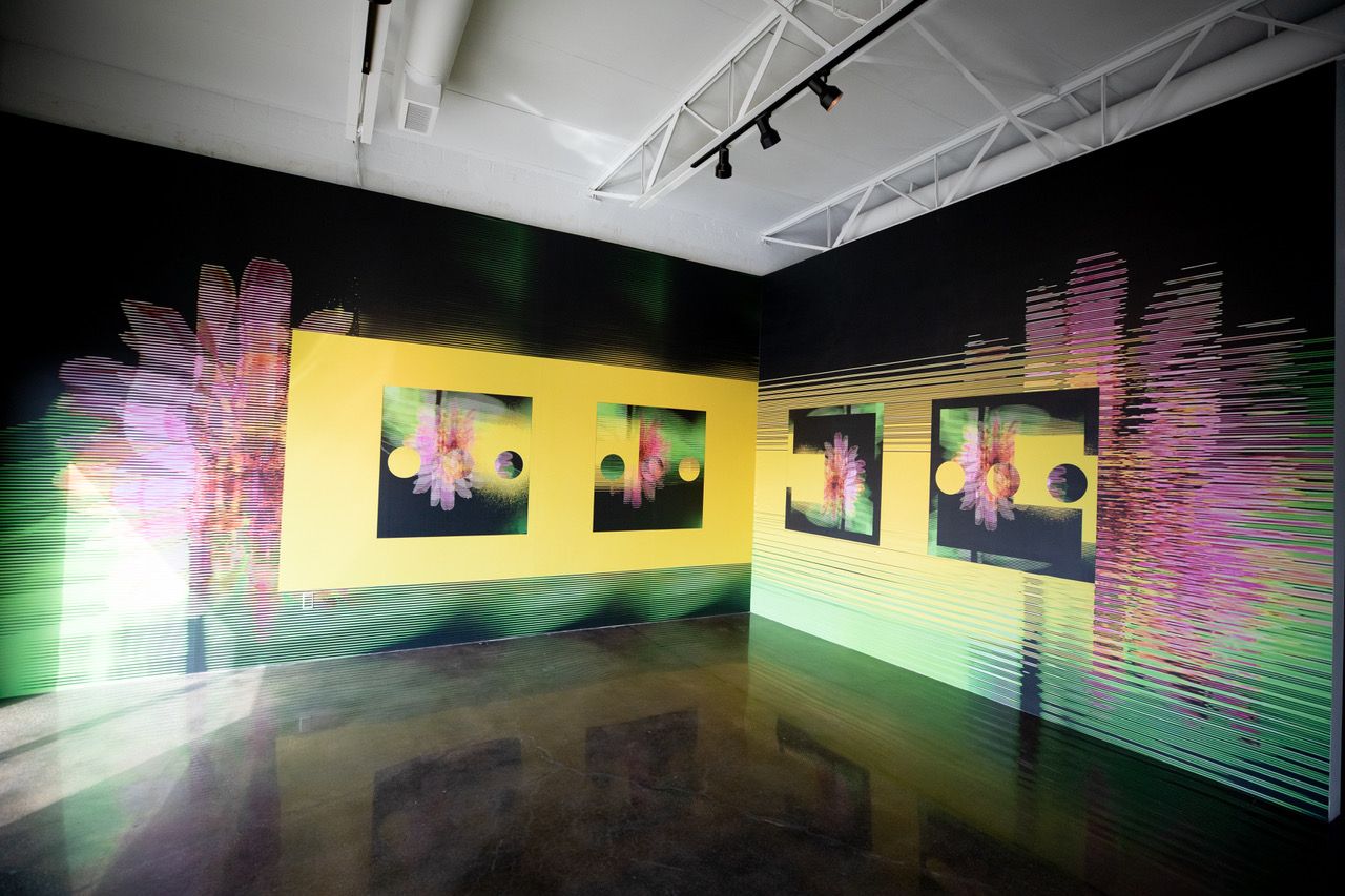
Installation view of John Pomara’s solo exhibition “Digital_debris” at Barry Whistler Gallery, Dallas, Oct. 14-Nov. 21, 2020. All photography by Allison V. Smith.
Walking into the open space of the Barry Whistler Gallery in Dallas to view John Pomara’s new Digital_debris show, one is quickly sucked into the main space where three bold 96” x 64” canvases are hung. Each makes brilliant use of black as part of a saturate color palette. Each expresses Pomara’s very own approach to monumentality and winds its way into the art historical conversation by being neither representation nor abstraction, neither this-worldly nor other-worldly, neither found-object, nor imagined completely from within.
Installation view of John Pomara’s solo exhibition “Digital_debris” at Barry Whistler Gallery, Dallas, Oct. 14-Nov. 21, 2020
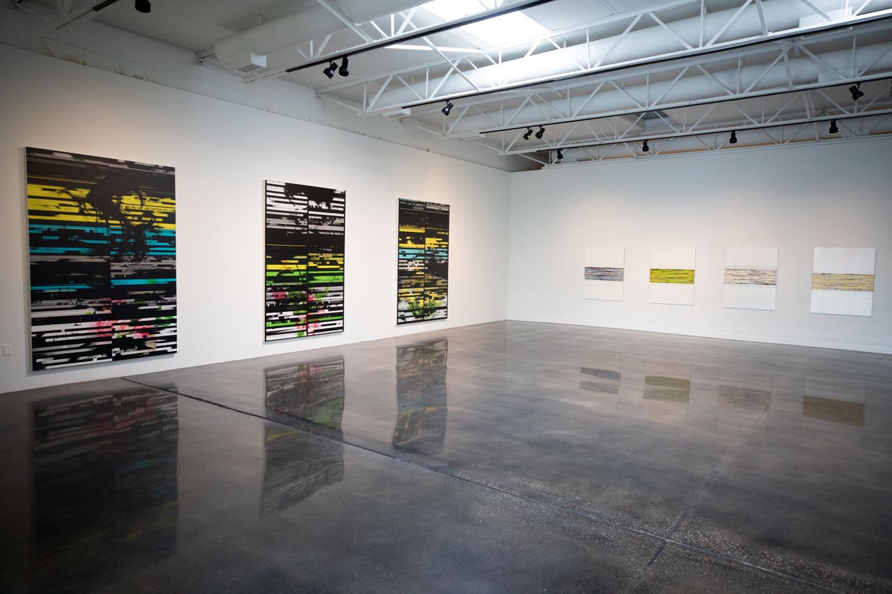
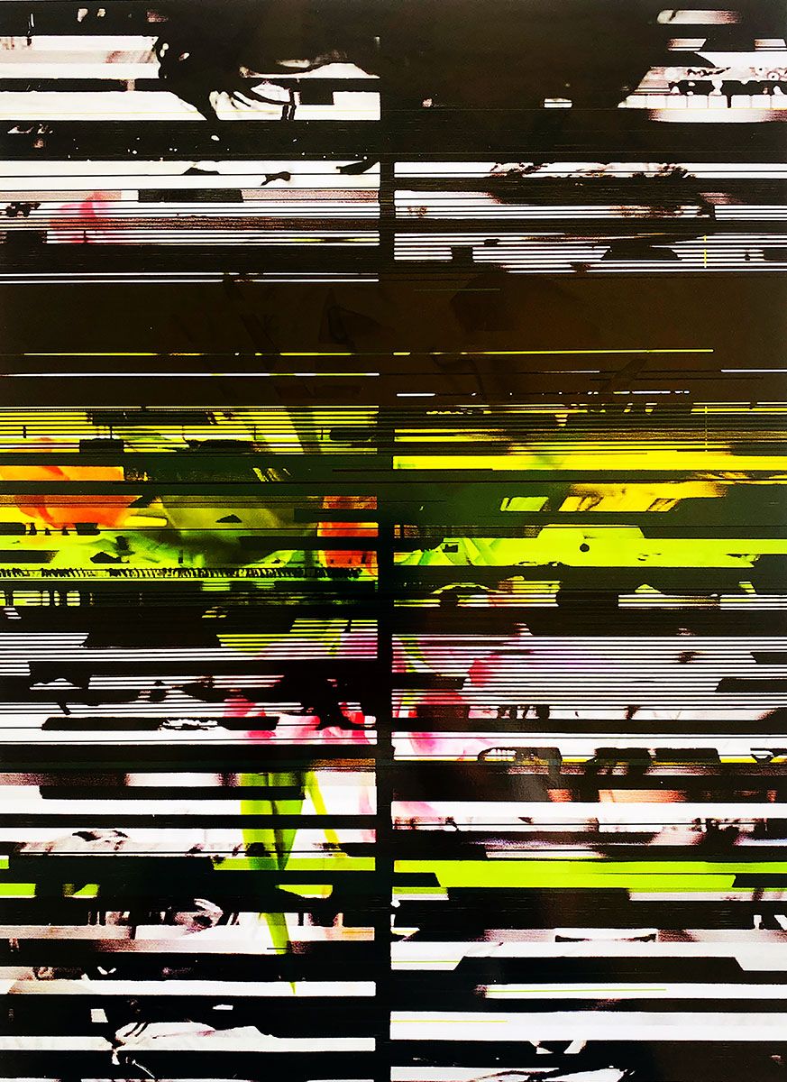
These Big Three: Bedtime Stories, I’m Looking Through You, and So Long Marianne, were all made in 2020 and convey something of the fragmentation of our times — social, aesthetic (…and pandemic). The volume of the message is enhanced by a chorus of three smaller works that imitate the style of their larger cousins — and hang stage-right inside Whistler’s foyer. These 16.5” x 21.5” works (I’m Looking Through You, Strange Brews, and Follow the Yellow Brick Road) also depend on the masterful use of varied, crosswise, night-black lines to organize an otherwise fractured and multi-hued composition. These paired picture sets stand in contrast to the other two color themes in the show — three sets of work dominated by white, and a third dominated by yellow.
But, as always, black is a mean tool in the artist’s palette. Handled deftly, no other chromatic weapon sits quite so near the right hand of art’s gods.
Interviewing Pomara, he said to me, “I never give up on it. I love black. I love Philip Guston’s use of it. I keep coming back to black over and over again. In 1980, I said to myself: ‘I’m going to use black in every painting from here on in.’”
He added that he recently got inspired to return to working only in black and white — a strategy he pursued for the first part of the ‘90s, and consistently utilized by Christopher Wool, Evan Gruzis, Marlene Dumas, and so many other current marquee artists.
A lot of painters suggest their work is “process-driven,” i.e., that the search for novel techniques determines the imagery they tack on a wall.
Few people are as true to this boast as Pomara.
He fell under the sway of arcane processes early in his career. It was an attempt, like the pop artists he venerates, to steer clear of the facture-happy, emotion-laden, machismo-thick imagery of artists celebrated in his day. In Pomara’s case, this vogue was promulgated by a tangle of Neo-Expressionists during the go-go, Yuppie-laden Reagan years, and included Anselm Kiefer, Julian Schnabel, and Jean-Michel Basquiat — among a storied set of others. These painters were roaming the art world like lions when the Pomara pissed clear of art school in 1980.
Working outside their idiom, Pomara told me his mission as a painter is to “take the romance out of it.”
His dance with black and white is deeply rooted in this act of aesthetic resistance. Told in art school that he ought to parlay his talent in graphics from lowly painting into a more lucrative illustration career, he found his feet in the early ‘90s when he started representing video static, film leaders, and black-and-white photos of germs in seemingly abstract diptychs that corrupted the representational strategies of Neo-Expressionism generally, and of the dual-pic photo-scrounger David Salle in particular.
He fell in love with the tonal fascism of the photo printer. He said he began making paintings that “looked like a fucked-up photocopy” in the ‘90s, then added, “In a funny way, I’ve been doing that ever since.”
Installation view of John Pomara’s solo exhibition “Digital_debris” at Barry Whistler Gallery, Dallas, Oct. 14-Nov. 21, 2020
Every time an artist plunges into new territory, audiences are left in the confused wake of that forward movement. We can’t say what any authentically new invention is or is not because we’ve got insufficient perspective. We search our brains for a basis of assessment — we probe our hearts for an appropriate emotion. With works like these, beautiful or ugly, visually arresting or forgettable, earnest or deceptive, we stumble forward and too often our lizard-brain takes over as we try to get our feet on rational ground. It’s easy to just walk away from over-challenging art without sweating our brains to “get it.”
We needn’t do that here.
Pomara’s been in the spotlight for decades, and he’s left a fat file of artistic confessions we can access. His pictorial strategies are a pleasure to investigate. There’s a lot in his work to hang a hat on.
There’s no doubt Pomara has leaned beyond achromatic work to become a wicked master of color. He approaches the world of hue a lot like he does black and white — as if it, too, were just a pit of coal-bright polarities ripe for dropping on a canvas.
So, what kind of colorist is this guy? Pomara has put together his own tint-wheel far outside the chromaticity of most of artistic comrades. This range isn’t as friendly as Warhol’s, or as reactive as Monet’s, or as calculating as Albers. It’s synth-color. It tantrums, brays and warns.
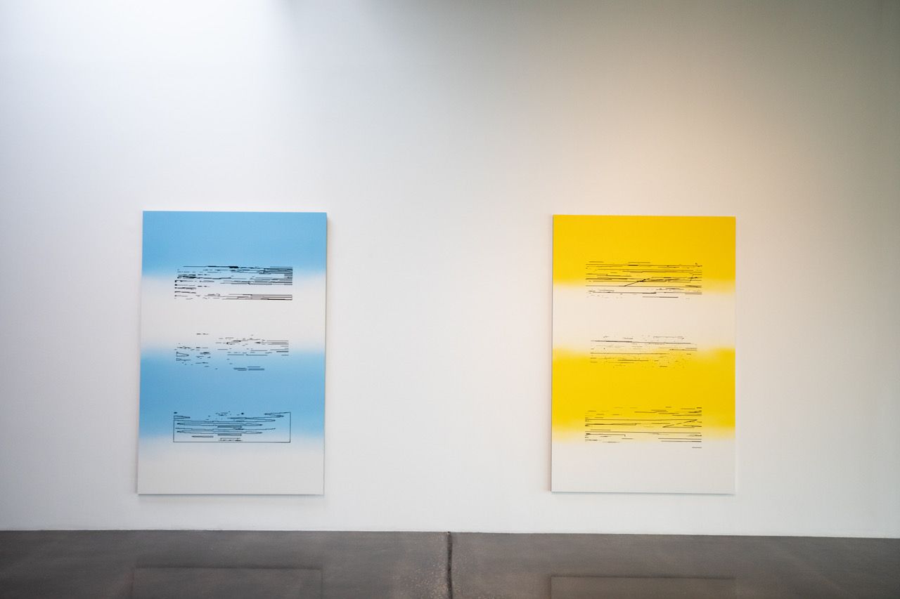
In his mural on the Whistler Gallery’s first wall (stage left), it seems to seep toward you like a chemical gas, disorienting you in mists of yellows, greens, and mauves. Pomara says he wants his pigments to reach out and get attention. They do.
Who is he like, in this regard? And does this strategy have anything to do with his first love — bleach white and bitchy black?
Installation view of John Pomara’s solo exhibition “Digital_debris” at Barry Whistler Gallery, Dallas, Oct. 14-Nov. 21, 2020
It’s a big claim, but: He’s like our old tortured pal, Vincent Van Gogh.
Any acquaintance of Pomara may tell you he’s as much a wack job as any creative type, but he’s also a linchpin in the Dallas art community — socially poised, and well-loved. He ain’t so outside himself as to excise an ear.
Still, he likes to off-road with the color-wheel like some madman.
Pomara’s unrepentant love of yellow may be insufficient to put him in the same curry tub as the wild-flying Dutchman, but that soup of association has hairs of truth in it. (Reportedly, Van Gogh said, “How lovely yellow is! It stands for the sun!”)
Pomara is at play with the game of hue in so many ways that evoke Van Gogh. Chief among these is (again) his crafty encounter with black and white.
Maybe he got into the animal mind of these tones when he worked so single-mindedly with them in the early ‘90s.

Installation view of John Pomara’s solo exhibition “Digital_debris” at Barry Whistler Gallery, Dallas, Oct. 14-Nov. 21, 2020
As I’ve said, he’s not averse to framing a whole composition in unchecked ebonies, as he does with the pictures I’ve already mentioned, but he doesn’t hold back from dropping sub-elements into fat fields of white, either — as he does with this exhibit’s Jet_set and Sky_Pilot series. Sulfur yellows, juvenile greens, electric lilacs, and ocean-surf blues are at play with foundational black and white tones. His use of complements (colors stationed across the color wheel: red and green, orange and blue, yellow and purple, etc.) isn’t slavish, but he seems to grok, as Van Gogh put it, that “Black and white are also colors … for their simultaneous contrast is as striking as that of green and red.” That is, if one handles them right. Pomara is savvy enough to use black and white as equals to their rivals in his slam-dance of hue.
Beside his stated intent to smash your eye with a few decades of stacked- up palette strategies, what else motivates Pomara’s color mix and, incidentally, his imagery as a whole?
When I talked with him, he held up Robert Rauschenberg as a prime influence. He is enraptured by Rauschenberg, Warhol, and the minimalist Donald Judd because of their embrace of industrial processes.
Robert Rauschenberg, Flue, 1980. Solvent transfer, acrylic, and collage on paper, 32 x 25.
In Rauschenberg’s Flue (seen here) he uses solvent transfer (say, putting turpentine on a magazine pic to dissolve it onto a second surface) and collage. In his long historical production of canvas work, Rauschenberg pioneered the use of silkscreen, industrial paints, and machines to make art. But among Rauschenberg’s bigger projects was an attempt to critically reflect what he saw as a sojourner among the detritus of New York’s streets.
What’d he find in those fertile days of the 1950s and ’60s? Car tires, ice cream ads, and maybe the carcass of a pig, a goat, and a bird. All these things made their way into his paintings — or “combines” as they were eventually called.
Cezanne said of Monet that he was “only an eye, but my God, what an eye!” The same can be said of Rauschenberg — the main difference being that Monet liked trees and whatnot. Monet put cathedrals, boats and bridges into his paintings, but more often he focused on landscapes, seascapes, and daisies. His plein air tradition helped us see how the sun illuminated the natural world. Rauschenberg claimed a fidelity to life. Monet claimed a fidelity to light.
Rauschenberg’s subject was rarely nature (unless you tip your hat to his taxidermy). He put human culture in his pics — usually it was the pop or urban kind. His godly eye pored over magazines, TV screens, and asphalt. His artworks were gallery-ready stages for all he discovered there.
But what the hell does this have to do with Pomara?
Rauschenberg’s cultural moment demanded a rebound from the emotionalism of the man-sweat Abstract Expressionists. He used silkscreens and other tools to dodge dependence on the artist’s expressive hand — which had become as sacred as gestures of priestly absolution. This spirit of mannishness, emotion, and signature paint-splatter rode high once more in the ’80s — just as Pomara first got his brushes wet. (In 1980, he emerged from a Masters of Fine Arts program in Texas and New York). The dilemma of Rauschenberg and other artists (those we call “pop”) was to outflank the swelling, ego-fraught brushwork of de Kooning, Kline, and Pollock — freighted as it was with a sense of the artist’s spiritual mission.
Pomara had to dispense with the influence of a new-born claque of these types.
Adding to the earlier pile of Neo-Expressionist references, we might name Enzo Cucchi, Georg Baselitz, and Francesco Clemente. In other words, any relatively defenseless, newly-hatched art-grad had to deal with a towering wall of paint-slamming dudes (and, yes, they were mostly dudes). Pomara’s wily strategy to resist stole more than one tactic from Rauschenberg, and some inspiration from the Neo-Ex, Sigmar Polke, whose plunge into abstraction and self-identification as an “alchemist” (while using meteorite dust, red lead, flower pigment, ground-up stone tools, silver leaf, silver oxide, damar resin, and various other exotic, and often poisonous substances, on unusual surfaces) signified an elevation of “process” like no other artist before him. At the same time, but unbeknownst to Pomara, Gerhard Richter was destroying mechanical images with squeegees — a tactic Pomara would undertake in the ensuing years.
All the while, Pomara fell back on the philosophy of his fellow Texan, Rauschenberg (who came out of the womb in Port Arthur). Like Rauschenberg, Pomara reflected a world we live wholly in, but need fresh aesthetic guidance to see. He’s set himself up, Virgil-like, to guide us through this world, fending off temptations to fall toward the aesthetic of Richter, Polke, his Port Arthur hero, or any other hard-charging Pop, Ab Ex, or Neo Ex painter on the scene.
More aggressively than Rauschenberg or Warhol, Pomara has dodged the artist’s “hand.”
John Pomara
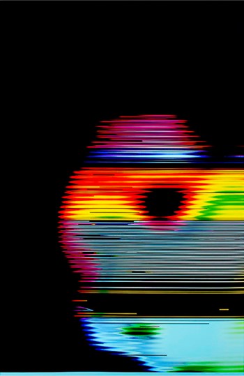
While doing so, he’s chosen to train his fabulous eye on the virtual world — the skein of sturm und drang that marches across screens on our phones, tablets, and laptops every day. Like a rottweiler hunting bones, Pomara has dug raggedly into that sphere, exhuming and displaying its many splendors, but failing to surrender to any of its easy seductions. He steals its abstractions and, if it’s not abstract, he won’t import any untweaked figuration. If he finds an image he likes, he might hide it, partly recognizable behind black slats or other elements, or put it in a digital blender of some sort, and deconstruct it into info bits, then present that face — or whatever it is — as an abstraction whose source would be impossible to know (as he does with this show’s Sky_pilot pics. More on that below).
Pomara is not stacking discarded TVs on top of each other to crash a “phantom-dream car” through, exploring the camera’s play of veracity, or making looping videos that exhaustively dredge through a single theme. As a bird-dogger of algorithms, atmospheres, and accidents inside digitalia, he freezes things. He makes video’s static… static.
Rauschenberg’s world was the streets; Pomara’s world is the dreamscape demographers say we spend a sixth of our lives in: the light pulses making up our digitized information streams. He grabs the whole dang urinal of it, whacks it into little pieces with Adobe illustrator, then immobilizes it on a surface through multiple runs from printers. Slyly, he layers and tweaks things with a hand as adept as any of his forbears, then presents the subsequent set-up for our consideration.
We could say Pomara stalks video, guns it down, and stuffs it for our living room walls. The main thing is the stuffing.
John Pomara, I’m Looking Through You, 2020. Unique UV pigment ink on canvas. 96 x 64 inches
Over the past 30 years, Pomara has hopped the train of one technological innovation after another. Color scanners with high-resolution hit the domestic market in the mid-‘90s, and Pomara grabbed one for artistic play. In the early 2000s, he experimented with large-format copy machines, blurring images by moving them during illumination. He was a fan of the moon-shot pics that scattered and corrupted themselves on everyone’s home TV from 1969-’72. As home-computer usage advanced, he began screen-saving glitches he found in the online universe.
He remained loyal to his position as a painter, even as he maintained distance from plain old painting. In his first attempts to delimit the artistic “hand,” he borrowed imagery from electronica, applied it through multiple stencils, then employed a weapon from the arsenal of the housepainter by dragging three-foot wide, single-handled paint guards (used to control overspray during industrial spray-paint projects) over the entire canvas surface. He’d layer stenciled figures, sometimes letting them half-dry so he squeegeed over emulsions that were still tacky — blurring them so they looked like his ‘90s experiments with moving copy originals across printer glass.
The printer is still more primary for Pomara than a paintbrush.
The artist had a revelatory moment in 2011 when he discovered a website spazzing out, creating picture mash-ups that captured his imagination. He screen-saved like mad for two days before the resident web-master stuck a savvy thumb in the download dike.
That spurred Pomara to learn just enough coding to frack his own on-screen picture streams. He now captures these pastiche beasts, and reconfigures them still more by layering and, occasionally — for the love of white — by pouring on bleach. This wipes out structured sections of his fragmented pictures, reclaiming drip-technique appearances we naturally attribute to Neo Ex and Ab Ex exemplaries.
Ever since Lascaux, artists have exploited the misshapen aspects of undersurfaces to inspire figure, line, and shape. Pomara couldn’t be looking at anything less dense than a cave wall, but his strategy’s the same: use the rich diaspora of Lady Chance to guide one’s hand. Make nice with your “mistakes.” Give the glitch a brush and make it paint a wall.
He still roves the rabid lands we see on laptops for found objects — instances of mistaken juxtaposition, errant cropping, or bad coding. His reports on encountering this stuff is uncanny. I’ve never seen it. (Have you?) Pomara sees it all the time. The fates are going to bat for this man it seems.
As Rauschenberg adopted a scavenger’s aesthetic in the ‘50s, utilizing the detritus of city streets and pop culture to create rummage-strewn compositions, Pomara is a Rauschenberg of electron viewscapes. He builds an aesthetic from that world’s flotsam and puts it in canvases and prints — ones that are made through mechanical processes themselves.
He has few fellow travelers in this regard.
Among the pop artists he doesn’t mention, I think of early James Rosenquist, who positioned himself just as distant from facture and, as he grabbed image multiples from the passing scene, seemed to have a hankering for the cross-hatch of male and female, which Pomara — as he hides femme nudes, flowers, and bouffant hairdos behind his masculinizing grids — seems to be playing with, too. (Often we feel, like film noir, that we’re peeking through louvered blinds toward indiscernible intimacies).
Even more like Rosenquist, Pomara has a conversation going on with professional billboard makers and industrial painters. His surrogates at Dallas’ Coupralux Digital use large-scale, UV pigment, copy printers to make banners and billboards. They’re fond of Pomara, so they let him do odd things with their machines. The major trio of pics in Whistler’s main room were made by overprint processes that fire layer after layer of hot, hyper-dense, industrial toner on a canvas until it gets cement-like and adequately archival to arrange on a gallery wall.

John Pomara, Sky_pilot, 2020. Oil enamel on aluminum. 72 x 47 inches
If we spin away from those big lovely black things and look stage-right in the gallery, there’s a facing trio — Sky_pilots 1, 2, and 3. We ought to know they got made by Pomara dragging three 72” x 47” Alumacore boards over to a water-misting paint booth owned by an auto painter. (He got the idea for Alumacore — think thick aluminum cardboard — from Rauschenberg.) Pomara discovered he could use easily cracking commercial oil enamels (one of Picasso faves) on stiff Alumacore to keep the paint archival. Pomara guides his auto-guy to lay down three layers of car-smooth oil enamel on the metal, white as death. He uses a spray can to put Rothko-esque color fields on them, then goes to work rasterizing a face in Adobe Illustrator, unitl it makes just a few zen-like waggly lines. He stencils these on. They end up inching, ant-like, among his hue-fields
But the recently-deceased Rosenquist isn’t really a man of Pomara’s cultural moment, and Pomara claims he’s been inspired by a host of artists he’s grown up with: Peter Halley, (the head of Yale’s graduate painting program), Jonathan Lasker (NEA Fellowship winner), and Liz Trosper (Pomara’s UT Dallas colleague).
At first glance, some of Pomara’s paintings also look a fair bit like those of Chris Dorland.

Installation view of John Pomara’s solo exhibition “Digital_debris” at Barry Whistler Gallery, Dallas, Oct. 14-Nov. 21, 2020
Each has a highly evolved style and has rightly earned art-world attention for it, but I wouldn’t say any have gone out on a limb as much as Pomara, nor taken up the task of wholly mastering their influences. I dropped double Matisse quotes in my last Glasstire investigation, and offer another here: “I have accepted influences, but I have always known how to dominate them.”
Pomara trail-blazes new processes and imageries so packed with new life that it’s hard to orient them in any imagistic conversation we’ve seen so far.

1 comment
Thanks for this in-depth look at Pomara’s work; in all the extensive writing that’s been done on him in the past (catalog essays, newspaper articles, online journalism), his “glitch” processes and the reasons behind them are rarely if ever explained with such detail or passion.
One comment of the author’s surprised me — that he hadn’t himself seen “instances of mistaken juxtaposition, errant cropping, or bad coding” while surfing the web.
The sellers of smartphones and social media interfaces certainly aim for a “seamless” experience and anyone who actually has one is to be congratulated. My own experience of the web, on a range of devices, with even the fastest connections, is one of half-rendered pages, mistakenly sized fonts, and blinking dropdown menus. There are actually websites and entire communities devoted to the unseamless experience in all its humor and horror. “Annoying.technology,” “The Website Obesity Crisis,” “The Triumphant Rise of the Shitpic” and “In Defense of the Poor Image” are just a few examples.