
A lot of prints I see these days are quite genteel and pleasant. Printmaking has evolved into a rather polite art form. But this wasn’t always the case—look at Minotauromachy, on view in the Picasso show at the MFAH, or the nasty satirical prints of 18th-century England. And it wasn’t the case at print events at Houston’s Burning Bones Press and the Continental Club last week.
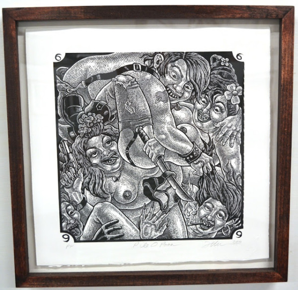
Tom Huck, Pile-O-Poon from the portfolio Hillbilly Kama Sutra (2010-12), linoleum cut print, 16 x 16 inches
Tom Huck is a woodcut and linoleum cut artist from St. Louis. He had a show at Burning Bones Press, a printmaking studio on Yale Street run by Carlos Hernandez. Hernandez is known for his silkscreen gig posters and music images—you might have seen them in exhibits at Cactus Records. Huck and Hernandez’s work is neither polite nor genteel, nor is it academic, nor does it consciously operate within a particular theoretical system. It makes no pretense at being avant garde. It is not intellectual nor is it middle-class. It is not the kind of art typically shown in a high-street gallery. Sometimes it’s called low-brow art. Whatever the economic origins of the artists, their art self-consciously adopts a working class stance. And the prices are pretty working class, too. You can buy a Carlos Hernandez print from his Etsy shop for $25, although many cost quite a bit more.
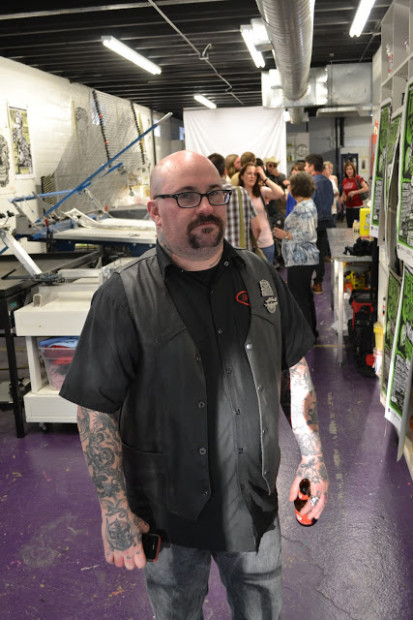
Sad Tom Huck
We were chatting about George Jones, who passed away that day, and I asked Huck to pose for a photo. He had a big grin, but I said,
“Don’t smile so much—George Jones is dead.” So that’s Tom Huck thinkin’ about George Jones. His print operation is called Evil Prints, and he counts as his influences “Albrecht Dürer, José Guadalupe Posada, R. Crumb and Honoré Daumier.”
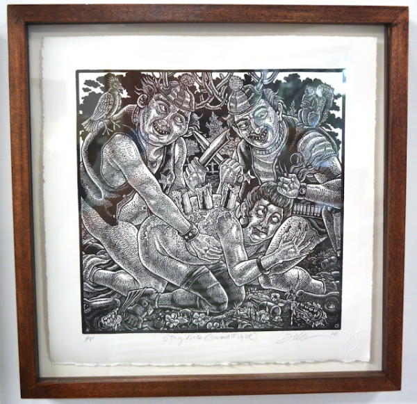
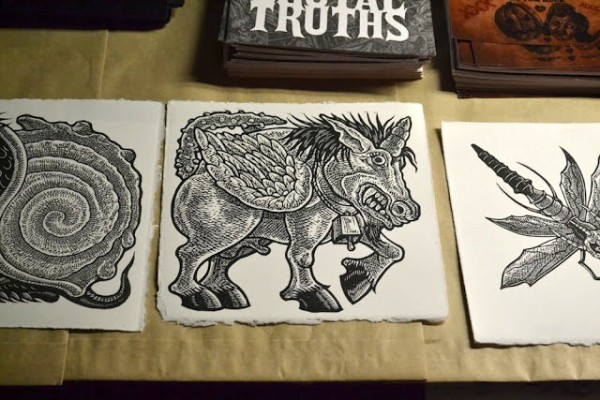
Tom Huck, Stag Night from the portfolio Hillbilly Kama Sutra (2010-12), linoleum cut print, 16 x 16 inches
Tom Huck, Hillbilly Kama Sutra portfolio (2010-12), linoleum cut print, 16 x 16 inches
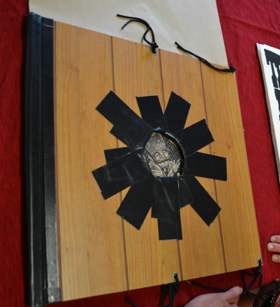
The Hillbilly Kama Sutra was a commission for Blab!, a semi-regular periodical devoted to “lowbrow” art and comics. I love the portfolio cover—wood veneer with a glory hole.
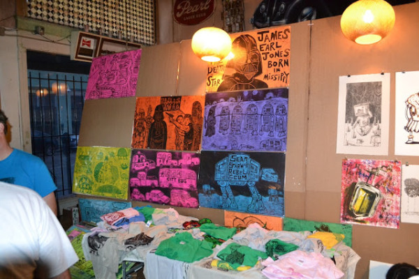
The day after the Tom Huck show, there was an all-day event called It Came From the Bayou at the Continental Club, co-sponsored by Burning Bones Press and AIGA Houston, the local designers’ organization. Printmakers came from all over the country to show off and sell their work. Everyone had tables, so it felt a bit like a comic convention.
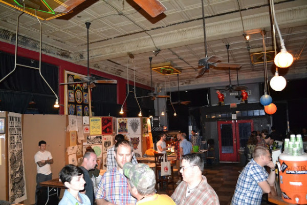
The Continental Club taken over by printmakers
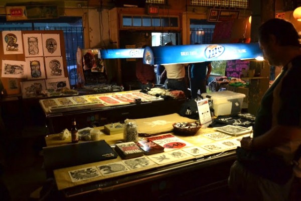
The pool tables in the back were used for display—Tom Huck’s table is in the foreground.
From Tom Huck’s table
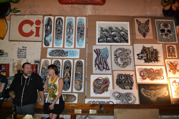
The prints included their share of skateboard art.
While there was a lot of standalone art, a lot of it was in service of something else—gig posters, skateboard deck designs, etc. The functional art reflects the culture on display—they do rock posters and skateboard art because these are things they’re into. (For some print artists, there is no separation between their enthusiasms and their art—the Fort Thunder artists in Providence, RI in the ’90s did silk-screened gig posters, hosted music shows and played in bands themselves.)
The default medium is silkscreen. Silkscreens are quick (useful if you have to do a gig poster for a show next week) and have a poster-like visual punch. Obviously silkscreen posters have been associated with rock shows since the ’60s, with a revival in the ’90s when people like Kozik and Coop came along. But I was surprised at how many woodcut artists were here. If silkscreen is the perfect print medium for designers, woodcut is perfect for showing off one’s drawing prowess.
But I didn’t see many etchings, engravings or lithographs. My guess is that those media are not ideal for the kinds of prints displayed here—large, and with maximum graphic impact.
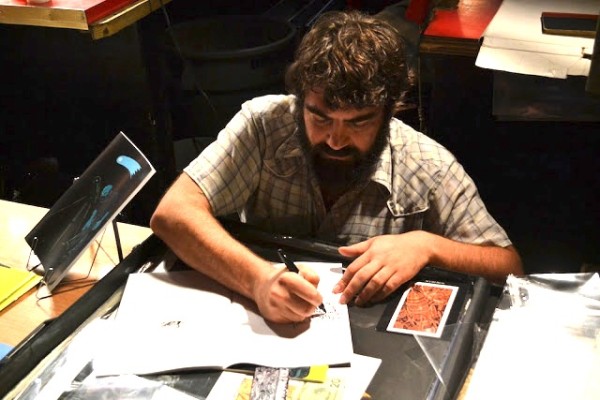
Matt Rebholz signing a comic for me
Matt Rebholz was the exception to the silkscreen/woodcut rule, showing intaglio prints with very fine linework. But he also had two issues of a comic book called The Astronomer for sale. This comic was funded by an outrageously successful Kickstarter campaign (he asked for $4,000 and got over $11,000). The comic combines various myths and legends into one grungy epic of cosmic Aztec/Norse Yetis. It reflects another aspect of this subculture–comics (specifically alternative comics).
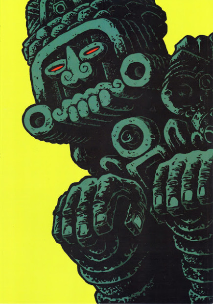
The Astronomer, Issue 1 by Matt Rebholz
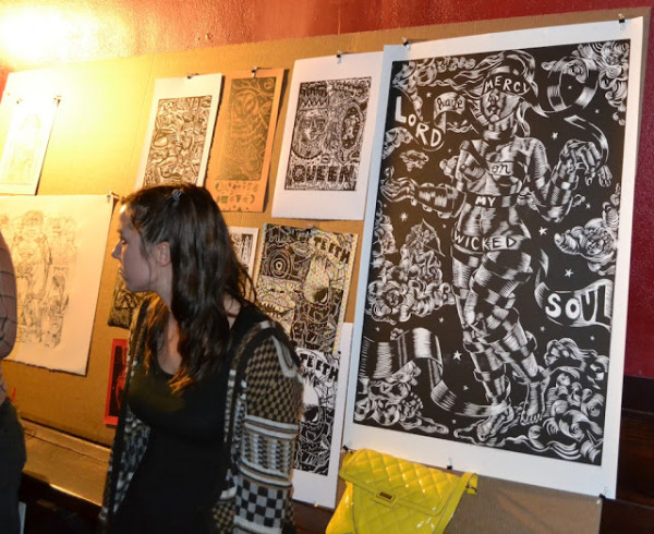
Courtney Woodliff and her art
Another artist whose work I liked a lot was Courtney Woodliff. It also had an alternative comics vibe, reminding me stylistically of Krystine Kryttre, Jeff/Jess Johnson, Julie Doucet and Michael Dougan. In other words, it has a kind of ’80s/’90s feel to me. She was selling prints pretty cheap, so I bought one.
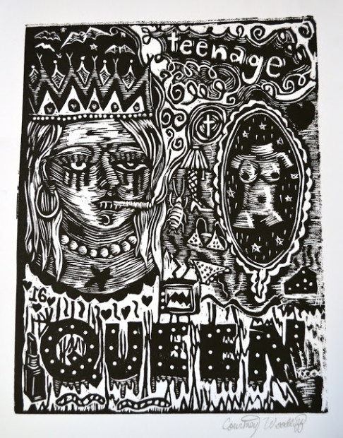
This violent image is like a collision between Johnny Cash, Courtney Love and Ed Gein. That kind of defines the aesthetic on display at this show. This was a kind of art that thrilled me when I was younger. Nowadays I get a little tired of the adolescent sensibility of a lot of this art (skulls! chicks! rock music!), but frankly I sometimes need the energy it gives me, especially after a season of somewhat enervating art by people like Liz Magic Laser and Tony Feher.
Sean Starwars’ table
This was Sean Starwars‘ table, and unlike many of the artists present, Sean Starwars didn’t use his prints to show off his bravura drawing skills or brilliant design—they seem deliberately primitive and consequently rather refreshing. Sometimes stupid has a vitality all its own.
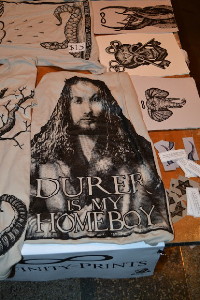
Nonetheless, the average artist here showed a high degree of craft. I wasn’t surprised to see this t-shirt on the Infinity Prints table—master printers like Durer are held in high regard by these modern descendents.
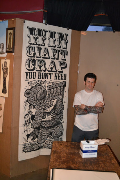
Cannonball Press
This giant print from Cannonball Press suggests another influence—carnival and circus posters. The influences on the art here were schizoid–on one hand, renaissance artists like Durer and Hans Holbein are revered; at the same time, abject art like carnival signs and tattoo art are big influences. This speaks to the collapsing of hierarchies that was supposed to have happened with the end of modernism. But from where I sit, those hierarchies still hold sway for the most part—no less than 19th-century French artists, we have our academies which offer artists official credentials (an MFA) and collectively look somewhat askance at the kind of artists shown at It Came From the Bayou. But I don’t want to portray this as some kind of great injustice. For one thing, the wall between these art worlds is porous—look at the rise of graffiti art in the estimation of the art world. And second, the printmakers at It Came From the Bayou and artists like them have made their own thing. They don’t really need validation from Artforum.
There was a third event on Sunday at St. Arnold’s brewery, but I didn’t attend it. I had seen enough prints that weekend. But this is just the start of the annual print invasion here. PrintHouston has lots of shows and events lined up this summer. I suspect they will mostly feature printmaking of the polite, genteel school as opposed to the kind Courtney Woodliff and Tom Huck do. But it is nice that PrintHouston started off its season with this big barbaric yawp. I thoroughly enjoyed it.
Robert Boyd is proprietor of the esteemed arts blog Great God Pan is Dead.
