

Color in the Land of Oz (not included in the exhibition!)
A twister sweeps across a sepia-toned Kansas and suddenly Dorothy enters Technicolor. In Victor Fleming’s 1939 film “The Wizard of Oz” Dorothy, opening the door into Oz, along with her audience, sees the world in color for the first time. Author L. Frank Baum was fixated on color theory; even the land of Oz was based on the color wheel, and through Judy Garland and MGM, Baum’s story became one of the world’s most famous movies. Unlike any film before it, “The Wizard of Oz” exemplifies the visual power of color.
From street cone orange to blue suede wingtips, color initiates psychological, physical and emotional responses. For visual artists, along with novelists and movie directors, color also becomes content. Yves Klein’s oscillating ultramarine connotes mysticism while Yayoi Kusama’s red and white spots imply a stagnant lunacy. The Museum of Fine Arts Houston’s exhibition The Artist’s Palette: Primary Colors on Paper attempts to reveal how some artists utilize color in their work to communicate meaning.
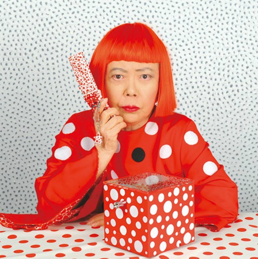
Yayoi on her flip phone
The Artist’s Palette creates a defective rainbow across the lower level of the Law building. From left to right is a steady wash from yellow to blue to red. At either end of the exhibit hangs a wall text explaining basic color theory and Newton’s prisms, but it would fail to distract any ten year old with a smart phone. The text explains that primary colors “are unique because they cannot be created by mixing other colors” but never gives away why this fact is pertinent to the exhibition. Similarly, some pieces are explained in meticulous detail while others remain mysteriously obscure.
The most successful works in the exhibit are distinctly color-centric. Robert Motherwell’s Lyric Suite embraces in small scale the power of his large black expanses. A true abstractionist, Motherwell’s dedication to color derived from a reverence for light: “[Light] is the summation of an artist’s conviction and an artist’s reality, the most revealing statement of his identity, and its emergence appears through form, color and painterly technique as a preconceptual quality rather than an effect.”
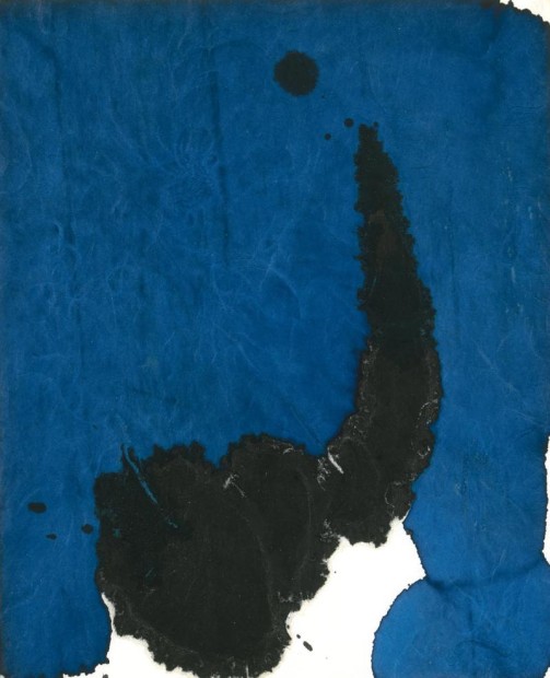
Robert Motherwell, Lyric Suite (1965), black and peacock blue ink on rice paper

Kate Shepherd, Circling Around Yellow, Bigmouth (2010), screenprint on paper, ed. 1/1
Bookending the exhibit are two notable pieces by Kate Shepherd. Red Print #24B and Circling Around Yellow, Bigmouth. Shepherd’s prints are wonderful exercises in chance, process and design. In order to arrive at her final composition Shepherd restricts herself to a specific set of rules in her printmaking process: “Use only one design; print with inks discarded by other artists; cover the paper’s entire surface; and create unique compositions by shifting the paper, rotating the design 180 degrees.” Eagerly exploring color as medium, Shepherd’s prints distinctly advocate the proposal of the exhibition.
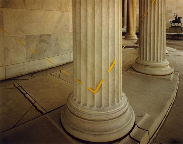
John Pfahl, Yellow Right Angle, Albright-Knox Art Gallery, Buffalo, NY, chromogenic print, ed. #10/75. From the series Altered Landscape (1975)
Another successful piece is by photographer John Pfahl, who manipulates a landscape via tape or string and photographs the outcome. In Yellow Right Angle a trick of perspective transforms the Beaux-Arts architecture of the Albright-Knox Art Museum into a support system for a thin yellow line. Pfahl’s simple manipulation superimposes a sharp gesture of post-modernism over the marble columns of the American Renaissance.
More of my favorites include Ad Reinhardt, Roger Vulliez, and William Eggleston, who all deal with color in imaginative and purposeful ways. Others prove less convincing. What disappoints are not the works individually, but the lack of vision in the curation. Even though this section of the museum has garnered a reputation for being laissez-faire, a show about color at a major museum should be exciting to look at and understand.
Instead, the exhibition feels like a PowerPoint presentation. The curation moves the viewer from one piece to the next didactically, but with little consistency. Within a few steps the exhibition shifts from a banal photograph of an airplane by Amy Blakemore (with no curatorial notes) to the drama of Nino Migliori’s Let’s Remember the Future, memorializing the victims of the 1980 massacre at the railway station in Bologna, Italy. In some cases this unlikely pairing emphasizes the strengths of either work, but with too many variables, the overall effect is haphazard.
The Artist’s Palette informs, but does not inspire. Unlike a movie theater, a nationally recognized museum doesn’t have to be a venue for pageantry and theatrics. Many museums base exhibitions on didactic themes, but often this turns art into merely images with explanations. This exhibition should have remained somewhere over the rainbow.

1 comment
Yayoi Moto Razr !!