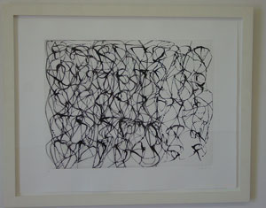
While the word “labyrinth” might suggest a convoluted tangle of dim passageways, many of the 37 works in Labyrinths at Devin Borden Hiram Butler Gallery are actually quite minimal, clean, and stainlessly sleek. In this way, Borden and Butler explore Borgés” insight that a labyrinth can exist within a single line.
The exhibition is divided into works that suggest “word labyrinths” in the front room and “abstract labyrinths” in the main room. One highlight of much smaller “word labyrinths” section is a nice congregation of letter-size works on paper by Carl Andre, Ken King, and David Hutchinson. Andre’s poem, Florash (1972), recalled grade school “word finds” in its layout as well as in its elicitation and stymieing of a single-minded search for intelligibility. Unlike most word finds, however, Andre’s ambiguously elided word fragments conjure impressions that prompt viewers to formulate their own poetic interpretations and images. For Untitled (2000), King threaded a single sheet of paper through a typewriter, applying differing blocks of type each time, until the rectangular coagulation of letters and symbols became unreadable. For Querelle (2001), Hutchinson hand-transcribed an entire chapter of Jean Genet‘s "Querelle" onto a single sheet of paper that accrued a similarly unreadable sedimentation of text.
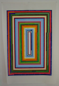
As the first piece you see upon entering the main room of “abstract labyrinths,” Melissa Thorne‘s stunning Plan 1 (1999) provides a fitting welcome. Thorne has rendered a spiral motif in ink on mylar with flawlessly straight lines and precise perpendiculars that evoke the inescapable labyrinth of the Minotaur. The spiral is meticulous, but not staid-the brightly colored bands of the spiral seem to stop and start without reason, and because it is only pinned at its top edge, the mylar flaps wildly in the current of air produced by the gallery’s ventilation system. What’s more, from the vivid, familiar array of colors, to the way the ink within each band of color has settled unevenly, the entire piece feels like something you could at least try to recreate with an old set of scented magic markers.
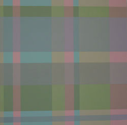
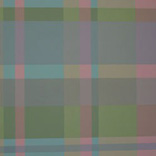
Whether in homage or in jest to the hallmarks of minimalism, many of the works in the “abstract labyrinths” group feature grids and repeating structures. In this vein, a suite of small drawings by Agnes Martin (1976, 1999) and a pair of mixed media works on paper by Jennifer Bartlett (1995) are predictable, high-profile inclusions. Aaron Parazette’s painting Calling Card (1994) makes a breezy nod to the grid with its plaid-like interweaving of precisely delineated blocks of sea foam, azure, lavender, and pink hues that seem lifted from a pair of ladies” madras shorts. Except for the slightly more substantial paper, the gridded arrangement of carnival-colored polka dots in Damien Hirst‘s laser print, Opium (2000), is virtually indistinguishable from patterns found on many ordinary wrapping papers. Sherrie Levine contributes a delicate work on paper, Watercolor 2 (2000), that places vertically elongated ovals on a carefully pencilled grid. Feathery in shades of white and ivory, intermittent ovals emit a barely perceptible iridescence. The grid has lift-off and a renewed dynamism Terry Winters” Amplitude (2000), an etching in deep browns, tan, and black that surges with the tensile energy of an ambiguous cross-hatched form that tilts precipitously towards an undisclosed beyond.
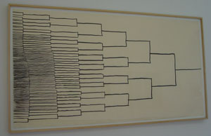
DeWitt Godfrey‘s ink drawing Untitled (1998) suggests a hastily scrawled version of the type of diagram used to map tournament basketball play. It seems to have been drawn in an intuitive way that started with and focused on the apparent winner, with the horizontal bars that represent the lesser players scrunching hurriedly and cramped into the left side of the paper. Godfrey’s drawing seems especially appropriate now, as television coverage of the Olympics winnows the vast throngs of competitors to a few medal-clutching all-stars.
In Bruised (2002), Joseph Havel has pinned his signature clothing labels-in this piece, the imaginary “Bruised” line makes its debut-into a square that covers nearly the full height of the main gallery’s back wall. Progressing from the center of the work to its edges, the otherwise identical labels transition from pale pink to lavender in centrally aligned nested squares. The tract of labels evokes both a geometric, inversely colored bruise and a fluttering sea of taxidermic butterflies.
Though the show features relatively few out-and-out paintings, several works interject a painterly sensibility, including Brice Marden‘s gorgeously fluid etching Cold Mountain (1991), and Mary Heilmann‘s gestural Mint Print (1998). Tom Sachs seemingly takes a break from irony and sloganeering in Alpine Jr. (1995), his vision in layered white duct tape. While supplanting brushstrokes with other things that resemble them is nothing new under the sun, Alpine Jr. glistens with a seductive, snowy freshness — and with its water-resistant finish, it’s one you don’t have to shield from the kids.
Overlapping perfect circles create a mesmerizing rhythm in Bridget Riley‘s etching, Untitled (2000). While the spacing and precision of the circles creates an impression of uniformity, upon closer inspection it becomes apparent that the pattern of circles is not consistent throughout. Instead, the circles cluster in almost unnoticeable clots, build-ups, and nodes. In this, Riley subverts utter systematicity while maintaining its trappings — an approach that marks many of the more interesting works in the exhibition.
Maria Stalford lives in Houston, TX.
