

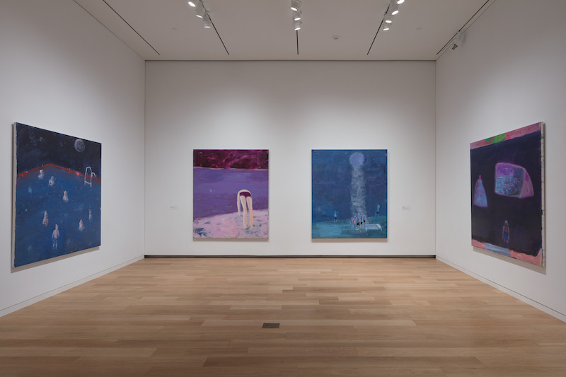
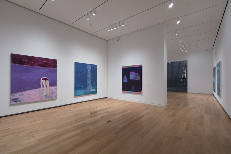
Alison Hearst, the Associate Curator at the Fort Worth Modern, has been keeping painters happy with her FOCUS series of exhibitions. These are usually installed in the museum’s project space, and recent past exhibitions have included Jules de Balincourt, Stanley Whitney, Katherine Bernhardt, and Fred Tomaselli. Currently, the fresh paintings of Katherine Bradford continue this trend of smart, interesting shows. Eleven large canvases are divided among the three coves in the back of the museum. They form little groups with separate bits of storylines, though all the works are from 2017. With Hearst’s parsing we get to see just enough concurrent work to get a complete thought from the artist.
Bradford’s work feels new and wide-eyed, teenagery even; but with a more sophisticated understanding of abstract composition. There’s a braveness on Hearst’s part to exhibiting work that, similarly to Katherine Bernhardt’s, on its face seems off-handed or thin. I imagine some museum-goers will think these paintings are too fun to be “good.” But the work is decidedly serious, though not much interested in conventional markers of virtuosity. Bradford’s paintings do different things.
There’s a range of icons and motifs, simple shapes, and types of brushwork being explored. There’s the “Rothko glow” of rich jewel-like fields of color, Twombly-esque crumbs and finger-smudges of paint. And a cast of figure “types” that float or fly or are otherwise engaged in some curious activity. Bradford’s figures are all generically human yet singular in their execution, as if they tripped out of the brush and landed in unpredictable ways. As a fulcrum to build and drive her storylines, she uses the goofy little things that paint and accidental shapes can do. And hidden in her cavalier brushwork are wise and focused decisions.
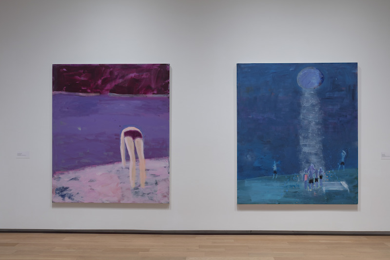
About half the works portray groups of people, observed from afar, giving us the role of reflecting on the larger shape of their activities. We see, unseen, and the figures are faceless: mostly silhouettes or profiles, stacked in space in “pre-linear perspective” ways. In some, they stand under a giant moon or in line at an event, crowd around a burning castle, or group-high-five on the beach, with the suggestion of something slightly magical. Not surreal because they’re neither as rooted in representation nor as consistent with the twisting of it. They seem to grow from a different branch altogether, one that taps into a more basic visual impulse.

Dreamy night air, like essential children’s book illustrations, finding mystery in air, in water: water as metaphor, water as ether. Fuzzy fields of Listerine color absorb the light pollution of the digital age and use it to animate primitive/modern scenarios. Solar Eclipse is lit with the pale greenish glow of night-vision. A line of young people wait in a darkened landscape as if at an outdoor concert. Behind them, some extraterrestrial light event opens up the sky. There’s a lot of Phillip Guston in the cartoonish bodies, arms and legs that bend like PVC pipe in noodly outlines, but also an LED understanding of how light operates in today’s environment – the social energy it can emanate. Burning Castle cranks this light up to an eye-searing level. There’s something completely ridiculous about the separation of colors — the way the castle is made from dark, inky swipes over fluorescent yellow, and how the mass of figures glows a dumb red against it. Somehow it makes sense.
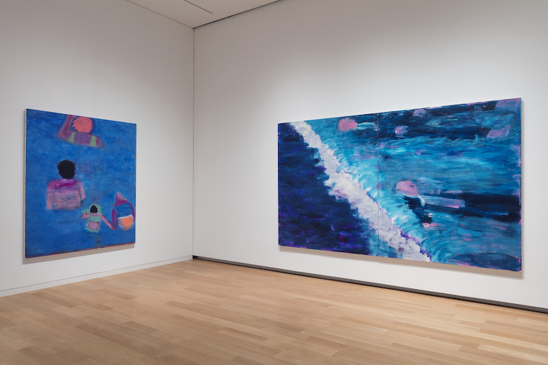
Another group of works is dedicated to swimmers: torsos poking out of water, or guys in suits bobbing aimlessly. The figures in this group are blown up to life-size, the space zoomed in and painted with a larger, juicier brush. They have a more monumental feel and can overwhelm the viewer.
Human Pool, Mixed layers up its watery surface with blues and purples that extend off all four edges of the canvas, which is dotted with swimmers with their backs turned. With just this hint of narrative, we’re left to make visual sense of some simple shapes and surprising color choices, like the weird green halo around the child and warm brown edging the woman’s hair.
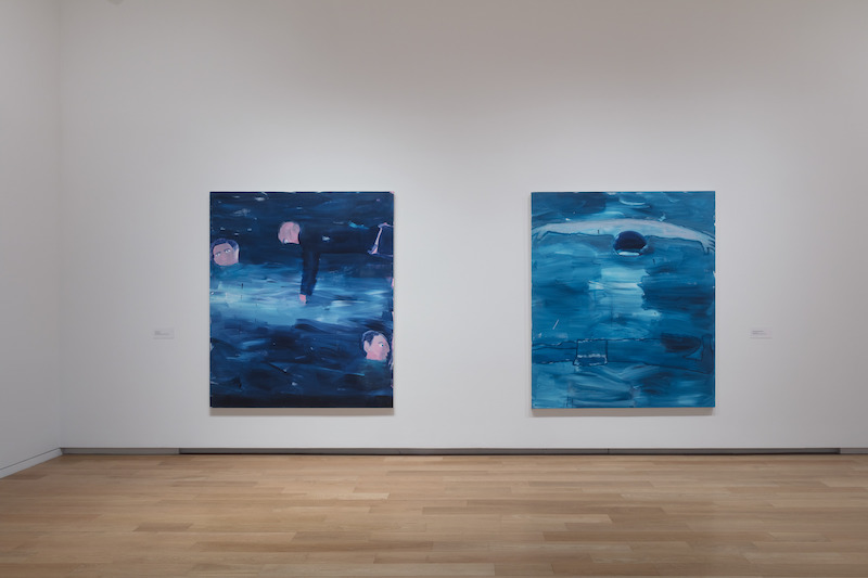
Waterfall and Current use the middle-aged businessman motif and read metaphorically. It’s funny and dark, as much for the imagery as for the way a pink blotch ducks under some dark blue. Again, very prototypical subjects in very particular paintings.
In many works, the stage set of figures is superimposed onto a kind of infinite space built from an abstract field of marks and layers of semi-transparent color, sometimes thinly raked over one another. In Pool, Red Rim, Bradford finds a way to overlap a body of water directly onto a vast night sky, bringing together two fathomless fields onto the same plane. The bare optical facts of this are funny and puzzlingly simple.
The art critic Peter Schjeldahl, who’s made a career of articulating the experience of looking, has described Velasquez’s Las Meninas as containing a second of real time cooked into it. Done by structuring the space so that the shifting areas of focus — different sets of eyes, and a little cognitive road bump in where we as viewer fit in the scene — all fire a piston. Somehow the physical time of looking syncs up with the time represented and trips us into the painting. Bradford does this tripping a lot in her work. The best example is Under Water, Over Water in which the semi-conscious effort it takes to translate the brushy blue strokes outlined by a thick black line, into the visual experience of a figure under water, flips a switch between us and the work. There’s some kind of felt analogy between the actions and reactions accumulating on the surface of the canvas, and the cognitive structuring of its meaning.
Ultimately, I’m not really sure what these works are after. I’m OK with that. Bradford gives precedence to the visual logic of paint, aware of its lies, aware of its truths. Motifs are used to get to the mark-making, which is used to create space, which then serves the drama of the narrative, which falls away into an abstract vocabulary of moves and decisions. The whole thing is diverting and circular — a more accurate picture of what a painting practice is really like. And when it’s good it’s open-ended, honest, and serious. And the work is allowed to be fun.
At the Modern Art Museum of Fort Worth through Jan. 14, 2018.
