
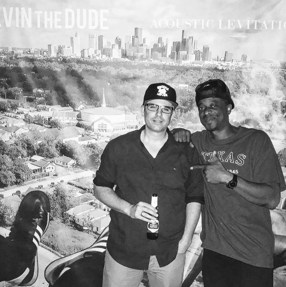
Image courtesy of Mike Frost
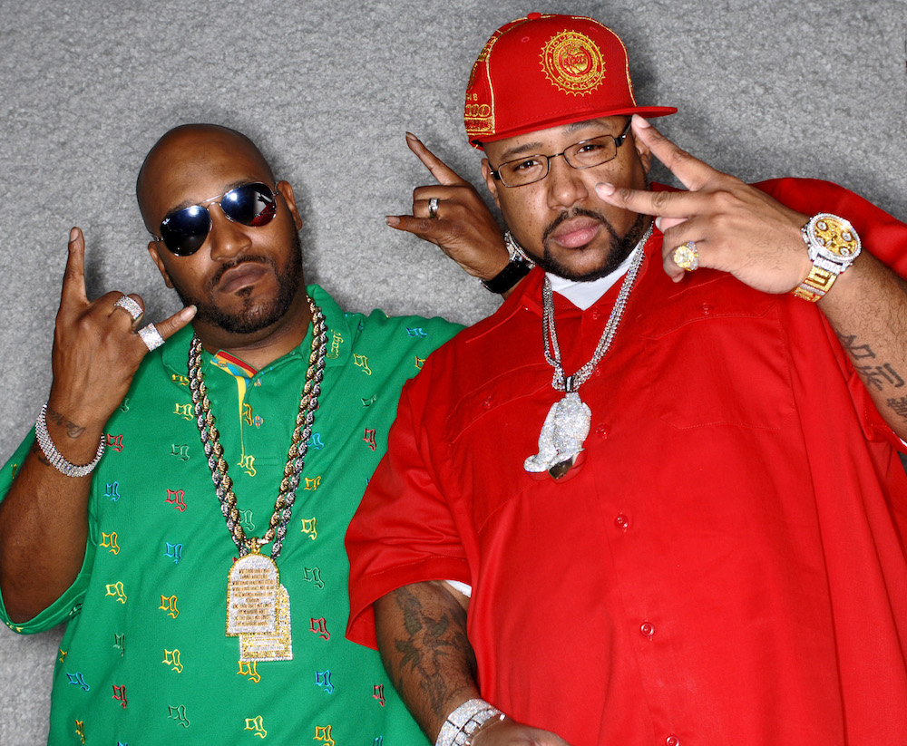
I was on Instagram one day looking at my Activity Feed and noticed that Slim Thug “liked” an image of two individuals. The ‘Gram that Slim double tapped was a photo of Devin the Dude, standing next to an ordinary looking guy, who was holding a bottle of Stella Artois. I chuckled, and thought that I had stumbled upon a picture of a fan with an artist, at one of Houston’s many music festivals.
Then I looked closer and saw that the straight-laced man was wearing a black hat with a Swishahouse logo on it. Swishahouse is a Houston-based independent music label, and in the early 2000s, it was responsible for the mainstream commercial success of local Northside rappers Slim Thug, Paul Wall, Mike Jones, and Chamillionaire. Since Swishahouse gear isn’t commonly worn, the guy in the label’s hat, drinking an atypical beer, and positioned next to Devin the Dude, puzzled me.
Both of them were standing in front of a backdrop displaying artwork which appeared on Devin the Dude’s latest album, titled Acoustic Levitation. I was familiar with the record’s artwork because I had recently interviewed Devin on that album, and its cover art was a topic in our talk. Devin told me a designer named Mike Frost had been doing his artwork for years, and on this particular cover, “He put his graphic work with some of my drone footage, and we tried to find a new way of putting some stuff together.”
It turned out that Mike Frost was the paradox in the photo as well as its uploader. With just over 1,000 Instagram followers, Frost has dedicated his Instagram account to posting images of past record covers he’s designed with short narratives behind each cover. The stories are fascinating, and Frost agreed to speak with me about the history of his work. In our conversation, he described the creative process behind some of his favorite album covers. But while recounting his beginnings and chronicling his art, he also provided an interesting angle on the evolution of Houston’s cultural landscape.
In the early ‘90s, when Frost started creating, Houston was unused. The world of Montrose, and the punk-rock, graffiti, and rap subcultures made the city too weird to be boring, but it was still too boring to be weird. The Arboretum, Cy Twombly Gallery, and the old Whole Foods (next door to Book Stop) are examples of eccentricities that made Houston tolerable, but never really a destination for outsiders. Although the city’s landscape was drab, it was fertile, and particularly in regards to rap.
Later in that decade, hip hop was becoming mainstream in the South, just as it was across the country. And during that time, Pen & Pixel, a Houston-based design company, was profiting off of this new flood of business. According to Frost, the firm was equipped with office space, designers, and a room full of clip-art archives. With its resources, Pen & Pixel produced most of the Dirty South’s most recognizable album covers.
On the other end of the design market, the city had Mike Frost. This Mister No-Art-School-Background artist worked at a comic book store because to him, art was an escape from the problems he dealt with at home. He entered the world of design by doing art work for a friend’s music group and designing fliers for a local promoter who held rave parties in abandoned buildings in downtown Houston.
Frost’s escape quickly catalyzed into a compulsive dedication to master the craft of graphic effects. After an awkward job interview, Pen & Pixel turned Frost down for a design positon. Pen & Pixel’s dismissal gave Frost the chip on his shoulder to spur him on to become become a multiplatinum album-cover designer. He’s responsible for the design and layout of countless albums.
The lack of any discernable pattern in Frost’s designs is significant. His aesthetic was formed as response to Pen & Pixel’s rejection of him. His broad creative palette only contained the tools his denier wasn’t using. He was motivated by disapproval, which forced him to break through the business with original work.
I met up with Frost at Houston’s on Kirby to do this interview. When I entered the restaurant, I noticed Frost’s hair was combed and his collared shirt was tucked into his creased black dress pants. He left his oil-and-gas desk job early to give me an incredible story about how he followed his passion as a bummed-out teenager by doing design work for Houston rappers. Mike is older now, and has a family, but his Maker’s & Diet-fueled responses to my questions still seem to come from that same place of discontent which have led to so many distinct album covers.
Due to Mike Frost’s impact on Houston culture, archivists at the Woodson Research Center in Rice University’s Fondren Library are in the process of gathering and displaying his work. In honor of his induction into the library’s collection, The Center for Engaged Research and Collaborative Learning will be hosting a panel discussion at the University on Frost’s work, October 14, 2017. For more information on this event please visit CERCL’s website.
(Note: All images courtesy of Mike Frost.)
Douglas Doneson: Tell me about your creative beginnings.
Mike Frost: In 1991, I worked at a comic book store on the Northside of Houston, called Northside Book Emporium. Jermaine Rogers, who is a famous poster artist, worked there with me. A lot of my punk-rock friends used to come over. 30 Foot Fall, Taste of Garlic, and Fenix TX were my homeboys; Fenix TX were mainly the guys kicking it around the comic book store. We’d draw pictures. I wanted to make a comic book.
I also used to submit artwork to local zines. This guy named Josh Mares from Los Skarnales accepted the art for his zine, which was called Houston’s Propaganda. I had just gotten a computer that my parents bought me. My parents were poor, so buying a computer was a big deal. Josh Mares came to my house and brought me Photoshop, which my computer didn’t have enough memory to run. Eventually we got more memory, and I just started to learn from that point.
Around that same time, I went to Nimitz High School with a guy named Chad Porter, who is now a director going by the name Orbit. Back then, he was in a group called Kamakazeez and wanted me to do their cover. I did that album cover, they put it out, and I started to get calls. And from that, Russell Washington, of Bigtyme Recordz, who first signed DJ Screw and U.G.K., got me to redo his logo. And from there, it kept growing.
While that was happening, Orbit would tell me about Pen & Pixel, a company out of Houston that was doing all the album covers at that time. I thought “They are involved in the music business? I want to be there.” For a kid from Houston, in the ‘90s, even being able to touch the music business was like a faraway L.A. dream.
I wanted to go in that direction, so in 1997, I worked for six weeks on this piece of art to take to an interview I got with Pen & Pixel. I did my best to get a job there, so [while there] I went to the bathroom and on my way back I heard them talking: “Well, he doesn’t have art-school background, so we are going to pass.” And then I walked up, like, “Hi.” That is where the chip on my shoulder came from because it fucking hurt my feelings. So, I went to Texas Art Supply and I bought every book I could find on graphic effects.
DD: At that time, you were also designing rave posters?
MF: I started doing rave artwork in 1996. The rave parties were downtown in the bank building. I don’t know the name of the bank. Back then, downtown was empty. Eastside was empty. All around Houston was empty. There were tons of warehouses and skyscrapers that were empty. Real-estate guys were really receptive to making money off any real estate they had. Today, the economy is much better, so it would be impossible to do that now. And the reason it was called the bank building is because there was a DJ set up in a huge safe, as big as a house. Knowing Photoshop, I hooked up with Chris Anderson, the guy that originated the parties there, and started working with him on artwork.
DD: What was the first album cover you designed?
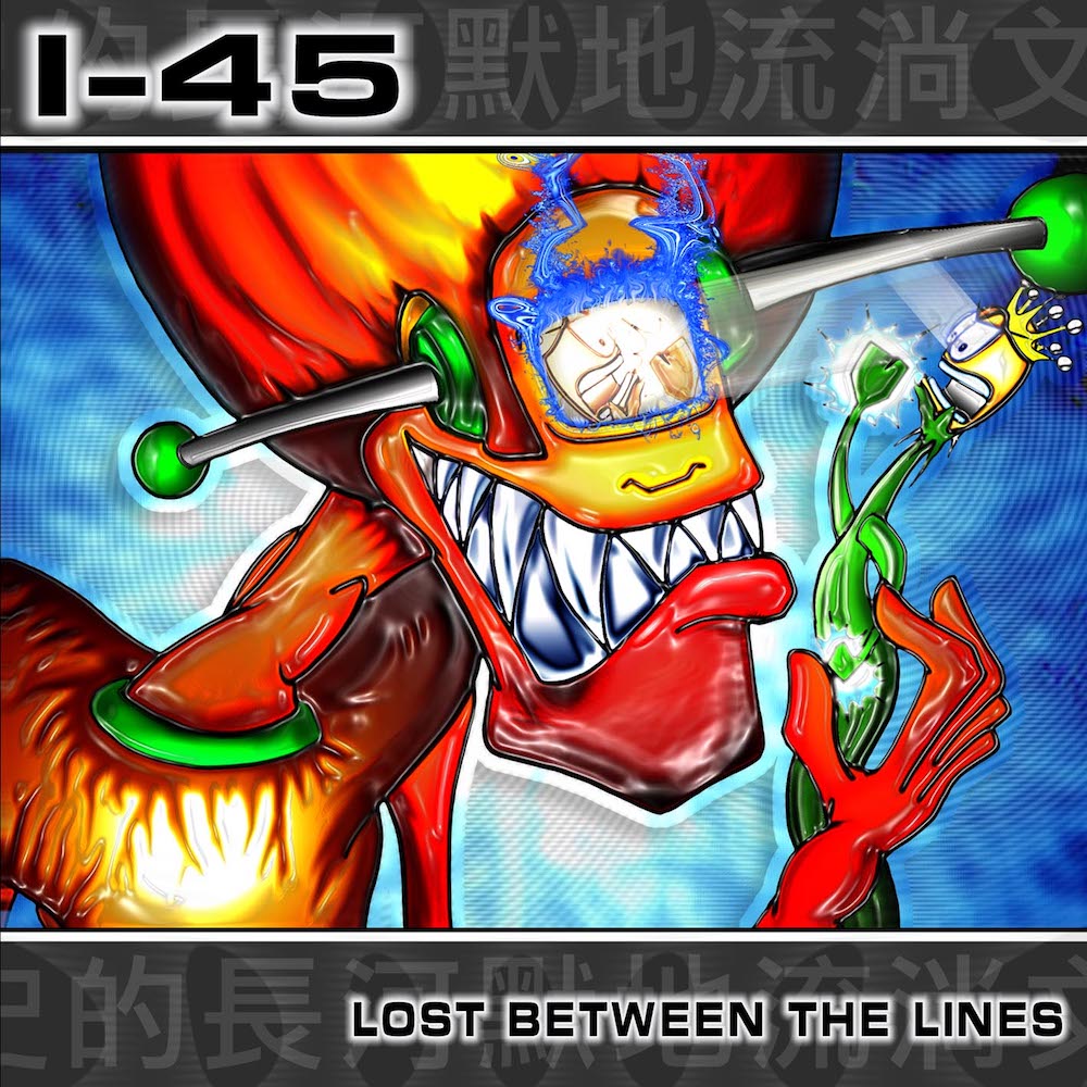
MF: In 1998, I designed a cover for I-45, a band that played at Fitzgerald’s. And they were the first guys that called me. I don’t know why they even thought of me. The album cover was a remote-control demon with chrome teeth oppressing a plant person. It was a really weird piece of art. I was listening to Tool’s song Disgustipated when I was creating it.
DD: I want to talk to you about some of your favorite covers that you’ve designed.
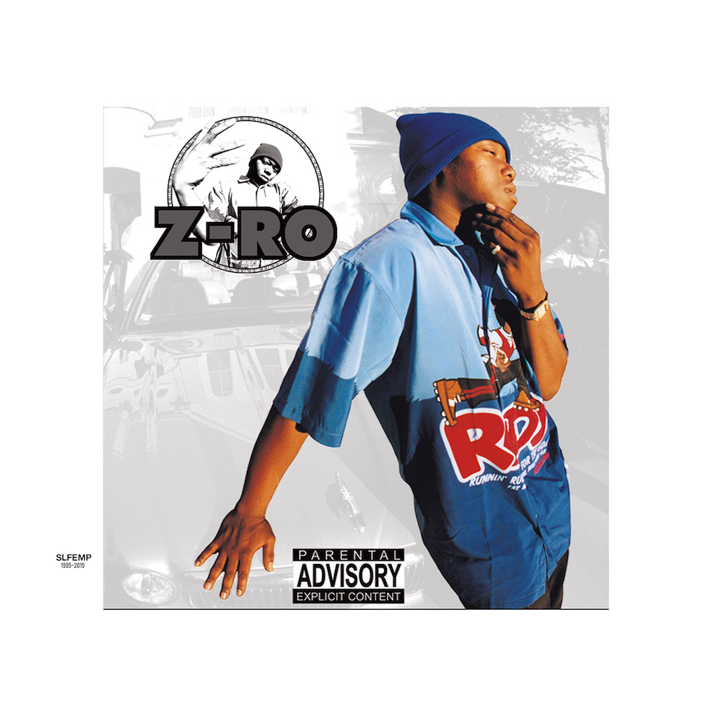
MF: Z-Ro’s self-titled album [2002] is cool because I brought stuff I did for rave fliers into the hip-hop culture. I used 5th color silver ink and foil stamping. I pitched that idea to everybody before I put that album cover out. Everybody was like, “No, no, no, no.”
The extra cost of special effects added up. It also took longer to get back from production. A lot of clients would rather spend their money on more CDs rather than nice packaging.
But this guy from KMJ [Records] — Z-Ro’s old label — actually approved it and backed me maximizing print and graphics and putting it towards the hip-hop records. After that album, people started paying attention to me. Still, people were really hooked on diamonds and graphics. Photoshop didn’t exist [pause], and then it did. At that point, you could do all these fanciful graphics that Pen & Pixel did. The only way I could compete was to come with simplicity, materials, and photography.
DD: But didn’t you have Photoshop?
MF: I did. But how was I going to compete with a giant in the industry? They had all the tech, all the money, and all the newest equipment. My dad used to tell me [that] anything I did to bring attention to myself, but spent more than I should on, he called an “image carrier.” He said: “That’s an image carrier, son, you don’t need that shit.” I looked at the Pen & Pixel style as an image carrier. All their clients were paying this for that, like a stock market; it was an inflated value for something that wasn’t a full value.
DD: So, you attempted to break the perception of value of the digital diamond?
MF: Oh, no. I totally did that. Me and my rave homeboys used to design fliers and would joke. They’d bring catalogs to the house and say “Let’s put this watch on him,” and we’d joke about people being fake. When I was designing, I’d say to a client, “You’re in the hood? Okay, let’s take pictures over there [in the hood].” People would pay a thousand bucks to have diamonds added to the cover. And that’s a ten or fifteen-minute operation. When I looked at the time involved in doing that and I looked at the amount of work, I just knew there was false value there.
I wanted to go out and shoot what I saw. I didn’t want posing or any of that. The hardest part of a shoot for me now is people getting prepared for me to shoot them. That’s not what I’m here for. Don’t put your best gangster t-shirt and sunglasses on and trim your beard when I am coming out to shoot you. That’s not what I fucking want. I want it raw. I want it raw all the time.
DD: How did the foil stamping on Z-Ro’s self-titled album set you apart?
MF: Nobody was doing it. It was a way to strip everything. If you look at Z-Ro, he was dressed plainly on that cover. It was a way for me to strip all the jewelry and pineapples and present him simply. I knew that if I changed materials, printing techniques, and did something people were not doing, they would pay attention. Instead of looking at adding things to people, I changed the quality of the materials, because the physical CD was the thing back then, so that was the way for me to take what I knew and stand out.
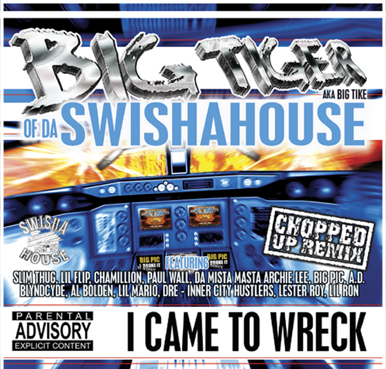
DD: Tell me about the Big Tiger I Came to Wreck cover. (2000)
MF: For one of the last rave parties, I did a rave flier and t-shirt that said, “Destroy New York.” I had this fascination with plane crashes. Big Tiger had an album titled, I Came to Wreck. I thought, “Dude, let’s do a plane crash.” We went to Dave & Busters and Tiger was playing a flight simulator game and I was taking photos so I could build a cockpit around him. We made the inside of the plane going down. That album was done one month before 9/11, and when that happened everybody was shaken up. They thought FBI would call us, but the FBI never called.
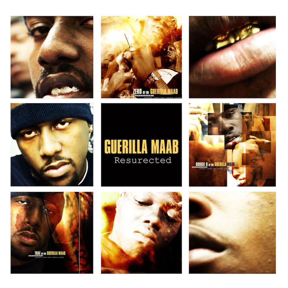
DD: What about Guerrilla Maab’s Resurected cover art? (2002)
MF: That was the first time I did a photoshoot. I literally just opened up the camera from the box. It was a 5-megapixel Canon or something. It was $600 of $700 at the time. Sometime before that, I had a meeting with Trae to shoot something and he happened to show up while I was playing with the camera. He brought Z-Ro and Dougie D. It was the first time I had ever met them. I didn’t know what to do. I opened up the box and just started taking pictures and playing with the settings like I knew what I was doing.
I shot a whole photoshoot for Resurected but ended up with nothing I could use. I started cutting pieces out of every photo and using the best piece. I put the cover together that way. With that chip on my shoulder, I had to take what I had and make something good out of it. That is my favorite one, because I was thrown into a situation where I had to hustle; I had a customer — even though I didn’t get paid — I had to show them proof. Sometimes you don’t need to get paid to have that drive.
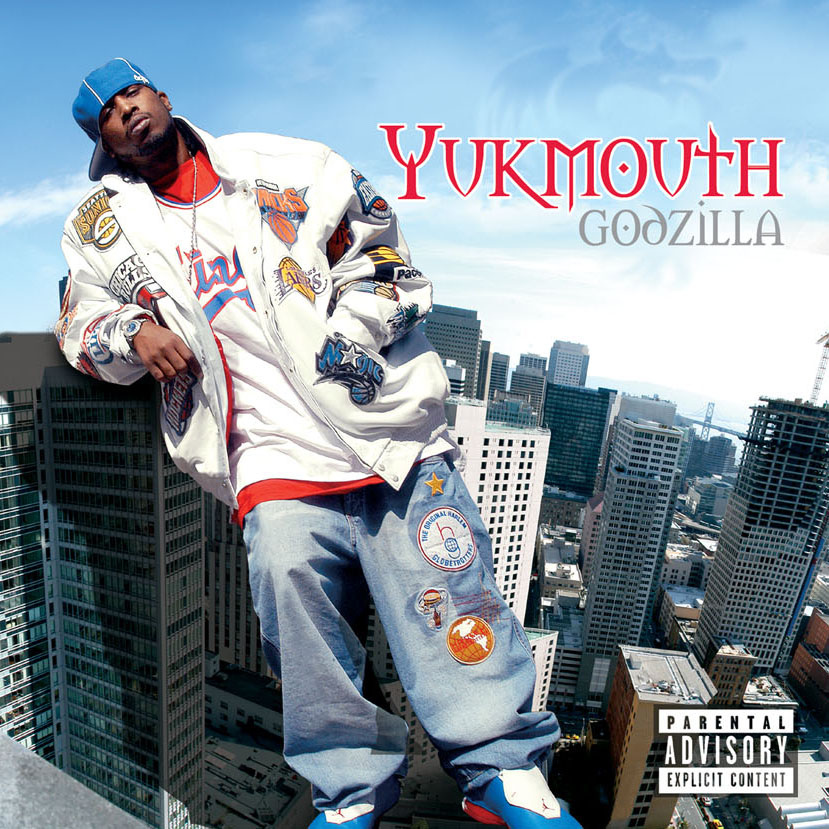
DD: Didn’t you cut photographs for Yukmouth’s Godzilla album art too? (2003)
MF: Yes. I talked Rap-A-Lot [Records] into sending me out of town. I wanted to go out of town so bad, because I had never been out of town. I actually left on that plane with like $50. I didn’t eat the entire trip. My hotel was in downtown San Francisco. It was not a sky scraper, but it was on a hill and tall as fuck. I talked a security guard into allowing me onto the roof and I was actually standing on a ledge with a wide-angle lens shooting all the pictures.
The only thing I cut out was Yukmouth, who I shot in the Bay Area. I put him on this picture of downtown. I had to stitch the photos together for the city. Photoshop has the auto-stitch now. You can put 100 pictures in it and it will put them together. But back then I had to take a picture, about every ten degrees, and then I would go ten degrees down and go back. For that cover, I had to stitch the background by hand.
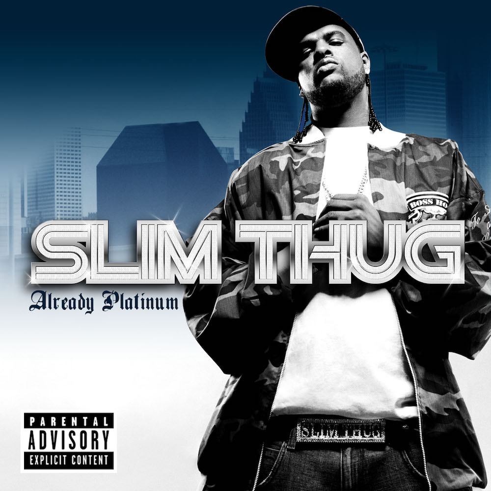
DD: You designed the cover of Slim Thug’s 2005 release, Already Platinum. This is when you broke into the biz.
MF: It was normal for me to take everything I needed with me. I went to Interscope [Records] to pick up the Slim Thug job. I brought my whole desk top, the monitor and all of that. I could tell that when the creative director, JP Robinson, was looking at me, he was thinking, “I don’t know what to do with this guy.” He put me in the spray-paint closet which was a terrible working environment. The next day I was like, “Hey I am just going to work in the house; it’s more comfortable.”
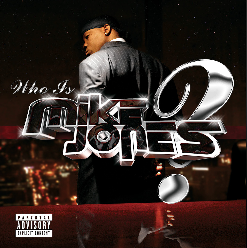
This was the first time I was excluded. A lady [who worked with JP Robinson] wouldn’t shake hands with me. She had a germophobia thing, which is cool. I brought her pages of Slim Thug covers and she loved them. About four months later, she called me. Somehow, she saw the Mike Jones cover, which I shot in 2004 at the Transco Tower, here in Houston. The Who Is Mike Jones cover is 99% black. There are red tones. And the font is chrome. If you didn’t know you were looking out of the Transco Tower down Post Oak Road, you wouldn’t be able to tell it was Houston.
Slim’s cover also had chrome lettering. She said, “why are you going to do something for me and do the same for somebody else?” But, that’s just Houston. I was like, this is national and I was giving America what it wanted; it wanted dirty, gold, and diamonds. I was trying to do that, but Interscope accused me of plagiarizing myself. I don’t think they understood that this was our fucking time. I communicated that to the “germ” girl, and she completely shut me out, which totally crushed me. I went with what I believed and got cut off from the whole thing. But it really didn’t matter, because at that time the industry was crashing, plus everybody was scared to stand out. That is kind of when I jumped out. That, and the pressure of feeding my family. My passion towards my art and my responsibilities to take care of my family reached a point where neither one was happening, so I fucking made other plans.
DD: You indicated that the pump-and-dump of the music industry in 2007 interrupted the underground artist market in Houston, which was an incubator for talent.
MF: It killed it. Before Swishahouse, Slim Thug, and Chamillionaire got signed, Houston had a pulsing, thriving, and underground mixtape market. [It was] this live underground culture. You could become popular at your local record store or you could already be popular and promote yourself there, like H.A.W.K., or E.S.G. did. Slim Thug and Swishahouse were big, but everyone could have had their turn. Everybody was making money and living well off of it. When everyone went major, all that died. Best Buy and a lot of big retailers started offering CDs at a lower price than the mom and pops. That, along with Apple, its iPods, and digital downloads had a lot to do with the death of the mom and pops, which in turn affected the underground market.
It’s confusing because the major push and the decline in the music business for Houston happened in a one-and-a-half-year period. So you had a time period from being able to sell 400,000 mixtapes to going to an environment where you could only move 200,000 units on a major release. The decline of the music business and all that just blends together. Which is why Houston artists have never been over played — something I noticed.
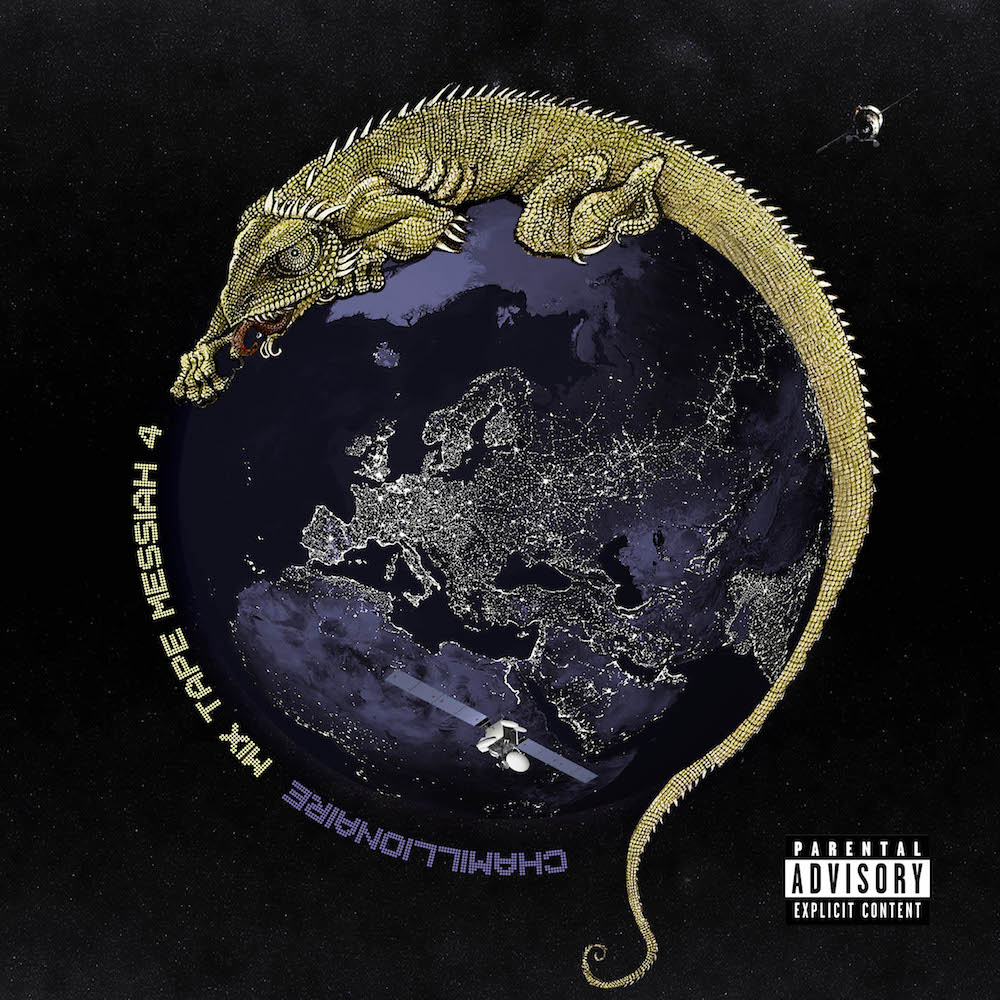
DD: Tell me about Chamillonaire’s album titled, Mixtape Messiah 4. (2008)
MF: Cham always appreciated art and technology, and that stuck out to me.
The lizard painting was on this album. I commissioned an artist named Shally Brady, who was also painting a mural in my house when this cover came out. I didn’t really have money to play with for initial albums, but for sophomore albums I actually had money to play with. I pitched this idea to Cham that everybody in Houston wants to see the rest of the world: we don’t get out. I said, “Let’s go around the world and take pictures.” Of course, he got Jonathan Mannion to go with him instead of me, who is a super dope photographer. But, Cham still had my back on doing the art.
Mannion was a photographer I looked up to since the beginning of my career. He wanted simplicity; that moment on a person’s face all photographers want to capture. His influence made me simplify what I was doing for a long time. But being older and thinking about it… I don’t agree with that shit. When I think of the lessons I learned from that stuff, I think: You should just be you.
DD: You were being you in 2007 when you asked Pimp C that question.
MF: I asked him to get back-to-back with Bun B and take a picture. And he said, “Why do all you fucking white boys want us to take the same fucking picture? You can’t think of anything fucking else?” And I responded: “We’re done.” [Laughing.] And then Bun B and him said, “Are you sure?” And I said, “I’m done.” [Laughing.]
DD: And what did you drunkenly ask Bun B?
MF: To do his album cover. We were at this bar downtown, and I think Obama was about to win the election, and Bun B was at the bar and I went up to him and said, “Yo, I am Mike Frost, let me do your motha’ fuckin’ album cover.” I was fucking drunk. I had to approach him again and apologize. I told him I still wanted to do his album cover. He said we could do one later. I’ve still never done an album cover for him, but I’ve taken photos for him.
DD: While on the subject of drinking, tell me about your work for Swishahouse’s project titled Under the Influence. (2009)
MF: I was getting back into drawing by hand. But, way back before Photoshop, I hand drew everything: books, magazines, and posters. I still have hundreds of sketches from back in the day. Those characters came from my head: God, Jesus, watching my friends’ moms from the Northside on crack trying to stab each other, and watching my dad go crazy. We had to put him in a mental hospital. Comic books and drawing were an escape for me.
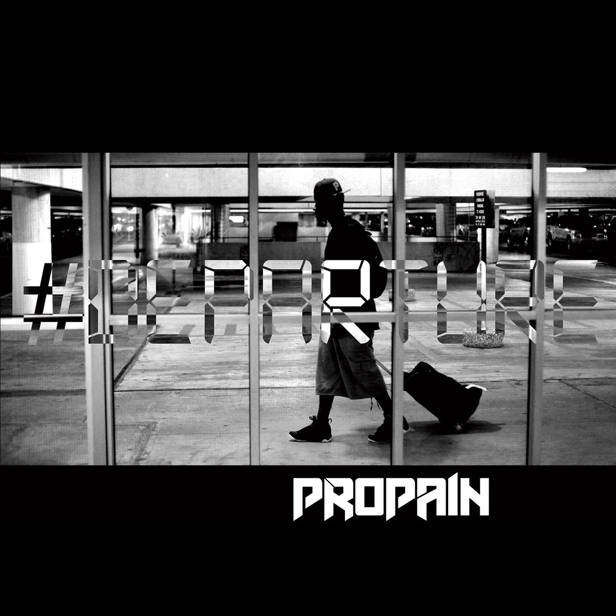
DD: The cover of Propain’s 2010 release Departure is interesting.
MF: That happened a little bit before I started fading out of the scene. I was stuck in the old generation and Propain represented the new generation of Houston rappers. So, we were in this weird mix and I just came from being king of a time to that. It was like a transitional area. I didn’t want to do graphics or any of that stuff. Stylistically, it is here where I reverted back to a simpler approach that was closer to where I began.
To shoot this cover we had to get inside the airport, so we bought two tickets to get in the terminal. We shot a bunch of pictures, but ended up using the one we shot in the parking garage. Sometimes it’s like that: I made all these plans, had all these ideas, and went through all the trouble to try them out, but ended up using the b-roll shot. You never know which picture is going to be the one. More often than not, the ones I put the most into, I never use.
I think I charged $300 or $400 for this cover. It was a time when prices for artwork dramatically dropped. It went back to the level it was at before the majors stepped in, but there was a lot less work. The mixtape game had been all but crushed. It was really hard for new artists to shine, and very few from Houston have broken through the noise since.

DD: And Paul Wall’s album titled, Check Season? (2013)
MF: This photo was taken in Vegas at the Hard Rock Casino. I made a few covers; Paul liked this one.
There were very few times that I travelled with an artist and a camera crew, but this one was extensive. We have two unreleased videos from this shoot. We started shooting the photos and video in Houston, where we threw a warehouse party to film a concert scene and we shot some scenes on rooftops downtown. Then me, my partner Brandon Holley, and Mark Armes, a local filmmaker, drove to Vegas and met Paul there. He gave us his suite at the Hard Rock Hotel. We mostly partied and lost some money in Vegas, but we did shoot for his Check Season cover in that room.
After Vegas, we left for Los Angeles and met up with some of Paul’s West Coast homies. We shot some scenes at a helipad, on a dam, and hanging out of the window of an Aston Martin flying through L.A. tunnels. We left L.A. for San Diego and got more film at an M.M.A. gym. All said and done, we shot two videos in four cities. I am kind of bummed that they were never released. Those were going to be my entry into the video market. Out of everything we did, the only thing we used were the images for the Check Season cover.
DD: I’ve heard that a cover can make an album, but I’ve also heard that it’s the album that makes the cover. What are your thoughts on this dichotomy?
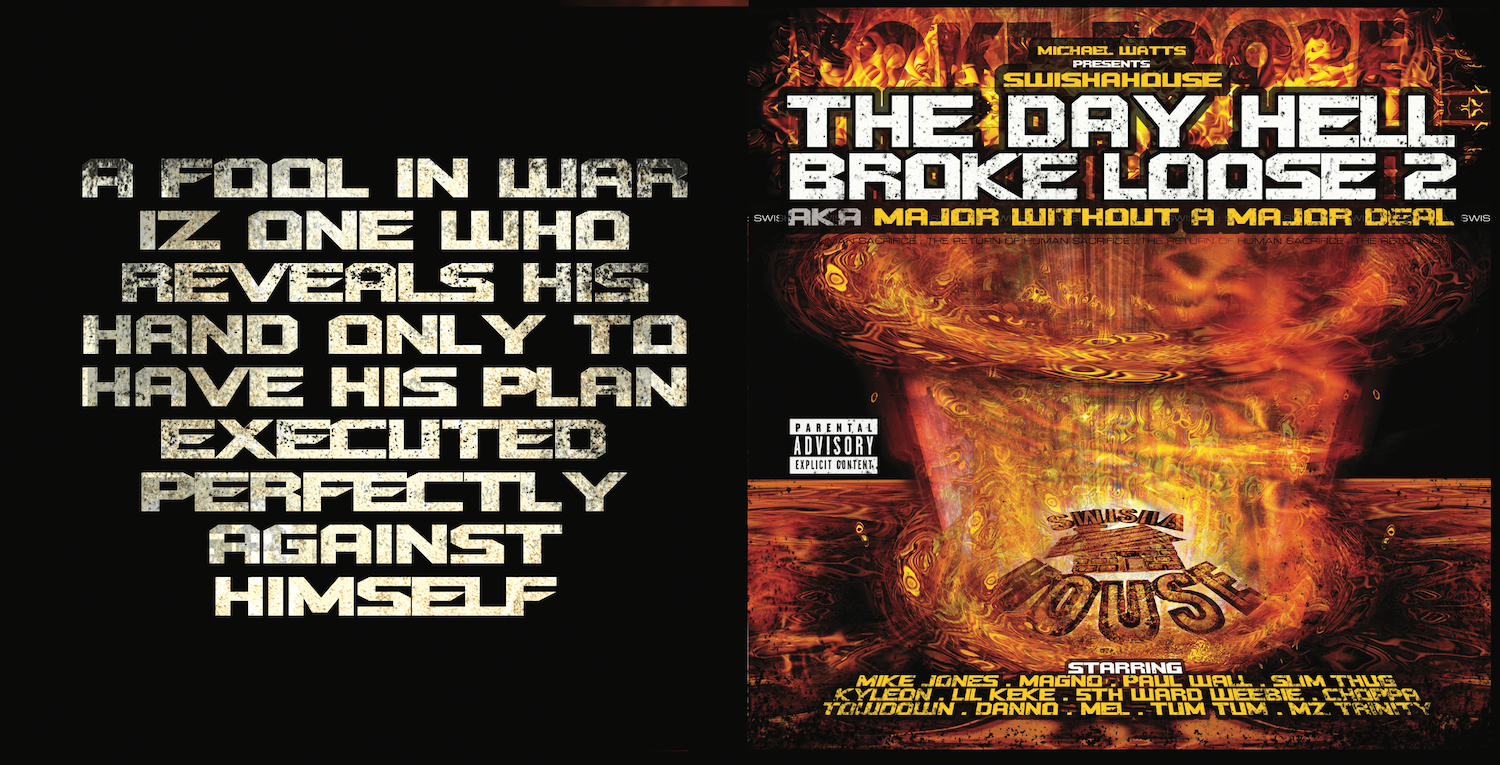
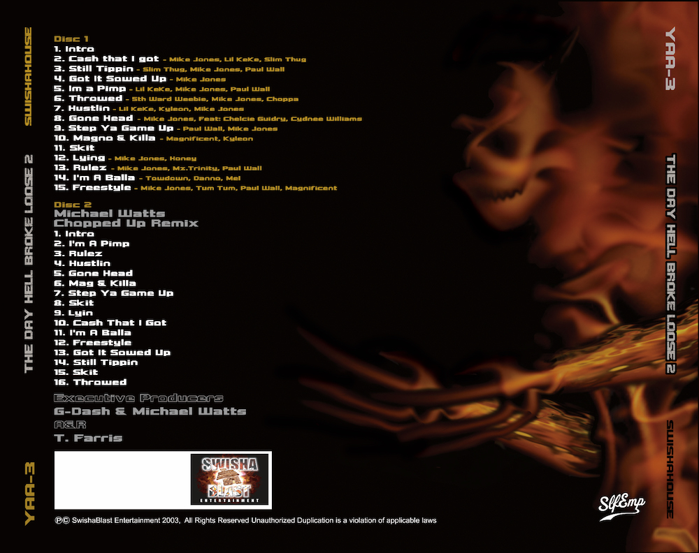
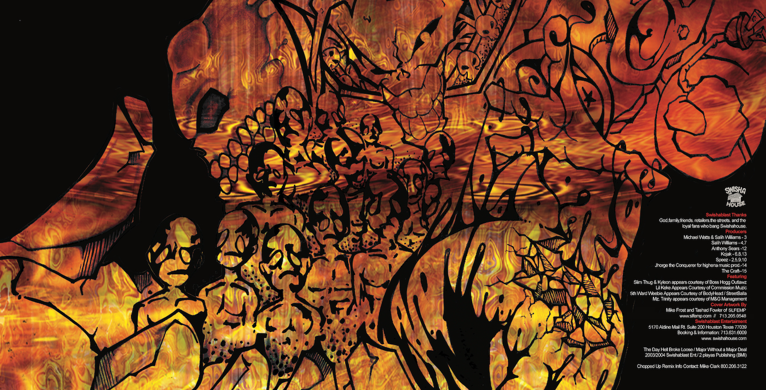
MF: It’s a synergy. If the album cover looks dope and the artist backs it up with shit that’s dope, it’s classic. A few examples of this are Metallica’s … And Justice for All; Nirvana’s Nevermind; Pink Floyd’s The Wall; and [brief period of silence]… Swishahouse’s The Day Hell Broke Loose.
DD: What about Snoop Dogg’s Doggstyle?
MF: I could have done better than that. [Laughs.]
Mike Frost will make a presentation on Oct. 14 at the Rice University’s Moody Center for the Arts in Houston in conjunction with the exhibition ‘Mickalene Thomas: Waiting on a Prime-Time Star.’ For more info, please go here.

1 comment
Shout out to my boy, Mike Frost! Respect