
For the high-end art collector, a vanity museum is a tricky thing to pull off. I live in the same city as the quirky, elegant Menil Collection, perhaps the best example of the genre. Virtuosic gems like the Menil are rare; and turgid, bombastic hothouses of art trophies are far more common. Such was my expectation of The Broad, in downtown Los Angeles, which I visited on the first day it was open to the public this week.
Like Eli Broad, Jean and Dominique de Menil were fabulously rich. But unlike him, they lived at a time when the glammy lifestyle of many rich people today would have been considered unspeakably gauche. Old money vs. new is embodied in these two buildings: the Menil Collection (Renzo Piano’s first museum building) is a low-slung, muted structure in a quiet residential neighborhood in Houston. Its design riffs on the local vernacular, with cypress wood paneling, a long dogtrot hallway, and slightly creaky, dark wood floors. By contrast, the Broad is all techno futurama, blocking the view of Frank Gehry’s flamboyant Disney Concert Hall, and giving the architectural finger to the trench warfare bunker of grubby MOCA, across the street.

Gehry, Schmehry: the Broad stakes its claim on Grand Avenue in downtown LA.
All of which is to say that I was predisposed to be critical of the pharaohic ego on display at the Broad. But although the main gripe about the collection is true, namely that it’s unsurprising, starfuckey and market-driven—a reflection, in short, of the unfortunate art world of our time—there are nonetheless some truly wonderful moments to be had. Mr. Broad himself enjoys a reputation for having wielded his money like a sledgehammer among LA’s art institutions (the flaming bag of dog poop that was Jeffrey Deitch’s tenure at MOCA can be safely laid at his doorstep). But the Broad is far less discouraging than it might be, given that the collection includes so many moments of genuine pleasure. I enjoyed it.
The building, by Diller Scofidio + Renfro, is a hard white exoskeleton over a gooey, rounded gray interior. There are no right angles, or any angles period, in the entrance lobby. Imagine being a microbe passing through the shell of an armadillo up into its gray vagina, and you get the gist: you ascend via a long escalator through a concrete, gray birth canal to arrive at the top floor, which is where the bulk of the better moments in the collection lie. Mercifully, the architecture melts away in the galleries for the most part, and the lacy exoskeleton does its job of modulating the natural light very well. I don’t think any of the third-floor art was artificially lit.
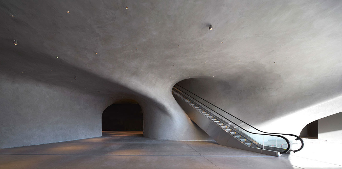
Armadillo orifices
The building also features peep show vignettes in its stairwell—viewing portals into the storage area—which are the poor man’s version of the backstage tour that museums give to seduce donors. It’s a smart strategy: give the people a glimpse of a Christopher Wool, a sliver of Richard Prince, hanging on their rolling steel racks. You aren’t in the inner sanctum and you’re never gonna be, but at least you can press your nose against a groovy ovoid window to look at it.
As for the art, there’s a lot of it, and some of it is great. Here are the highlights of my visit:
The Ellsworth Kelly room. A friend commented that the room is a little too tight, but I didn’t mind the way these four large canvases, ranging from the 1960s to 2011, filled it. (I guess these days I would rather a white cube be intimate than cathedral-scaled.) It’s a stunning overview of Kelly. At the risk of outing myself as a philistine, I admit I’ve never really understood what the big deal was with Kelly’s paintings before. I’ve certainly never appreciated them. But these four examples—all in the same red-blue-green palette, even though they span decades—form the most compelling primer I’ve ever seen of his work. Perhaps because they are hung so close, the simple observations he’s working from—a corner of a room, the bent shadow around a slightly open door, the actual shadow created by stacked canvases—become manifest. Scale, too, is his friend with such stubborn simplicity, and one of the paintings, Green Angle, is reportedly the largest he’s ever made.

Ellsworth Kelly, Blue Red, 1968. oil on two canvas panels. 73 x 161 inches overall.
Lichtenstein’s cathedrals. Roy Lichtenstein’s great achievement was figuring out a neat way to slam the door on Abstract Expressionism. Unfortunately, once he did so he got stuck, and of the five or six examples at the Broad, three or four of them just take up wall space to confirm his limitations as a painter. But in his series of nearly indecipherable cathedral façades, you see the guy freeing himself from comic books and bringing Monet’s serial light meditations into the mid-twentieth century. The paintings pulse between representation and abstraction, and his wild color combinations, drawn from old-school halftone printing, still glow with intensity. Here is the church, here is the steeple…on acid.
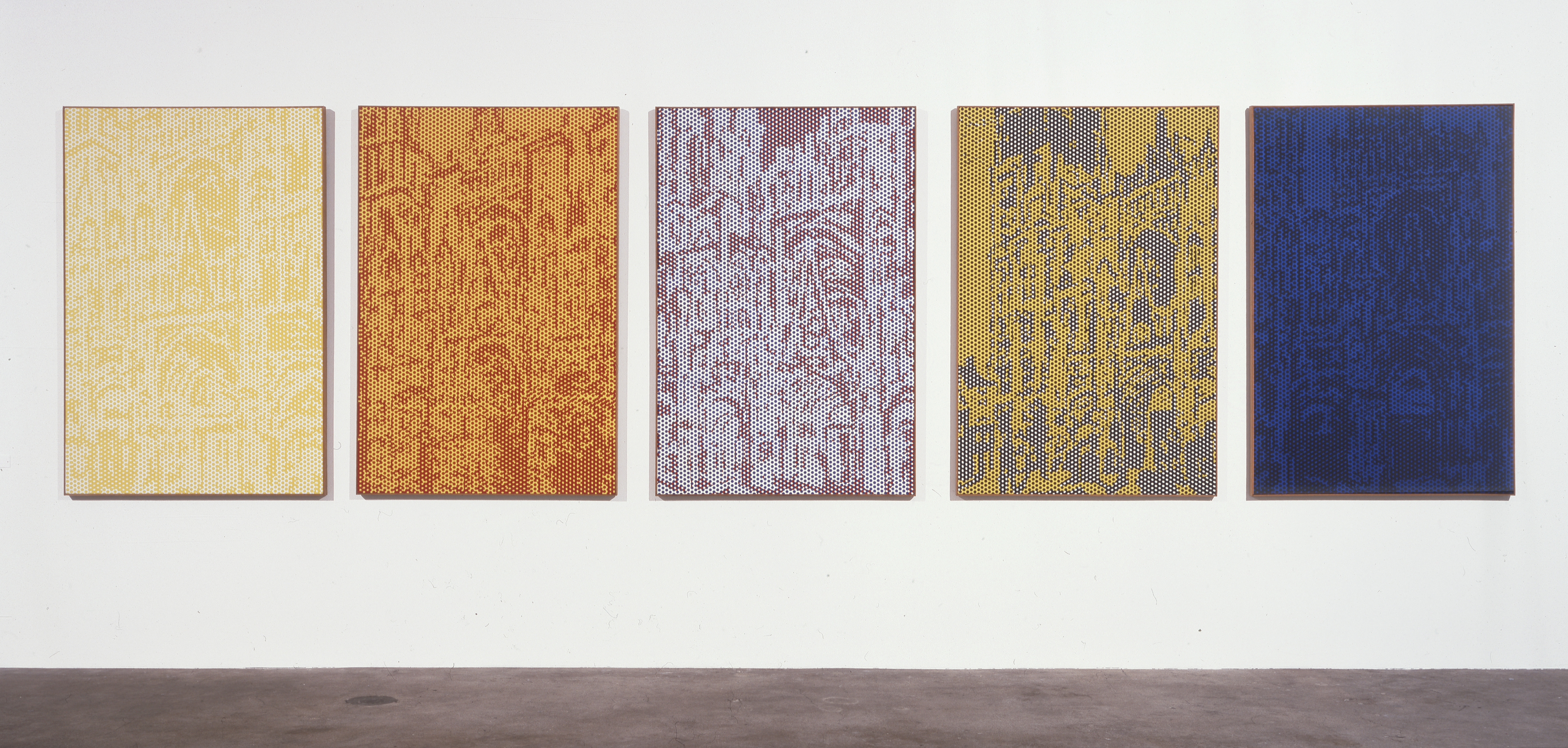
Roy Lichtenstein, Rouen Cathedral, Set III, 1969. oil and Magna on five canvas panels, 63 x 42 inches ea.
Cindy Sherman. I came around to Cindy Sherman after seeing her big retrospective a couple of years ago (I caught the iteration at the Dallas Museum of Art). Apparently the Broad has dozens of her photographs, although just her black and white film stills from the late 1970s and four iconic centerfolds from 1980 are currently on view. Sherman’s later forays into increasingly weird dress-up resonate with me most powerfully, especially when seen full-scale. Still, I was glad to see her in the mix, and her intimate prints in tabletop display cases made for a nice breather from all the enormous paintings on display.
Cindy Sherman, Untitled #92, 1981. color photograph, 24 x 48 inches.
The Red Haring. This is the only Keith Haring I’ve ever seen that didn’t feel like a cover for a feel-good pop album purportedly benefitting starving children. Loosely painted in two colors, with drips throughout, a woman’s figure dangling a Chanel logo reclines amid expensive brand-name artists (Stella, Johns). Unlike all the art that pretends to poke fun at luxury brands while really salivating over them, Haring’s painting really does take the piss. It’s a neat condemnation of the art world excess you’re standing in when you’re looking at it.
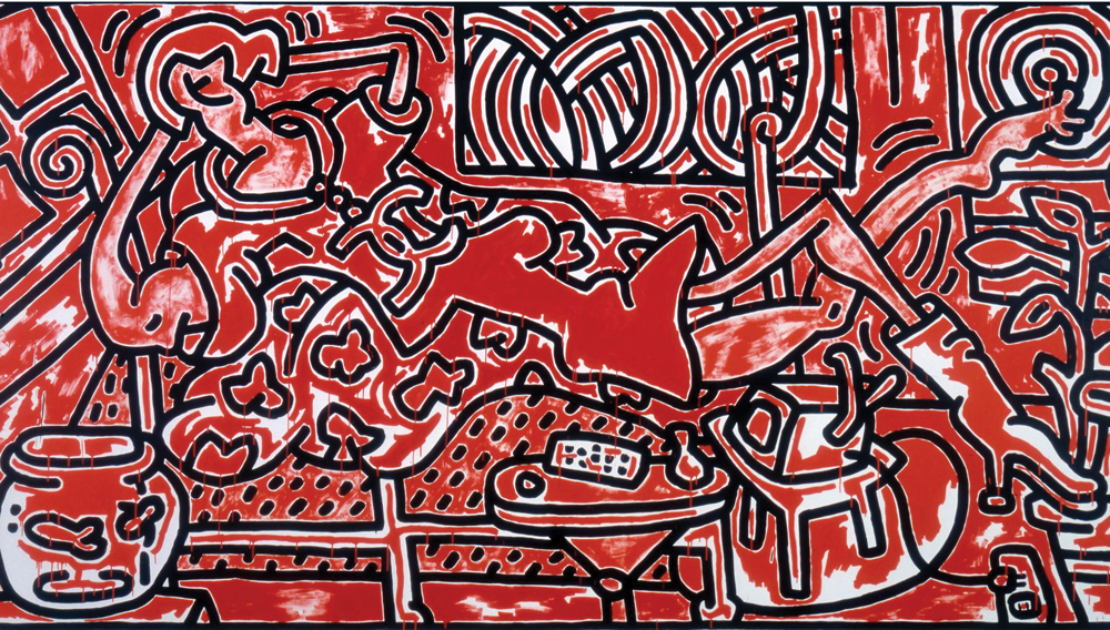
Keith Haring, Red Room, 1988. acrylic on canvas. 96 x 180 inches.
Lari Pittman’s gay pride parade. A gigantic painting that’s at once jubilant and grim, you can’t see it except through a forest of Koons sculptures. I’m not sure I would have noticed it had it not been pointed out to me, and I’m glad it was: the hysterical delight and revelry of a gay pride parade is belied by unsettling bits of text here and there. Red brick arches suggest the Stonewall neighborhood of the West Village, and helicopters overhead are apparently a reference to the LA riots, which were going on when the painting was made. The composition swings around wildly and is filled with wry details. I would like to go back and spend more time with it.
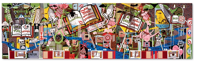
Lari Pittman, Like You, 1995. oil and enamel on five mahogany panels. 96 x 320 inches
Twombly room. I mention this more because of the artist than the hanging: the works in the Broad’s Twombly room aren’t as good as those in the Menil’s Twombly Gallery (again with the Houston comparisons!) and of course it’s not nearly as comprehensive, but it’s as good as you’re going to get in Los Angeles, and it’s pretty good at that. Twombly had the gift of making his masterful hand look throwaway and effortless, as evidenced by his Ilium (One Morning Ten Years Later), the first part of a triptych, the other two parts of which are in Houston. (Another early Twombly is hung elsewhere, with the Rauschenbergs and Johnses. This small, emphatic work is a treat, and an interesting contrast with the better-known, scribbly style of his maturity.)
![Cy Twombly, Ilium (One Morning Ten Years Later) [Part I] 1964 oil paint, lead pencil and wax crayon on canvas 78 3/4 x 82 3/4 in.](https://glasstire.com/wp-content/uploads/2015/09/the-broad-cy-twombly.jpg?x88956)
Cy Twombly, Ilium (One Morning Ten Years Later) [Part I], 1964. oil paint, lead pencil and wax crayon on canvas, 78 3/4 x 82 3/4 in.
Robert Longo’s Ferguson Drawing. Supposedly it’s uncool to like Longo for being such a macho white male. I don’t know about that, but this monumental piece shows why he’s still the king of the realistic drawing. I don’t want to like it, because it simplifies and beautifies something that was terrible, and still raw and recent. But I do like it, because it’s beautiful. Moth, meet flame.
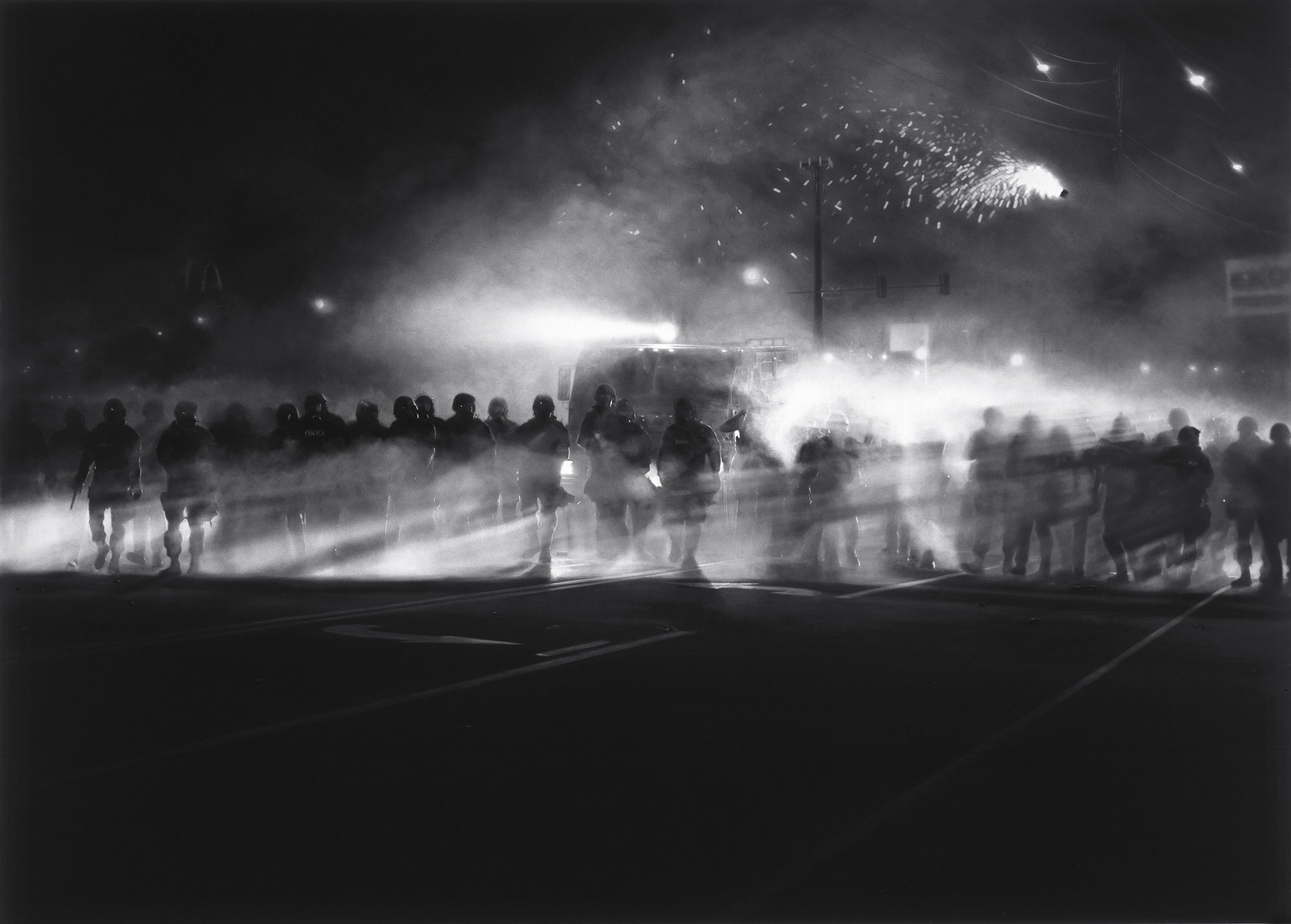
Robert Longo, Untitled (Ferguson Police, August 13, 2014), 2014, diptych, charcoal on mounted paper, 88 x 122 x 4 1/8 in., © Robert Longo
Finally, and most profoundly for me, down on the first floor there is a gallery with Ragnar Kjartansson’s 9-channel video The Visitors, from 2013. The piece has been shown several times in other cities, and much has been written about it. I had never heard of it and went in with no expectations—which, now that I think of it, is also how I first experienced the Museum of Jurassic Technology, and both experiences involved slowly unfolding wonder, and skeptical tedium, and finally sublime delight. I don’t have anything to add to the many reviews of The Visitors, except to say that you have to be patient with it in the way that you have to be patient with the young (I’m almost afraid to say that it involves a crumbling mansion filled with hipster musicians, given that such a description would normally send me straight for the door). The main lyric of the song that’s repeated over and over in the video is not, as I heard, “Once again I fall into / my family ways” but rather “my feminine ways,” which changes things, perhaps not for the better, but that’s OK. The Visitors is profound and exquisite. It speaks to the primal human experience of a solitude that yearns for a connection to something larger than itself, and I found it to be deeply moving.
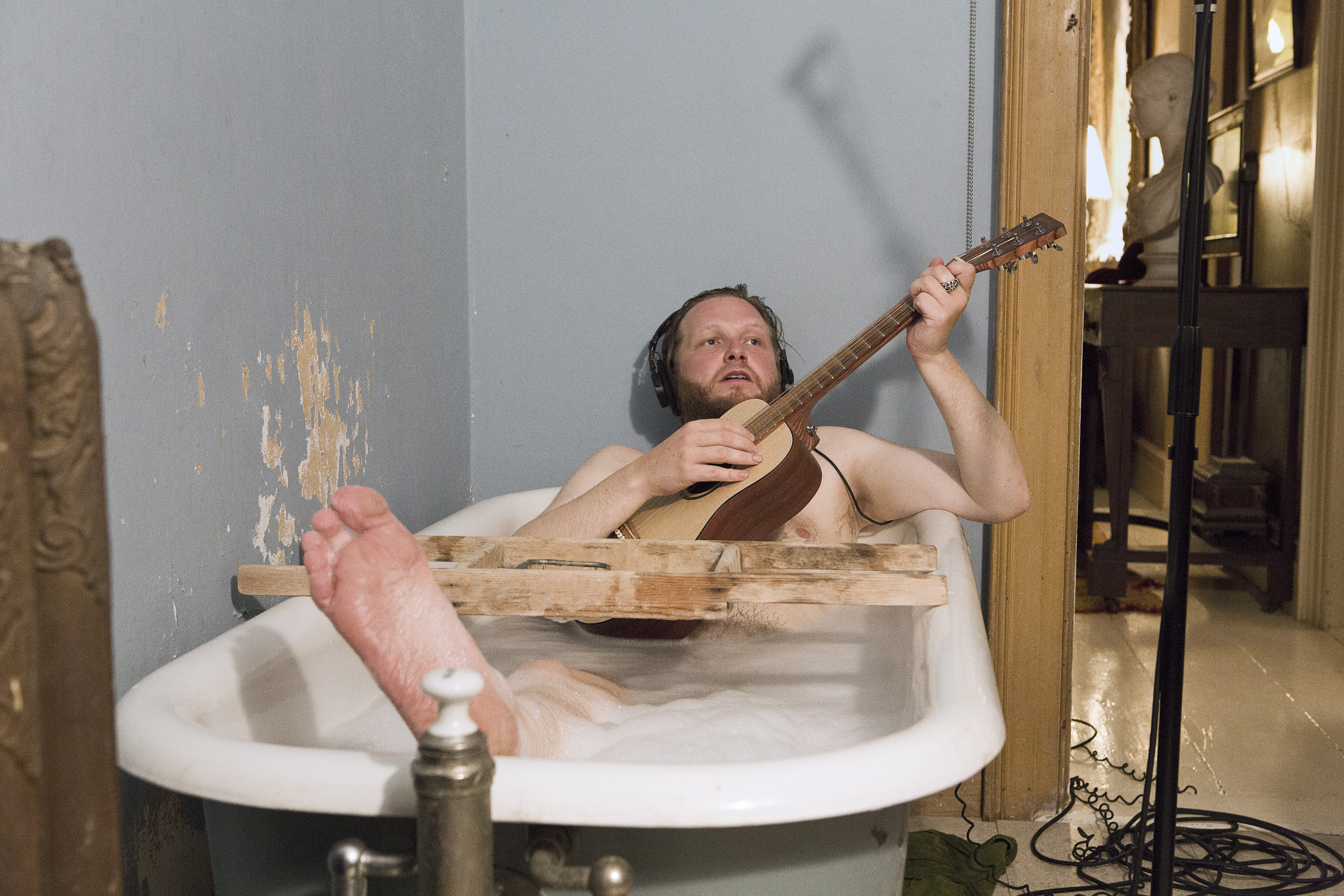
Ragnar Kjartansson, still image from The Visitors, 2012. Nine channel HD video projection, ©Ragnar Kjartansson; Courtesy of the artist, Luhring Augustine, New York, and i8 Gallery, Reykjavik
I spent well over an hour in the dark gallery of The Visitors, and afterwards I had zero capacity to absorb a roomful of Neo Rauch, much less put up with a roomful of cynical paintings by John Currin. And so at that point, I left. The Broad had given me all that it could that day. It was more than enough.

2 comments
Nice overview. Just one small note: The L.A. riots were in 1992, but Pittman’s “Like You” was painted in 1995. Helicopters are a pretty common sight over the city.
“Starfuckey” explains a lot. I hadn’t thought of it that way before. Thanks