
East Austin adds another powerhouse as gallerist Jill Schroeder breaks ground at the site of her new gallery on east Cesar Chavez; meanwhile, a celebratory exhibition of small-batch prints from artists that Schroeder has worked with over the past three years ushers out GrayDUCK‘s original South 1st Street space.
The works, printed in collaboration with master printmaker Satch Grimley, feel at home in the wide-open minimalist gallery—polished concrete floors, clerestory windows, and crisp unframed paper.
Speaking with Schroeder, it seems clear that the main thrust in curating this no-nonsense exhibition was simply to include a number of artists she had worked with in the past. The show has wide margins: there’s plenty of room between the works to digest, and though I wish there was a bit more to chew on, there are two interesting sub-themes that develop. The first deals with printmaking itself as a subject. The second addresses the slippery topic of wealth.
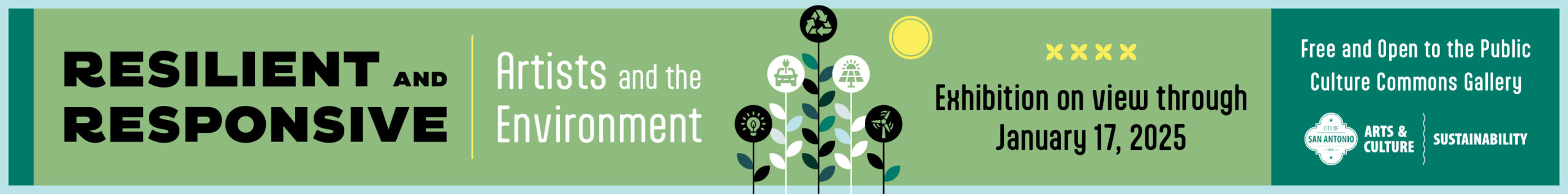
Jennifer Davis
Among other concerns, these works are prints about prints. Jennifer Davis’ Owl series must be seen in person. These test prints, with registration marks and color verifications unabashedly uncropped, are further manipulated by hand through application of acrylic paint. As any good colorist can, Davis has produced works that surpass the limitations of film and screen. She draws a direct comparison between the unique and the duplicated, and creates something that sits outside the range of mechanically replicable color. If you don’t see these in person, you simply have not seen them.
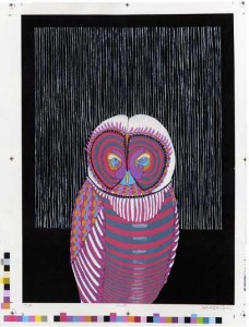
As though in response to Davis’ triumph of the unique, Mark S. Nelson showcases the power of edition. Nelson has four works on exhibition, two of the twenty copies of Floating with Plant, and two of twenty From Death till Birth, displayed in shuffled duplicate to create a rhythm of psychedelic retro graphics in pink and grey. Self- taught, Nelson frequently references historical genres of printmaking in his work. Floating with Plant and From Death till Birth stray slightly from his former bold-lined paintings and wall murals, but there is still some essence of Lynd Ward coming through, likely passed down through the wordless and unofficial canons of street art.
Ward and Nelson compared
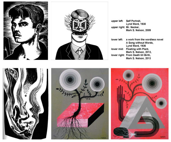
The most subtle and nuanced addition to this visual conversation on the nature of prints comes from Pamela Valfer in Landscape Simulation: Wisconsin Dells (The Sugar Bowl), Brownshill Doleman, County Carlow, Ireland, an incredibly detailed rendering of an eroded landscape depicted in the postcard-sized bleed-print. Much of the paper is left blank: what at first reads as an elegant use of negative space shifts into perspective as the source of the landscape’s erosion—the flawless surface of a lake. This small work is a giclée print of a much larger piece originally drawn by hand in graphite.
Valfer
Valfer’s Landscape Simulation series holds up natural environments, altered landscapes, and fictional versions of the two in loose comparison. It brings to mind how we as city dwellers experience “simulated” versions of nature through manipulated landscapes such as parks, through the depiction of nature in the pages of a magazine, or from the comfort of a sofa through a filter of pixels. Valfer displays this without judgment, without presenting a moral high ground, but simply as a truth of contemporary life, bringing up questions of the value of the real, the natural, and authenticity. At the same time, Valfer also questions ultra-representative art, sailing away on the boat of Hyperrealism while dismantling the vessel plank by plank.
By printing the work, she adds an additional filter to the landscape. Her final product is an inkjet print of a computer manipulated digitally photographed unique work in pencil which was based off of either photo, life, or imagination. What Valfer shows us is that this amalgamation of process and third-hand experience is no more or less real than the original landscape itself. This is the new reality.
The medium of Landscape Simulation: Wisconsin Dells is most fitting. Like Valfer’s simulated landscape, giclée itself is an invented reality. The term “giclée” is a brilliant product of what in advertising is known as foreign branding. Like “Häagen-Dazs,” “vichyssoise,” and countless others, “giclée” is a word made to sell things. In an effort to make computer-generated editions seem more legitimate (and therefore more valuable), a clever printmaker named Jack Duganne adopted the very French-sounding “giclée” (a derivative of “le gicleur” meaning “nozzle” or “sprayer”) for the new process. Ironically, “giclée” is now French slang for ejaculation. Perhaps they’ve found something American-sounding to sell digital prints in Paris.
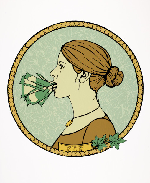
Torgerson, Fed
The market is as real as hunger, and money as a concept comes through in the gold leaf in prints by Tonja Torgerson and Jeannie Crosby. Bite by Torgerson is particular haunting, depicting a young woman ingesting (or is that regurgitating?) an unidentifiable, gold substance—a scene rendered peaceful through historical portrait conventions, Damson branch oval vignetting, and a returned gaze. Further down the wall of four (un)traditional portraits, Torgerson’s Fed is a quite sensible portrait of a conservatively dressed woman, save the absurdity of a pile of cash crammed into her mouth. The work references physical money in a secondary, more subtle way: its full-profile circular style mimics the design of a coin. I doubt that it is lost on the artist that currency is also editioned, and in the case of paper money, printed.
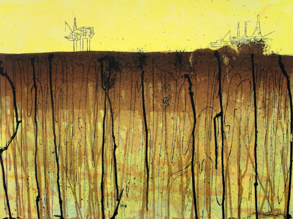
Sabra Booth, Black Gold
In keeping with the money theme, Black Gold by Sabra Booth seems like abstraction made readable through the addition of hastily drawn oil rigs; black squiggles turning to crude petroleum. Further on, the viewer finds the begging hands of Repurposed Artifact by Adrian Landon Brooks. One might even find themes of economy in Terrence Payne’s It’s No Use Fighting Over Chicken Feed and You Might Think You Are Dancing But Really You Are Dying Slowly … or at least in his titles, which could stand as individual works themselves.
It’s hard not to think of the market when you’re in a gallery that is scheduled to shift out of an expensive, gentrified area. It’s even harder not to think of the market when you are viewing editions, a type of work that dodges some of the difficulties of affordability and art. Schroeder’s commercial savvy comes through as much in the relocation as in the exhibition itself. Timed for the holiday season, it would be surprising if the exhibition didn’t sell most of its stock. Nearly all the works are priced within the $50-$200 range. It’s no shock that artists make up a significant portion of grayDUCK’s clientele.
Galleries exist in a strange gradient between shop and museum, money-maker and cultural institution. Pragmatism has certainly dictated that this exhibition leans toward the former, but recent announcements from grayDUCK concerning their new space sound like a more interesting mix. From their newsletter:
“The new property brings with it the opportunity to create a more social environment. … We’re looking forward to offering more solo shows to accomplished artists giving them an opportunity to transform the entire space. We also look forward to exhibiting more installation art, as well as providing a venue for events such as film, music, and performance.”
These promises make me very hopeful.
If you are planning a day out to view exhibitions, make grayDUCK’s original location your first stop. Schroeder’s grace remains unblemished despite her capitalist talents and, if asked, she will not hesitate to tell you where all the good shows are even at the cost of recommending competing galleries. Her consistent engagement with the Austin art scene balanced with a broader view makes me look forward to the new grayDUCK. If we are lucky, they will deliver all they’ve promised.
Hurry! Send Off at grayDUCK opened December 6th and will close December 22nd . Exhibiting artists are Allen Brewer, Sabra Booth, Adrian Landon Brooks, Jeannie Crosby, Jennifer Davis, Jenna Foster, Katy Horan, Mark S. Nelson, Terrence Payne, Casey Polacheck, Tonja Torgerson, Pamela Valfer, and Mathew John Winters.
Seth Orion Schwaiger is an artist, curator, and critic based in Texas and the UK. He received his bachelor’s degree from the University of Wyoming and his master’s from The Glasgow School of Art. His research interests include the development of arts systems with particular focus on the growth and direction of urban and regional art scenes in relation to larger national and international trends.
All images of work are courtesy of the gallery.
