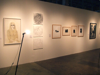
The first time I saw Arthouse’s NAT23 (read Angella Emmett’s review) I loved it. It was at the opening and quite frankly whenever
something didn’t catch my eye immediately I moved on. It was so packed
it was frankly hard to see the work. But it seemed full of fresh stuff
and interesting work.
something didn’t catch my eye immediately I moved on. It was so packed
it was frankly hard to see the work. But it seemed full of fresh stuff
and interesting work.
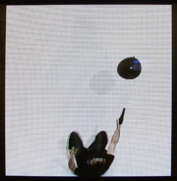
I went back the week before it closed and found that I really wasn’t
that into it. It was a terribly drab show, especially when I think
about how colorful (but in a way just as ultimately disappointing)
NAT22 was (read Andrew Long’s GT review). Last year’s crop of "new talents" as picked by Anne Ellegood
of the Hirschorn Museum and Sculpture Garden in DC was full of color,
like Suzanne Wright’s gigantic drawing "Rainbow Highway" (G.W.B)
(which has been the background on my phone since then!), and "talents"
interested in the physical characteristics of the materials and media
they used, as in Damien Gilley’s Parking Lot Miracle
video.
This time around, Nato Thompson of Creative Time chose a group
of artists who by and large were a lot less interested in material or
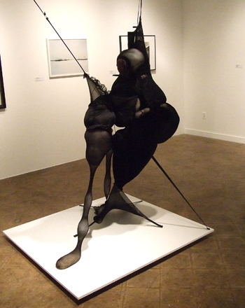
aesthetic qualities (with notable exceptions like Teruko Nimura’s Senga
Nengudi-aping Black Doll or Jill Pangallo‘s experimental YouTube "Some Lady" Series
videos), and a lot more interested in somewhat dry and unpretty
"commentary on the social dimensions of our daily lives."* This
disinterest in pure aesthetics is fine and well if you’re into that
sort of thing, and if talking to art historians has taught me anything,
it’s also THE way to look at things but personally I need some pretty
meat on thick bones, not a bunch of black and white pieces and a couple
of projects about how someone did something that Adbusters would be
proud of.
Other than Pangallo’s YouTube videos mentioned above, the highlights of
the show for me were so high that I am willing to just look past the
rest of the work and get a good fix. Joe Craig’s video vignettes based
on still photographs from the 70s were mesmerizing and pretty
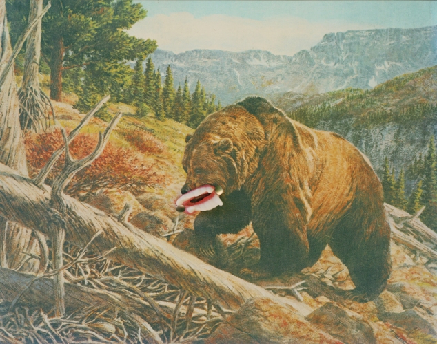
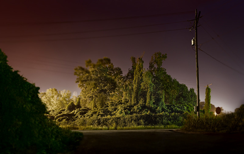
brilliant. Beau Comeaux‘s large prints of what I think were scale
models of Gulf Coast scenes were brooding, fascinating, sinister and
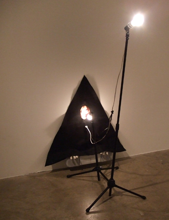
majestic. Eric Gibbon‘s John Lennon Communication Device‘s
hippie/camp minimalism was totally uplifting and Anna Krachey‘s super
flat and brightly colored compositions of abstracted or
decontextualized objects and images both show a deep visual
intelligence and an ability to find beauty in life that most of the
work in this drab show just never reaches.
To be fair, a juried group show like NAT will never ever please anybody
fully. It’s the nature of The Beast. On a fundamental level, I think I
disagree with Nato Thompson’s ideas
about what art is and what it does or can do to people and for people,
but part of the point of Arthouse’s yearly showcase is to present the
vision of a particular curator, and part of the point of visiting these
forays is to be exposed to new work and perhaps an interesting
framework for going inside of it.
* From Thompson’s curator’s essay for the show


2 comments
dude, you can come up with a better The Beast.
true, but I don’t know if I can come up with a nerdier one!