Sometimes you got to give credit where credit is due. Though the McKinney Avenue Contemporary still occasionally holds some curious exhibitions as sister shows to those at Pillsbury Peters Fine Arts — witness William Wegman and Dan Rizzie in the past year — the group shows the MAC showcases are uniformly solid, and its second-annual juried exhibition is no exception.
Juror Annette DiMeo Carlozzi, Curator of American and Contemporary Arts at the Blanton Museum of Art in Austin, shows she’s got an eye and ear tuned to the various media and mindsets that Texas artists are tapping into these days. And the show she’s rounded up is as diverse and expansive as the state itself, including installation pieces, painting, photography, and mixed media.
And you get the impression that standouts at the show would be compelling in whatever setting you found them. C. Sean Horton’s installation Is it Getting Heavy? creates a bittersweet, almost heartbreaking scene of age. Atop a small Formica table sits a small plate on which rests a powdered-sugar donut. A wooden chair sits away from the table a tad, as if somebody has just left the scene. The materials for the piece list cast bronze, powdered sugar, and grandmother’s plate, and it’s only through careful examination of the piece and referring to this media list that you realize that the donut sitting on grandmother’s pink plate is a solid ring of cast bronze. It’s the “heavy” thing to which the title refers, and it’s a sly, sweet allusion to the weight that everyday objects accrue as people age, both figuratively and literally.
Equally as poignant is Shelly Dammeyer’s color photograph The Last Time You Held Me is Forgotten. In it, a blonde wig covers a Styrofoam head and a pair of hands clutches the female stand-in tenderly. In the foreground, the top of a medical prosthetic or brace is partially visible, implying that the figure of the head is standing in for a person with whom the relationship itself a bit wobbly — or nonexistent.
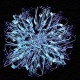
Perhaps the most playful and engaging pieces in the show come from Paul Booker. In his oil-and-ink-on-panel Orbit, Booker takes a comic-book inspired palette-hot, solid yellows, blues, greens and reds-and renders pseudo-scientific, pseudo-sci-fi imagery that immediately brings to mind the variegated vocabulary of Matthew Ritchie. But any derivative traces disappear in Booker’s Small Drawings with Corresponding Nomenclature, an array of 60 small figures-qua-creations tacked to the wall and labeled, with their names tacked correspondingly below. These small inventions — bearing “names” such as Salsa Freebase and Wavel Sinkhole — are a playful mix of the comical and grotesque, and the sort of wild imaginations that may result from a lepidopterist obsessed with Tolkien’s “The Lord of the Rings” trilogy.
All of the above laurels, however, isn’t to imply that the show isn’t without some rough spots. Though Gary Sweeney’s large mixed-media collage Art Must Take. presents an impressive front and expresses good intentions — it forms a well-known quote from French writer Françoise Sagan out of old signs — it still feels a bit like revisiting 1960s text-based pop-qua-conceptualism. As a result it feels more like an artifact than a contemporary work, as old as the signs that comprise it. Connie Connollay’s People I Know II is a large panel divided up into four rows of seven portraits of individuals involved in the Dallas-Fort Worth art community. Its large scale makes you suspect Connolly’s aiming for a Chuck Close-type of investigation of the human face, but the style is rooted more in traditional neo-realist vein without the painstaking scrutiny of flesh found in the work of Eric Fischl. In the end People feels more cute than cunning. And Randall Friedman’s installation The Social mounts small, air-blowing motors atop copper tubing to create a vision of human interaction. This piece is a witty visual pun on fraternizing people being nothing more than proponents of hot air, but after you get the joke — which happens instantly — it doesn’t leave you with anything else.
But that’s about as off as the show gets — and these weaker moments may not have seemed so if it weren”t for the exhibition’s standouts. A good example of this fact is the side-by-side mounting of Benito Huerta’s two charcoal-graphite-on-paper works, Brave New World and The End. In World, Huerta takes the familiar, ornately designed fonts found in advertising copy and logos — the looping swirls of Coca-Cola, the competent lines of I.B.M, et cetera — but uses them to form the sort of four-letter words that spring from a stevedore’s mouth after he’s spent a weeklong furlough at a Shanghai brothel. The overall effect is a surprisingly subtle and sly acknowledgement that advertising uses pleasing visual panache to make its products more alluring. But Huerta uses a similar approach in The End, only it has a less-powerful punch. Here, he spells out the title in the playful script used to conclude Warner Bros. cartoons from the 1940s and 1950s superimposed over an outer-space view of the world. It’s probably intended to have a quasi-imposing effect, but it simply feels a little half formed next to the more sophisticated Brave New World. But when it’s a matter of the more accomplished works that make the only slight less so works pale in comparison, it’s hard not to call the overall exhibition a success.
Bret McCabe lives in Dallas, Texas.


