Colorforms were fun: sticky vinyl shapes in bright colors one could adhere to a shiny black board to make glowing hard-edged images. A precursor to the computer paint program, they allowed picture making without painting, in colors more intense than any crayon.
Colorforms at Lawndale Art and Performance Center is the latest example of the triumph of Los Angeles bubblegum-art. It’s easy to recall a spate of recent shows revolving around this newish style: the just closed Humanoid show at DiverseWorks and Karim Rashid’s Pleasurscape at Rice, the CAM‘s 1998 Abstract Painting Once Removed, and Frances Colpitt‘s 1998 Chromaform at UTSA. What makes this style so popular with artists now? First, there is the removal of the artist’s hand; forty years after ab-ex, contemporary artists are still squeamish of authentic mark making. Second, bubblegum-art (this is now the official term) reconciles various unfinished themes from the 70’s and 80’s, blending raunchy body art, decorative painting, feminism, and neo-geo cleanliness in pleasant paintings ripe for a feel-good art market. Less fraught with psychology than surrealist bimorphs like those of Miro or Tanguey, less interested in natural form than Jean Arp or Henry Moore, the style is abstracted pop art: plastic surfaces and candy colors drawing imagery from culture rather than nature.
The installation makes the most of Lawndale’s awkward space, wisely limiting itself to a few larger works over a crowd of small ones. Paintings by Chris Kysor, Scott Barber, and Tim Litzmann alternate around the gallery walls. One sculpture, Jessica Halonen‘s Picnic, occupies the central zone between the four columns, leaving the periphery an uncluttered ambulatory painting gallery.
In Scott Barber’s best paintings, like the violent green Untitled, he uses poured paint to create slick synthetic layers with the peel-off tactility of vinyl sign lettering. In other works, like Celidwen, labored brushstrokes are at odds with the cool industrial finish and intense color. Caught halfway between clumsy folk-art and industrial product, Celidwen and Lip Sip Sip, Barber’s largest piece, suffer from less than pristine execution.
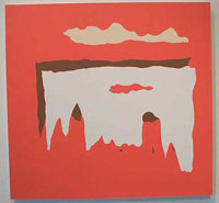
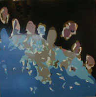
Chris Kysor’s paintings are the best of the lot; the curious quasi-landscape contours of Three Peaks and Black Insert (despite some thin spots) suggest mesas/clouds/caves with a snappy purposefulness. Velvety smooth color in unexpected combinations gives both pieces an elegance lacking in his larger Mountain Graphics. Clunkier but more fun, The Deep has a sense of its own ridiculousness. Crossing Peter Max with Morris Louis, Kysor overlaps a series of funky waves with stylized highlights and gesticulating tentacles.
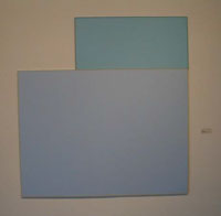
Tim Litzmann paints and sands sheets of Plexiglas to give them a mysterious, waxy luminosity. Litzmann’s subtly graded color creates ambiguous depth in a featureless field. An orange rectangular panel could be a window into a room full of melon-colored fog. In Untitled Algorithm #2, two powder blue panels abut one another to recall the shaped canvasses of Robert Mangold. Litzmann’s understated works are jostled by the other artist’s more colorful pieces, and seem dull by comparison. Like the eerie light effects of James Turrell, Litzmann’s works need careful contextualization to hold their own.
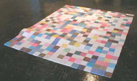
Jessica Halonen’s Picnic is a grid of tiles laid out to suggest a checked blanket. Two stiff wrinkles, as if the piece was riding over a root, carry the metaphor one step too far, but redeem themselves by making the piece something more than an inbred reference to floor pieces by Carl Andre and Rachel Lachowicz. The sprightly interplay of colored squares recalls Ellsworth Kelly’s grid pieces or a close-up of a digitized photo. Although Halonen’s tiles are literally made of colored sugar, they might as well be silica sand; unlike the gingerbread house, one isn’t tempted to nibble them. A mishmash of disparate metaphors, (candy, pixels, picnic, blanket, tile, minimalism) cancel each other out, leaving the piece lukewarm.
In abstract art, as in improvisational music, the game is to suggest everything while saying nothing, without lapsing into insipid noodling. When it’s good, bubblegum art can have a playful pop-art vitality or a curious surreal pathos, or both. When it’s bad, it’s merely stylish. Colorforms at Lawndale has some of both.
Bill Davenport is an artist and writer from Houston.
